


A user who wants to cancel has already made a decision. The design question is not how to stop them, it is how to handle the moment in a way that respects their choice without burning the relationship. Cancellation flows that bury the option, add unnecessary steps, or use guilt-laden copy do not retain users. They create frustration and resentment, and they make a lasting impression that users share with others. The goal is not to make cancellation impossible, it is to make it feel fair.
There is still room to offer alternatives. A pause option, a downgrade path, or a brief question about why they are leaving can all be presented without feeling manipulative, if the timing and tone are right. A well-designed cancellation flow can recover some users while sending the rest off on good terms, which matters more than most teams account for.
Make the Unsubscribe button easy to locate
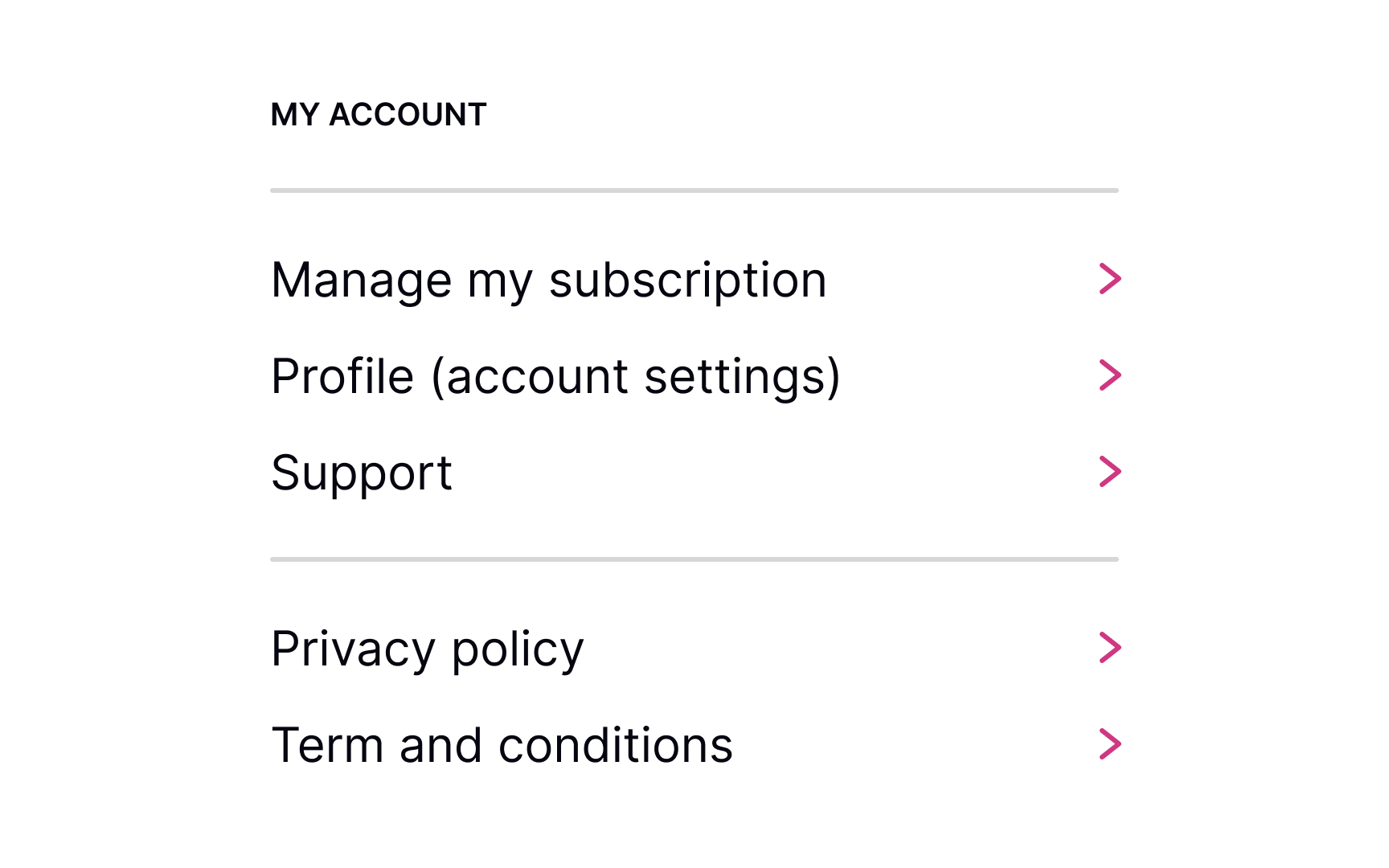

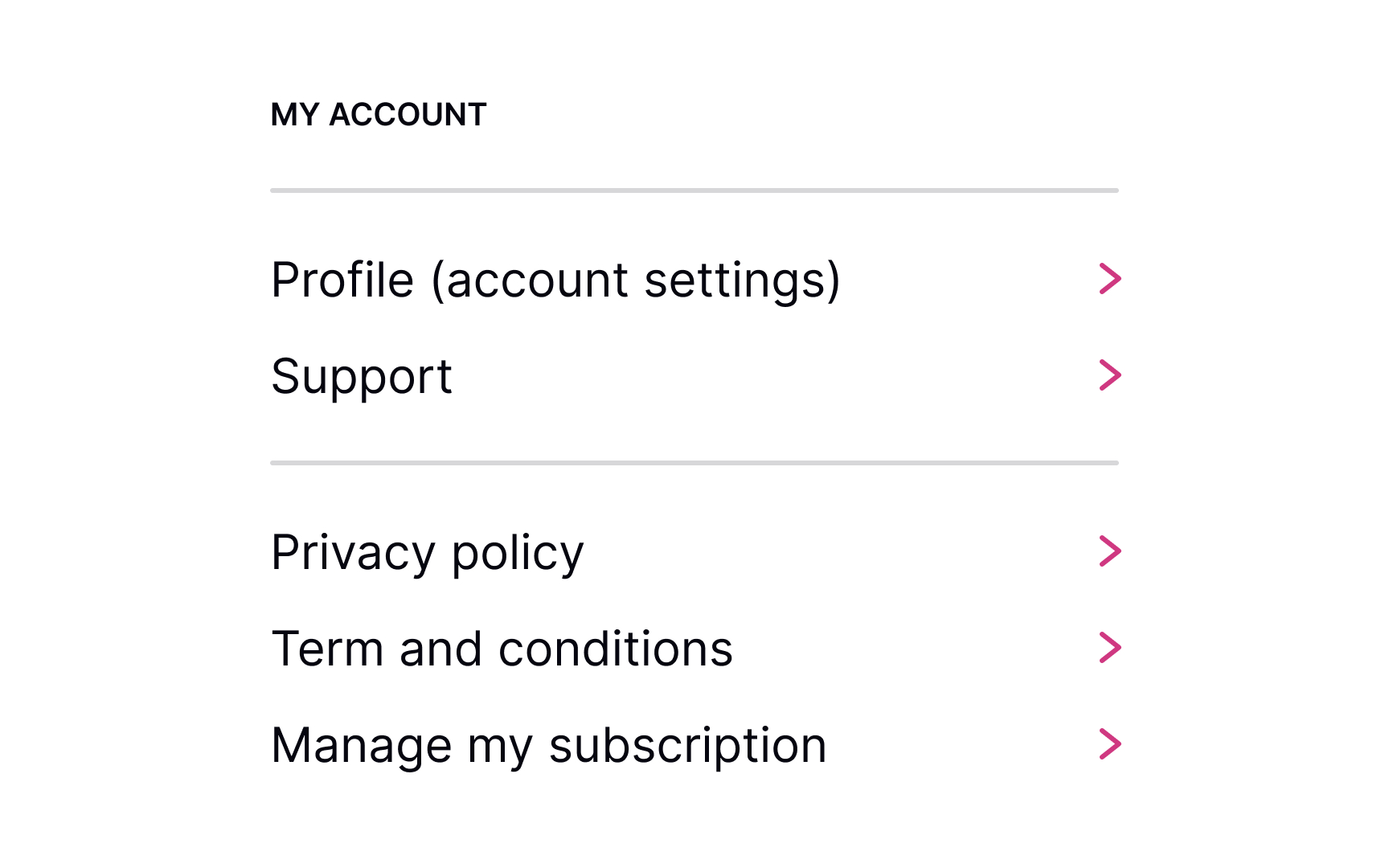

When users decide to cancel their membership, they should know where to find the right link or button without having to do extra guesswork. Usually, designers place it in the account's settings or billing sections.
Users have expectations of how this link or section should look, so make sure:
- It's easy to notice
- It looks clickable/tappable
- Use the appropriate labels like Unsubscribe or Cancel/Manage Subscription
Hiding the Unsubscribe button can lead to low loyalty and brand mistrust. Be honest and respectful, allowing users to decide for themselves whether they want to use your product or want to stop using it forever or temporarily.
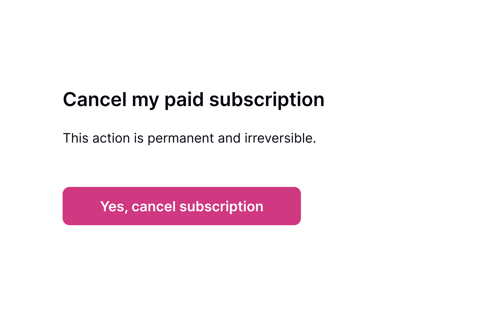
Confirm intent to cancel
Sometimes, users may accidentally click the destructive button that triggers the removal of an account or subscription. So prevent irretrievable actions by asking users to confirm their choice. Plus, it's an additional opportunity to try and reel users back by pointing out what they'll lose when they cancel the subscription. For example, if users can access the product only with a subscription, you can remind them of the product's value.
Conversely, if the product can be accessed in a free version, you can remind users of some specific subscription benefits. The golden rule here is to avoid using language that begs for sympathy or exploits tools of pressure or manipulation.
Request a reason for canceling
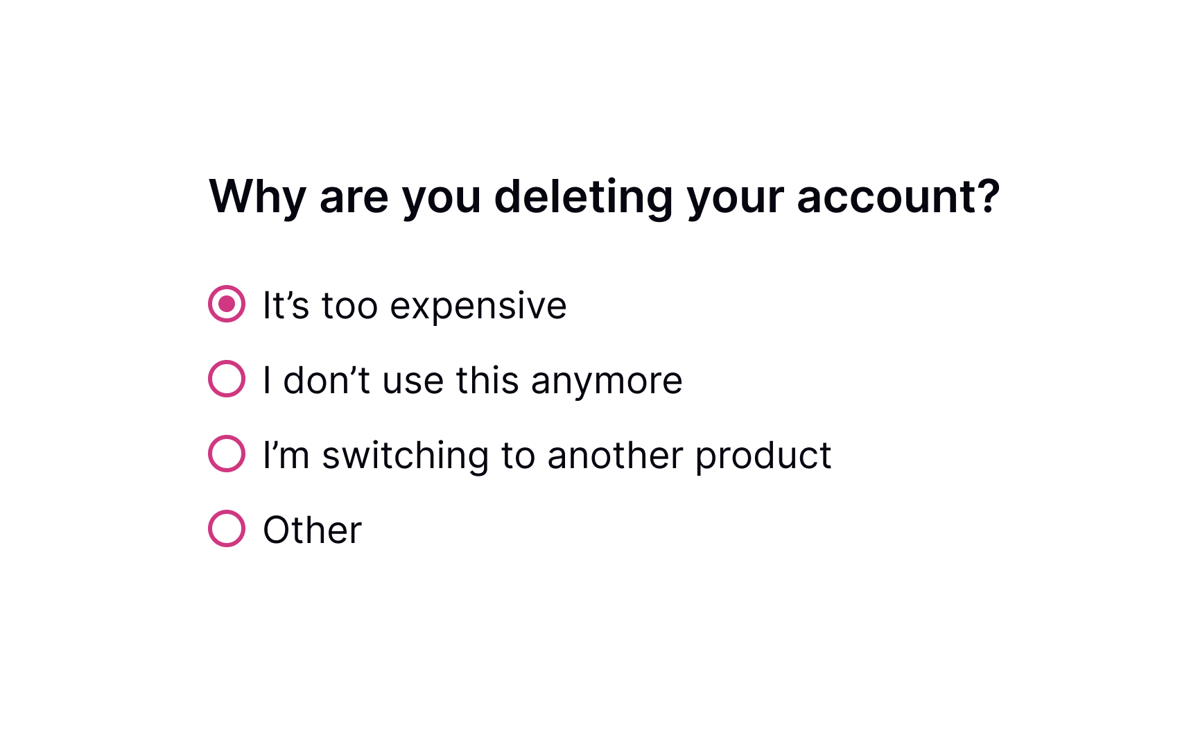
When users decide to cancel their subscription, it's a great opportunity to receive feedback and learn what can be improved. Was the product too expensive? Did users prefer a competitor? Did they get what they needed and no longer need the service?
Don't make this question mandatory and avoid pressing users to provide a detailed answer. Be polite and provide possible options for why users may want to leave. Additionally, include a section labeled "Other" that allows users to provide their own reasons for leaving in an open-ended format.
Pro Tip! If users abandon your product for the same reason, you should reconsider your pricing plans, user experience in general, or whatever most commonly makes them leave.
Offer incentives for continuing
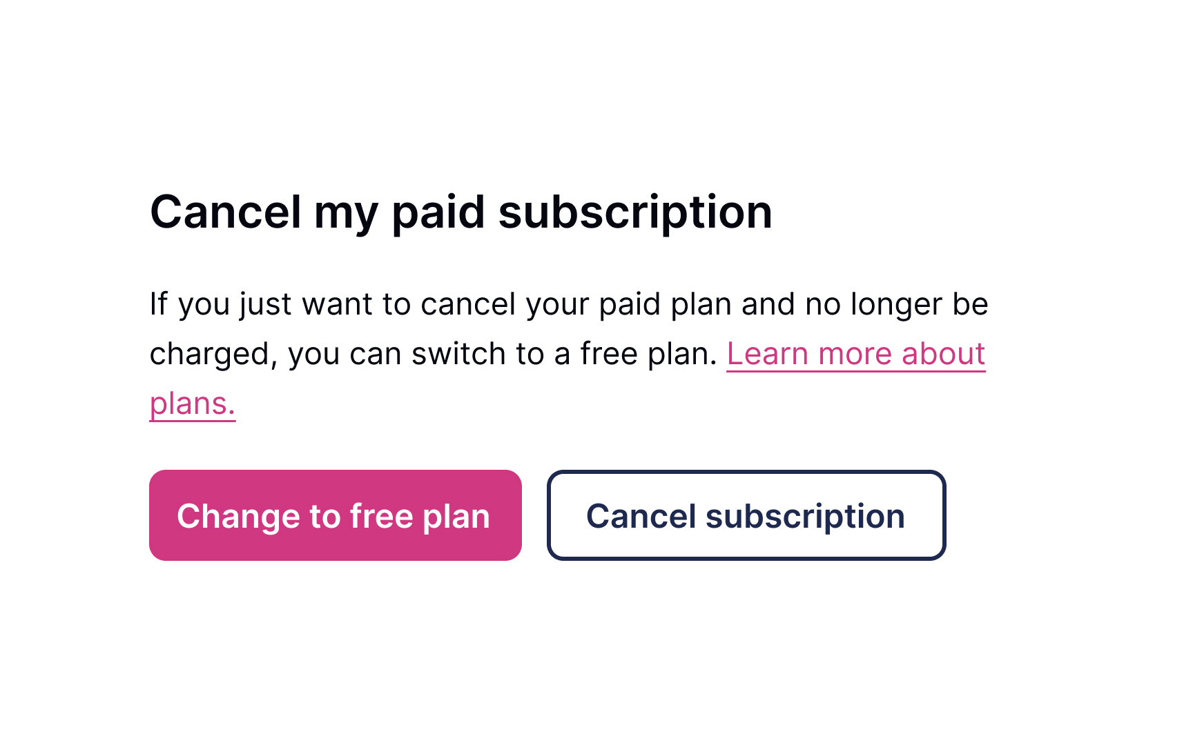
Sometimes, even loyal users want to leave. Don't let them go by offering attractive incentives that might make users reconsider their decision to cancel. It could be a temporary discount or a free upgrade to their current plan.
If you figure that users may have some financial issues, it's worth mentioning that they could opt to downgrade a subscription instead of canceling it entirely. Be friendly, polite, and don't pressure users to stay, no matter what. Your task is just to make sure they've considered all options.
Confirm cancellation of subscription
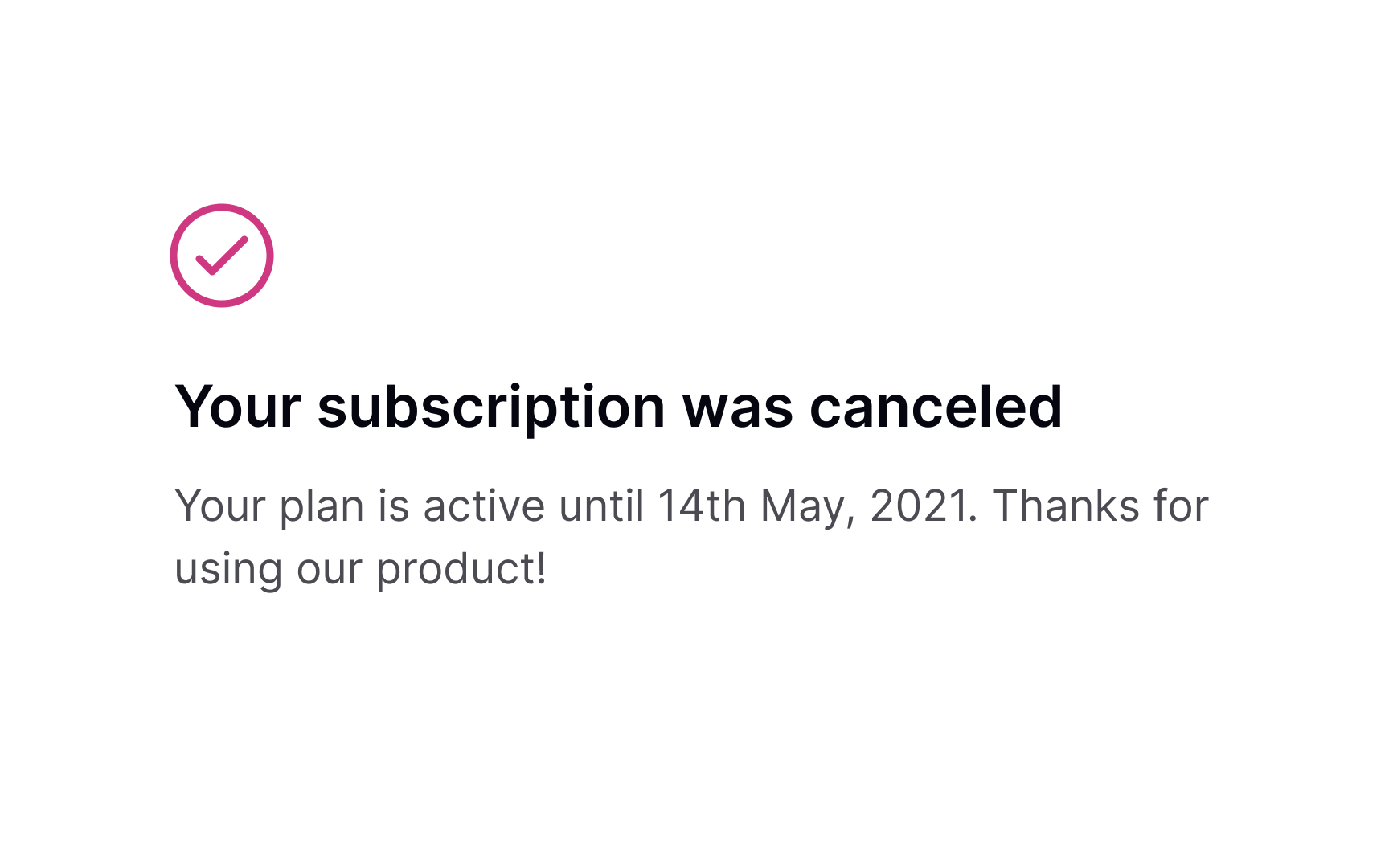
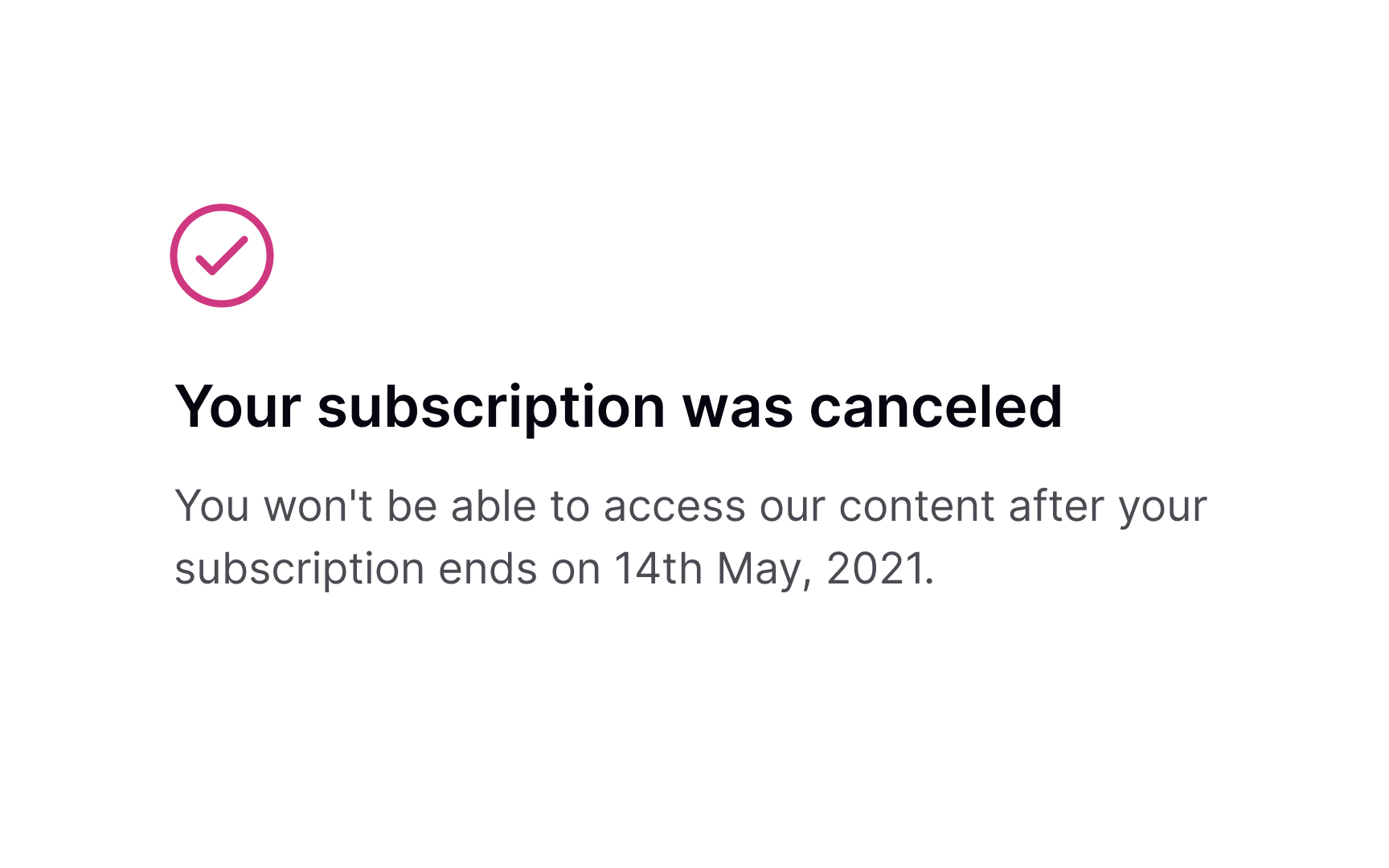
Once users cancel their subscription, they may still want to continue using it until it's active. The confirmation page is an excellent opportunity to explain how long users can use the membership after cancellation and what they can do if they decide to renew it in the future.
Follow-up via email
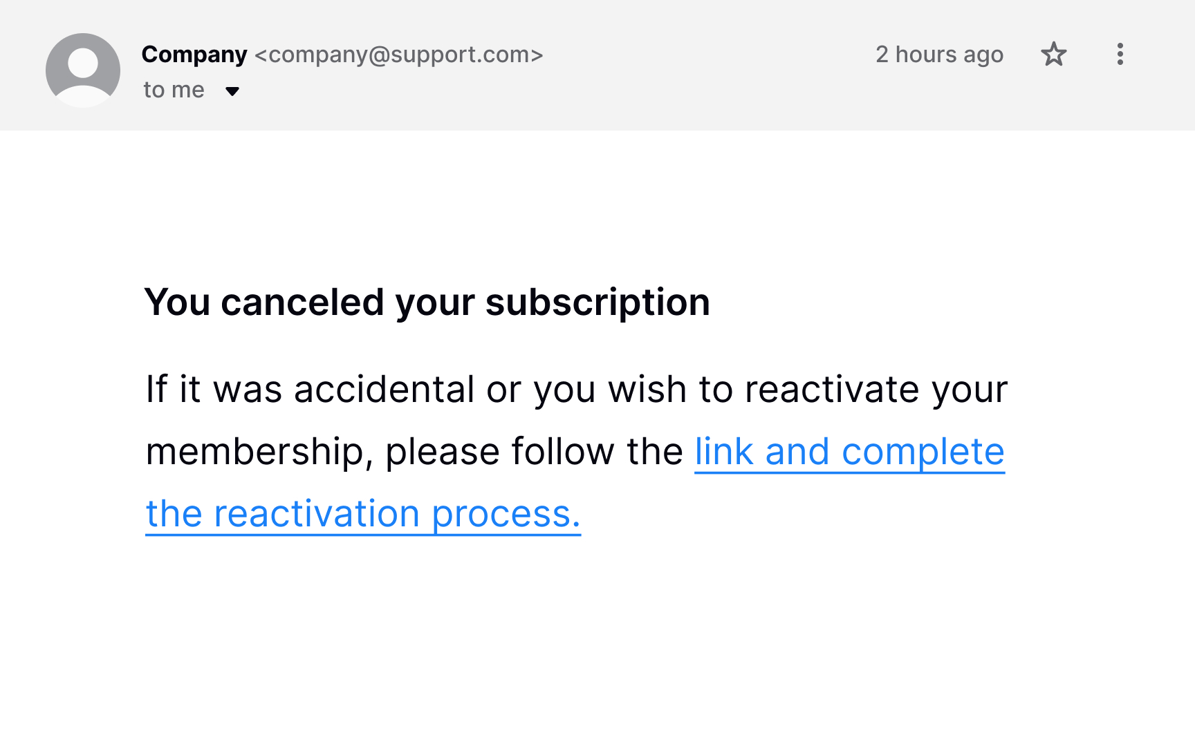
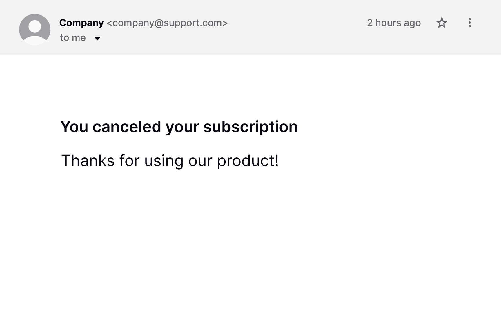
Mistakes happen, and users may accidentally click the Cancel button. Or, they may consciously cancel their subscription and then simply change their mind. Having an "emergency exit" and the undo option makes users feel in control of the system, fostering a sense of freedom and confidence.[1]
Make sure users always have a chance to revert changes and keep their membership. First, show a confirmation dialog asking users to confirm that they want to cancel the subscription permanently. Second, send them a follow-up email with a reactivation link after the cancellation. Some users will be grateful for this opportunity to undo the destructive action.
Topics
References
- User Control and Freedom (Usability Heuristic #3) | Nielsen Norman Group


