


According to the ecological valence theory, our color preferences don't emerge out of thin air.[1] Users’ likes and dislikes of colors stem from past experiences that, like a puzzle, consist of many pieces.
Events in politics and culture, technological innovations, cinema, music, and fashion all influence how people perceive reality. Users watch movies, attend art exhibitions, buy new devices, listen to music, visit restaurants, and celebrate holidays. Along the way, they absorb what happens around them and form opinions. Positive experiences create positive color associations, while unpleasant ones lead to negative impressions.
Industry-standard color palettes

According to a study conducted by a UK insurance intermediary, many industries are prone to using particular colors in their branding. They select colors that have the intended psychological influence on consumers and also create the right image of the industry. In turn, people start subconsciously associating those colors with particular industry sectors.[2]
For example, many airline companies pick blue to represent trust and security (e.g., United Airlines or Finnair) and red to ensure a caring attitude (e.g., Kenya Airways or Turkish Airlines).
On the contrary, red and yellow are the most common colors for fast-food restaurant chains (KFC, McDonald's, or Wendy's) as they're usually associated with appetite and stimulate hunger.
Color palettes of famous brands
Reds and yellows are incredibly stimulating, vibrant, and bold colors. These colors can increase your metabolism and appetite. They are also strongly associated with one of the most popular fast-food chains, McDonald's. Burger King uses similar hues to achieve the same effect.[3]
While these colors can make your customers feel hungry and crave your food, it can be a challenge for your brand to stand out. To address this, consider incorporating other accent colors and put thought into the brand name and logo design. For example, at Wendy's, they've managed to use the unappetizing blue, but it looks great and memorable.
If you are designing branding materials or a website for a healthy restaurant chain or for organic food delivery, it's best to avoid these colors as they may be associated with fast food, which isn't indicative of the quality of food.
Color palettes associated with holidays


Although there are cultural differences in holiday associations, it's also important to remember how colors affect moods or evoke particular memories or feelings among many users.
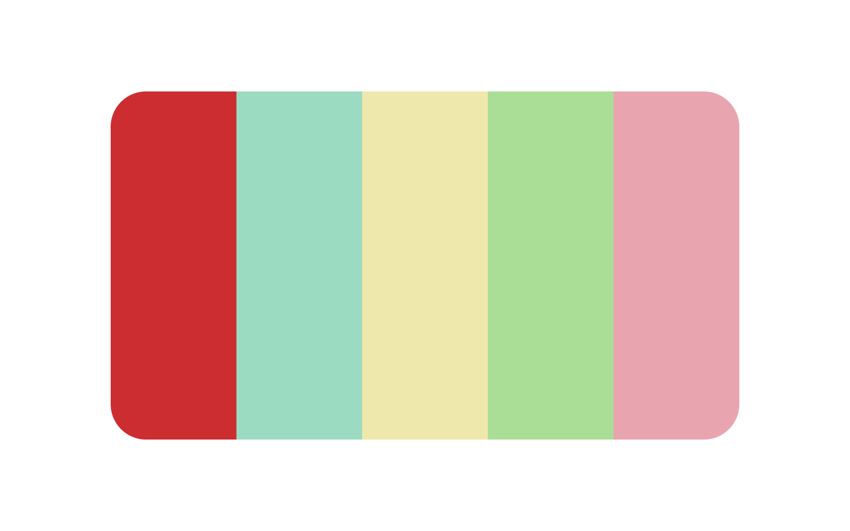
Specific shades of red and green may be associated with Christmas time and its attributes like Christmas trees, red stockings hanging over the fireplace, beautiful evergreen wreaths, candy canes, and mistletoe.
Similarly, in China and other Asian cultures, the color red is prominently associated with the Lunar New Year, symbolizing luck, prosperity, and joy. Red lanterns, envelopes filled with money, and festive decorations are all emblematic of this holiday.[4]
When selecting a color palette, keep these associations in mind and make sure to pick hues that promote the feelings you would like users to have when they see your product.
Color palettes in film & TV
In filmmaking, color is one of the most powerful tools used to express mood, evoke certain emotions, or convey a spirit of specific eras. Moreover, the best film directors have a recognizable style and color palettes that people associate with their movies.
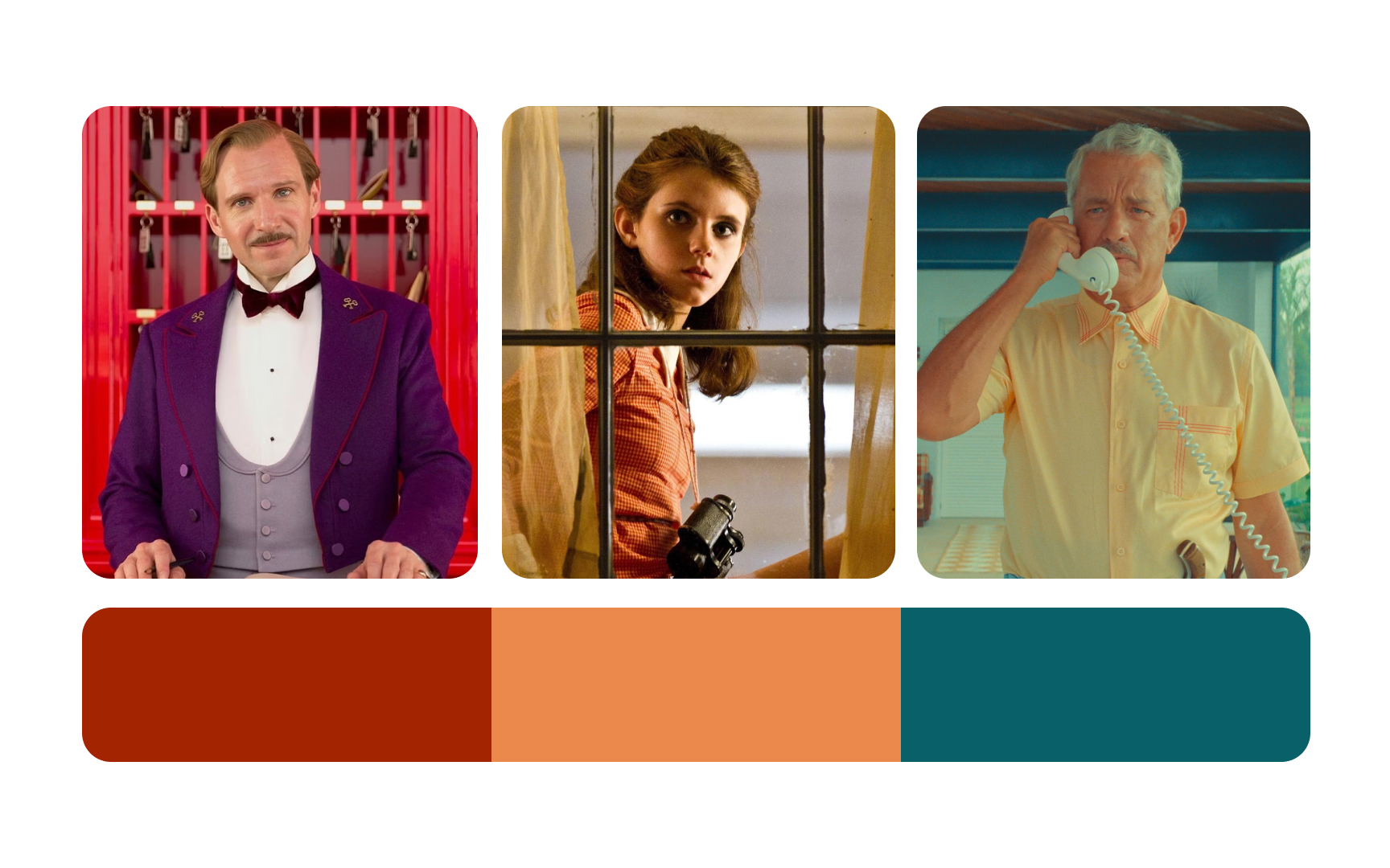
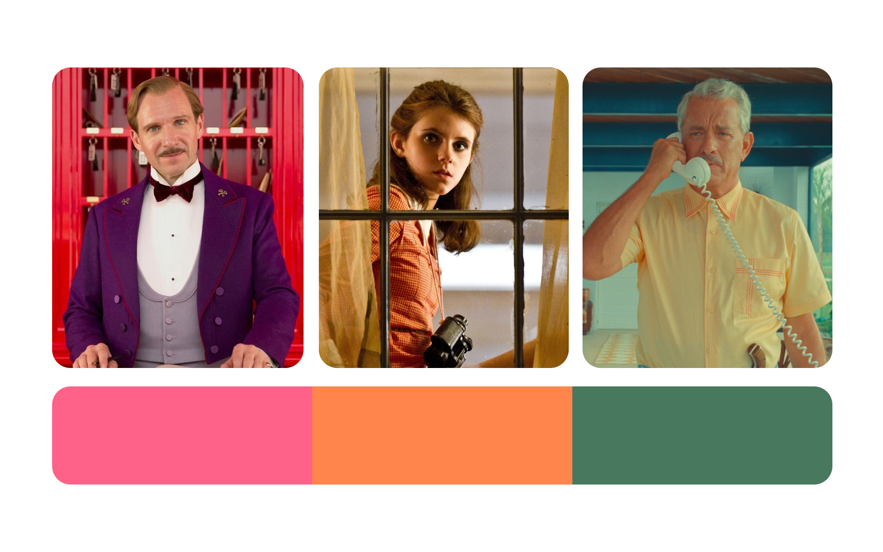
Wes Anderson’s warm browns, soft oranges, muted pinks, and gentle greens often feel dream-like and a bit nostalgic. The muted pink in The Grand Budapest Hotel and the hazy oranges and greens in Moonrise Kingdom help the cinematographer set a clear tone for the characters and shape the mood for viewers.[5]
People tend to associate romantic movies with consistently bright and more saturated colors. They feel more relaxed, safe, and eager to laugh seeing characters highlighted with cheerful light. Conversely, dramatic scenes are linked to melancholic dark or muted blue, green, black, or gray. Not to mention that heroes and villains can also be easily revealed by color.[6]
Color palettes of nature


Scientists suggest that our positive associations with green and blue have been rooted in our brains through evolution.[7] Green landscapes are linked to growth and vitality, while blue skies and water bodies suggest clarity and calmness. These natural colors are more than just visually pleasing; they can significantly impact our well-being.
Exposure to nature's colors, such as green and blue, has been shown to reduce stress, lower blood pressure, and improve mood. For instance, the serene greens of a forest can calm the mind, while the expansive blues of the sea can evoke a sense of peace.
Incorporating these colors into interfaces can help mitigate the negative effects of urbanization.[8]
Color palettes in pop culture
Apple's early iPod commercials with dark silhouettes dancing to a tune against colorful backgrounds were not just about selling a portable music player — they were selling an experience, a lifestyle.[9]
People got attached to the iPod on an emotional level, and colors from these commercials became a trend. Lime green, Barbie doll pink, cyan blue, and bright yellow crawled into many iconic movies and TV shows like Mean Girls, Skins, and Family Guy. Not to mention the rise in popularity of colored skinny jeans and Crocs observed at that time. Nowadays, the flashy colors of the early 2000s look outdated and create a retro feeling instead of being trendy and refreshing.[10]
While selecting the color palette for your website or app, don't just focus on trendy colors. What may seem up-to-date today will feel like a fad in a few years.
Color palettes for specific eras
If you enjoy watching movies from different decades, you're likely to notice that some colors dominate particular eras, creating specific moods and feelings. The popularity of different colors across the decades isn't accidental. Events in society, fashion, music, and art shaped the role of color over time. For example, in the 1950s, America was swept by consumerism, glamor, and prosperity. Delicate and powdery pastels, such as pinks, blues, and greens, conveyed feelings of youth, warmth, and joy. Nowadays, these colors are used to create a vintage atmosphere associated with this era.
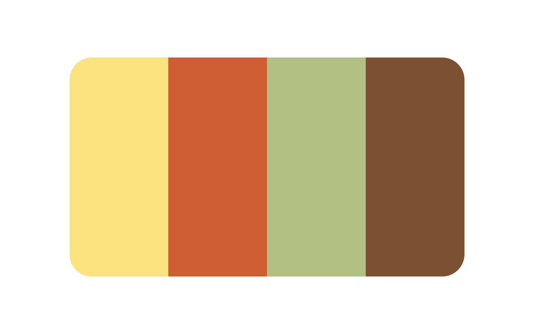
The 1970s were signified by a tremendous revolution in television when most stations worldwide upgraded from black-and-white to color transmission.[11] Furthermore, on the 22nd of April in 1970, Earth Day was celebrated for the first time in the US, aimed at increasing public awareness of the world's environmental problems. Earth tones dominated this era and the palette became more nature-inspired with harvest gold, rusty oranges, chocolate browns, overripe avocado green, etc.[12]
References
- Where modern product professionals learn UX, PM & AI skills | Uxcel
- The Most Popular Brand Colours In Each Industry And Their Impact On Consumers | Digital Synopsis
- McDonald's Logo: History, Meaning, Design Influences, and Evolution | crowdspring Blog
- Lunar New Year | Traditions, Legend, & Facts | Encyclopedia Britannica
- Wes Anderson's Colour Palettes | AnOther
- Cinematographers and the Color Palette: The Impact of Color | Student Filmmakers Magazine
- How Does the Color Green Make You Feel? | Verywell Mind
- Foliage colors improve relaxation and emotional status of university students from different countries | PubMed Central (PMC)
- Apple's iconic iPod commercials changed the way we looked at portable music | iMore
- #1 iPod commercial | YouTube
- How Did Color TV Come to Be? | ThoughtCo
- Avocado Green, Beige, Mauve, and More: These Are the Colors That Dominated Homes the Last 70 Years | Apartment Therapy


