


Every product team drowns in possibilities. You could build any of a hundred features, but limited time and resources force hard choices. Which idea deserves attention first? Whose request gets prioritized? These decisions often turn political, defaulting to whoever argues loudest or ranks highest. Prioritization frameworks cut through the noise. They give you structured methods for evaluating competing ideas based on data rather than opinions. When you can show stakeholders that Initiative A scores 400 on RICE while Initiative B scores 150, conversations shift from arguments to alignment. The frameworks help you defend decisions, manage expectations, and focus limited resources where they generate maximum impact. There are plenty of methods that product managers reach for daily. RICE quantifies reach, impact, confidence, and effort. MoSCoW categorizes work into must-haves and nice-to-haves for time-boxed releases. The Kano model reveals which features delight customers versus which ones they simply expect. The Eisenhower matrix helps you resist urgency bias and invest in strategic work. Each framework solves different problems. Understanding when to reach for which tool helps you make better product decisions and get your team aligned behind them.
Prioritization
Prioritization is how you decide which features, initiatives, or tasks deserve resources first. Product teams always face this challenge because ideas multiply faster than the capacity to execute them. You could probably fill your roadmap 10 times over with reasonable requests, each from someone convinced their idea matters most.
Without structured prioritization, teams risk building features nobody needs, missing market windows, or spreading effort so thin that nothing ships well. The loudest voice wins. The executive's pet project jumps the queue. Teams burn out chasing competing priorities that shift every week. Good prioritization creates focus by balancing customer impact, business value, technical feasibility, and strategic fit. It means saying no to good ideas so you can say yes to great ones. The process requires managing stakeholder expectations about what won't get built, making explicit trade-offs between quick wins and long-term bets, and defending your decisions with more than gut feeling. Product managers use frameworks to make prioritization more objective and defensible. These methods help you move past whoever speaks loudest in meetings toward data-driven decisions that teams can rally behind.[1]
RICE scoring model
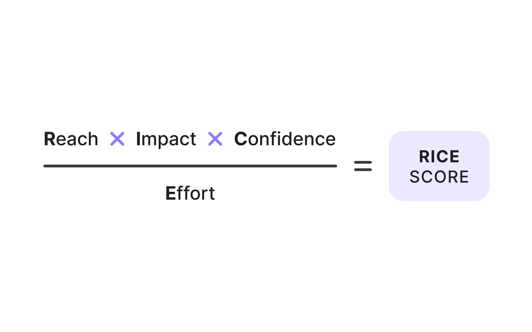
RICE gives you a numerical score for comparing initiatives objectively. The framework evaluates 4 factors:
- Reach measures how many people the initiative affects in a defined period. If you're planning a feature that will touch 500 users per month, your reach is 500.
- Impact scores how much it improves outcomes for those users, typically on a scale where 3 equals massive, 2 equals high, 1 equals medium, 0.5 equals low, and 0.25 equals minimal.
- Confidence captures how certain you are about your reach and impact estimates, expressed as a percentage. Anything below 50% is a moonshot where you're mostly guessing.
- Effort quantifies the total work required from all team members, measured in person-months. A project needing one week of planning, one week of design, and two weeks of engineering equals one person-month of effort.
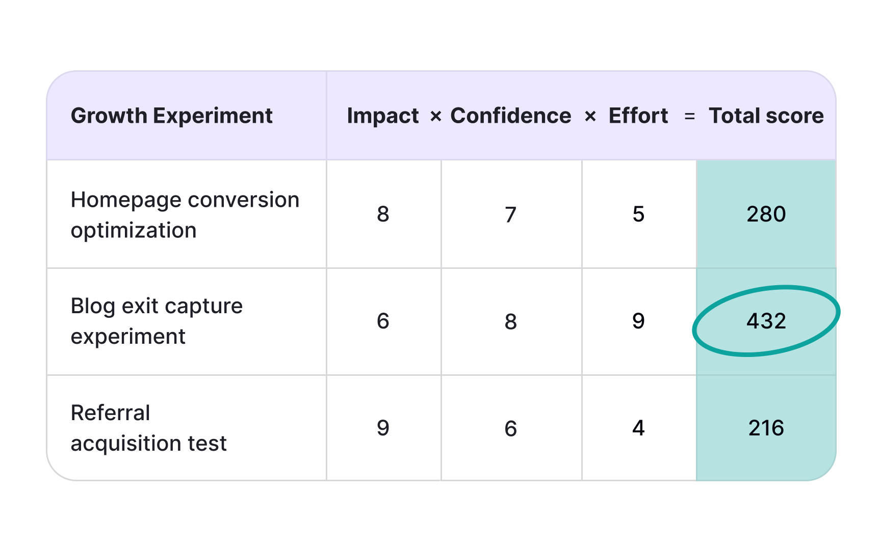
Here's the formula: (Reach × Impact × Confidence) ÷ Effort. For example, an initiative reaching 500 users monthly with high impact (2), 80% confidence, and 2 person-months effort scores (500 × 2 × 0.8) ÷ 2 = 400. Compare this against other initiatives to see which delivers more bang for your buck.[2]
MoSCoW prioritization
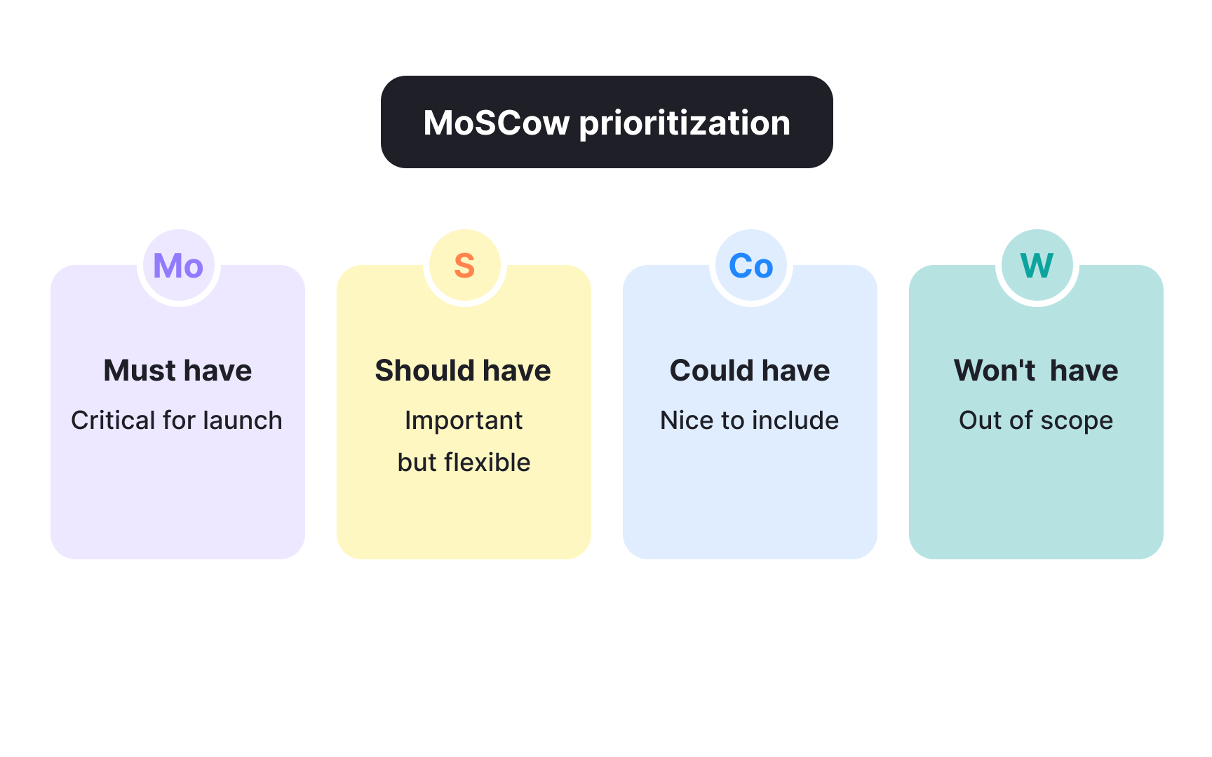
MoSCoW sorts initiatives into 4 buckets: Must have, Should have, Could have, and Won't have this time. Created by Dai Clegg at Oracle, the framework shines when you're working within fixed timeframes and need everyone aligned on what ships versus what waits:
- Must-haves are non-negotiable. Without them, the product fails or provides no value. Think about the core functionality needed for business objectives.
- Should-haves are important but not critical. Workarounds exist if you skip them, though those workarounds might be painful or expensive.
- Could-haves are nice additions that improve the experience but have minimal impact if left out. When must-haves or should-haves grow larger than expected, could-haves get cut first.
- Won't-haves are explicitly excluded from the current release. This category prevents scope creep by making clear what's not happening now, even if it might happen later. You're not saying the idea is bad, just that it doesn't belong in this sprint or quarter.
MoSCoW works particularly well for managing stakeholder expectations and creating cross-functional alignment when resources or timelines are constrained.[3]
Pro Tip! Keep must-haves under 60% of effort to maintain flexibility when priorities shift.
ICE scoring model
ICE simplifies RICE into 3 factors: impact, confidence, and ease. Teams score each factor on a scale, usually 1 to 10, then average or sum the scores. It's faster than RICE because you're using relative judgments instead of specific metrics. Impact measures how much the initiative moves key metrics or advances product goals. Confidence accounts for how much supporting data you have versus how much you're assuming. Ease assesses implementation simplicity, considering technical complexity, required resources, and time investment. Unlike RICE, which asks for person-months and specific user counts, ICE lets you say "this feels like a 7 for ease" and move on. The tradeoff is precision. A score of 7 means different things to different teams, and even the same team might score differently 6 months later. But when you need quick prioritization without extensive data gathering, or when you're just starting with frameworks and want something simple, ICE gets you moving. The lack of standardized definitions can cause inconsistency. One person's 8 for impact might be another person's 5. Teams that use ICE effectively establish shared definitions upfront, like "impact of 9-10 means it directly affects our north star metric."[4]
Pro Tip! ICE trades precision for speed, making it ideal for rapid prioritization sessions.
Kano model


The Kano model helps you understand which features will delight customers versus which ones they simply expect. Developed by researcher Noriaki Kano, it categorizes features into 5 types based on their relationship with satisfaction:
- Basic needs are table stakes. Customers expect them, so their presence doesn't boost satisfaction, but their absence kills it. Think about logging into your account or saving your work.
- Performance needs have a linear relationship where better performance equals higher satisfaction. Faster load times, more storage, and smoother animations all fit here.
- Delighters are the magic. These unexpected features surprise and please when present but don't hurt satisfaction when absent. They create a competitive advantage because customers didn't know to ask for them. Over time, though, delighters decay into performance needs and eventually basic expectations as competitors copy them and customer standards rise.
The model helps you avoid wasting resources on indifferent features, ensures basics are covered before chasing delighters, and identifies where you can differentiate.
For example, dark mode started as a delighter in many apps. Now it's a basic expectation. What delights today becomes tomorrow's baseline.
Eisenhower matrix
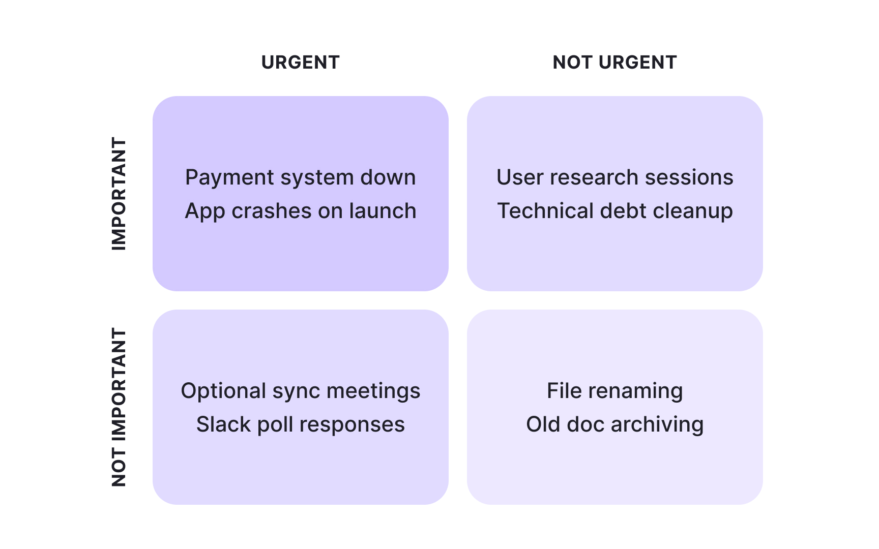
The Eisenhower matrix fights urgency bias by separating urgent tasks from important ones. Named after President Dwight Eisenhower, the framework creates a 2x2 grid with 4 quadrants. Eisenhower developed this distinction while serving as Supreme Commander during World War II and later as U.S. President, when he constantly had to prioritize competing demands on his time:
- Urgent and important tasks demand immediate attention. Critical bugs affecting customers, time-sensitive market opportunities, fires that actually matter. Important but not urgent work supports long-term goals and strategic progress. Product discovery, technical debt reduction, and building new capabilities. This quadrant is where innovation happens, but it's easy to ignore because nothing's on fire yet.
- Urgent but not important tasks feel pressing without advancing key objectives. Often, these are interruptions or other people's priorities masquerading as yours. Neither urgent nor important tasks are time-wasters to eliminate. The matrix helps you resist the pull toward constant firefighting.
Effective prioritization means maximizing time in the important-but-not-urgent quadrant. That's where you build competitive advantages and set up future wins. Teams naturally drift toward urgency because it feels productive and people are demanding responses. The framework makes this drift visible so you can push back intentionally.[5]
Value vs. effort matrix
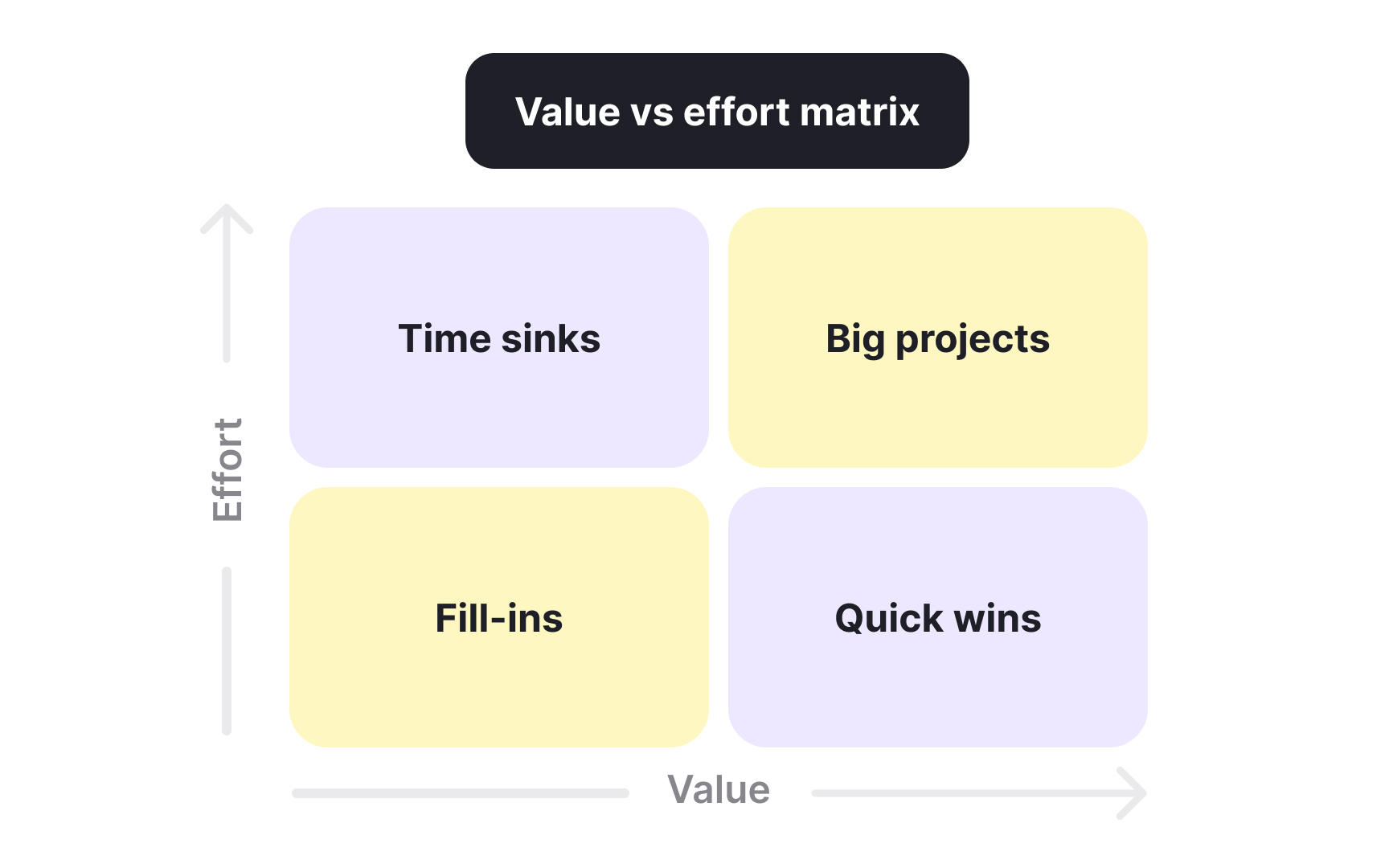
The value vs. effort matrix plots initiatives on 2 simple axes: how much value they create and how much effort they require. It creates 4 quadrants that make trade-offs visible at a glance.
- Quick wins land in the high-value, low-effort sweet spot. Prioritize these first because they deliver maximum impact with minimal investment.
- Major projects sit in high-value, high-effort territory. They're worth doing but need significant planning and resources.
- Fill-ins occupy the low-value, low-effort corner. Tackle them when time permits or assign them to junior team members for skill development.
- Time sinks haunt the low-value, high-effort quadrant. Avoid these or ruthlessly deprioritize them because they consume resources without corresponding returns. Sometimes stakeholders push for time sinks because they personally want the feature or because they're anchored on sunk costs. The visual matrix makes it easier to say no by showing where initiatives fall relative to each other.
The challenge is defining value and effort consistently across different types of work. Some teams use specific metrics like expected revenue or user impact for value. Others use relative scoring. The framework works best when non-technical stakeholders need simple, visual prioritization they can understand and discuss.
Opportunity scoring
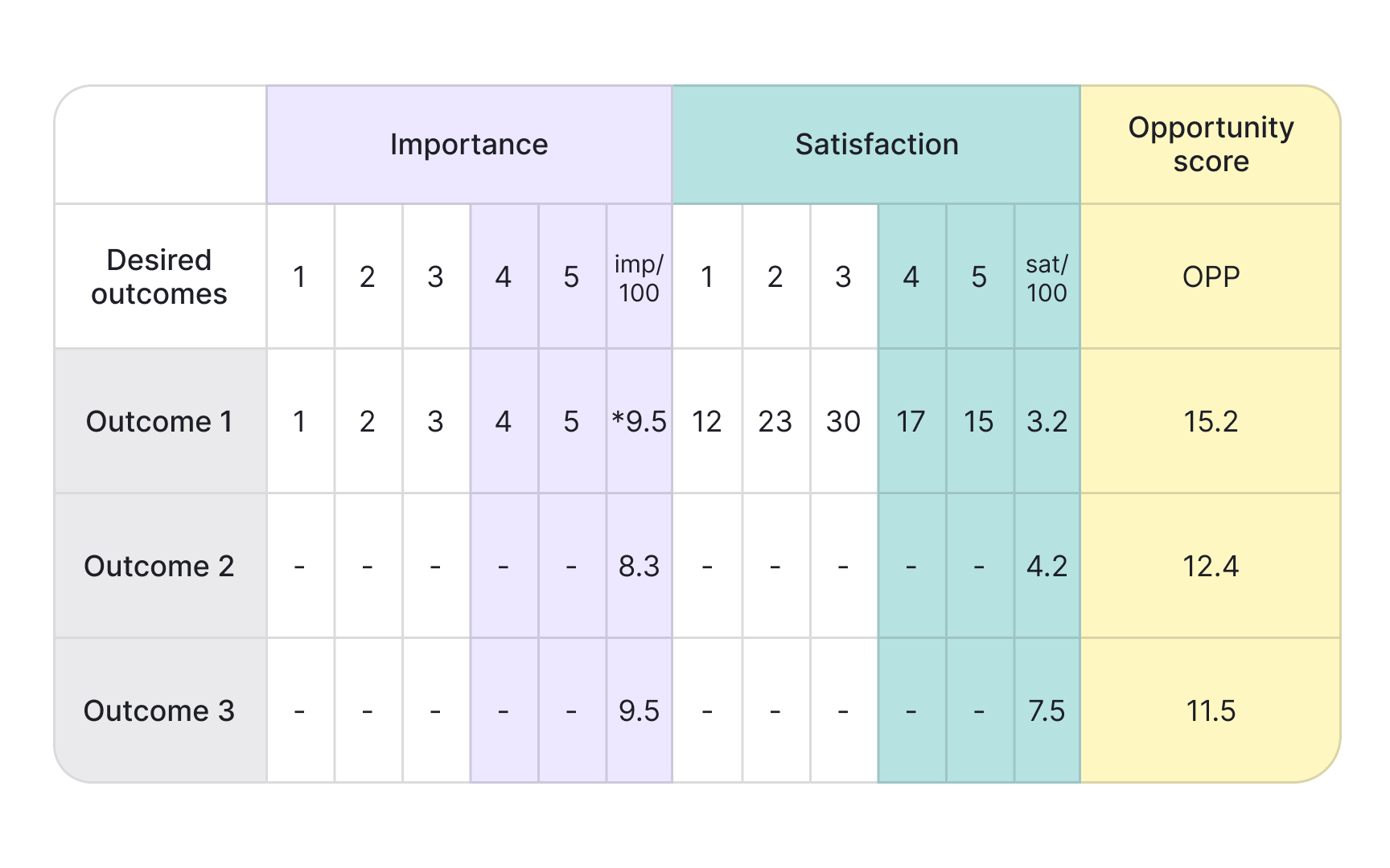
Opportunity scoring finds gaps between what customers care about and how well current solutions serve them. Developed by innovation consultant Anthony Ulwick, you survey customers about both importance and satisfaction for specific outcomes or jobs, then look for mismatches:
- High importance/low satisfaction. Features customers rate as highly important but poorly satisfied with represent your biggest opportunities. You know people care, and you know existing solutions fall short. That's where you can create real value and differentiation.
- High importance/high satisfaction. Features with high importance and high satisfaction are table stakes. You need to maintain them, but they won't help you stand out because competitors already do them well.
- Low importance/low satisfaction. Low-importance features are poor investments regardless of satisfaction. Why improve something customers don't care about?
The opportunity score formula is Importance + (Importance - Satisfaction), which emphasizes the gap. A feature with an importance of 9 and a satisfaction of 3 scores 9 + (9 - 3) = 15. A feature with an importance of 5 and a satisfaction of 5 scores 5 + (5 - 5) = 5. This method keeps you honest about building what customers actually need rather than what you assume they want. It works particularly well combined with jobs-to-be-done research when you need differentiation in crowded markets, and when you can gather satisfaction data through surveys or user research.[6]
Topics
References
- Prioritization frameworks | Atlassian
- RICE: Simple prioritization for product managers | The Intercom Blog
- MoSCoW Prioritization | ProductPlan
- ICE Scoring Model | ProductPlan
- Eisenhower Matrix | ProductPlan
- Opportunity Scoring | ProductPlan


