


A metric drop is rarely the problem itself. It is a signal that something deeper has shifted in the product, the system around it, or user behavior. Strong case studies show how product managers respond to such signals with structured reasoning rather than quick assumptions.
Root-cause analysis helps turn scattered symptoms into a coherent explanation. It connects high-level metrics to the actions, decisions, and constraints that influence them. This requires looking beyond dashboards and asking what must have changed for a metric to move in the first place. Funnels and metric trees make these relationships visible, while techniques like the 5 Whys help push past the first plausible answer.
In many real cases, complete data is not available. Diagnostic thinking then relies on clear hypotheses, explicit assumptions, and careful prioritization of what to validate next. The goal is not certainty, but a defensible explanation that guides action.
Well-articulated diagnostics strengthen case studies by showing how problems were framed, how evidence was weighed, and how surface-level issues were separated from core causes. This kind of reasoning demonstrates judgment, not just analytical skill.
Recognizing when a metric drop is a signal, not a conclusion in case studies
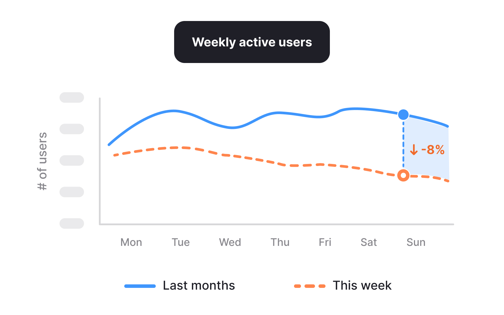
A drop in a metric is an observation, not an explanation. In case studies, weak diagnostics often stop at the number itself and treat it as the problem. Strong diagnostics treat the drop as a signal that something in the system has changed. The task is to understand what kind of signal it is before jumping to solutions.
High-level metrics summarize outcomes but rarely show where the change originated. When such a metric moves, it usually reflects shifts in several lower-level factors rather than a single cause. For example, a decline in weekly active users could result from fewer new users joining, existing users returning less often, or a change in how activity is defined or tracked. Reading the drop correctly means asking what inputs could realistically influence it, instead of assuming the most visible or recent event is responsible.
In a case study, this distinction matters. Describing a metric drop as the problem makes the story reactive and shallow. Framing it as a signal shows analytical restraint and sets up a structured investigation. It communicates that the work started with interpretation, not action.[1]
Pro Tip! If multiple metrics moved together, note which ones changed first. Timing often hints at where the signal originated.
Mapping a metric drop across a funnel in case studies
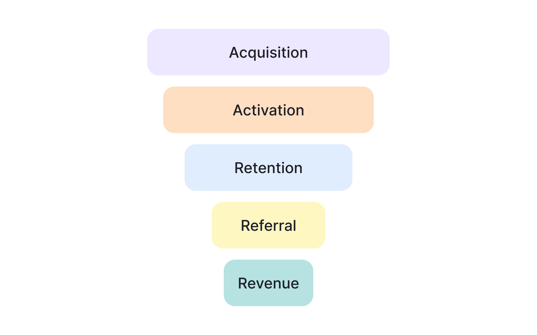
Once a metric drop is treated as a signal, the next step is to locate where it appears in the user journey. Funnels break an outcome into sequential stages, such as acquisition, activation, retention, referral, and revenue. This structure helps show where behavior actually shifted rather than treating the journey as a single block.
A top-level metric often aggregates several funnel steps. A decline may be caused by fewer users entering the funnel, weaker progression between steps, or losses near the end. Mapping the drop across stages helps eliminate entire categories of causes before deeper analysis begins. If entry and activation remain stable but engagement falls, early acquisition is unlikely to be the issue.
In case studies, this step shows disciplined narrowing. Instead of listing possible reasons, the funnel view demonstrates how the problem space was reduced using structure. It also clarifies which parts of the journey deserve attention and which likely do not, based on observable signals rather than intuition.[2]
Pro Tip! If only one funnel stage drops while others stay stable, avoid broad explanations and focus on what is unique to that step.
Breaking down a top-level KPI using a metric tree
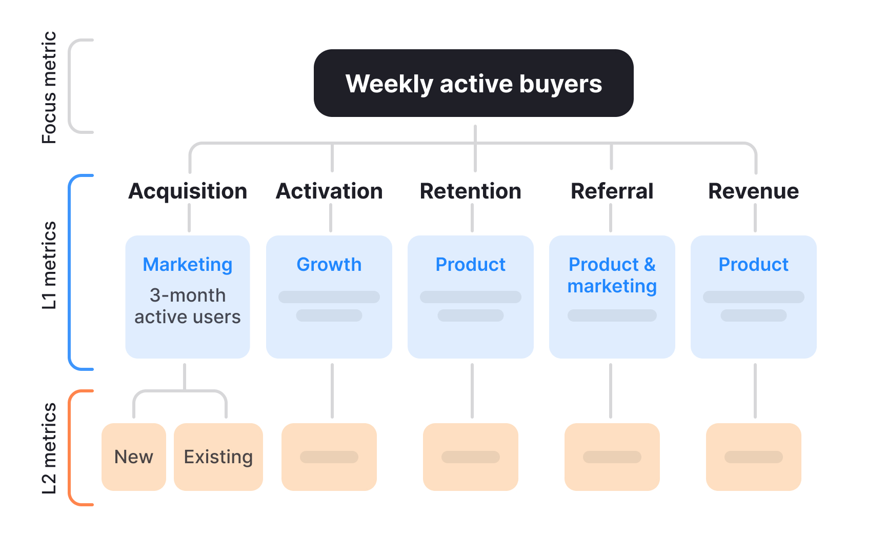
After locating where a drop appears in the funnel, the next step is to understand how the metric is constructed. A metric tree breaks a top-level KPI into the input metrics that mathematically or behaviorally drive it. This makes it possible to see which parts of the system could realistically explain the change.
Top-level metrics often look simple, but they are usually the result of several interacting components. For example, revenue can depend on the number of active users and the value generated per user. If revenue drops, the metric tree helps clarify whether the issue is volume, value, or a combination of both. This prevents teams from optimizing the wrong lever.
In case studies, metric trees show structured thinking. Instead of guessing causes, the narrative explains how the KPI was decomposed and which branches were examined first. This demonstrates control over complexity and makes the diagnostic logic easy to follow.
Pro Tip! Start with inputs that have a direct relationship to the KPI before considering correlated metrics.
Applying the 5 Whys to move past the first explanation in a case study
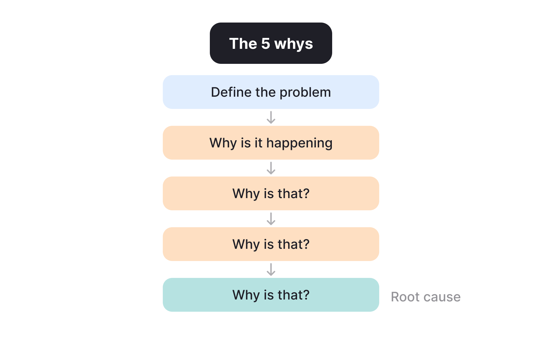
Even after narrowing the problem space, early explanations are often still surface-level. The 5 Whys technique helps push beyond the first plausible answer by repeatedly asking why a change occurred. Each step aims to uncover a deeper condition rather than assign blame or jump to fixes.
The value of this technique lies in resisting the temptation to stop too early. A statement like “users dropped because engagement declined” only restates the metric. Asking why engagement declined can lead to questions such as whether users reached key actions less often, whether a recent change increased effort or confusion, or whether external conditions altered usage patterns. Each “why” moves the explanation closer to a condition that can be examined or tested. The process ends when the explanation points to something actionable rather than another restated metric.
In case studies, the 5 Whys strengthens credibility. It shows that conclusions were not based on the first available narrative. Instead, the reasoning traces a clear path from an observed outcome to an underlying cause that can inform decisions.
Pro Tip! If asking “why” leads to opinions instead of evidence or assumptions, note the gap instead of forcing an answer.
Deciding which metric tree branches deserve investigation
A metric tree shows many inputs connected to one outcome. When a KPI drops, not all of these inputs deserve equal attention. The goal is to figure out which inputs could realistically explain the change and which ones can be ruled out based on what actually happened.
A useful starting point is timing. Some metrics change slowly, such as long-term retention or pricing effects. Others can change quickly, such as how often users open a feature or complete a key action. If a KPI drops over a short period, slow-moving inputs are unlikely to be the main reason. Fast-moving inputs are better candidates.
Another signal comes from stability. If certain inputs stayed flat during the same time window, they are less likely to explain the drop. For example, if the number of new users and activation rates remained stable, but usage of a core feature declined, attention should move toward the engagement branch of the tree. This does not prove the cause, but it helps narrow the search.
In case studies, this step strengthens the explanation. Listing which inputs were stable and which ones changed shows how the investigation was focused. It also makes clear that some paths were intentionally deprioritized, not ignored.
Pro Tip! Write down one clear reason for ruling out each branch. If no reason exists, that branch may still matter.
Separating observable symptoms from underlying causes
When diagnosing a problem, it is easy to confuse what is visible with what actually caused it. Observable symptoms describe what changed, usually in the form of metrics or user signals. Underlying causes explain why those changes happened. Mixing these two leads to shallow conclusions.
Symptoms are often measurable outcomes. Examples include lower conversion rates, fewer completed actions, or a drop in active users. These signals are important, but they do not explain themselves. Saying that conversion dropped because fewer users converted simply repeats the observation in different words.
Underlying causes point to conditions or changes that made the symptom possible. For example, increased friction in a specific step, a mismatch between user expectations and the experience, or a constraint outside the product that affected behavior. These causes are not always directly visible in dashboards, but they help explain why the numbers moved.
In case studies, making this distinction explicit improves clarity. Stating which observations were treated as symptoms and which explanations were considered causes shows careful reasoning. It also prevents the diagnosis from stopping at metrics instead of leading to meaningful decisions.[3]
Pro Tip! If removing the issue would not change user behavior, it is likely a symptom, not a cause.
Forming clear hypotheses from limited evidence in case studies
Once potential causes are identified, they need to be turned into hypotheses that can guide further analysis. A hypothesis links a specific change to a specific outcome and makes the assumption explicit rather than implied.
A useful hypothesis stays grounded in observable shifts. For example, instead of saying “engagement dropped because the experience got worse,” a clearer hypothesis would be: “After the onboarding flow was shortened, fewer users completed the first key action within their first session, which contributed to lower weekly active usage.” This connects a concrete change to a measurable behavior and avoids vague explanations.
In case studies, this level of specificity matters. It shows that reasoning moved from signals to assumptions in a controlled way. Even if the hypothesis later turns out to be wrong, stating it clearly demonstrates how conclusions were shaped and what evidence would be needed next.[4]
Reasoning when data is missing or incomplete in a case study
Real product cases rarely provide complete data. Some metrics may be unavailable, delayed, or unreliable. Diagnostic thinking then depends on making assumptions visible and reasoning carefully about what is known and unknown.
When evidence is incomplete, it helps to separate facts from assumptions. Facts describe what can be observed with confidence, while assumptions fill the gaps. For example, knowing that a metric dropped is a fact, while assuming users were confused by a change is an assumption. Stating this difference avoids overstating confidence.
In case studies, explaining how decisions were made despite missing data strengthens credibility. It shows awareness of uncertainty and demonstrates how risks were weighed. Clear reasoning under uncertainty often matters more than perfect data.
Choosing next actions based on diagnostic confidence in a case study
After diagnostics are complete, the remaining question is what to do next. Not all conclusions carry the same level of confidence, and not all actions carry the same level of risk. Strong case studies show how the next steps were chosen based on this balance, not just on what seemed promising.
When confidence is high, actions can be more direct. For example, if several signals point to friction in a specific step and no conflicting evidence appears, improving that step is a reasonable move. When confidence is lower, safer actions make more sense, such as running a small experiment, collecting targeted data, or monitoring a related metric more closely.
In case studies, this distinction matters. Explaining why an experiment was run instead of a full rollout, or why observation came before change, shows responsible decision-making. It connects the quality of the diagnosis to the scale of the response, making the outcome feel proportionate rather than reactive.


