


A shopping cart seems simple. List the items. Show the total. Provide a checkout button. But reducing carts to item lists misses how users actually shop. They want to verify they added the right variant. They want to adjust quantities without hunting. They want to remove items that pushed the total too high. They want to check if that item is still available. They want to return to product pages for details they forgot. Each of these needs is an opportunity to support or frustrate.
Clickable product names let users verify choices. Clear controls let them adjust without confusion. Accurate thumbnails prevent mistakes from reaching checkout. The best carts anticipate these behaviors and make every action obvious. A cart that only lists items forces users to work around it. But, a cart that supports shopping keeps them moving forward.
Clearly indicate the number of added items


Once users add an item to their cart, let them know about it by implementing a cart item count badge next to the shopping cart icon. According to the NN Group, a clear indication, such as a visible badge of the number of added items in the cart, gives users a sense of control. As a result, they feel more confident about continuing to shop or completing their checkout. Make sure the cart badge stands out — the color red is a great choice for adding a strong accent.[1]
Provide intuitive cart quantity controls
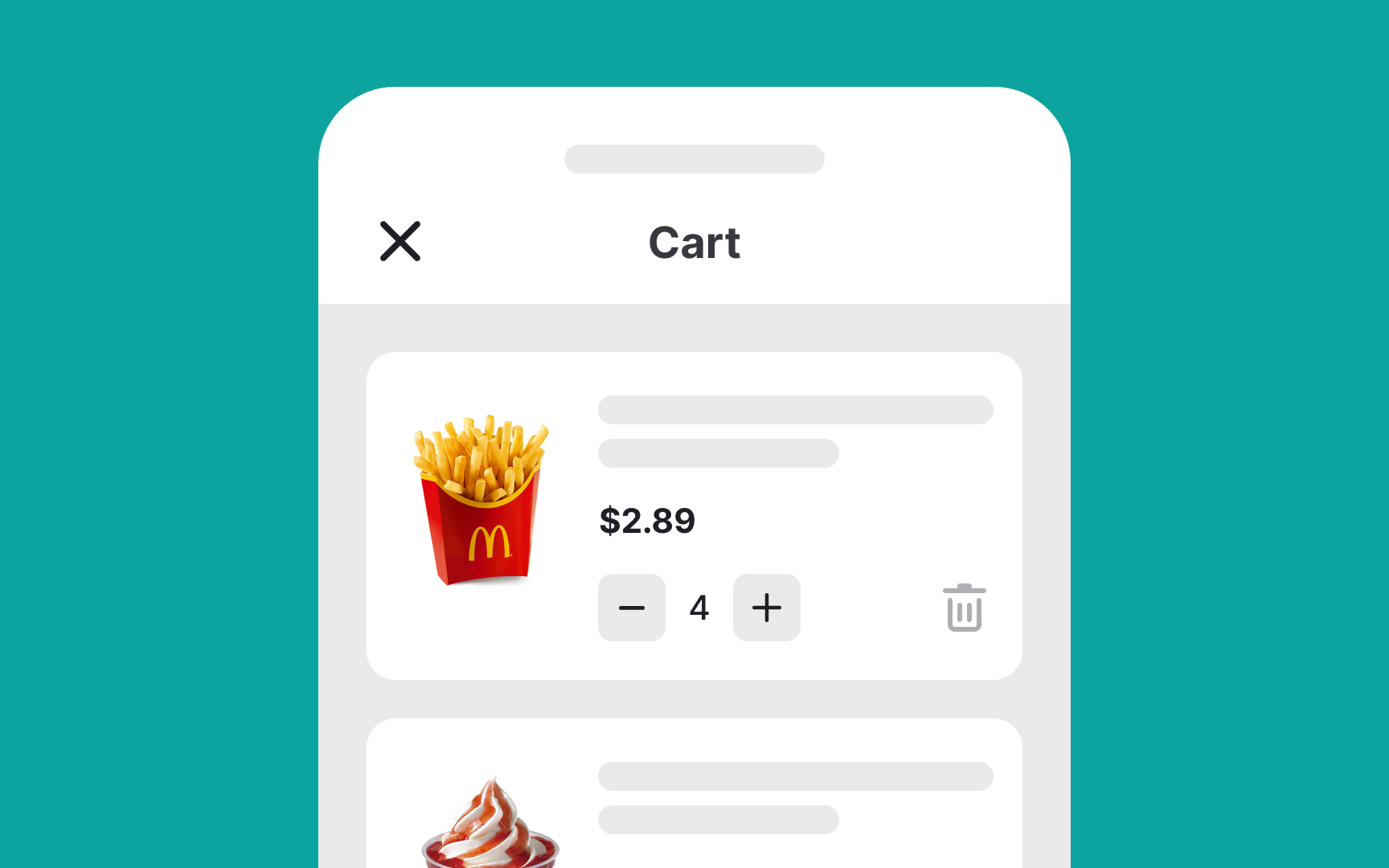
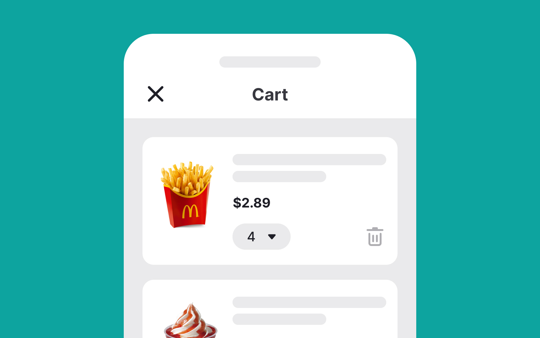
To minimize friction during the shopping experience, it’s crucial to let users easily edit the number of items in their cart.[2] If they make a mistake, they shouldn't have to restart the entire process, as being forced to do so can significantly diminish the likelihood of completing the purchase.
Particularly for mobile users, adjusting item quantities needs to be user-friendly. Dropdown controls can be cumbersome on smaller screens, leading to longer interaction times. A more efficient solution is to implement an input stepper control. This simple toggle allows users to increase or decrease quantities with just a tap, offering a more intuitive and hassle-free shopping experience.
Allow removing multiple cart items
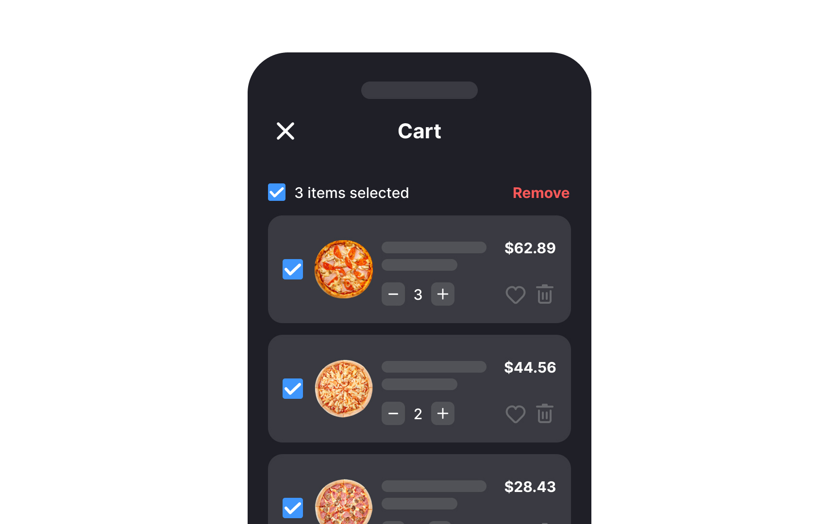
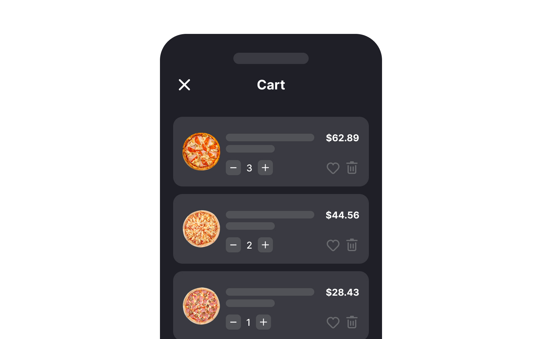
When users have to delete items from their shopping cart one by one, it can be a tedious and time-consuming task. This frustration can lead to users becoming discouraged and potentially abandoning their cart altogether. Enabling bulk deletion functionality empowers users to manage their cart more efficiently. This means they can quickly remove several items in a single action, which not only saves time but also reduces the overall friction in the checkout process.
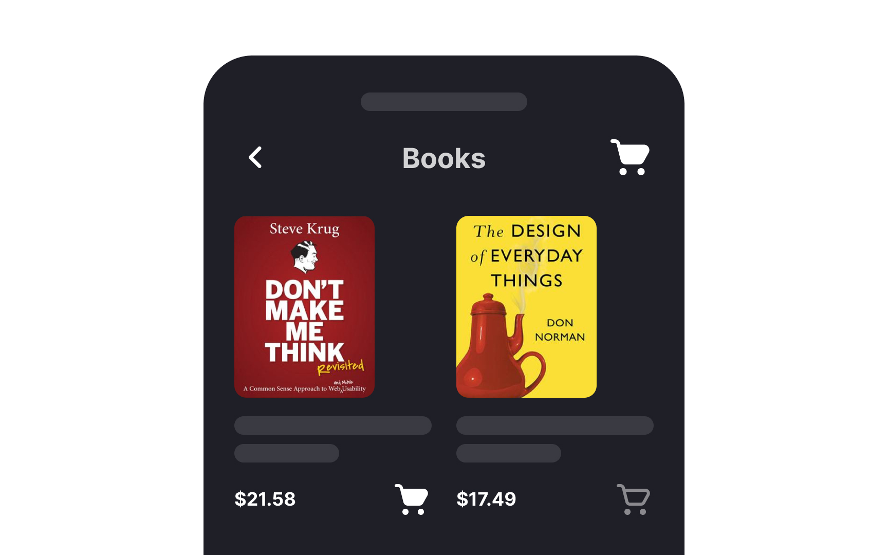
Use recognizable shopping cart icons
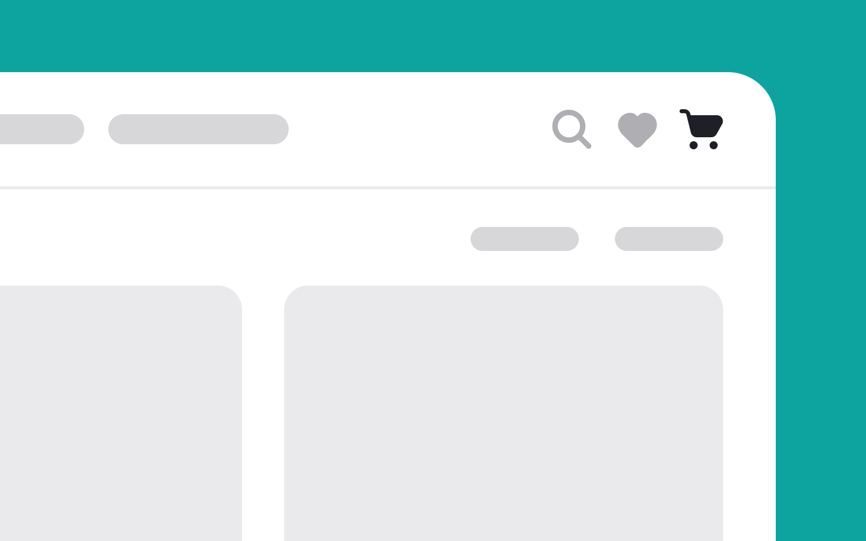
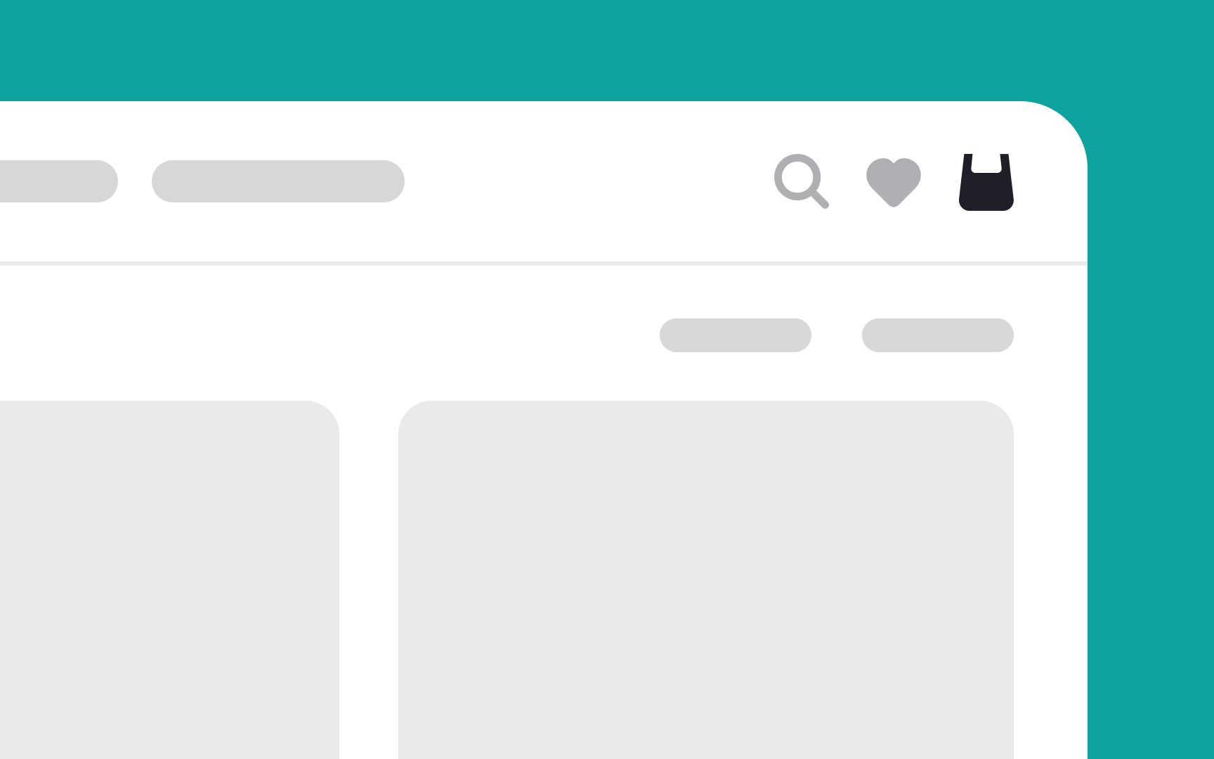
In designing e-commerce websites, it's essential to use a shopping cart icon that users instantly recognize. Opt for the universal shopping cart symbol, simple and clear, ensuring it's easily identifiable at first glance. This icon acts as a familiar beacon, guiding users effortlessly to view their selected items.
On desktop interfaces, where there’s more screen real estate, complementing the icon with a clear label, like "Your Cart" or "View Cart," adds another layer of clarity. This label helps reinforce the icon’s purpose, especially beneficial for users who might be less familiar with standard e-commerce symbols.
Make a clear shopping cart summary
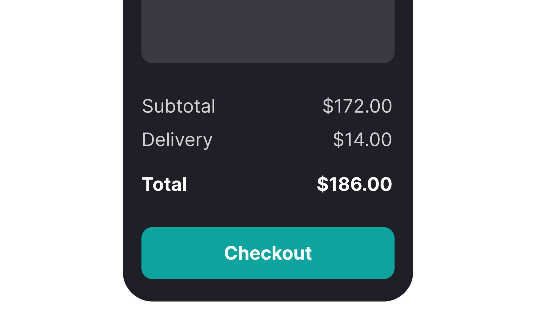
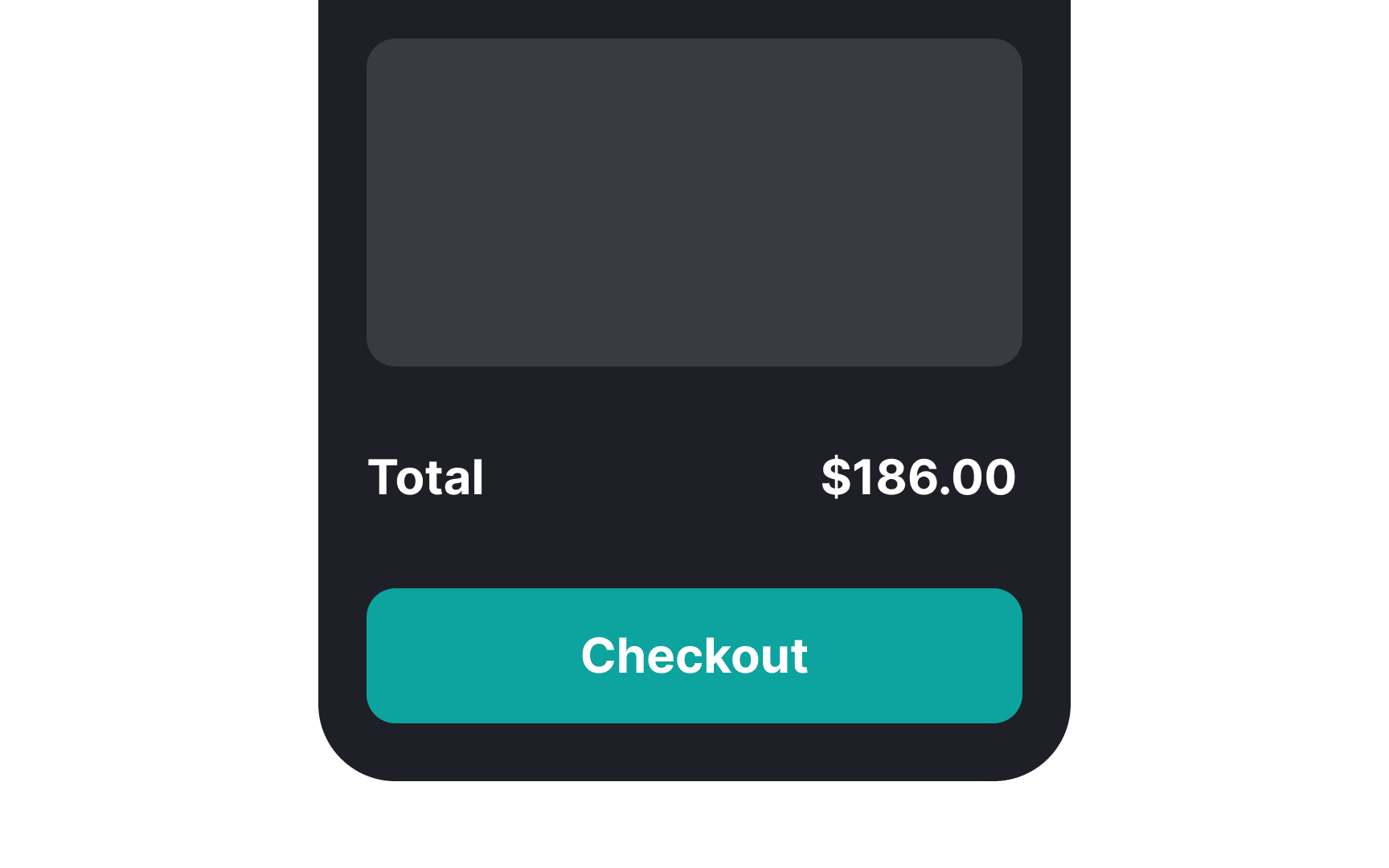
Ensuring users have trust in your platform starts with clear communication, particularly about their shopping cart contents. Show them a full summary of all charges before they head to checkout. This open display of costs helps users decide on their purchases confidently.
In this summary, users can verify their choices, look over product details, and make comparisons. They have the flexibility to tweak their spending, whether it's to stay within a budget or to tap into discounts. This level of transparency empowers users, boosting their confidence and trust in your service.[3]
Use accurate and visible thumbnail images
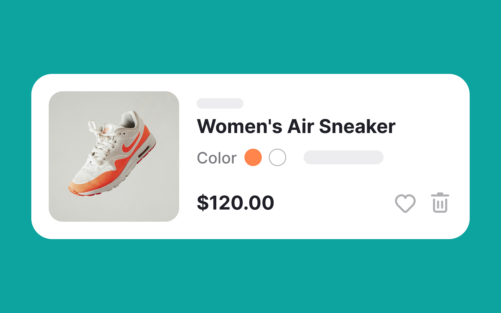
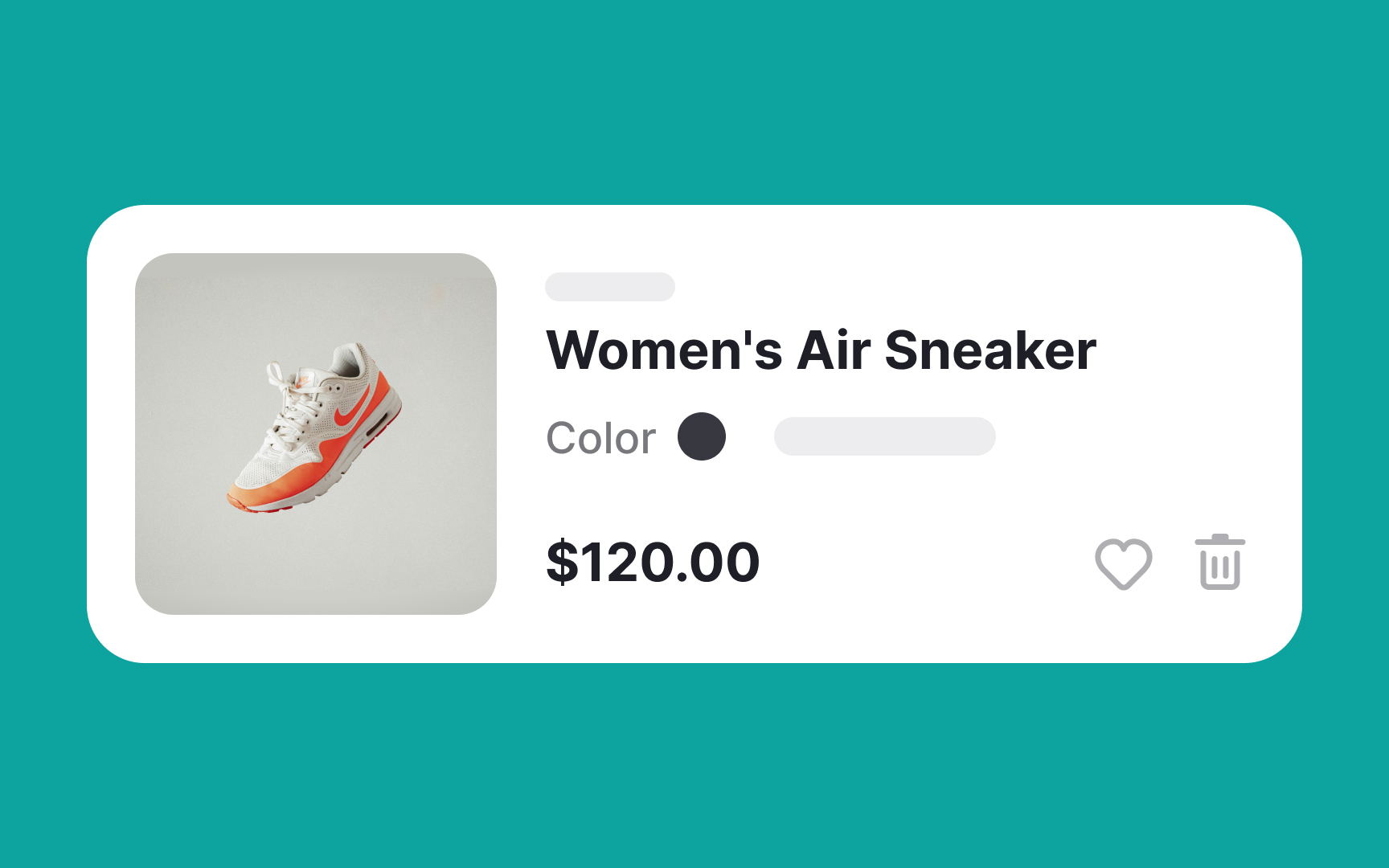
Typically, products come in various sizes and colors. It's important to ensure that the thumbnail image in the shopping cart reflects the exact product variant the user has selected. For instance, if users choose black sneakers, the thumbnail should display them in that specific color.
Moreover, ensure that the thumbnail images in the shopping cart are visible enough for users to preview their purchases or compare items before continuing to the checkout page.
Displaying the correct information is key to building brand trust and eliminating any potential confusion. Accurate, high-quality thumbnails help users quickly confirm their choices, contributing to a smoother shopping experience and reinforcing their confidence in your brand.
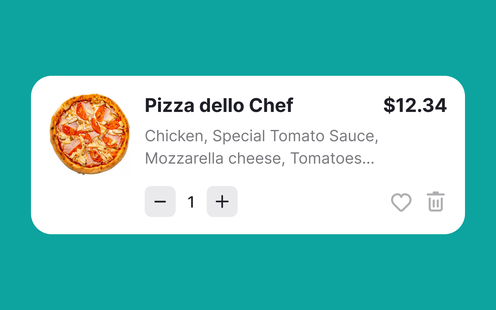
Make the product name visible and clickable
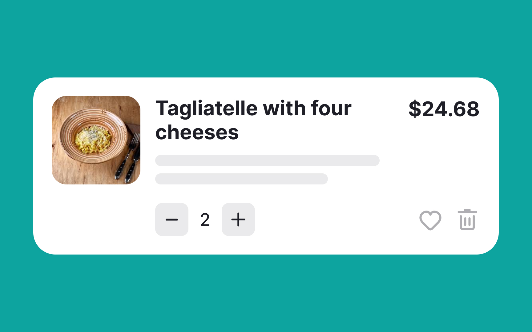
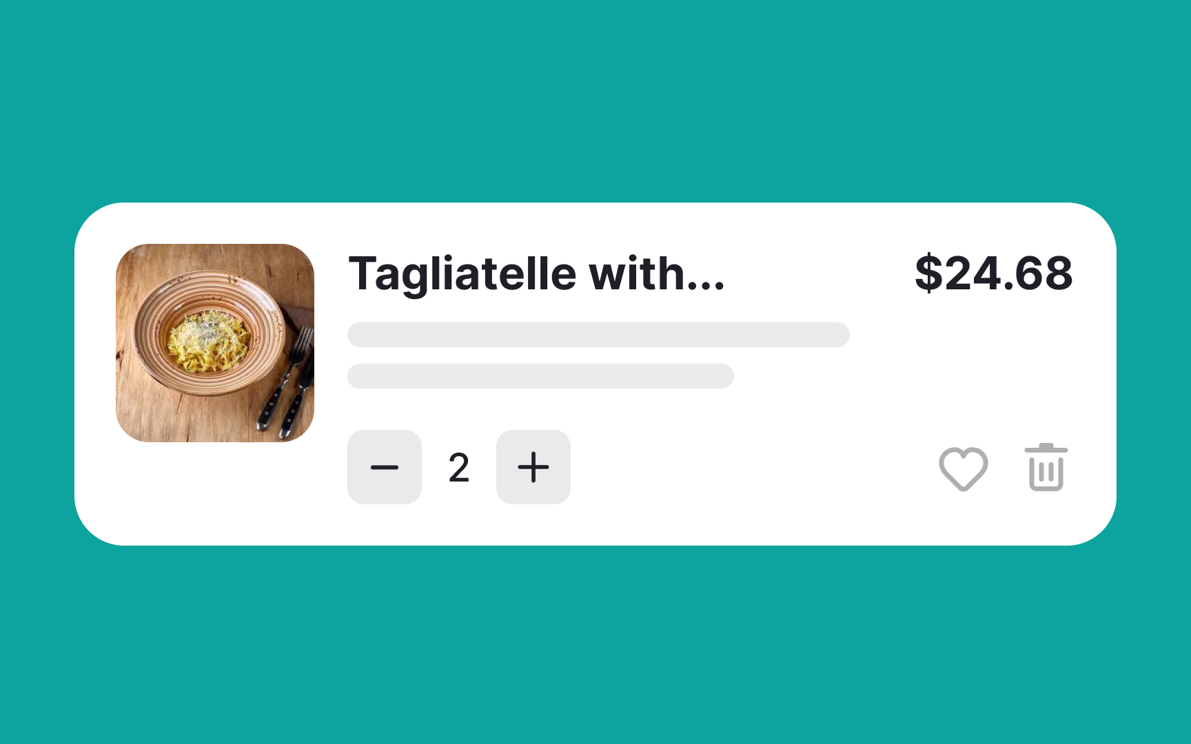
Always display the full product name in the shopping cart. Users review the items they are about to purchase in the cart, so there should be no guesswork involved. Don't forget to display product details such as ingredients, size, color, and price so users can compare items and review their selections before purchasing.
Also, ensure that both the product name and thumbnail image are clickable and link to the product page with the complete product details. Users may want to take a final peek at the product before proceeding to payment.
Place the checkout button after the order details
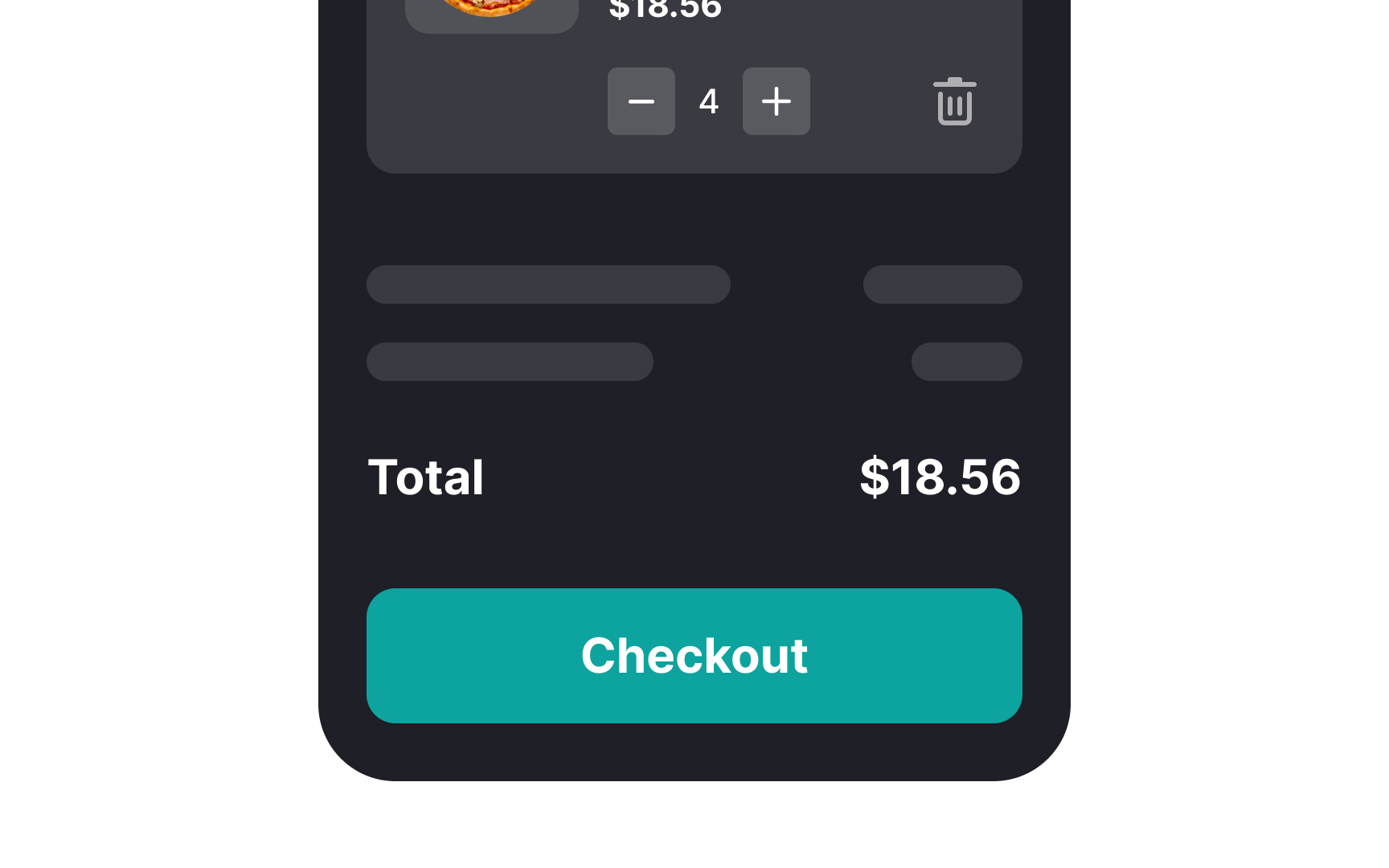
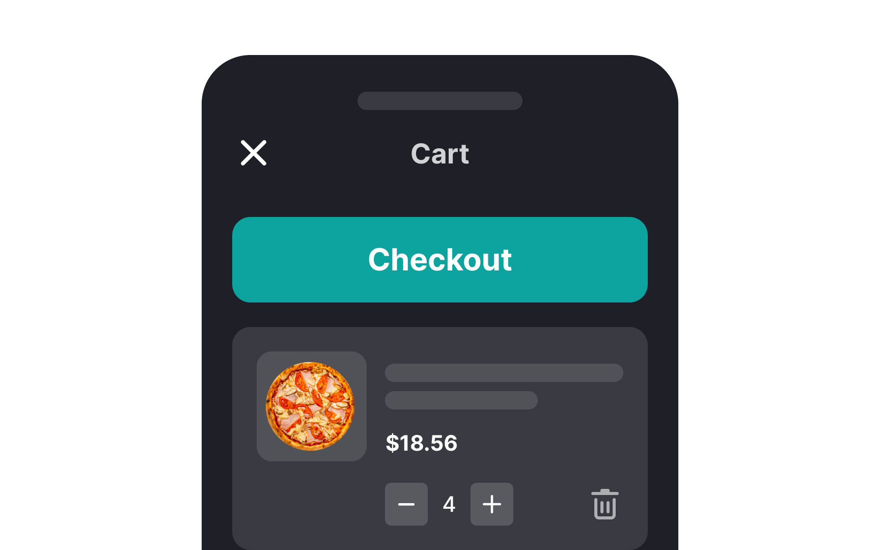
Playing around with the natural hierarchy of page elements confuses users, resulting in them leaving without buying. Allow users to review the order before proceeding to the checkout and place the checkout button at the bottom of the page. This way, you support intuitive user behavior to make a final check if everything is fine or if any further modifications are needed.
Allow in-cart editing
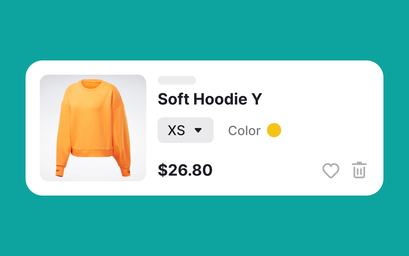

Allow in-cart editing and provide dropdown menus or clickable options next to each product where users can easily select their desired size without leaving the cart page. This way, they can swiftly make adjustments if they reconsider their preferences. It will also eliminate the cumbersome process of navigating to the product page again.
Maintain hierarchy within the shopping cart
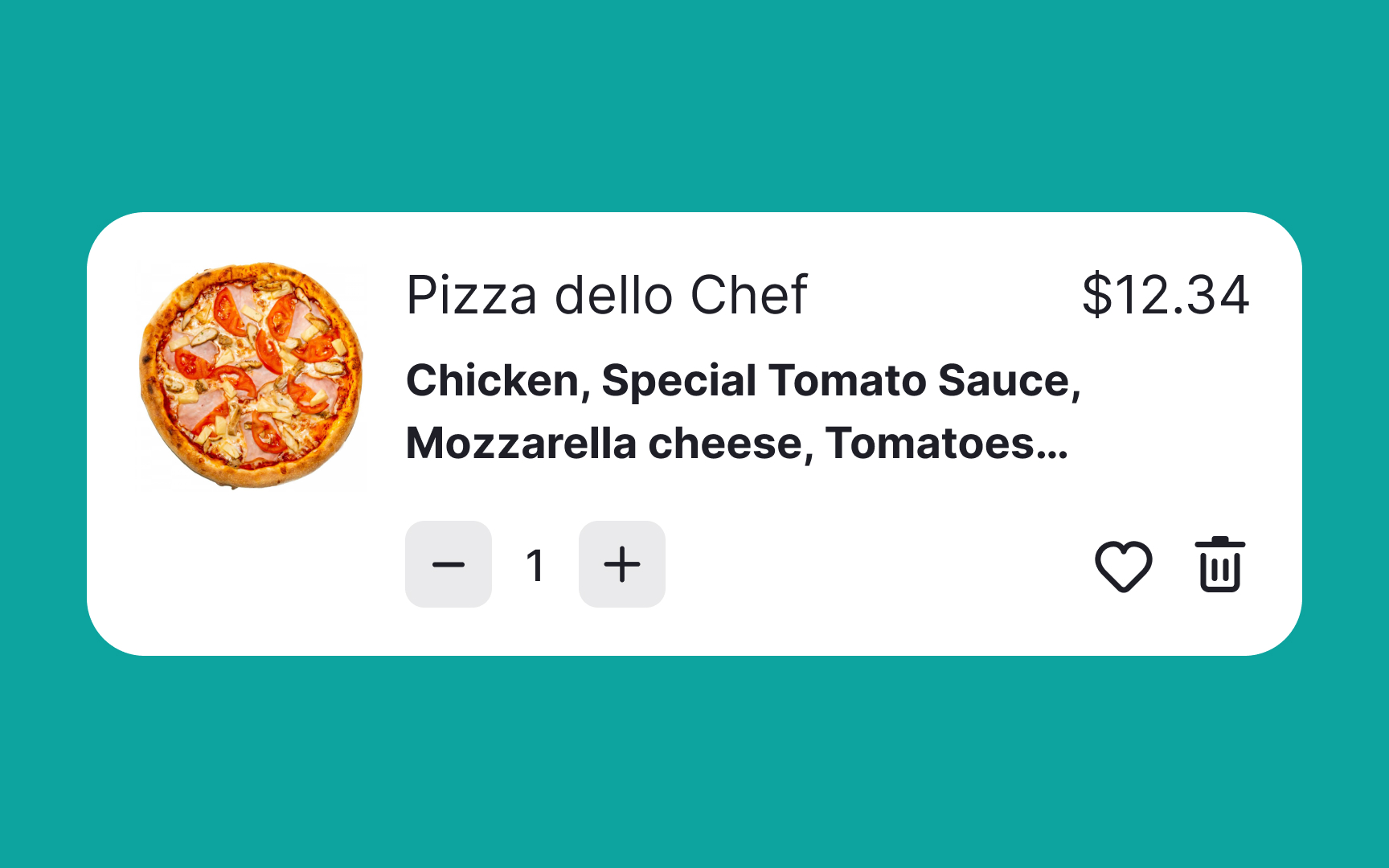
Visual hierarchy is a powerful tool for guiding users through a seamless and intuitive experience. It plays a significant role in shaping how users perceive and interact with a page. To optimize this in shopping carts, prioritize and emphasize specific details you want users to focus on, such as the product name and price, especially before they move forward to the checkout stage.
Utilizing size and font weight effectively can help achieve this. By making the product name and price slightly larger or bolder compared to other elements on the page, you naturally draw users' attention to these crucial pieces of information. This ensures that they are clearly visible and easily digestible, allowing users to make informed decisions without confusion or hesitation.
References
- Adding an Item to a Shopping Cart: Provide Clear, Persistent Feedback | Nielsen Norman Group
- Cart Page - Checklist Design
- Decision Making in the Ecommerce Shopping Cart: 4 Tips For Supporting Users | Nielsen Norman Group


