


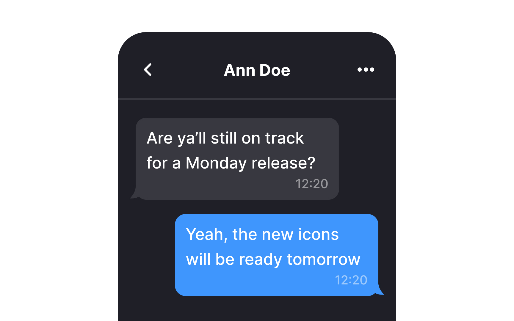
Users have sent thousands of messages across dozens of apps. That history creates deep expectations about how chat should work. Messages appear at the bottom. Yours sit on the right. Theirs on the left. Time groups separate conversations across days. Typing indicators signal someone is responding. These patterns feel so natural that their absence feels like malfunction. Designing chat interfaces means working with these expectations, not against them.
Innovation happens in the details: how notifications surface unread messages, how media previews display inline, how reactions allow response without typing. The foundation stays familiar because familiarity lets users focus on communicating rather than learning.
Build in a typing indicator


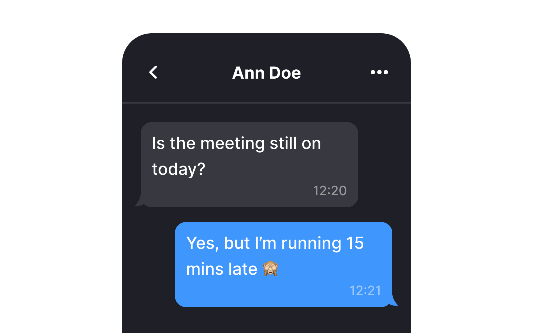
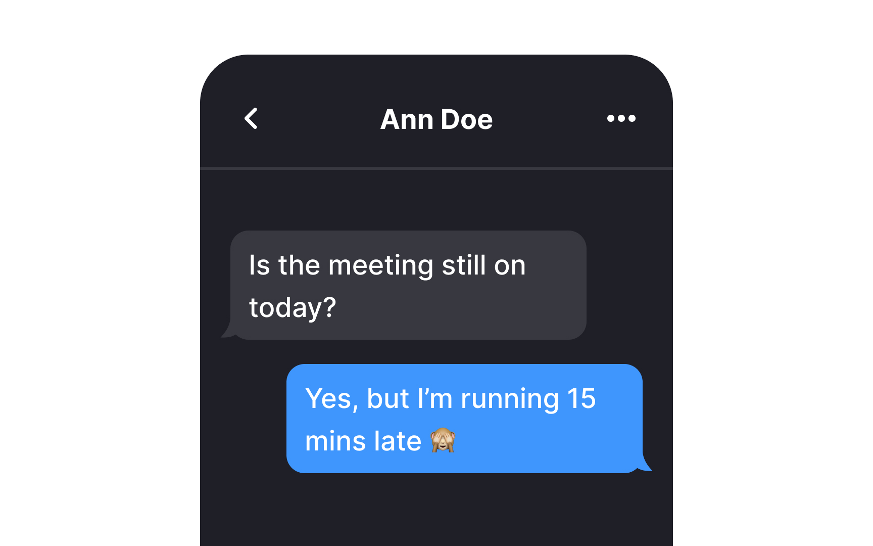
A typing indicator is a visual cue within a chat interface that informs users when someone else in the conversation is currently composing a message. This feature helps prevent situations where people send messages simultaneously, potentially causing confusion or conflicting responses.
You can design typing indicators as a simple text message that reads "User is typing," or make them more dynamic, such as speech bubbles that animate into view when someone starts typing and disappear once they stop.
Include timestamps for clarity on timing
Timestamps in chat interfaces can take two main forms. Absolute timestamps show the exact time messages were sent, while relative timestamps tell users how many minutes, hours, or days ago they came in.[1]
Knowing the exact timing of a message is crucial as the relevance of information can shift rapidly; what's critical now might not matter tomorrow. Timestamps enable users to estimate the urgency and respond to messages with informed priority.
Pro Tip! When using absolute timestamps, make sure to convert them to users' time zones.
Stack messages

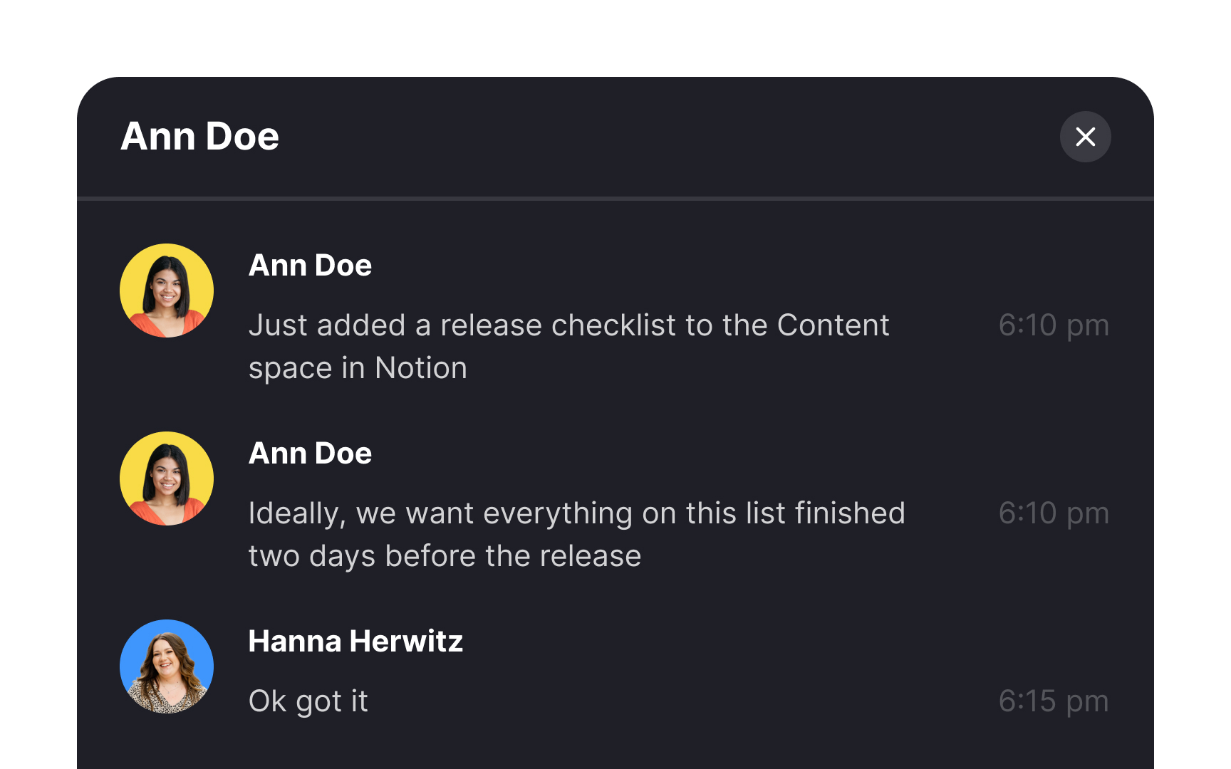
Stacking messages that were sent over a short period of time keeps the UI cleaner. When several messages are sent in quick succession, there's no need to display the exact time for each one. Instead, group together messages that were sent within a few seconds of each other and assign them a single timestamp.
Choose chat bubble shapes for visual comfort
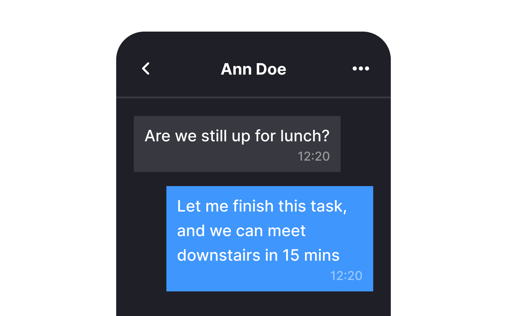
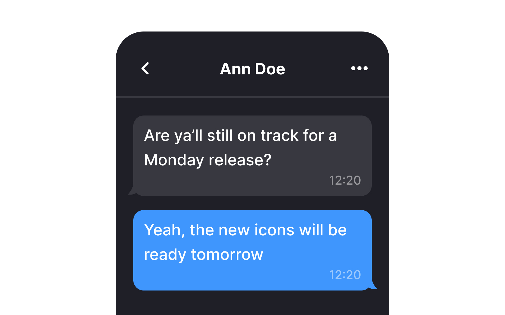
From childhood, we've learned that sharp corners have the potential to cause harm, while rounded corners are associated with safety. When you're in the process of designing chat containers, opting for rounded corners is a wise choice. Chat bubbles with curved edges not only appear visually clean but also have an appealing aesthetic.
This design principle isn't just a matter of preference; it aligns with the Fundamental Modeling Concepts (FMC) Guidelines that suggest that rounded lines are more natural for our eyes to follow.[2] As corners gently curve inward toward the center, they assist users in focusing better on the content within the container.
Indicate the sender and recipient
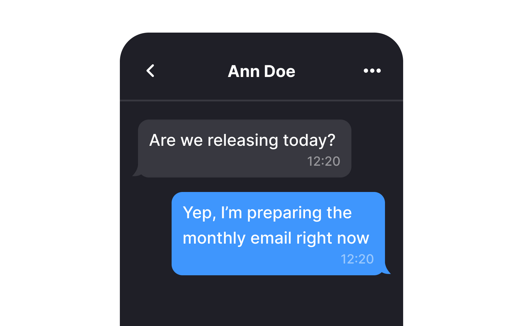
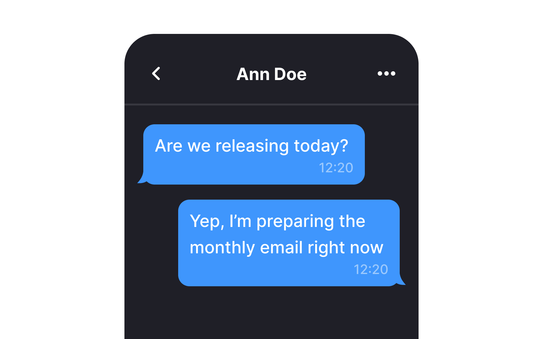
Much like speech bubbles in comic books or cartoons, chat bubbles play a crucial role in identifying the sender of a message. Use distinct colors and small tails in chat bubbles to aid users in swiftly and efficiently scanning through conversations. This visual cue will allow your users to instantly differentiate between messages sent to them and by them.
Pro Tip! When it's a group chat, consider coloring the names rather than the whole bubble.
Group messages by date
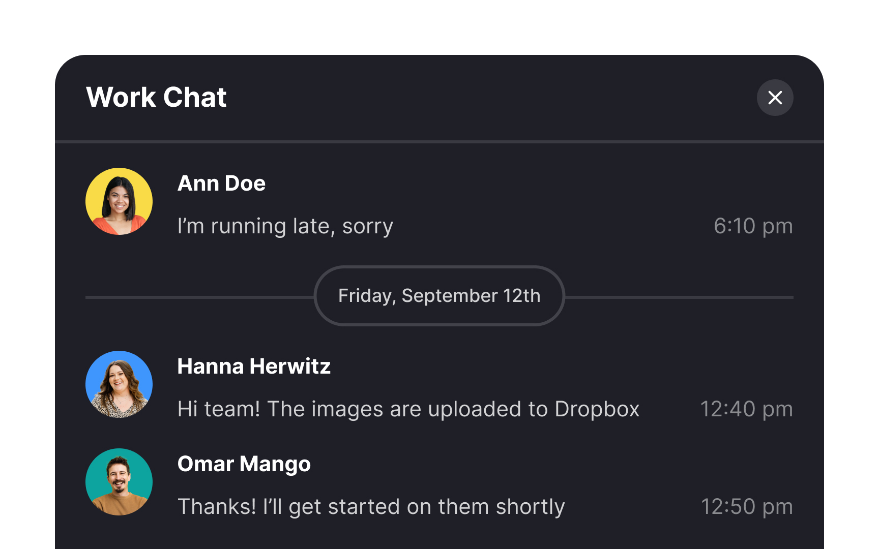
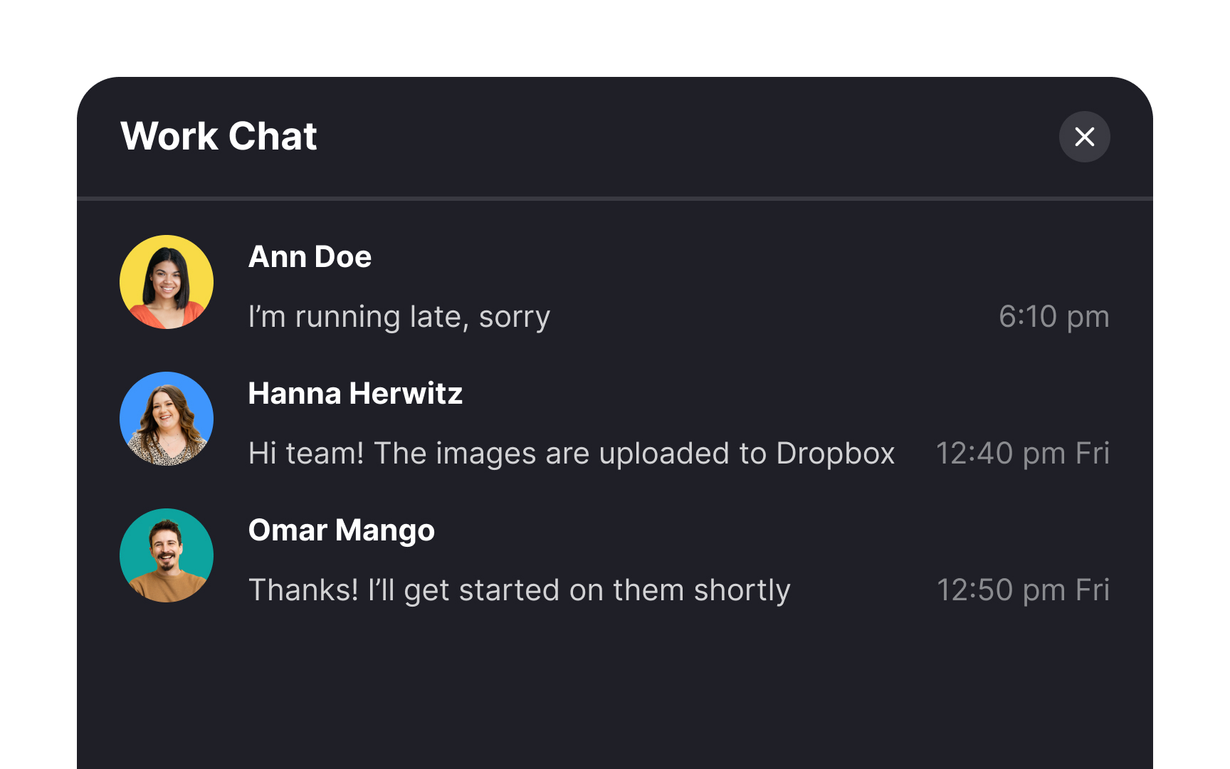
To efficiently organize messages, implement dividers in both the chat interface and the chat list. In the chat interface, use dividers to group messages by date, allowing users to easily locate specific conversations. This not only streamlines the process of finding relevant information but also minimizes potential confusion.
Also, extend this practice to the chat list, where messages are displayed in summary. With the help of date dividers, users can quickly identify and access conversations from specific days.
Ensure comfortable reading of chat containers
When it comes to messaging interfaces, chat containers that stretch across the entire screen can feel somewhat disorienting and may pose a challenge for users to track with their eyes.
Conversely, employing a narrower width promotes quicker and more comfortable reading of messages. It also contributes to a more visually appealing and user-friendly interface overall.
Add message previews
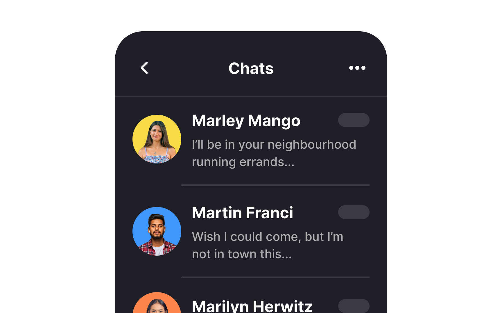
At times, users may prefer not to immediately read a message, especially when it might be an annoying piece of spam that warrants no attention. This is where displaying a message preview beneath the sender's name can save the day. It provides users with a quick glimpse of the message content, helping them decide whether it requires immediate attention or can be attended to at a later time.
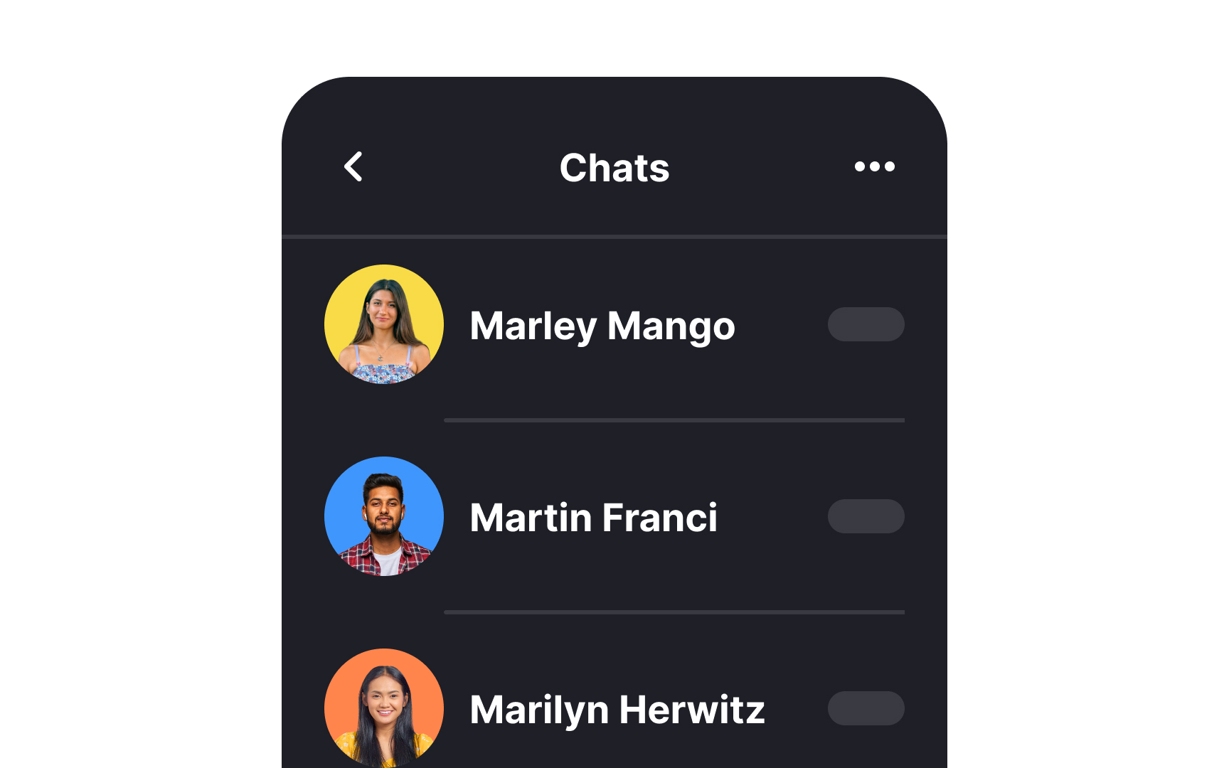
Make the notification badge prominent
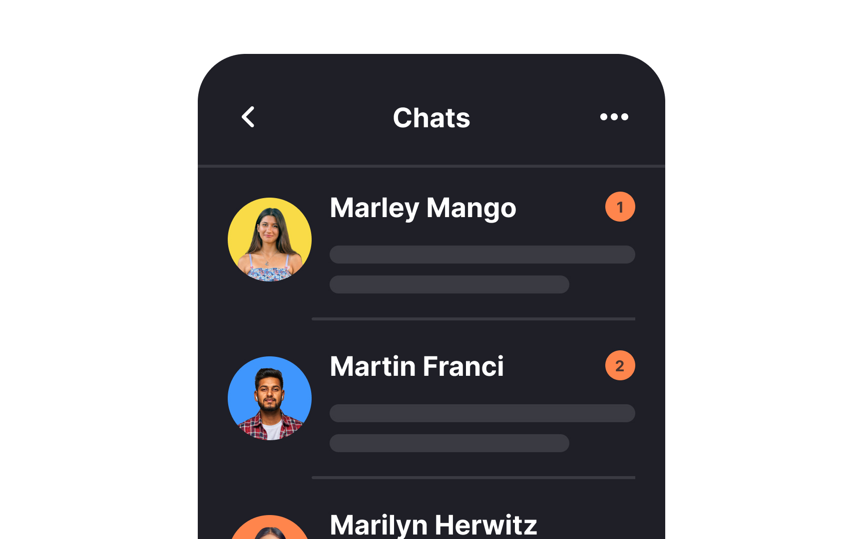
Use a prominent notification badge to signify unread messages. Human memory can be quite fallible, and many individuals might not recall whether they've already read a specific message, particularly in the midst of a hectic day. The unread badge serves as a visual reminder, reducing the risk of overlooking crucial information and helping users stay on top of their messages effectively.
Differentiate system messages
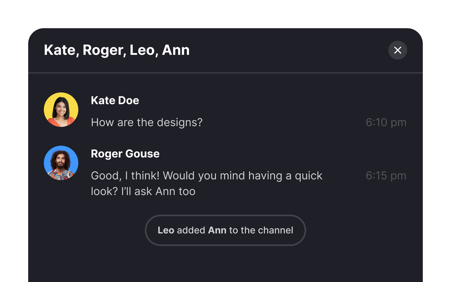
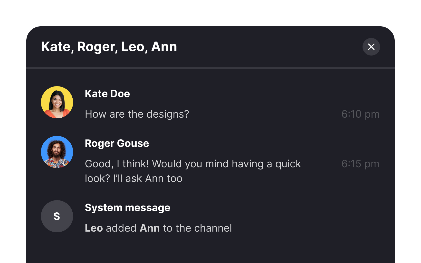
When designing a messenger interface, make sure you distinguish system messages, like "user joined the chat," from regular user messages to prevent any potential confusion. Opt for a design that sets these system messages apart, while also ensuring they integrate seamlessly with the overall aesthetic. Employ subtle cues, such as color schemes and fonts consistent with other design elements, to maintain a cohesive and user-friendly interface.


