


Affinity mapping is a collaborative analysis method that turns raw research observations into organized clusters of related ideas. After a round of interviews or usability sessions, teams typically have hundreds of individual notes covering behaviors, quotes, and pain points. Affinity mapping imposes structure on that volume by grouping notes that share a common theme, making patterns visible that would be difficult to spot when reviewing findings individually.
The method works best as a team activity. The more people from the research team who participate, the more perspectives the clusters reflect and the more disagreements surface that solo analysis would miss. That collaborative friction forces explicit discussion about what the data is saying before anyone moves to conclusions.
Flexibility matters throughout. Initial groupings are rarely final. Notes move, clusters merge or split, and labels get refined as the team works. This lesson covers how to prepare data, run the session, discuss and name clusters, and translate the resulting diagram into actionable insights, including how AI tools can support the process.
When to use an affinity diagram
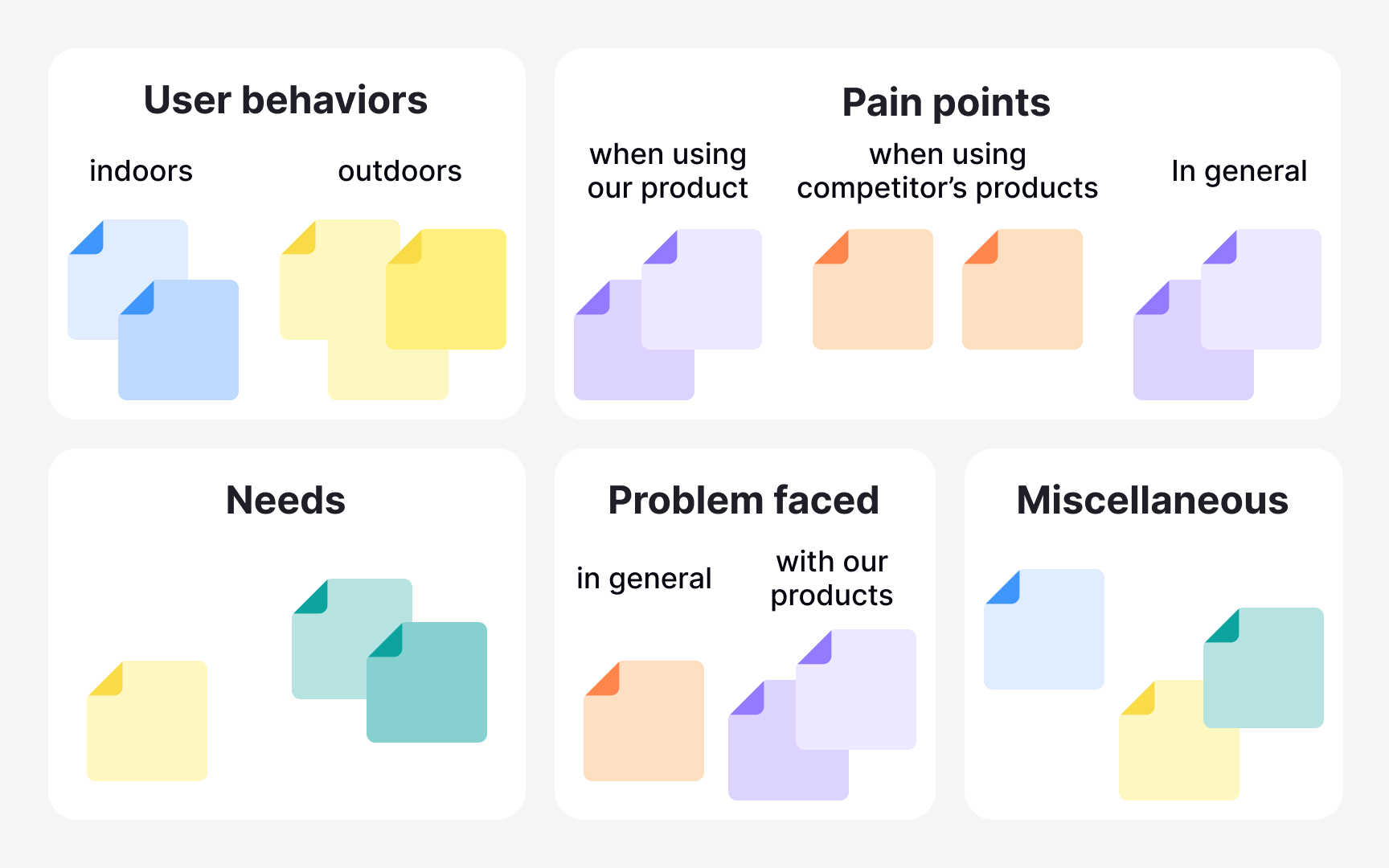
Affinity diagrams work best when you have a large volume of qualitative data and need to find patterns in it. Think of the moment after a round of user interviews or diary studies when you're staring at pages of notes, quotes, and observations with no clear structure. That's when affinity diagramming earns its place: it helps you group scattered insights into meaningful themes so you can move forward with clarity. Common use cases include clustering findings from user research, sorting design ideas by functionality, building user personas, and prioritizing feedback from usability testing.
The method does have real limitations worth knowing. It requires a skilled facilitator and a clear focus question. Without one, teams tend to group notes by surface-level keyword similarities rather than genuine insight. It's also not the right tool when you have very few data points, since patterns can't emerge from thin data. Remote sessions are possible using tools like Miro or FigJam, but they require extra facilitation effort to keep groupings visible and meaningful.[1][2]
Collect data for affinity diagramming
The first step of affinity diagramming is collecting your raw data. Before you can spot any patterns, you need a solid base of qualitative material to work with. This typically comes from user interviews, usability testing sessions, focus groups, field studies, or open-ended survey responses. The goal at this stage is to gather enough observations, quotes, and findings to make meaningful groupings possible later.
Use whichever research method fits your study goals, but make sure to capture individual data points rather than summaries. Each observation or quote should stand on its own, because you'll be moving these pieces around independently when you start clustering. A single sticky note per insight is the standard approach, whether you're working on a physical wall or a digital whiteboard tool like Miro or FigJam.
The quality of your affinity diagram depends entirely on the quality of the data you bring in. Vague or secondhand notes are hard to cluster meaningfully, while specific, firsthand observations make patterns much easier to identify.[1]
Write notes for affinity mapping
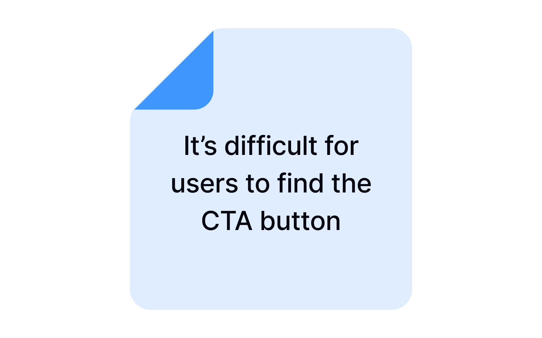


The first step of affinity mapping is transferring every relevant data point onto individual sticky notes or cards. One insight per note is the rule here. It might feel tedious, but it matters: once you move into the clustering phase, you'll physically rearrange these notes, and bundled observations are impossible to split and sort accurately.
What goes in the notes? Direct user quotes, observed behaviors, pain points, and findings from interviews, usability sessions, or field studies. User quotes are especially valuable because they preserve the participant's voice, making it easier for the team to stay grounded in real experience rather than interpretation.
Involving multiple team members is worth the coordination effort. When different people contribute observations, you reduce the risk of overlooking findings that one person might have deprioritized. Each participant brings their own perspective on what counts as significant, and that diversity strengthens the dataset before clustering begins.
Keep each note brief and legible. A single sentence is ideal. If a note requires explanation to be understood, it's a sign to simplify it or split it into two separate points.[2]
Pro Tip! Don’t worry about data repetitions in the notes — you can stick them overlapping one another. Just make sure the most descriptive note of the lot is on the top.
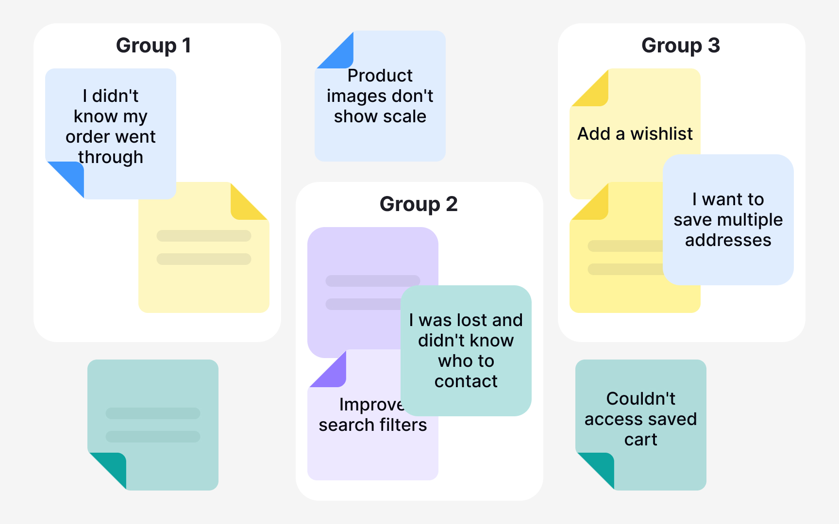
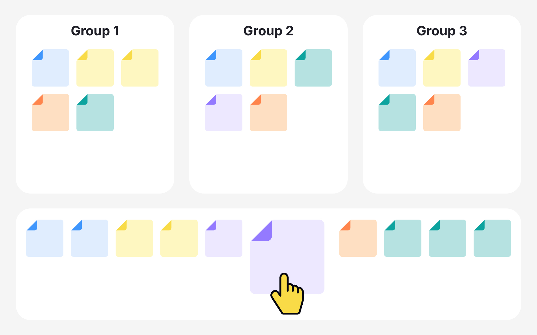
Group similar notes in affinity mapping
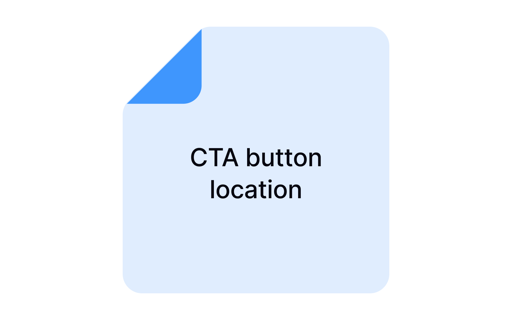
Once all the sticky notes are on the board, the team shifts from individual work to collaborative sense-making. This is the grouping step: together, participants discuss each data point and move related notes into clusters. The goal is to let themes emerge from the data rather than forcing notes into categories decided in advance.
A good starting point is to look for the most obvious connections first, forming broad top-level clusters. From there, create sub-groups as more nuanced patterns become visible. Group labels don't need to be perfect on the first pass. Name them as you go, and revise as the picture becomes clearer.
Not every note will find a clean home. It's normal to end up with outliers that don't fit neatly into any group. Collect them in a separate area and revisit them near the end. Some will eventually connect to an existing cluster; others may point to a theme worth exploring in future research.[3]
Discuss data clusters in affinity mapping
Once all the clusters are in place, the real analytical work begins. Discussing each group as a team transforms a wall of sticky notes into genuine insight. Walk through every cluster together, summarize what the notes have in common, and talk through what the pattern means in the context of your research goals. This is also the moment to draw connections across clusters. Some themes will overlap or reinforce each other in ways that only become visible when you step back.
Use this discussion to prioritize. Not all clusters carry equal weight. Some point to critical pain points that need immediate attention, while others reflect edge cases. Dot voting is a practical technique here: team members place a mark next to the clusters they consider most important, which surfaces consensus quickly.
The discussion phase often reveals gaps in your research. When a cluster raises more questions than it answers, that is worth capturing. Note the open questions as you go, because they become the foundation for follow-up research or more targeted interviews.
Resist the urge to jump to solutions during this step. The goal is to understand the data deeply before moving to any design decisions.
Keep affinity mapping flexible and iterative
Affinity mapping is an iterative process and the first arrangement of notes is rarely the final one. As the session progresses and the team discusses what each cluster means, it is common to realize that a note fits better somewhere else, belongs to two groups, or reveals a theme not visible during the initial sort.
Moving notes around is not a sign that the process is failing. It is a sign that it is working. The discussion changes how people see the data. A note that seemed clear when written down can take on a different meaning once placed next to other observations. Staying rigid about placements prevents those realizations from surfacing.
If a note feels relevant to more than one cluster, create a duplicate and place it in both. This is preferable to forcing a choice that misrepresents the data.[4]
The silent sorting phase lets people place notes independently without being anchored by someone else's grouping logic. Once the discussion opens up, that same openness should carry through. Encourage the team to question placements, challenge labels, and merge or split groups when evidence supports it. The goal is a diagram that accurately reflects the data, not one that locks in the first instinct of whoever sorted fastest.[5]
Turn affinity mapping insights into action
The real value of an affinity mapping session only becomes clear in what happens after it ends. The clustered diagram is not the deliverable. The insights, decisions, and next steps that come from it are. A session that ends with a neat board but no agreed actions is an incomplete one.
Once clusters are prioritized and discussion has surfaced the key patterns, the team needs to translate findings into concrete outcomes. This might mean identifying design changes to investigate, defining follow-up research questions, or flagging gaps that need more data.
Not every output will be a solution. Some clusters raise more questions than they answer, and that is a valid result. Capturing open questions is just as important as capturing decisions because they feed into the next research cycle.
When the team cannot address everything at once, dot voting is a reliable way to reach consensus on what to prioritize. Each team member marks the clusters they consider most urgent or impactful, making collective judgment visible without lengthy debate. The goal is to leave the session with a shared understanding of what the data means and a clear sense of what comes next.
Use AI tools in affinity mapping
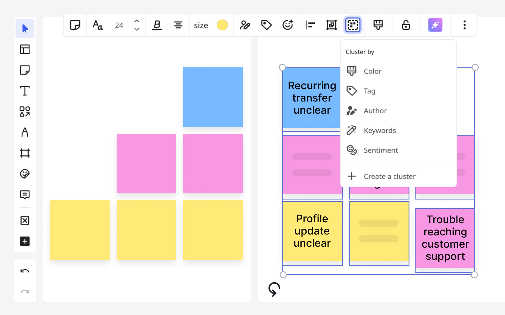
AI can take on some of the mechanical work in affinity mapping, but it cannot do the thinking. Tools like Miro can automatically group sticky notes by keyword similarity or sentiment. Dedicated platforms like Dovetail and Notably go further, offering AI-powered transcription of user interviews, automatic tagging of themes, and pattern detection across sessions. These features reduce the time spent on early-stage data organization.
However, AI-generated clusters are rarely perfect. Notes that require contextual understanding rather than surface-level keyword matching often get misplaced or fall into a catch-all category. AI output should be treated as a starting point for human review, not a finished analysis.
The collaborative value of affinity mapping cannot be replicated by AI. Much of what makes the method useful is the shared sense-making that happens when a team sorts notes together. That discussion, the friction of disagreement, and the insight that comes from it, is how teams build a common understanding of the data. AI speeds up organization but does not replace judgment. Use it to pre-populate the board and save time on mechanical sorting, then rely on the team to do the interpretive work that matters.
Topics
References
- Affinity Diagramming: Collaboratively Sort UX Findings & Design Ideas | Nielsen Norman Group
- Affinity Diagrams: How to Collect, Organize, and Group UX Insights | Maze
- Avoiding 3 Common Pitfalls of Affinity Diagramming | Nielsen Norman Group
- Affinity diagram | Lyssna
- How to use affinity mapping for user research


