


Forgetting a password is one of the most common moments of friction in any digital product. It happens to almost every user at some point, and how the product handles it determines whether they get back in quickly or give up entirely. Research suggests that 75% of online customers abandon a purchase after a failed password recovery attempt.
The reset flow sounds simple: send a link, let the user create a new password, confirm it worked. But each of those steps has failure points. Reset links that expire too quickly, confirmation emails that end up in spam, password requirements that only appear after submission, and unclear error messages all add up to a flow that feels like an obstacle rather than a solution. A well-designed password reset flow is fast, forgiving, and clear at every step. It treats a frustrating moment as an opportunity to rebuild trust.
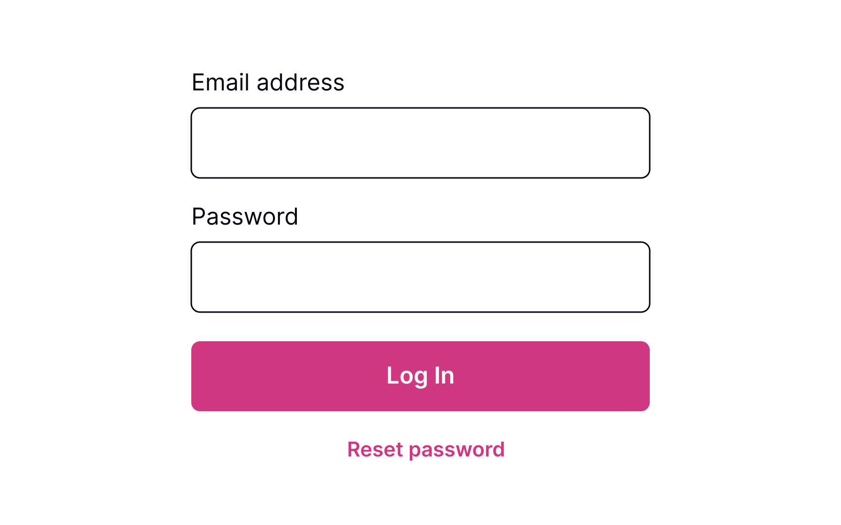
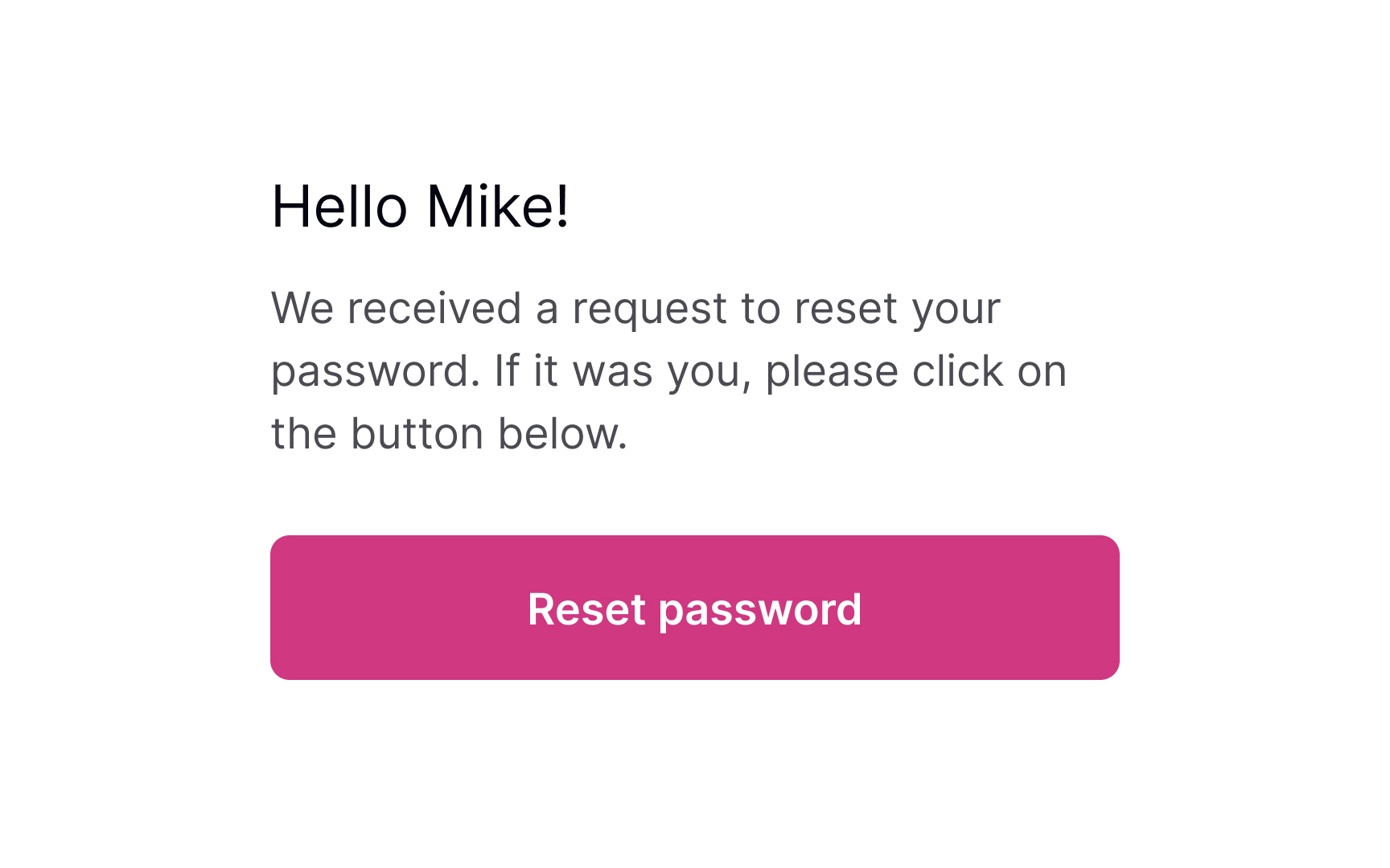
Place reset link close to the password field
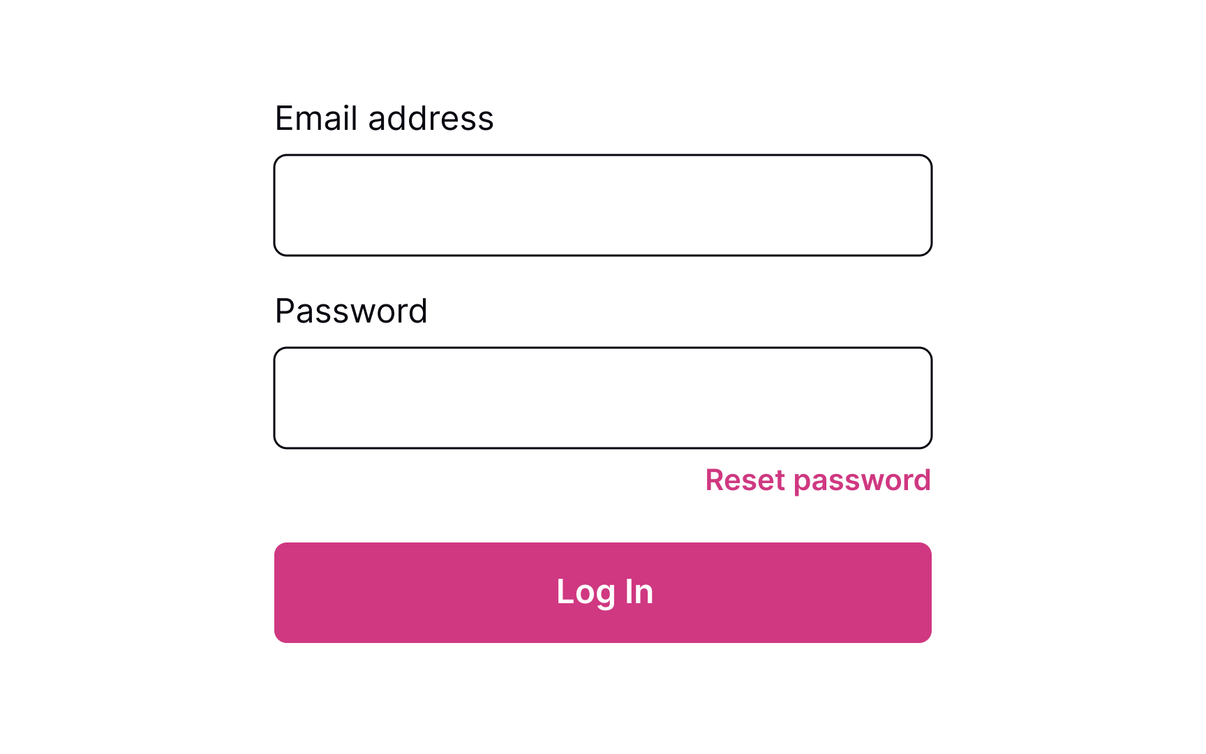


Providing users a Reset Password link works like an "emergency exit," supporting Nielsen's heuristic about user control and freedom. The heuristic advocates users' rights to make mistakes and states that a system should allow users to get out of trouble without much effort.[1]
The Reset Password link gives users an opportunity to recover from an undesirable situation and makes them feel more relaxed and comfortable.
Although the Reset Password link isn't the primary action on a page, it should still be visible. Place it below the password input where users expect to see it, show its clickability, and provide a straightforward label that eliminates any doubts about what happens when users click it.
Ask for account details to verify
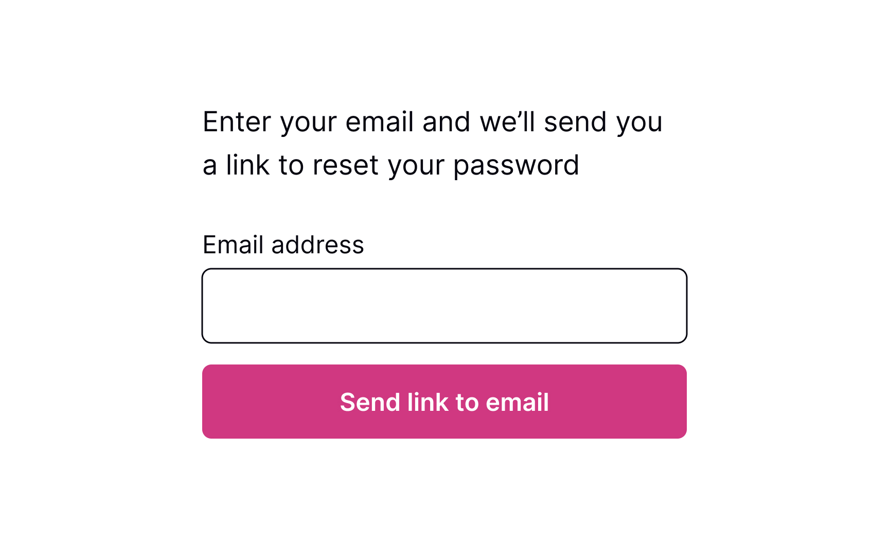
Commonly, systems ask for an email to send users a link or a phone number to send a code to recover the password. This data is usually enough to identify a person and help them restore their login information securely.
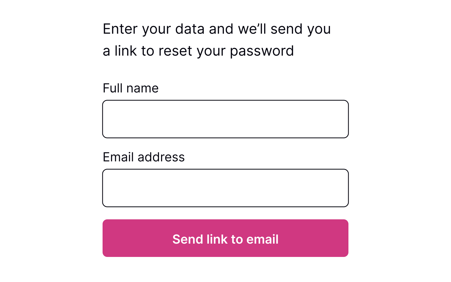
The process should be quick and painless, so avoid asking unnecessary questions and making them fill more than 1-2 fields. Otherwise, users may feel insecure or simply abandon the product.
Pro Tip! If users have already entered their email address or phone number on the previous login page, prefill this data on the reset password page to speed up the flow.
Show the confirmation page
Once users provide their email or mobile phone, show them a page explaining what happens next. If you ask for an email, inform users to check their inboxes for an email with a password recovery link. If you ask for a mobile number, notify users that they will shortly receive a code or link on their phones.
Keeping users up to date makes them feel confident that everything will be okay and they will recover their account in a short time.
Explain next steps
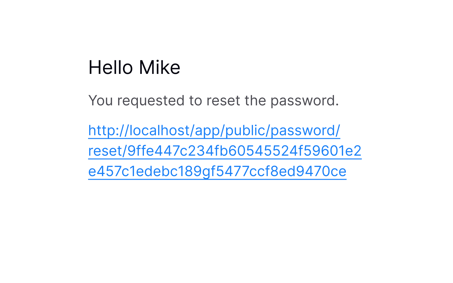
After you send users a password recovery link to their emails or phones, your job isn't done. The email or text should contain clear and straightforward instructions on what to do next.
Avoid including too much text — a prominent link to the reset page or a code that allows users to reset their password should be included.
Reset the password
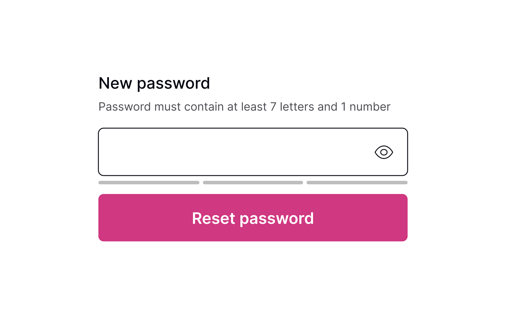
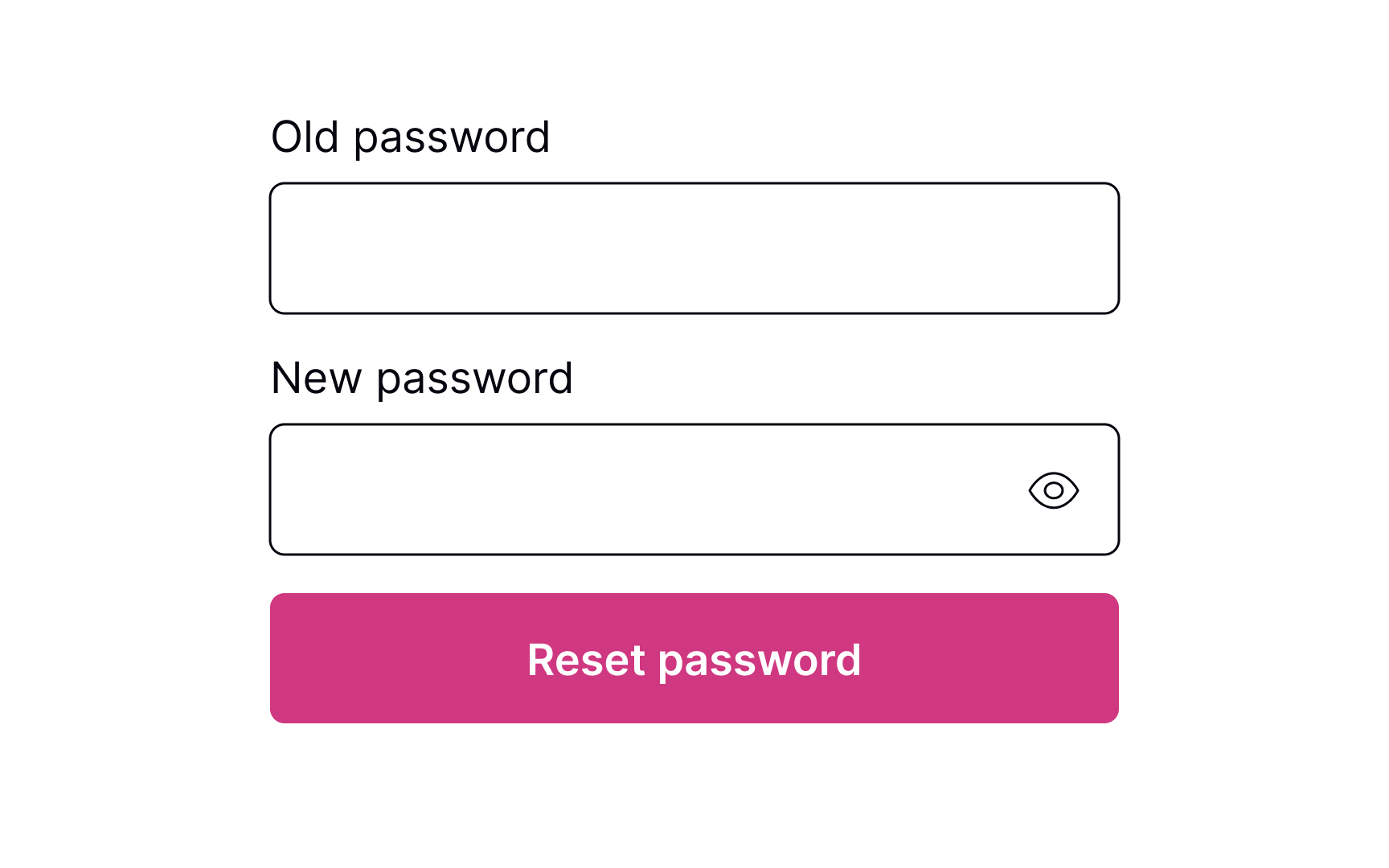
Whether it's a verification code or a link to click, the next page should include a clear input to enter the new password. Don't forget to include password requirements and make sure users can see them the entire time while typing. If there are more than a couple of password requirements, consider adding bullet points to make the instructions scannable.
Pro Tip! Never insert password requirements inside the field label or placeholder.
Password successfully reset
After users successfully reset their password, it's a good idea to congratulate them. Resetting a password can be a frustrating experience, so acknowledging their success can create a positive user experience. Once users have reset their password, redirect them to their intended destination — the login page.
Topics
References
- User Control and Freedom (Usability Heuristic #3) | Nielsen Norman Group


