


.svg)
A form can have all the right input types and still fail if the styling works against users. Padding, margins, label placement, text sizing. These visual decisions determine whether a form feels approachable or overwhelming. Spacing does heavy lifting. Too tight, and fields blur together into a cluttered wall. Too loose, and related elements stop feeling connected. The goal is balance: enough breathing room for scannability without breaking the visual relationships between labels and their fields.
When forms look organized and feel intuitive, users stop noticing the form itself and focus on finishing the task.
Provide enough input padding for scannability
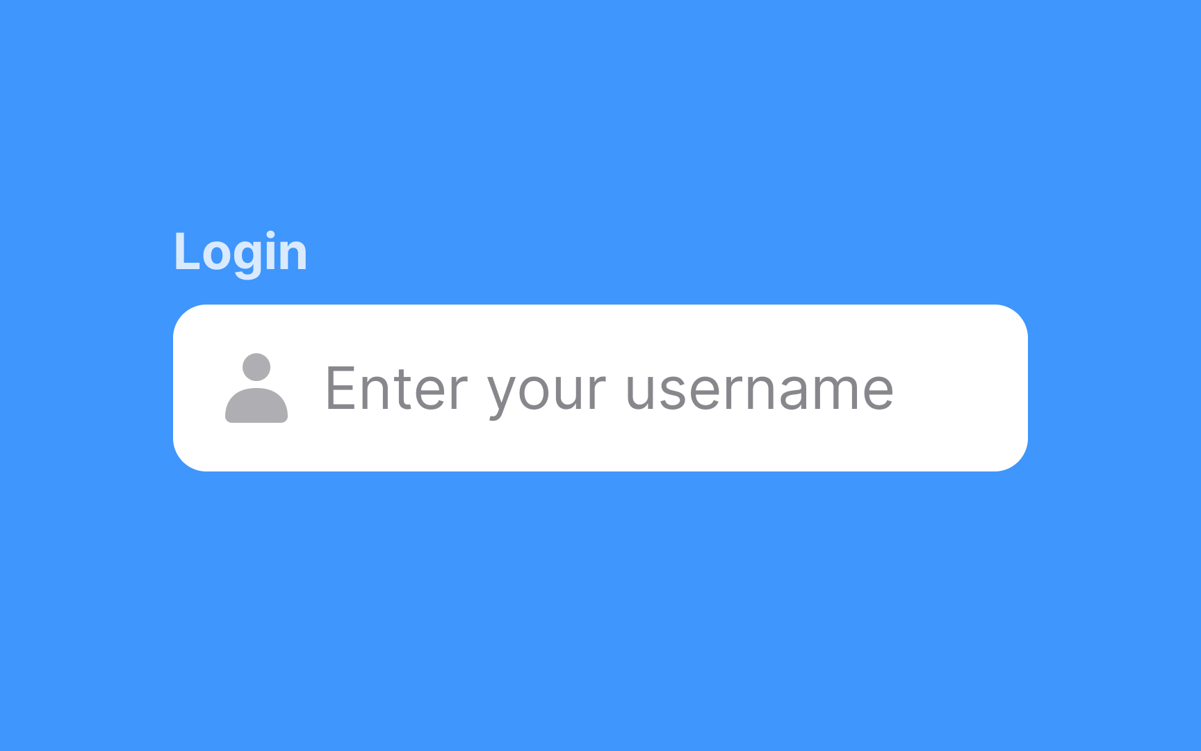


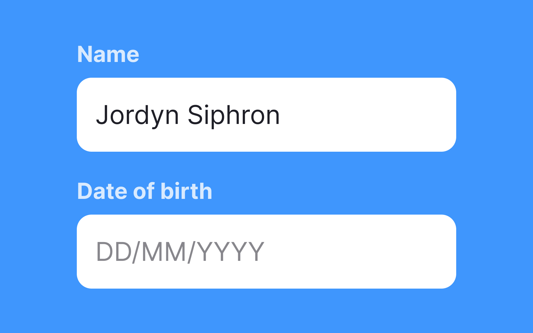
Padding around inputs gives text enough breathing room to be read and scanned. Since users are often reluctant to fill out forms, they are more likely to complete a form if it is easy on the eyes. Generous padding not only greatly enhances legibility but also makes forms easy to tap or click.
Add enough space between inputs
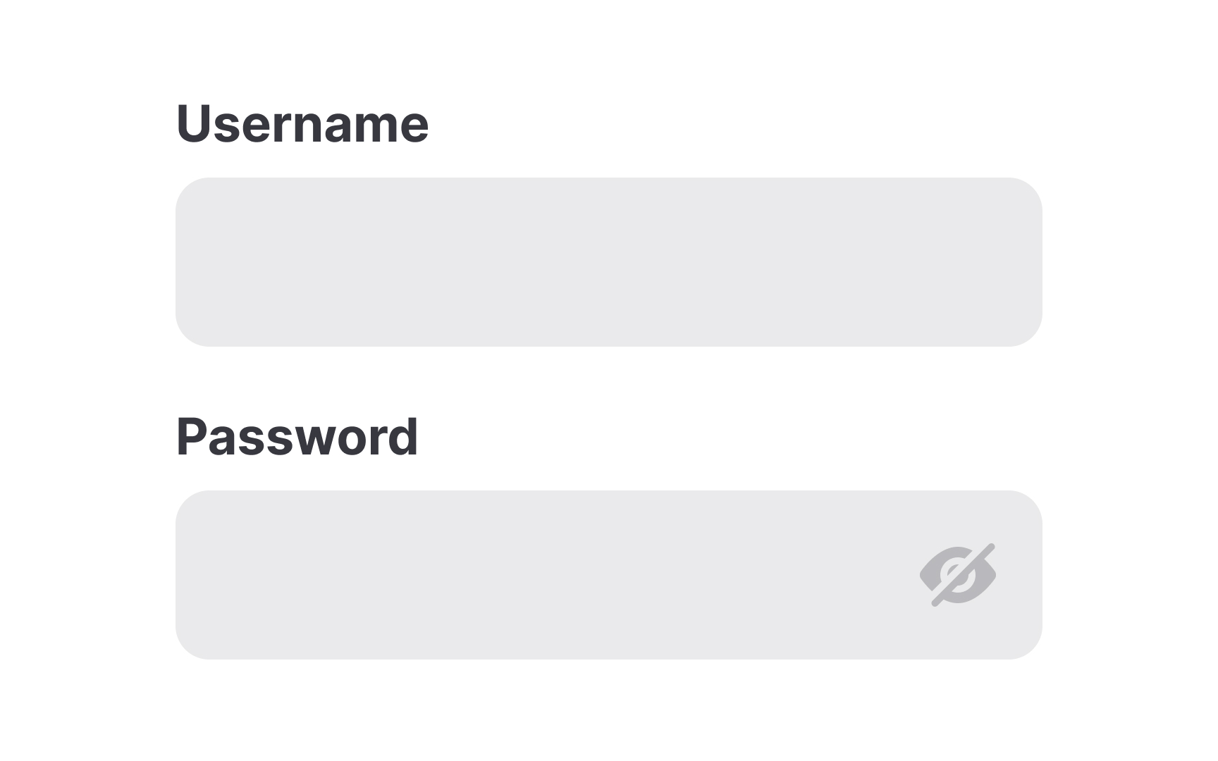
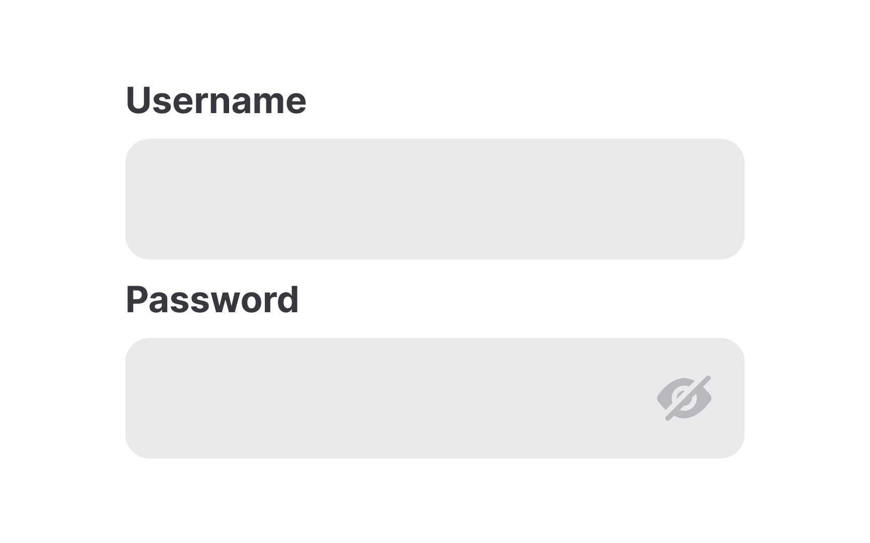
Margins between inputs can be tricky. If there's too little space, inputs can be hard to tell apart and appear cluttered. If there's too much space, they can seem unrelated. Find the right balance to establish a proper visual hierarchy.
The principle of proximity states that related items should be close to each other to be perceived as one group.[1] So, for example, if you're using fixed labels above inputs, the distance between an input and its label should be smaller than the distance between an input and an unrelated label.
Pro Tip! When adding extra space between inputs on mobile view, make sure the page doesn't turn into endless scrolling. Consider breaking the form into smaller pages.
Avoid clutter and add enough spacing between elements


If you smash a bunch of elements together, it can create a cluttered mess of a form. Proper component spacing prevents this. Take time to organize and space your input elements in a way that allows them some breathing room while keeping them visually grouped in a logical way. The distance between inputs in a form should be larger than any spacing between component elements.
Pro Tip! Add at least 4px between input borders and helper text for a neat and uncluttered look.
Use standard input styling for faster recognition


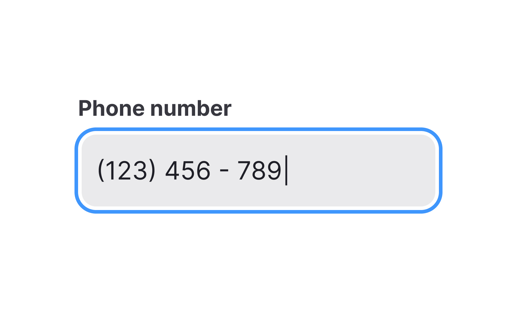
It can be tempting to get creative with your input styles. However, it's best not to go too far. Google research reveals that users tend to identify the text input box faster when it has a semi-transparent fill.[2]
Experimenting with border radius and different colors for your inputs is generally fine, but be careful not to overdo it. Stick to the traditional input styling and don't forget that text and background should meet the color contrast requirement of at least 4.5:1.
Provide helpful labels
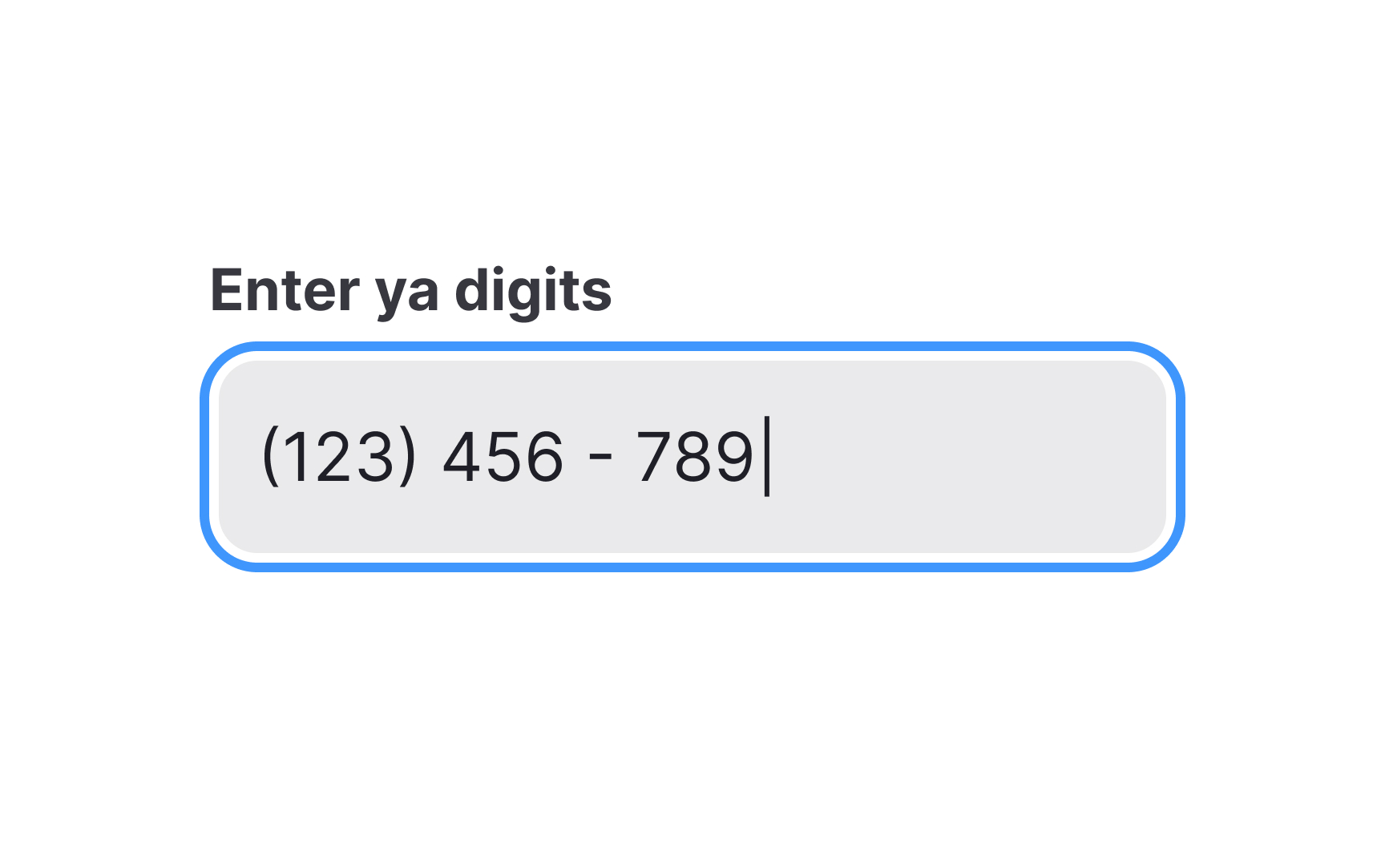
When writing label commands, keep in mind their primary goal — to guide users and briefly explain what information they need to provide. It requires labels to be concise, informative, and extremely clear.
Avoid technical jargon, complicated constructs, and slang. In the best scenario, unclear labels may only puzzle users for a couple of seconds. At worst, users will stumble and start questioning whether they understand what data they should provide.
Instead, keep it short, but make your instructions as straightforward as possible using everyday language. One or two words are generally sufficient to make your labels clear. If an input requires a more detailed explanation, consider adding helper text or the Info icon with a meaningful tooltip.
Ensure labels are easier to read
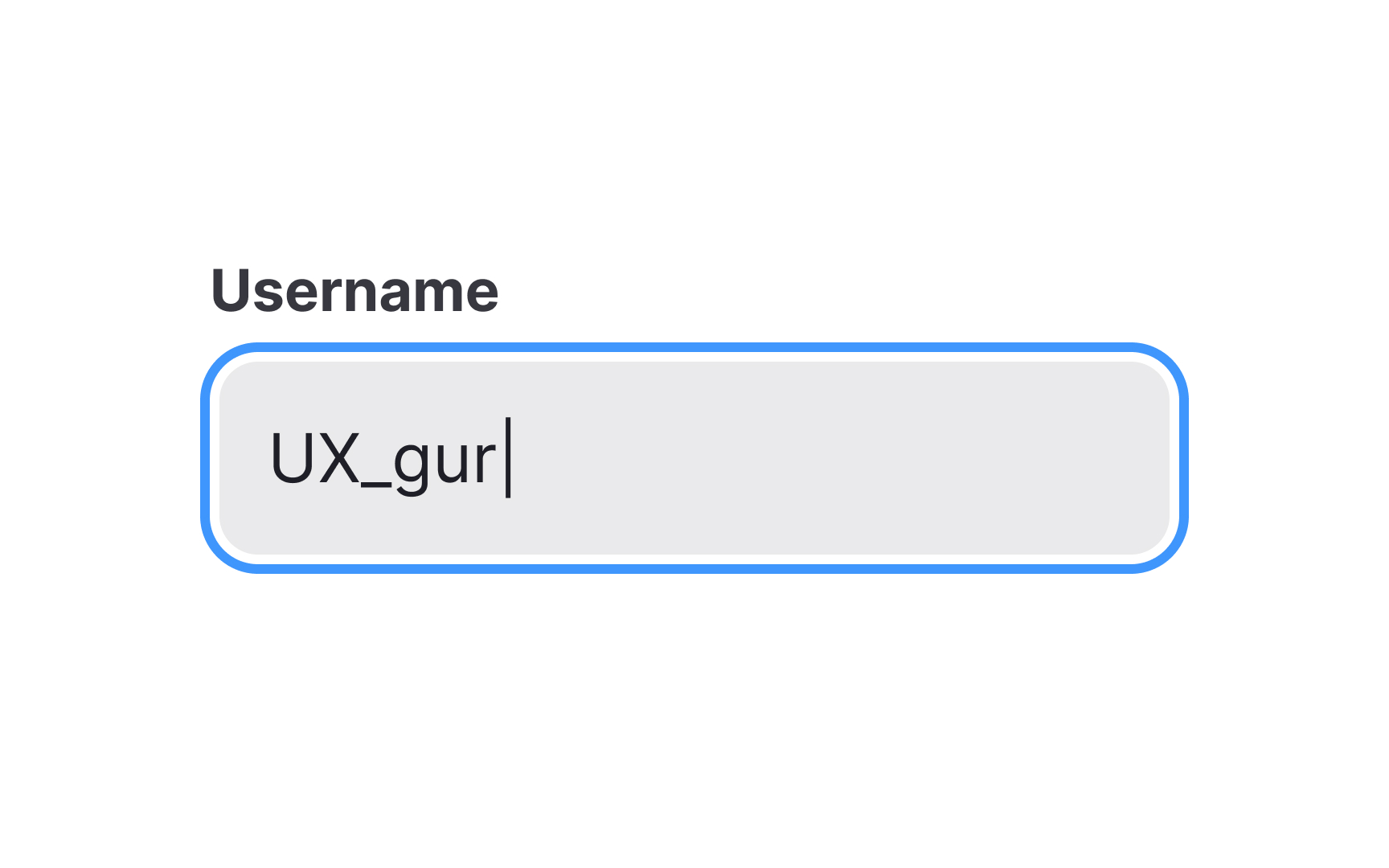
Input labels need to be easy to find and read but shouldn't draw attention to themselves. Like captions, labels represent secondary text and should be at least two sizes smaller than the body text to indicate a difference. So, if your body text is 16px, the size of labels should be 13px or 14px.
Pro Tip! When designing for mobile, find a way to view your designs on an actual device and check the font legibility.
Select a label case that's easier to read
The label case is important for readability. There are two common options to choose from:
- Sentence case: Each word starts with a lowercase letter except for proper nouns and the first word of a sentence. This works well for both long text and short phrases like headlines or labels. It's also easier to write and read, especially for lengthy content.
- Title case: The first letter of each major word is capitalized, while the rest are in lowercase. This gives more prominence to the text and can be suitable for UI elements such as alert titles, menu items, and labels, but may not be the best choice for long pieces of text.
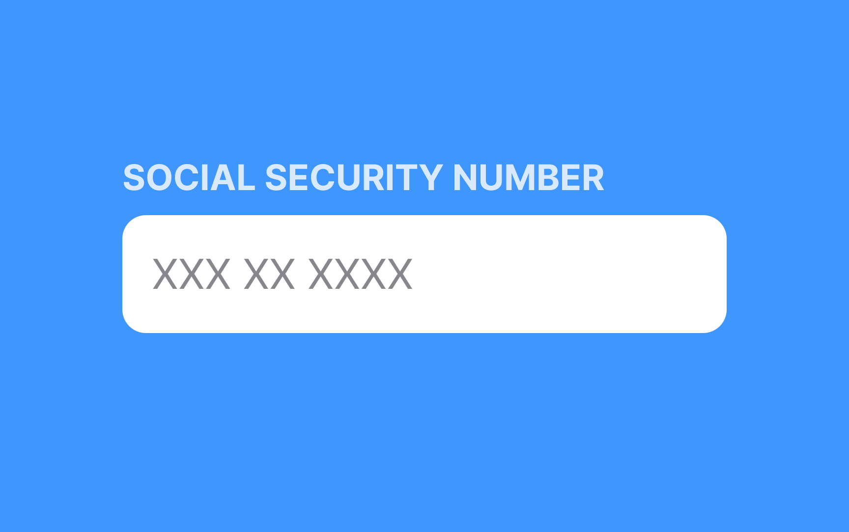
Using all capital letters (ALL CAPS) for regular text is not a good idea because it's harder to read and adds visual clutter. While there are some specific cases where it's acceptable, like acronyms or design purposes, it's generally best to avoid using all caps for longer texts.
Keep the input text legible
The input text size, as well as the placeholder size, should be easy to read. There’s no single “right” size for text inputs, but 16px is a good starting point. It can be larger if you have a text-heavy page or slightly smaller if you design an interaction-heavy page.[3]
Pro Tip! Keep in mind that the legibility of different fonts can vary even at the exact same font size.
Provide concise but meaningful helper text
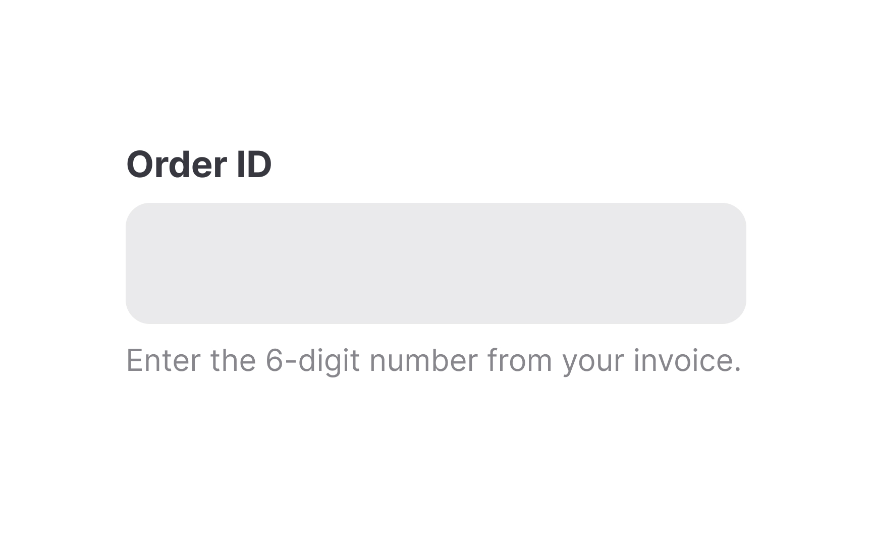
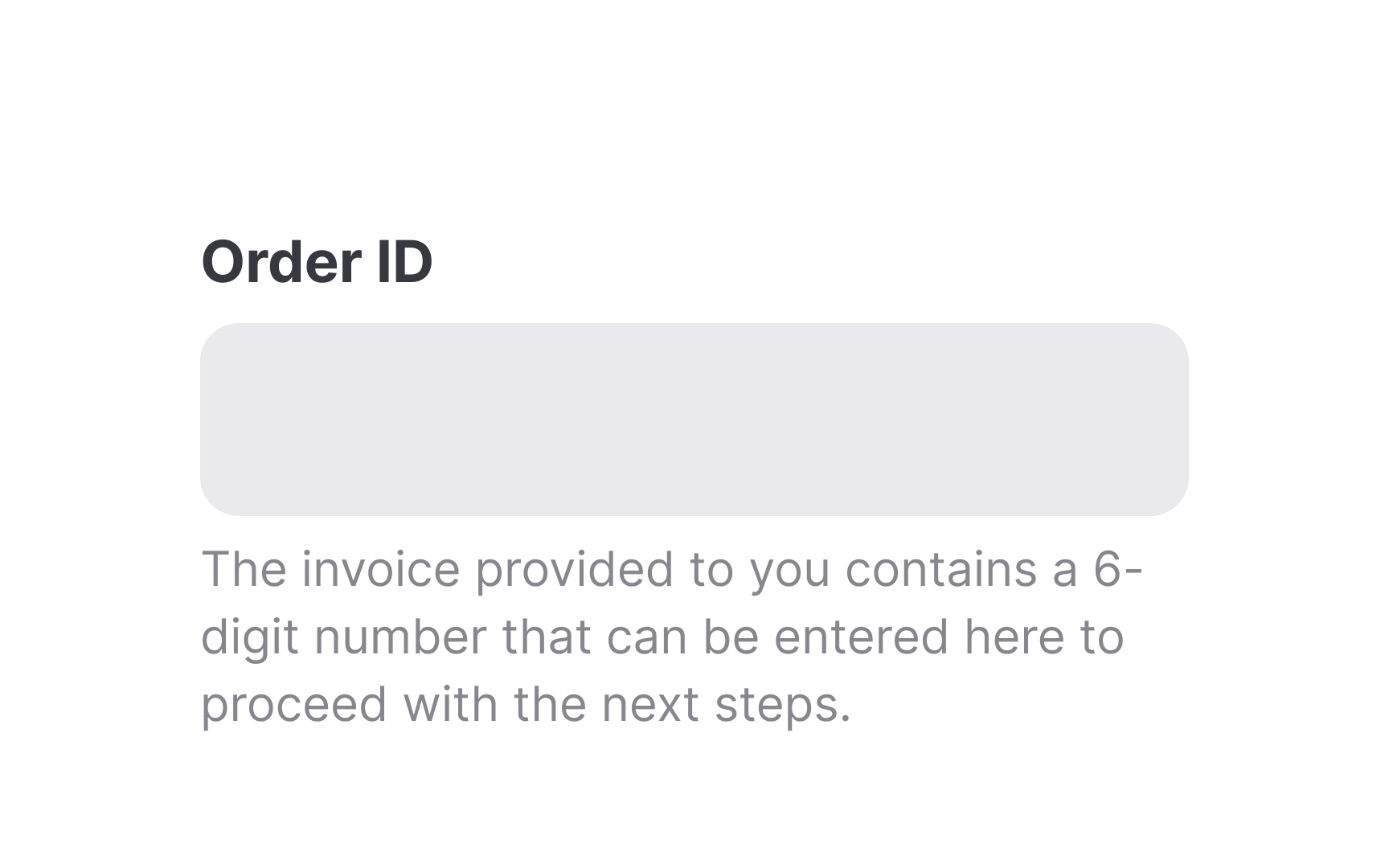
If your input requires more nuanced information than a one or two-word label can provide, consider including helper text. Aim to keep it concise and straight to the point and only use it when users feel confused about what information they're supposed to provide.
Remember that users don't read on the web, especially when it comes to microcopy, which is supposed to be short and snappy. Cut off unnecessary words that don't add to the meaning and keep the helper text up to one line.
Pro Tip! Helper text should be smaller and less prominent than your label text. For example, if your labels are 14px, 12px regular is recommended for helper text.
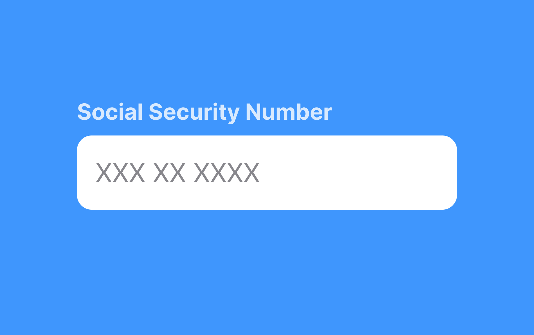
Provide informative placeholders
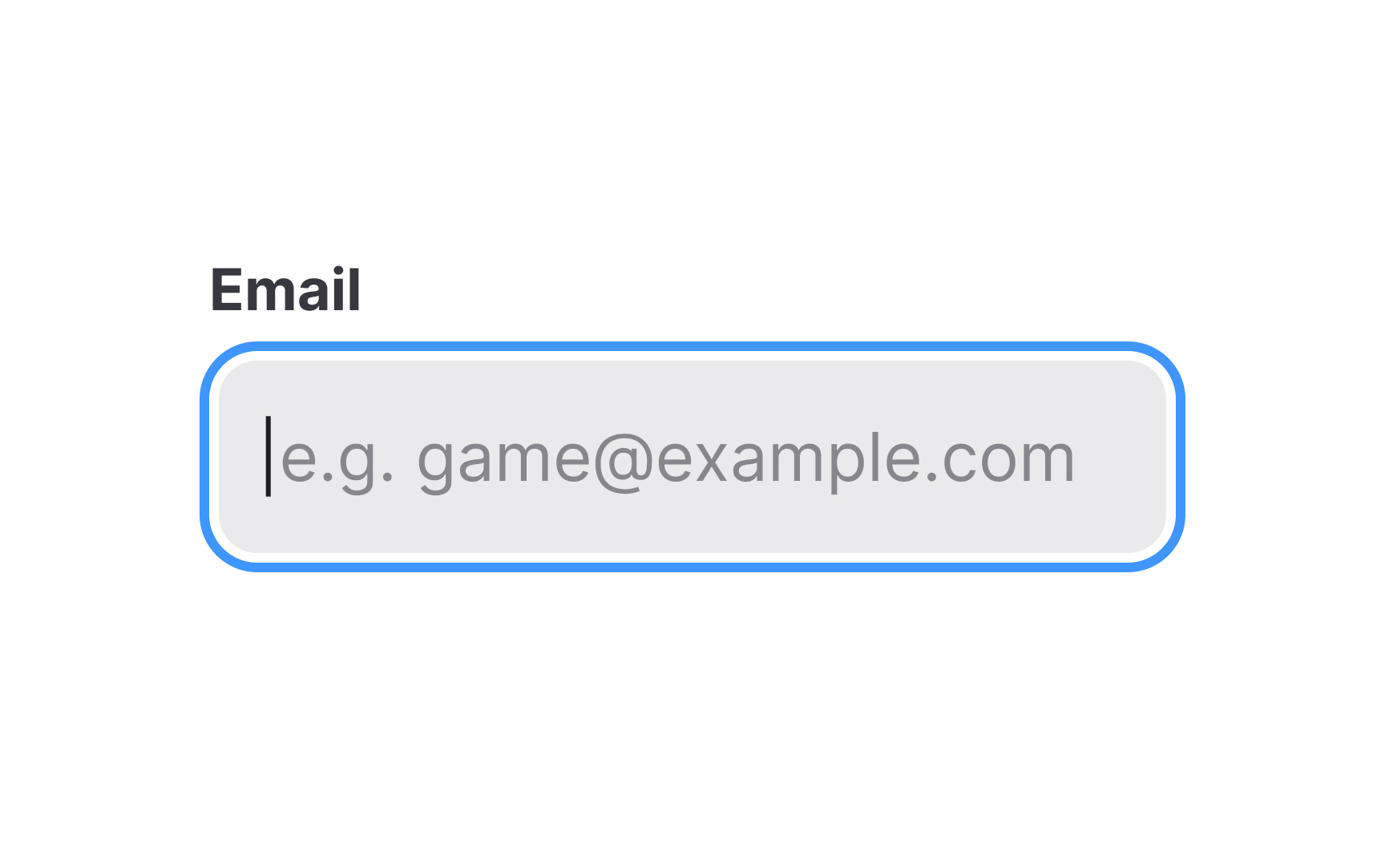
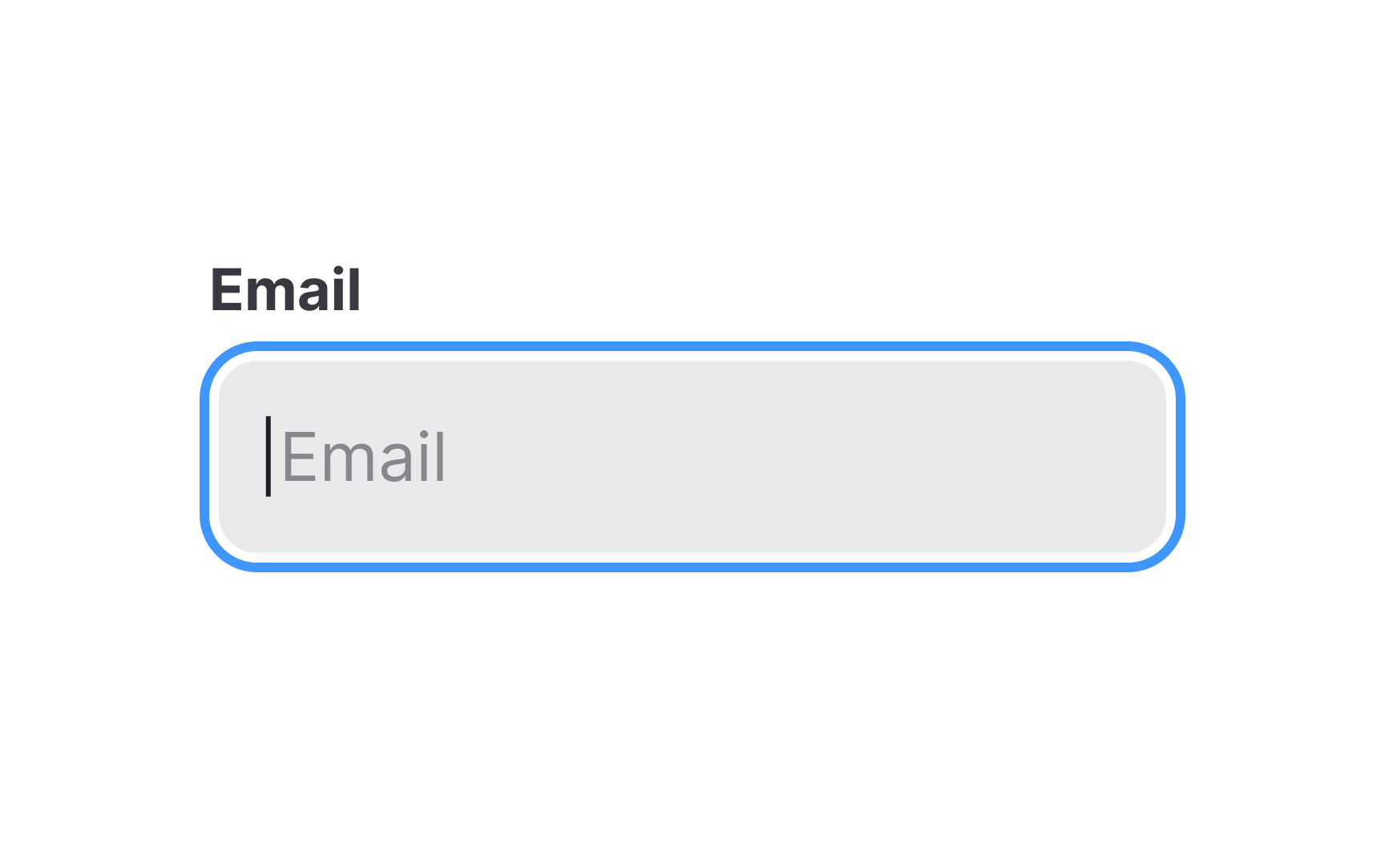
Placeholder text is another way to clue users in on what an input should contain. Don't repeat the label's text here. Instead, use this space to give users examples of the data they should enter. Placeholders should be colored more subtly than the input text, so users don't mistake them for data they've already entered themselves.
Placeholders can also be remarkably confusing if they disappear when users place a cursor inside the input. So make sure they come along with labels or consider using floating labels.
References
- Proximity Principle in Visual Design | Nielsen Norman Group
- The Evolution of Material Design’s Text Fields | Medium
- A Reference Guide For Typography In Mobile Web Design — Smashing Magazine | Smashing Magazine


