


.svg)
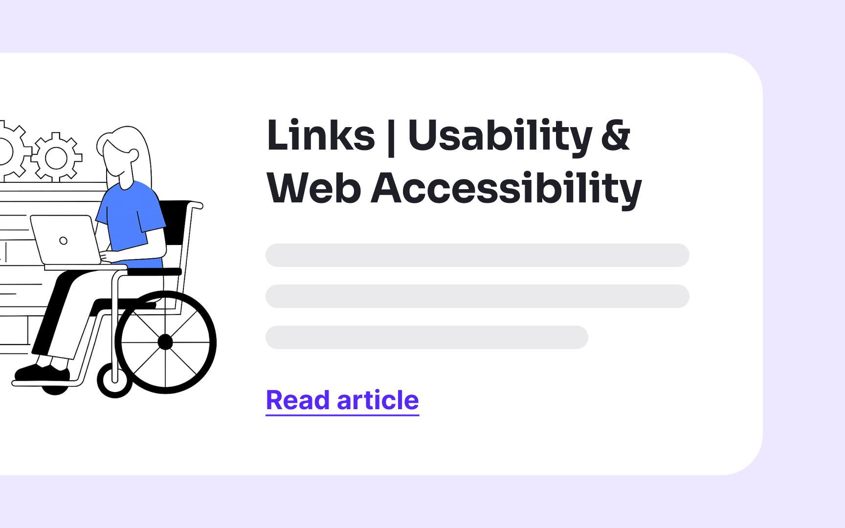
We click on links countless times each day, often without a second thought. But for many users, poorly designed links create frustrating barriers. When links blend into surrounding text or rely solely on color differences, they become invisible traps for users with visual impairments. Keyboard-only users struggle when links don't show focus indicators, while screen reader users get confused by vague "click here" or "read more" links that offer no context. These frustrations aren't limited to users with disabilities; everyone benefits from clear, predictable links.
Use descriptive link labels


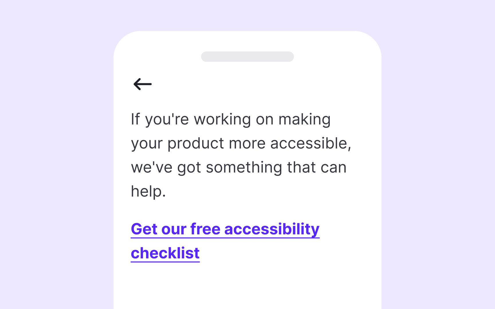
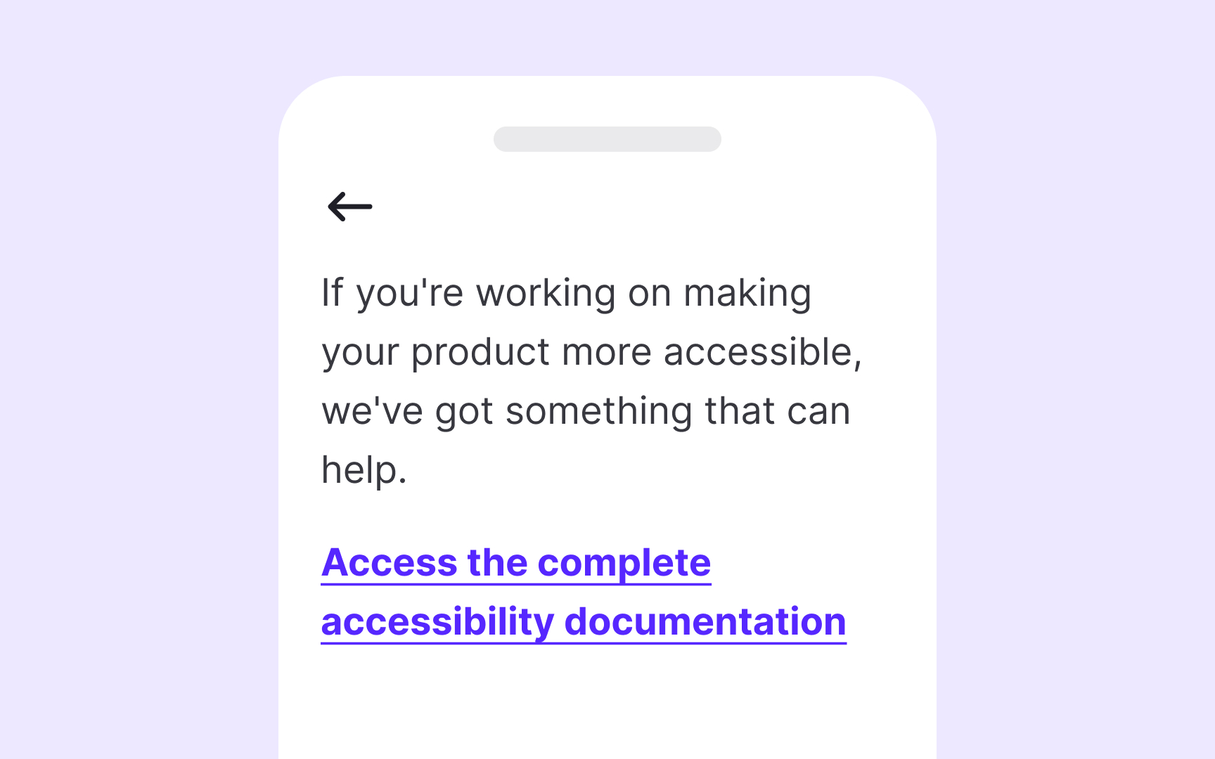
Assistive technology users often navigate web pages by jumping from link to link, similar to how visual users scan pages. When screen reader users press the Tab key, they only hear the link text without any surrounding context. Links labeled generically as "Click here" or "Read more" provide no information about their destination, creating a frustrating experience.
Descriptive link text immediately communicates where a link leads and what users can expect after clicking. Good link text is specific but concise. For example, instead of "Click here," use "Download pricing guide" or "View product specifications."
The ideal link text should:
- Make sense when read in isolation
- Clearly indicate the destination
- Be unique from other links on the page
- Avoid starting with phrases like "click here" or "link to"
Balance is important. Keep the link text descriptive yet reasonably brief. "Read full report" is much better than "click here," while "Read the full comprehensive report about designing better links for usability and web accessibility published January 2023" is unnecessarily long.
Pro Tip! Test your links by reading only the link text aloud in sequence. If you can understand where each link leads without context, you've created accessible link labels.
Indicate links that open in a new window
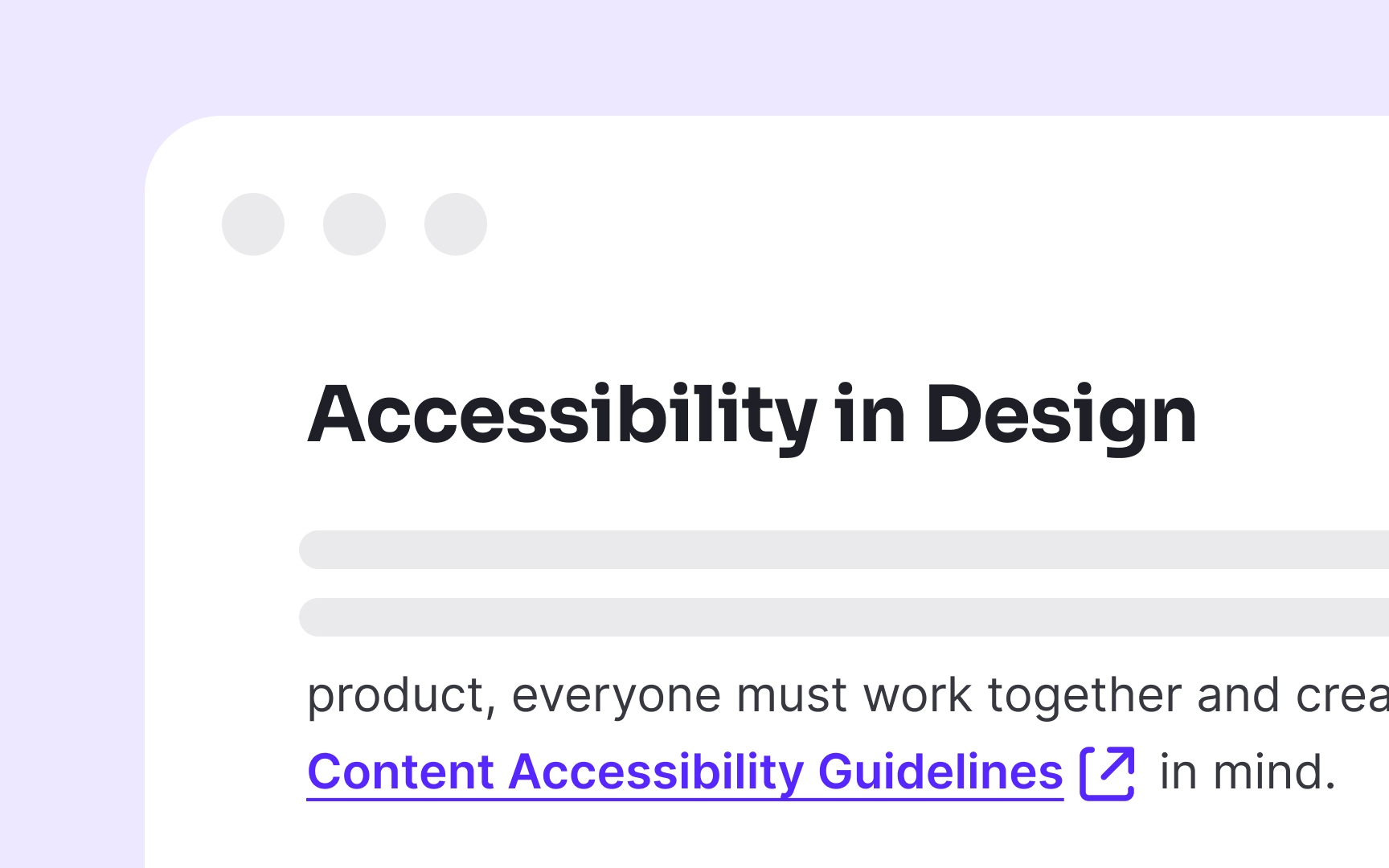
Links that open in new windows or tabs can disorient users, particularly those relying on assistive technologies. When a new window opens unexpectedly, screen reader users may become confused as the back button doesn't function as expected, and they lose their place in the original document.
The best practice is to avoid opening links in new windows unless absolutely necessary. When you must use this behavior, such as for external links on banking sites or when users might lose unsaved form data, always clearly indicate this behavior beforehand.
There are several effective methods to communicate when links open new windows:
- Add "(opens in new window)" or "(new tab)" at the end of the link text
- Use appropriate ARIA attributes (aria-label="Link name (opens in new window)")
- Add a distinctive icon with proper alternative text
When including this information, place it at the end of the link text to avoid repetition by screen readers. For example, use "Accessibility Guidelines (new window)" rather than "New window: Accessibility Guidelines."
Specify link destination
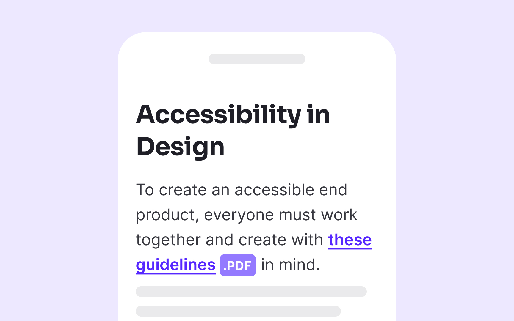
When linking to non-HTML content like documents or media files, explicitly indicate the file type and size in the link text or immediately after it. For example, use "Annual Report (PDF, 2.5MB)" rather than just "Annual Report" when linking to downloadable files. This practice helps users anticipate potentially lengthy downloads or the need for specific software to open the content.
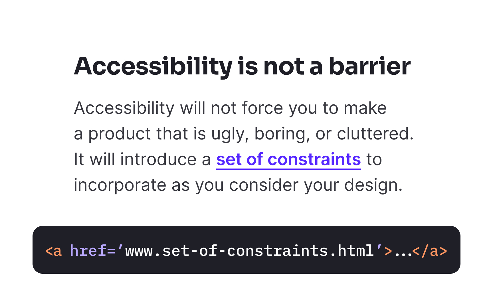
Never use raw URLs as link text, even if they seem self-explanatory. Screen readers read URLs character by character, turning www.example.com into a tedious "double-u double-u double-u dot example dot com." This creates a frustrating experience for screen reader users. Instead, use descriptive text that explains the destination, such as "Example Company Website" or "Product Documentation."
When your links lead to actions rather than destinations, make this clear through your link text. For instance, use "Subscribe to newsletter" instead of "Newsletter" to indicate an action will occur rather than simply navigating to a page.
Pro Tip! If you're using image-based icons to indicate file extension, add alt text to make it accessible to screen reader users.
Make your links recognizable
If links look too similar to the surrounding text, most users will overlook them, especially when scanning content quickly. Relying on color alone to indicate links can also make them invisible to users with color blindness or low vision.
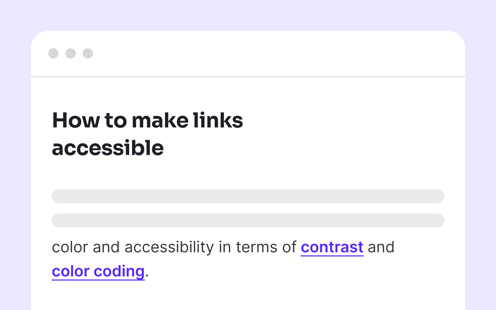
To ensure links are easy to identify, use multiple visual cues. Underlining is one of the most effective and universally recognized ways to signal a link. It not only makes links stand out but also helps users spot important information while skimming. You can reinforce this by using a distinct color that meets contrast requirements, but don’t rely on color alone. Recognizable links support better accessibility and help all users navigate content more efficiently.
Use consistent voice and tone
Your chosen brand voice should extend to every interactive element, including links. If your overall content uses a friendly, conversational tone, your links should match this approach rather than suddenly switching to formal or technical language. Similarly, if your brand voice is professional and authoritative, maintain that same character in your link text.
While maintaining brand consistency, link text must still prioritize clarity and descriptiveness. Replace generic phrases like "Learn more" or "Click here" with specific, action-oriented text that communicates both destination and purpose while reflecting your brand voice. For example, a playful brand might use "Dive into our color theory guide" while a more professional one could use "Explore our comprehensive color theory guide."
Pro Tip! Create voice and tone guidelines specifically for interactive elements like links, buttons, and form labels to ensure consistency while maintaining accessibility.
Ensure that controls have focus states
Focus indicators serve as the visual equivalent of a mouse pointer for keyboard users. Without clear focus states, keyboard-only users face an impossible challenge, they can't see which element they're currently interacting with, making navigation essentially invisible.
Every interactive element, including links, buttons, form controls, and custom components, must display a visible focus indicator when selected via keyboard. This visual cue should be distinctive enough to stand out against both the element itself and the surrounding content. Standard browsers provide default focus indicators (usually a blue outline or dotted border), but these often lack sufficient contrast or visibility.
Design focus states with intention rather than relying on browser defaults. The WCAG 2.2 requirements specify that focus indicators must have a minimum contrast ratio of 3:1 against adjacent colors and be at least as visible as the default browser indicators.[1]
Use the <href> attribute for links
For a link to be truly accessible, it must be properly coded with an href attribute. Screen readers and other assistive technologies specifically look for this attribute to identify and announce elements as links to users.
Many developers create "fake" links using non-link elements like <div> or <span> with click handlers or by using anchor tags without href attributes. These approaches create major accessibility barriers because assistive technologies cannot identify these elements as interactive links. Without the href attribute, screen readers will not announce the element as a link, keyboard users cannot tab to it, and browsers don't display the correct cursor.
Pro Tip! There's no need to use the words "link" or "links to" in your link text, as screen readers tell users when they encounter a link.
Provide links to help consistently
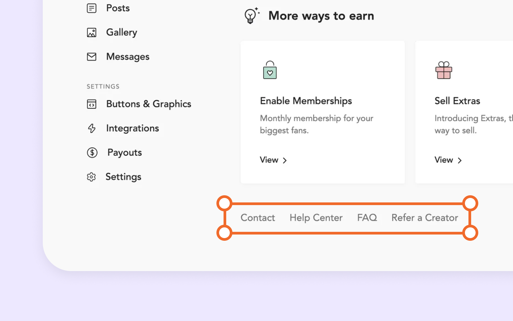
Help links serve as essential navigation elements for users who encounter difficulties. These include links to FAQs, documentation, contact forms, knowledge bases, support chats, and other assistance mechanisms. Their consistent and predictable placement is particularly crucial for users with cognitive disabilities, low digital literacy, or those using assistive technologies.
Common placement patterns include:
- Persistent footer links to support resources
- Help sections within the primary navigation
- Utility navigation areas in the header
- Consistent help icons in fixed positions (like bottom-right corners)
Whatever pattern you choose, maintain it across all pages within your product. When users learn where to find help on one page, that same knowledge should apply to all other pages they visit.


