


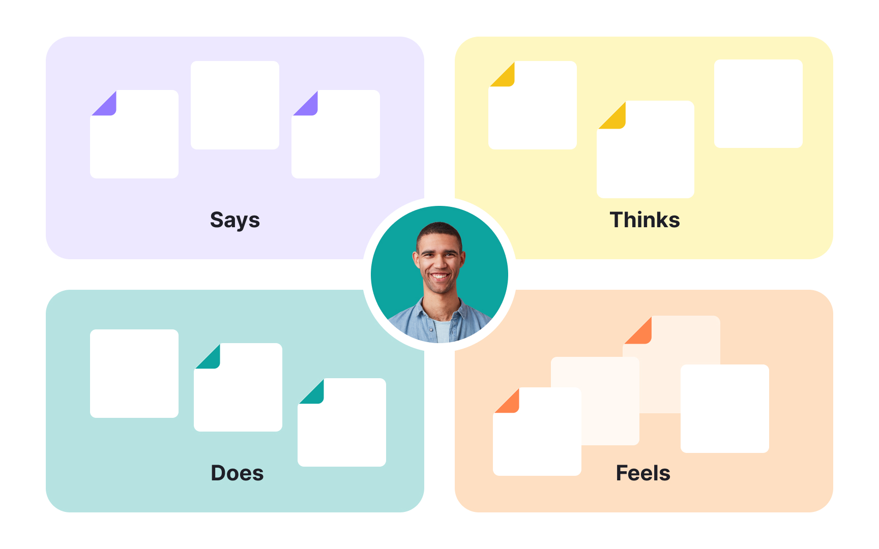
An empathy map is a research synthesis tool that organizes qualitative findings into 4 quadrants: what users say, think, do, and feel. The format was designed to make user insight accessible to an entire team, not just the researchers who ran the sessions. By capturing what is currently known about users in a single visual, empathy maps help teams build shared understanding before moving into ideation or design decisions.
The tool is most useful when it surfaces tension. What users say they do often differs from what they actually do. What they think privately often differs from what they say out loud. These gaps between quadrants are where the most valuable design opportunities tend to sit, and they are easy to miss when findings stay in raw notes or lengthy reports.
Empathy maps also serve as a diagnostic for research gaps. Quadrants that are sparse or filled with assumptions signal where more research is needed before a team can design confidently. This lesson covers the 4 quadrants in detail, how to create an empathy map from qualitative research data, and when alternative formats are better suited to the situation.
What's an empathy map?


An empathy map is a collaborative visualization that captures what a team knows about a user's behaviors, thoughts, and emotions. It's not a timeline or a journey. It's a snapshot that gives teams a shared foundation for design decisions.
Traditional empathy maps divide into 4 quadrants with the user or persona at the center:
- Says captures direct quotes from research.
- Thinks surfaces what users might be processing but not saying out loud.
- Does records observable behaviors.
- Feels notes their emotional state.
Empathy maps come in two forms. A one-user map reflects a specific person, usually built from a single interview or a diary study entry. An aggregated map synthesizes patterns across multiple users who share similar behaviors, and it's often a useful starting point before creating personas.
Why empathy maps matter
Empathy maps are most useful at the start of a design project, before requirements are defined and concepting begins. That's when teams most need a shared, grounded picture of the user to avoid defaulting to assumptions.
Both the process of building a map and the finished artifact offer value:
- Analyze qualitative research. Empathy maps help teams make sense of research notes, interview transcripts, and survey answers, and surface gaps in what they still need to find out.
- Communicate users to the team. The finished map gives everyone, including stakeholders, a visual reference for user attitudes and behaviors that can protect design decisions from bias.
- Collect data directly from users. When filled in by users themselves after a session, an empathy map can act as a secondary data source and a compact summary of that research.[1]
Pro Tip! Keep empathy maps up-to-date by revising and adjusting them as you do more research.
The "Says" quadrant in empathy mapping
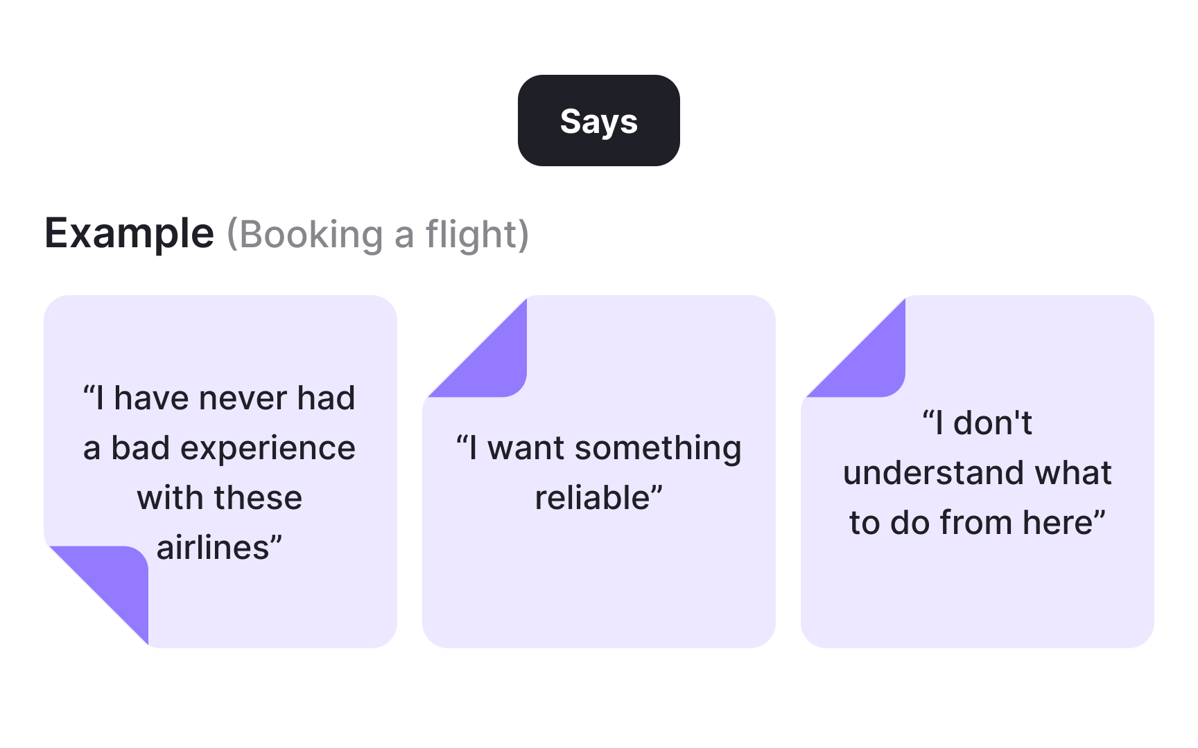
The Says quadrant captures what users say out loud during interviews or usability studies. The goal is to fill it with verbatim quotes pulled directly from your research, not paraphrased summaries.
Direct quotes are valuable because they reflect exactly what users expressed, without interpretation. A researcher listening to a participant say "I don't understand what to do from here" gets something more actionable than a note that reads "user was confused."
Some examples of what goes in Says:
- "I am loyal to Delta because I never have a bad experience."
- "I want something reliable."
- "I don't understand what to do from here."
The “Thinks” quadrant in empathy mapping

The Thinks quadrant captures what users are thinking throughout the experience, based on your qualitative research. The key question to ask: what occupies users' minds, and what matters most to them in this context?
Thinks can overlap with Says. A user might say "this is taking too much time" and think it simultaneously. But the more revealing entries are the ones users would never say out loud. Users might hold back because they feel self-conscious, want to seem polite, or are unsure whether their frustration is valid.
You won't get this data directly. Instead, infer it from behavioral cues: hesitations, facial expressions, body language, and moments where what users do contradicts what they say. Interview techniques like think-aloud protocols, where users narrate their thought process in real time, can also surface thoughts that would otherwise stay hidden.
Some examples of what goes in Thinks:
- "This is really annoying."
- "Am I dumb for not understanding this?"
- "This is taking too much time."
The “Does” quadrant in empathy mapping
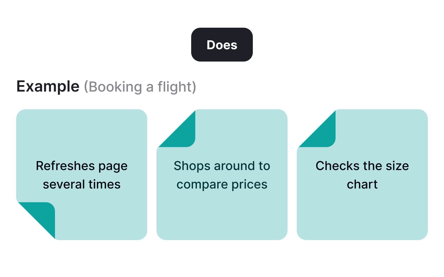
The Does quadrant captures the actions users take, based on what you observe or uncover in research. The goal is concrete, physical behavior: what users actually do, not what they say they do.
Some examples of what goes in Does:
Pay attention to moments where actions contradict words. A user might express satisfaction but repeatedly backtrack through a flow, or complain about a feature they keep using anyway. These contradictions are some of the most valuable things an empathy map can surface. They point to unmet needs and design tensions that users themselves may not be able to articulate.
The “Feels” quadrant in empathy mapping
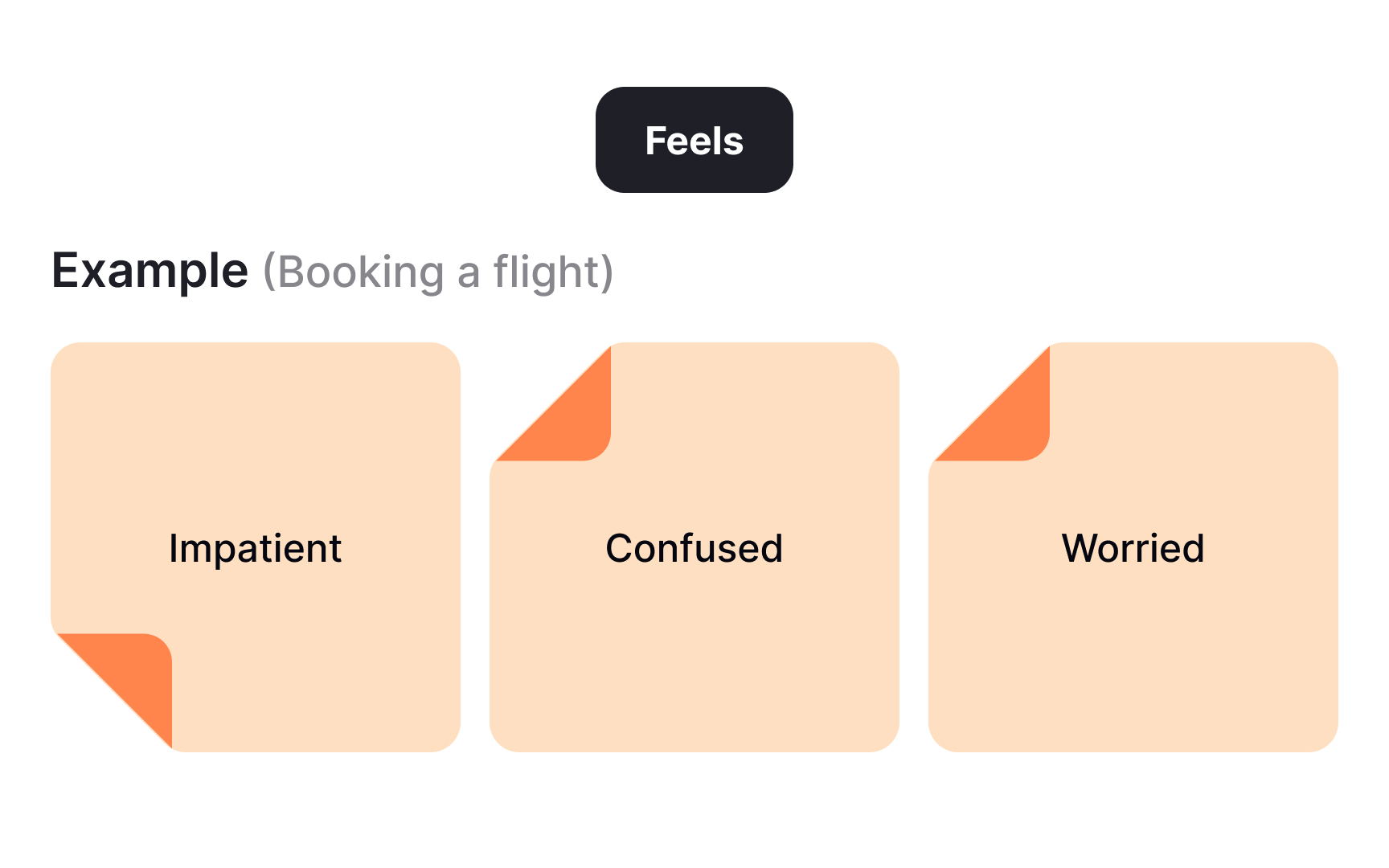
The Feels quadrant captures the user's emotional state during the experience. Each entry typically pairs an emotion with a short sentence for context, making it clear what triggered the feeling.
To fill this quadrant, ask: what worries users, what frustrates them, and what makes them feel confident or excited? Emotions are inferred from research, not stated outright, so look for cues in tone, word choice, and behavior.
Some examples of what goes in Feels:
- Impatient because the pages load too slowly
- Confused by too many contradictory prices
- Worried about making a mistake
How to create an empathy map
While you can create an empathy map solo, doing it with a team brings in multiple perspectives and builds shared ownership of the findings.
Follow these 5 steps:
- Define your scope and goals. Decide who the user is and what task or experience you are mapping.
- Gather your materials. Work on a whiteboard with sticky notes and markers, or use a remote collaboration tool like Miro or FigJam.
- Collect your data. Run interviews, direct observations, contextual inquiries, or diary studies. Bring all findings to the team before you start mapping.
- Generate ideas as a group. Have everyone read through the data and add sticky notes to each quadrant independently.
- Cluster and name themes. Bring similar notes together, label the clusters, and discuss what patterns emerge.
Once the map is complete, digitize it and add context: include the user or persona, any open questions, and the date and version number.
When to use alternative empathy map formats
The 4-quadrant format works well for initial analysis, but it's not the only option. If you need more detail, add quadrants like Goals, Pains, and Gains to capture what the standard map leaves out.
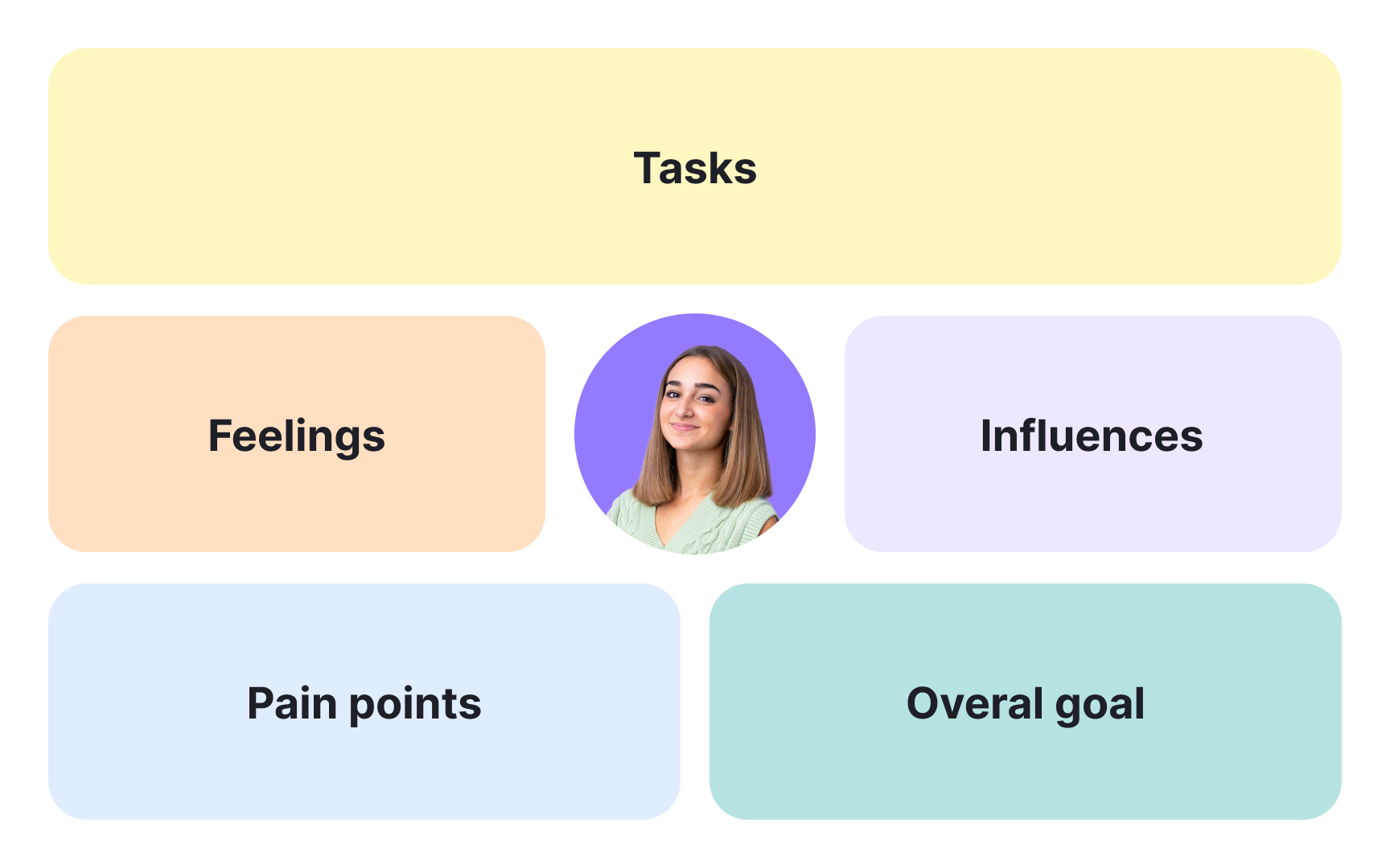
For UX-focused workshops, the format adapted by Paul Boag, a UX consultant and author with over 30 years in the field, is worth considering. Boag found the traditional map too generic for design work and built a version around UX-specific questions:
- Feelings: How do users feel about the experience? What matters to them?
- Tasks: What are users trying to complete?
- Influences: What people, places, or things shape how users act?
- Pain points: What obstacles, fears, or frustrations are users hoping to overcome?
- Goals: What is users' ultimate goal, and what are they trying to achieve?
The broader principle holds: empathy maps are flexible tools. Adapt the format to fit your research goals rather than using it as a fixed template.[2]
Topics
References
- Empathy Mapping: The First Step in Design Thinking | Nielsen Norman Group
- Adapting empathy maps for UX design | Paul Boag - User Experience Advice


