


Getting a user to the payment page is the result of a lot of work. It is the final step in a journey that started with acquisition, moved through consideration, and arrived at commitment. Losing them here, because of a confusing layout or an unclear error message, is a costly mistake.
Payment pages carry a unique design challenge: they need to feel both frictionless and secure. Users are handing over sensitive information, and the design has to make them feel confident that the right thing is happening. Clear field labels, recognizable payment options, honest feedback on errors, and a straightforward confirmation flow all play a role.
The difference between a payment page that works and one that does not is rarely dramatic. It is usually a handful of small decisions that add up to either trust or doubt.
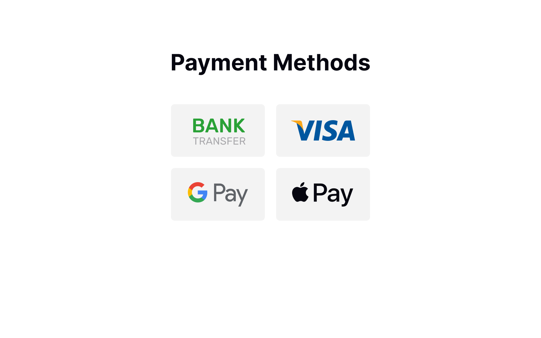
Offer payment methods
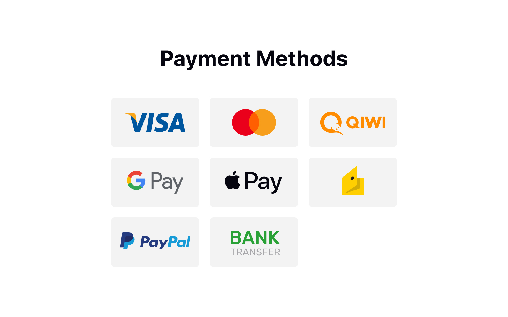


According to studies by the Baymard Institute, your website or mobile app should provide as many payment methods as you can if you sell internationally and don't want your users to have any trouble paying for your product/service.[1] However, it's true that seeing too many unnecessary payment options confuses users and causes choice paralysis. So what's the best solution?
Learn your audience and provide a range of payment options that are relevant to them. For example, credit cards are becoming less dominant in many countries like Germany, Russia, and China. If you don't sell to the UK, there's no point in offering BACS Direct Debit payment options.
Request payment details
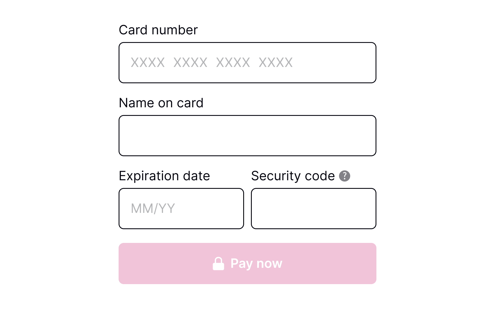
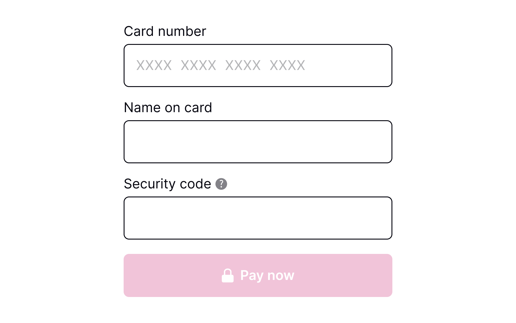
When requesting payment information from users, it's important to ensure that all relevant text inputs are provided and that their size is appropriate for the details being entered. Some inputs may require users to provide unfamiliar or unclear information, in which case it's helpful to offer a brief but informative explanation. One effective way to do this is to include an information icon that users can click for more details.
Pro Tip! In a product where users may make repeat purchases and saved payment methods are available, consider a flow that allows users to add/remove payment methods.
Validate payment details
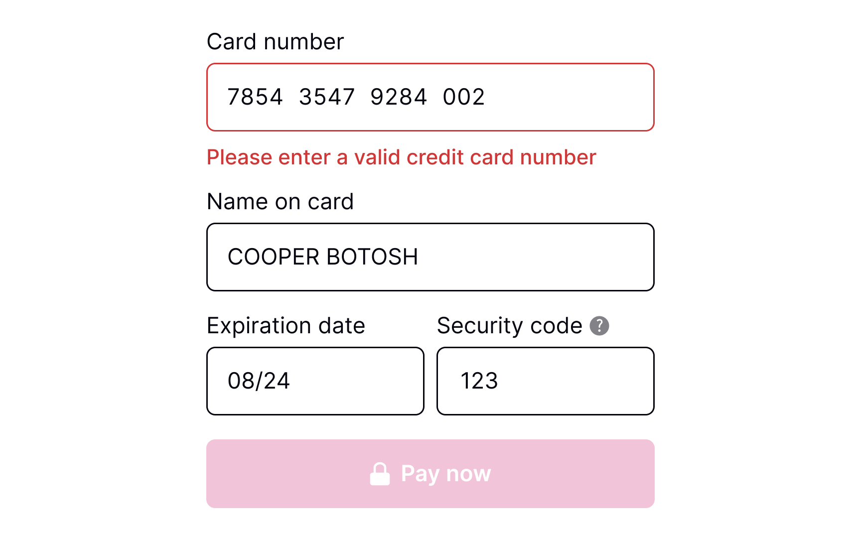
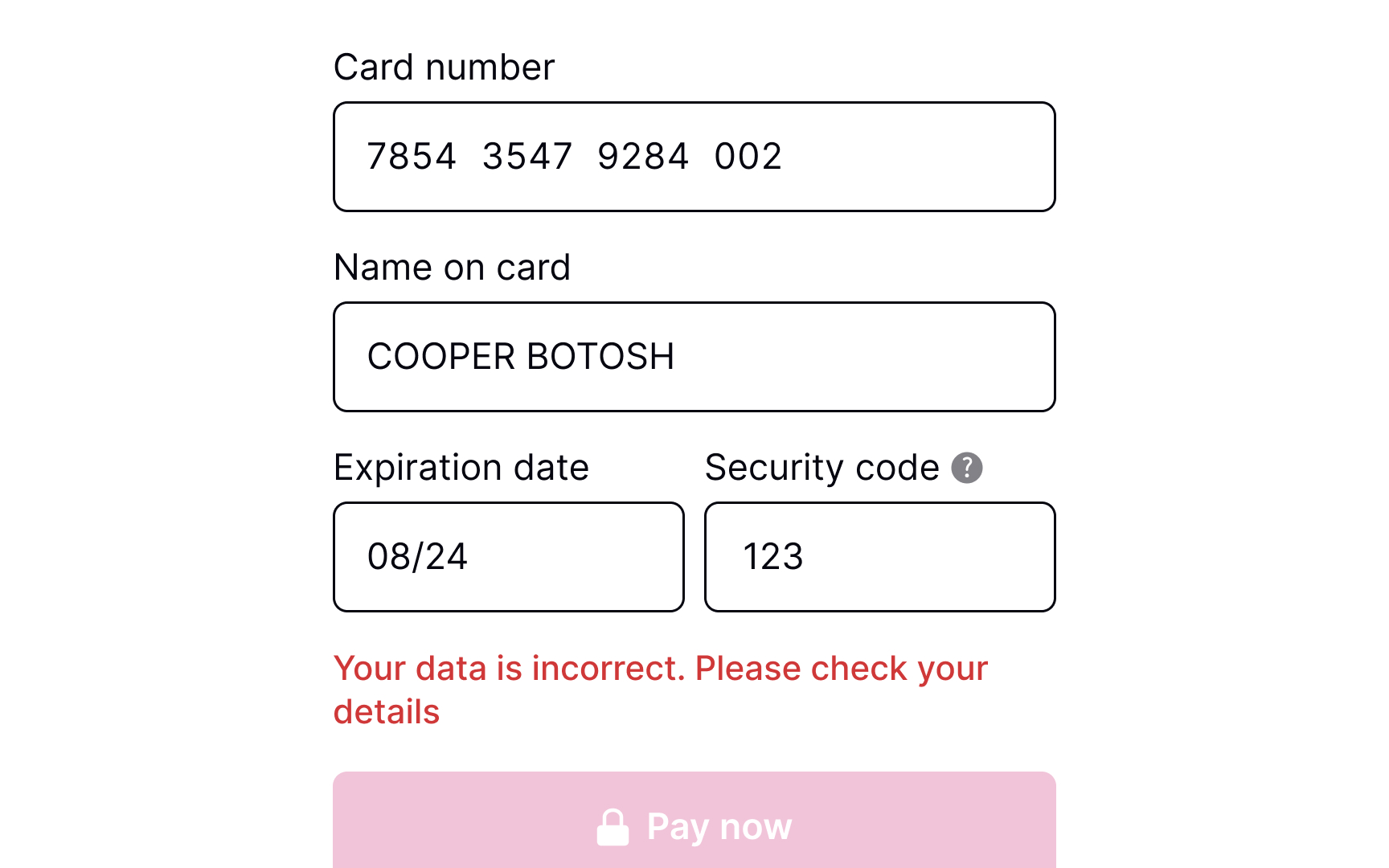
Users are humans, and they make mistakes, especially when entering payment details on mobile and using one hand. It's vital to consider adding validation before users submit their payment details. Users mistype numbers, or the card may have expired — so make sure to address these numerous error states.
To make users' lives a bit easier, consider adding input masks — i.e., constraints on the input text. Masks help ensure that numbers or strings meet the expected format, prevent any unnecessary errors, and reduce friction prior to system validation.
Show payment processing
Payments may not be processed instantly and can take a few seconds or even a few minutes. Therefore, it's crucial to add a loading page to reassure users and alleviate any concerns they may have about their payment. By displaying the current status of the system, users are more likely to trust the payment process and feel in control of the transaction. This can help increase credibility and improve the overall user experience.
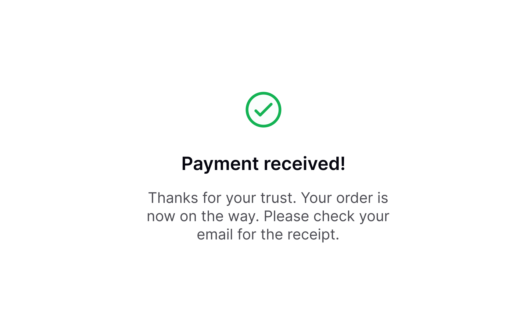
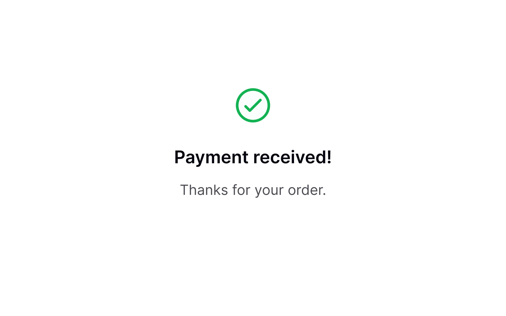
Confirmation of payment processed successfully
Once users have submitted their payment, a success message should appear, confirming that the payment has been processed and the funds have been received. This provides a sense of satisfaction and completion to users. To ensure that the success notification is effective, it should be clearly visible and given enough time to be read by users.
Outline next steps
After users have made a payment, it's important not to give the impression that your job is done. Instead, take the opportunity to express gratitude and offer information about the next steps if needed. For example, if they have purchased a product, thank them for choosing your brand and provide them with shipping updates. If users have signed up for a subscription, provide them with a link to start using the product or suggest that they check their email to activate the subscription.
This helps build a positive relationship with users and ensures that they are fully informed about their purchase.
Topics
References
- Payment Method UX: How to Design the Payment Selector | Baymard Institute


