


.svg)
Choosing the right selection control is only half the job. How you design it determines whether users move through a form smoothly or stumble. Sizing, alignment, positioning, and defaults all influence usability in ways that aren't always obvious until something feels off.
A form that looks fine can still frustrate users if the details aren't considered. These best practices exist because small inconsistencies add up. They slow users down, create errors, and erode trust. Getting the fundamentals right means user interactions that feel effortless, even when you're asking for a lot of input.
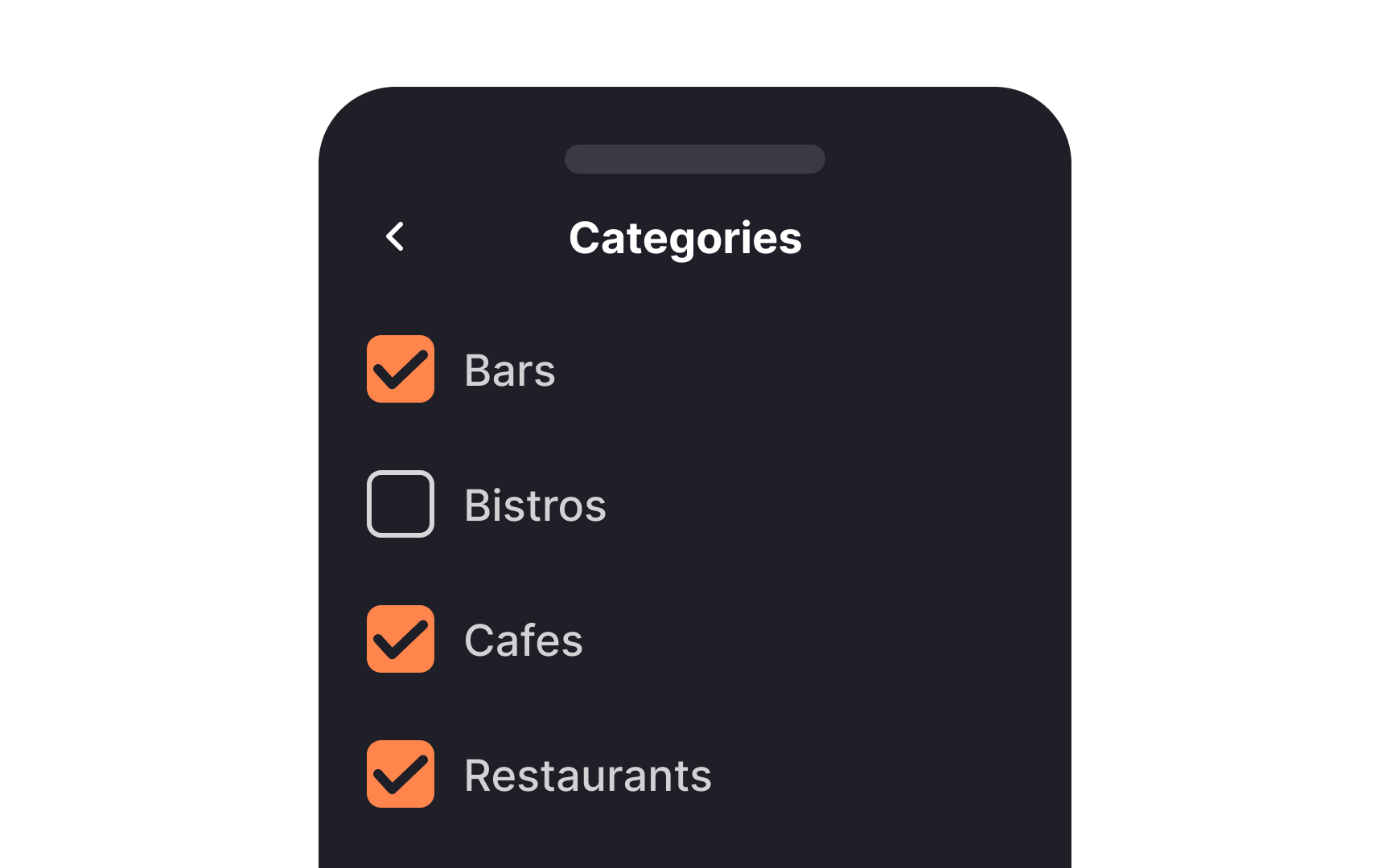
Keep controls' sizing consistent


Uniformity in the size of selection controls like buttons and checkboxes is crucial for an unbiased, user-friendly experience. When you vary the sizes, you run the risk of subtly pushing users towards specific options, which can erode trust.
Although one goal of UX design is to guide user actions, it's essential to do this transparently and ethically. Steering behavior should never involve trickery but should aim to help users make informed and easy choices.
Improve subhead alignment for better scannability
Aligning your subheads with the actual buttons or checkboxes, rather than their labels, can improve both aesthetics and usability. This subtle alignment supports better scannability, guiding the eye naturally as users browse through options. It streamlines the user flow and makes the interface feel more organized and intuitive.
Maintain text alignment for better scannability
When aligning labels, especially those that are more than one line, treat selection controls as you would bullet points. Text should be aligned together, with the selection controls to one side. This makes the text easier to scan and makes the selection controls themselves stand out better.
Maintain uniform alignment for wrapped text
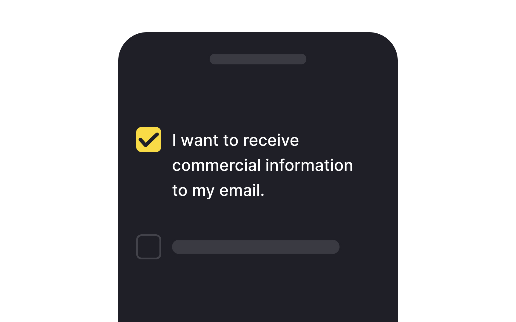
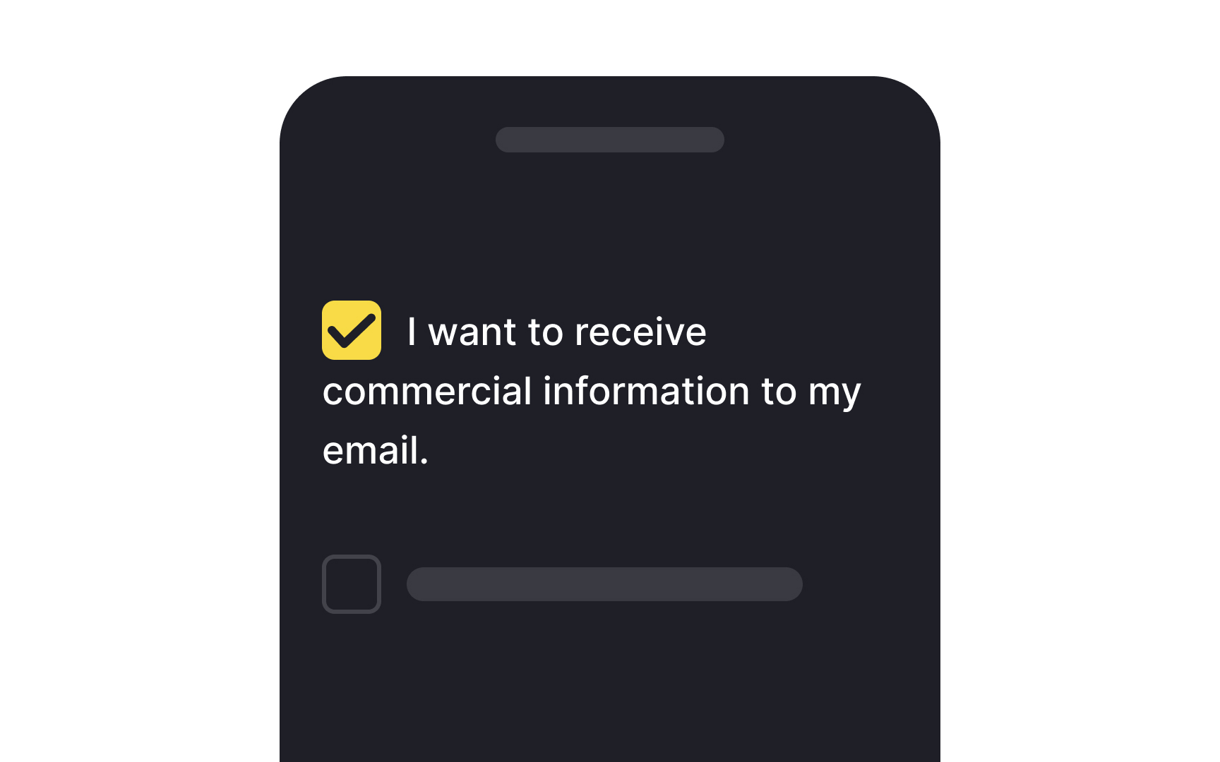
When it comes to designing interfaces, text readability next to selection controls like checkboxes or radio buttons shouldn't be an afterthought. Making text easy to read can significantly accelerate the user journey, enhancing overall satisfaction.
One crucial tip is to maintain consistent alignment for wrapped text. If your text spans multiple lines, each line should align with the one above. This approach not only boosts legibility but also ensures that key information won't be missed. Plus, it draws the right kind of attention to the selection controls themselves, making them more noticeable.
Keep the traditional shapes for selection controls
Sticking to familiar UI patterns is crucial when designing selection controls like checkboxes and radio buttons. It's because users come with built-in expectations. For instance, radio buttons are generally round, and checkboxes are square. You could tweak their styles to fit your design theme, but altering their fundamental shapes can lead to user confusion.
The idea isn't to stifle creativity but to maintain a balance between innovation and usability. So, feel free to play with colors, borders, or shadows, but keeping the basic shapes intact will help you provide a user-friendly and intuitive experience.
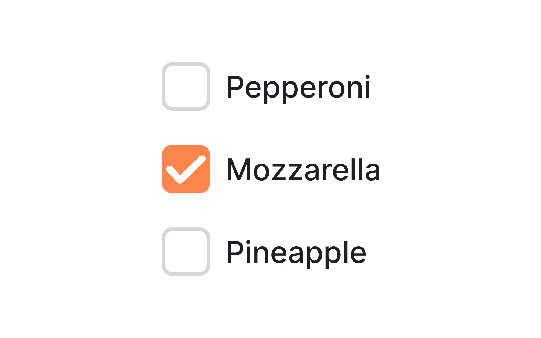
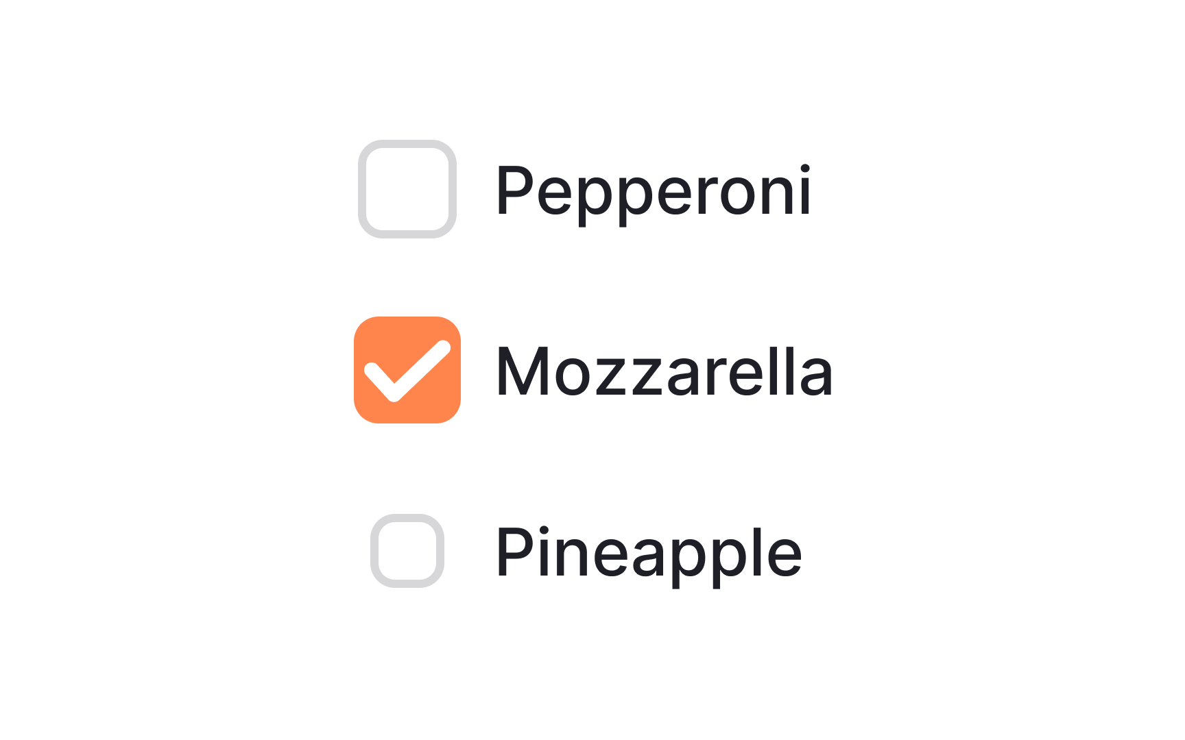
Use checkboxes for multiple related options
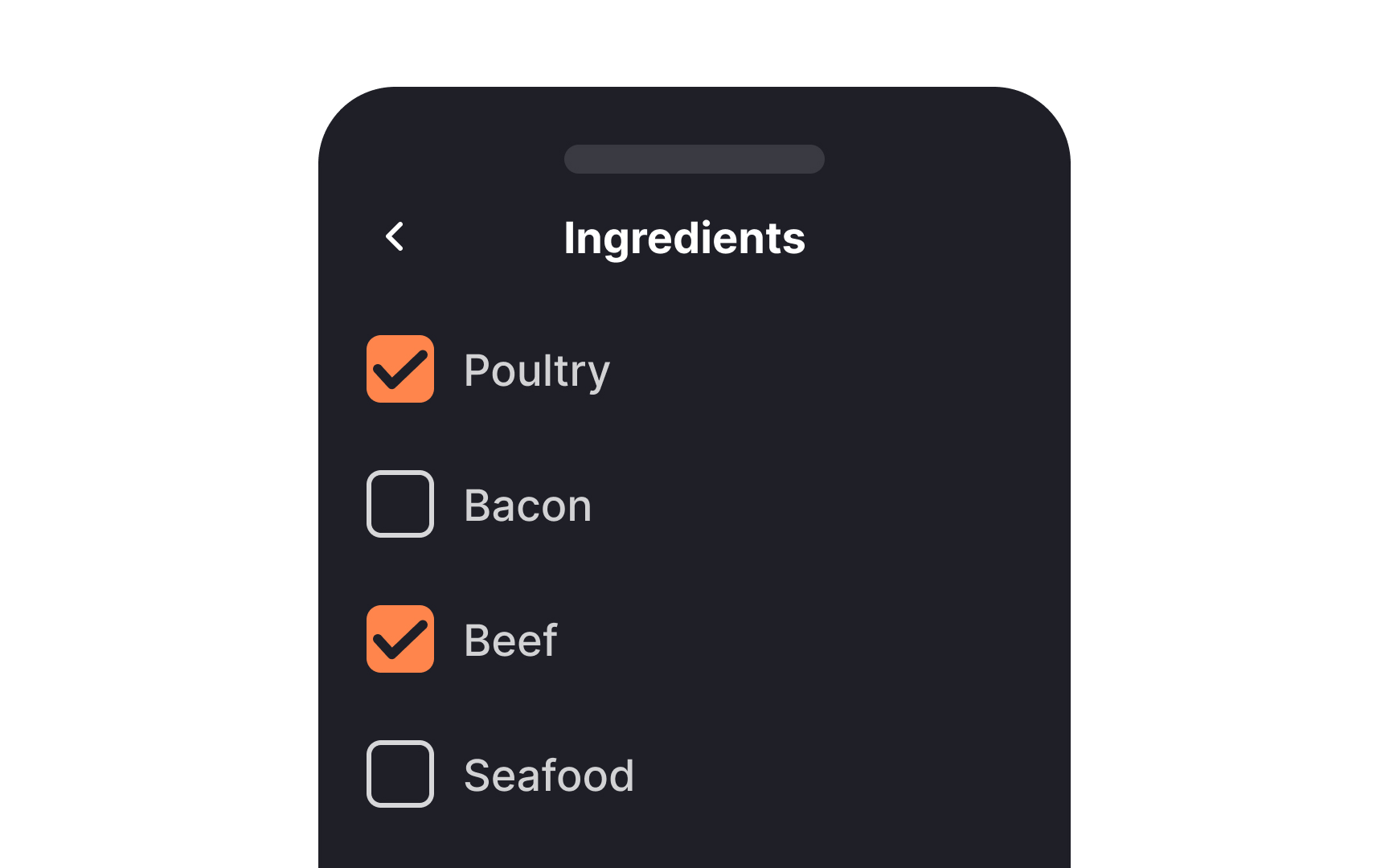
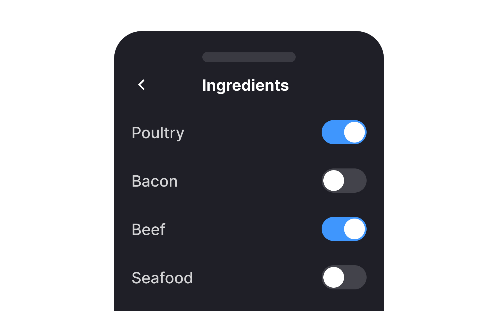
When a list contains multiple related options, checkboxes create a better user experience than switches. Checkboxes make the options appear more closely linked and saves space in the UI. Switches, on the other hand, are better for options that should immediately be turned on or off, and aren’t necessarily closely related to one another.[1]
Align controls with the labels


When dealing with checkboxes next to multiline labels, it's best to align the checkbox with the first line of the label text. This boosts readability and ensures a smoother visual flow. If labels have varying lengths, aligning to the first line creates a more consistent and less cluttered look, making it easier for users to scan the options and make selections.
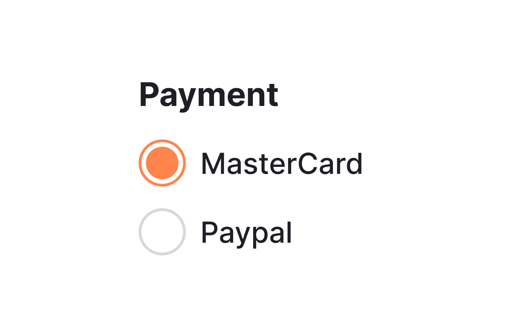
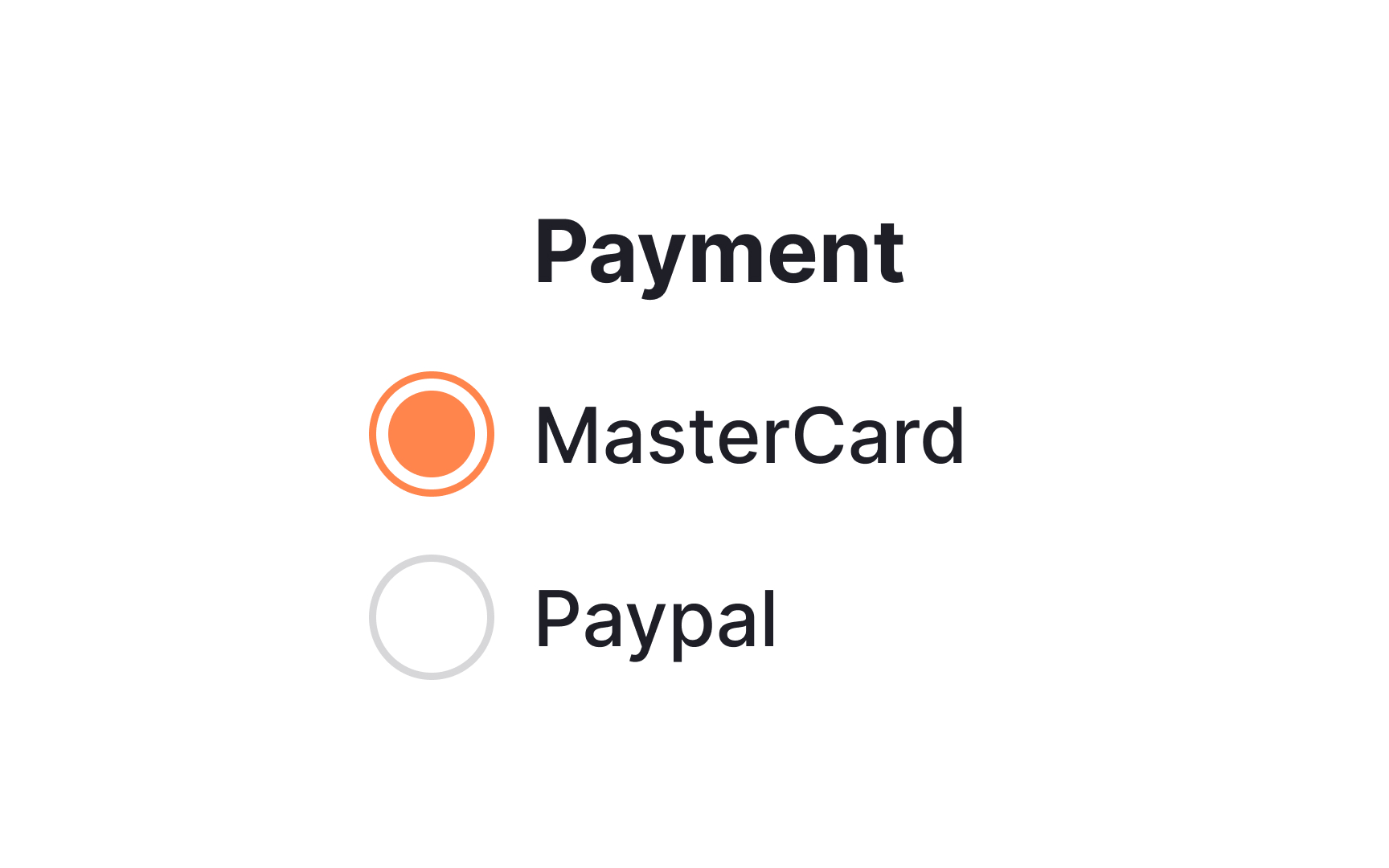
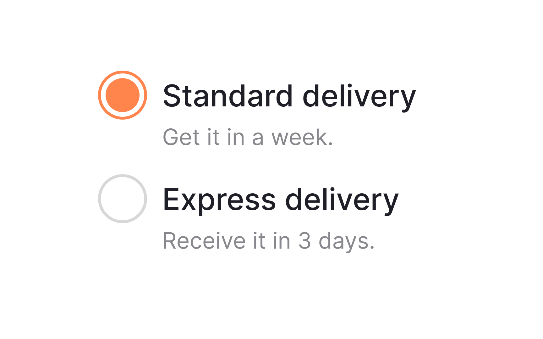
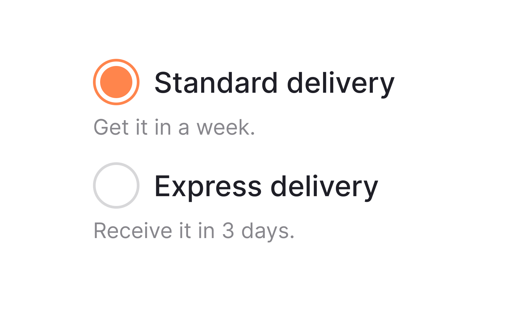
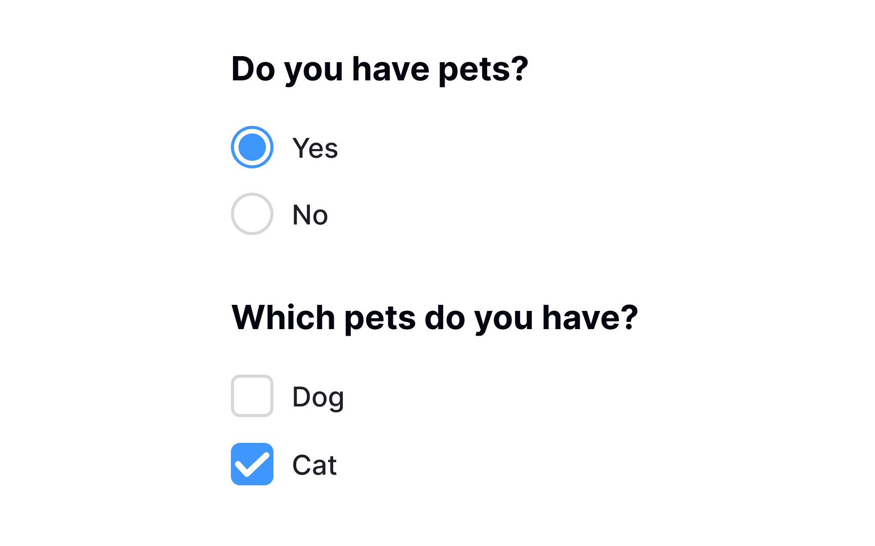
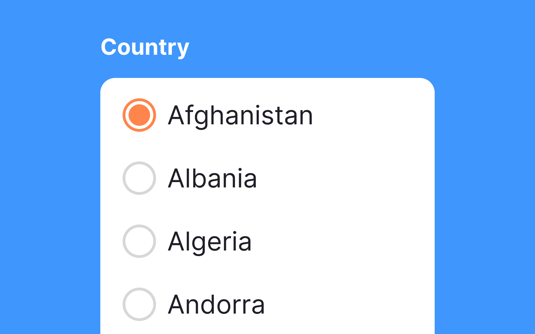
Set default selections
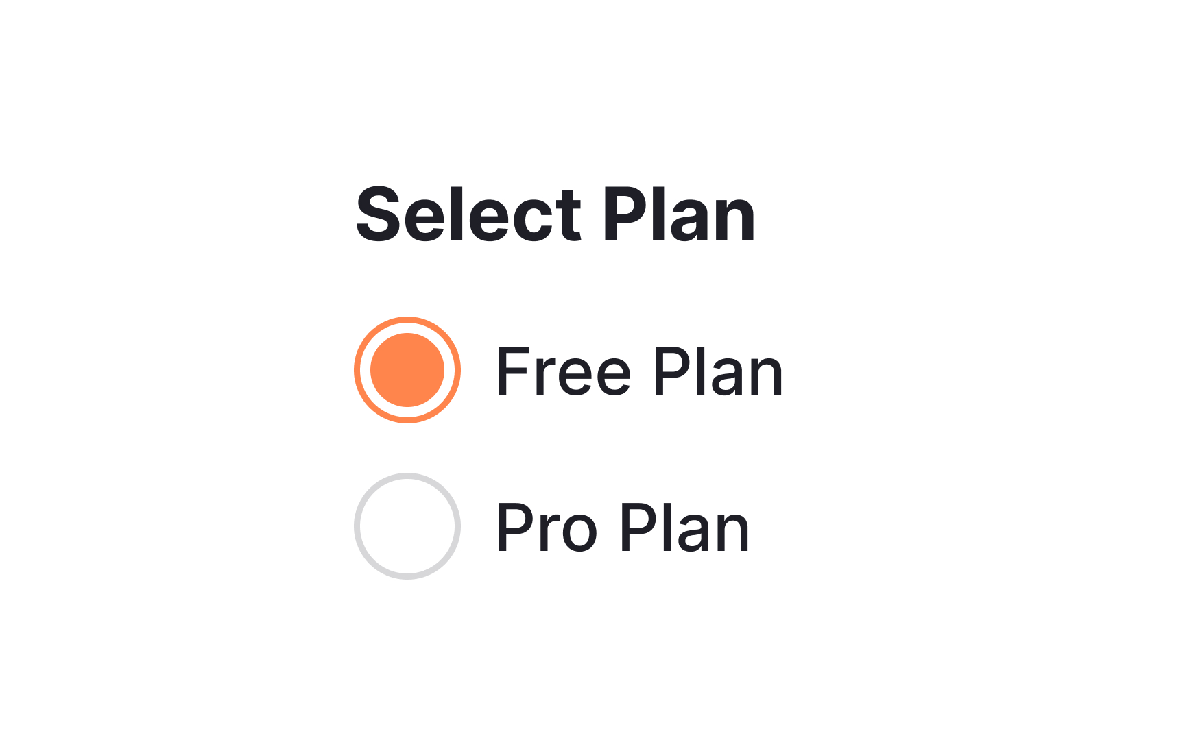
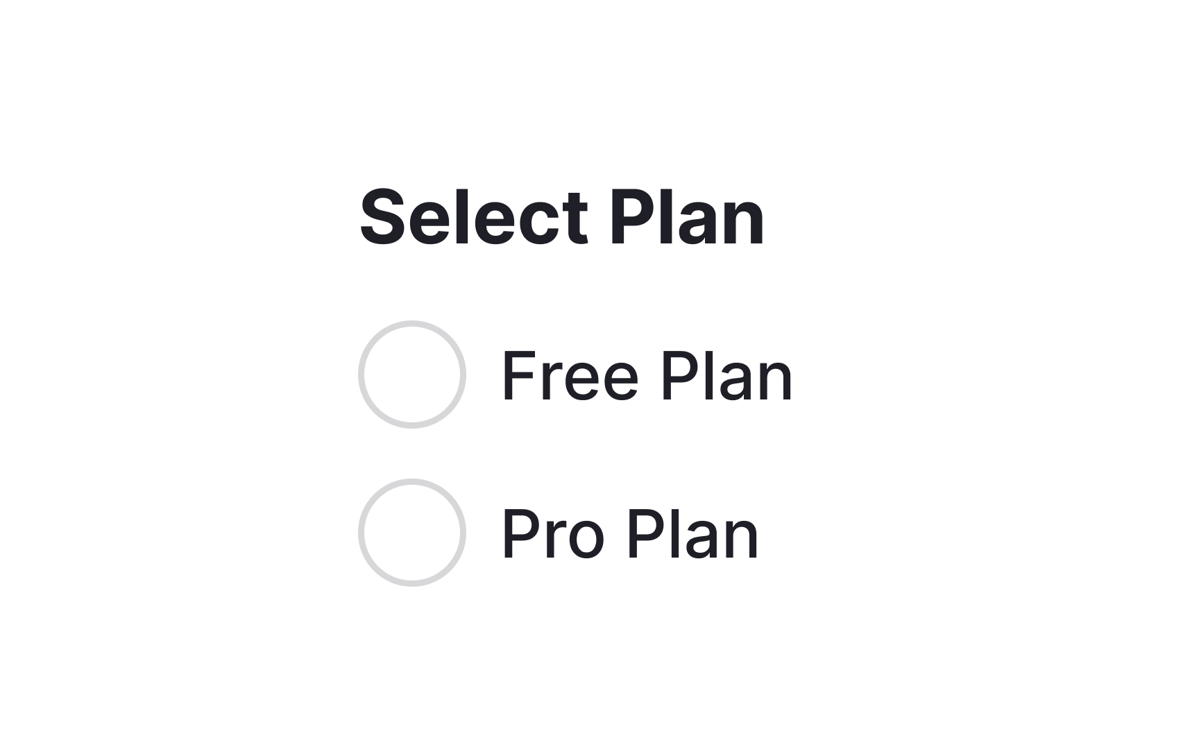
Radio buttons, particularly if they’re for a required field, should always have a selected option.[2] A default selection helps avoid the dreaded “no options selected” error message and can encourage users to make a particular choice.
Offer users more options in an organized manner
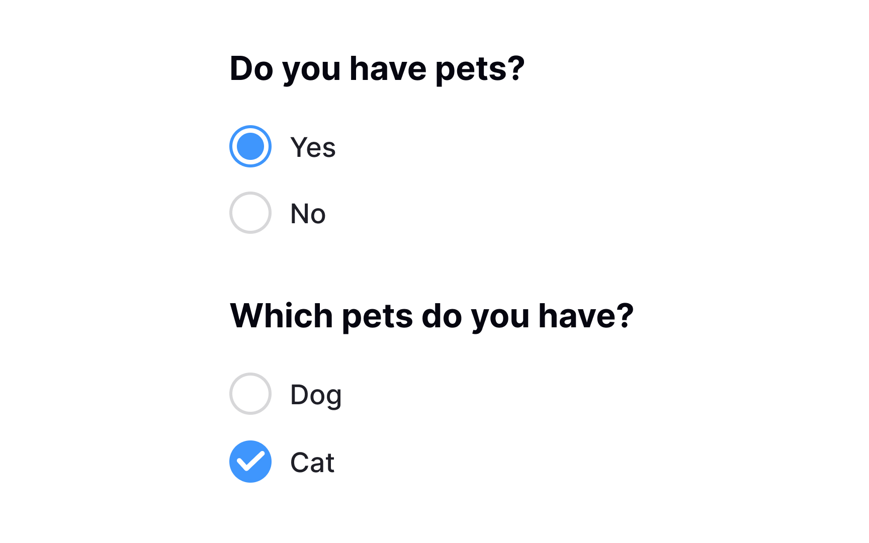
Nested options are essentially sub-options that fall under a main selection. Think of them as branches growing from a main tree trunk. In UI design, checkboxes are commonly used to represent these nested options. When users select a primary checkbox, additional related options may appear below it, often indented to visually signify their relationship to the main choice.
This is a tidy and intuitive way to offer users more control without overwhelming them with choices upfront. By using checkboxes for nested options, designers allow users to select multiple sub-options while still keeping the interface streamlined and user-friendly.
Position controls before labels for greater efficiency
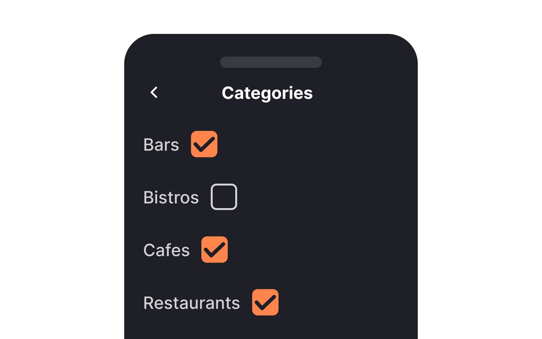
In left-to-right languages, controls like checkboxes or radio buttons should generally be placed before their text labels. This setup not only enhances the visual appeal but also streamlines the UI for a more orderly experience.
Positioning controls this way also expedites user interaction, as it allows users to click through multiple controls in quick succession with minimal mouse or finger movement. Adhering to this pattern makes the interface predictable, helping users complete tasks more efficiently.
Use dropdowns for lengthy lists of choices
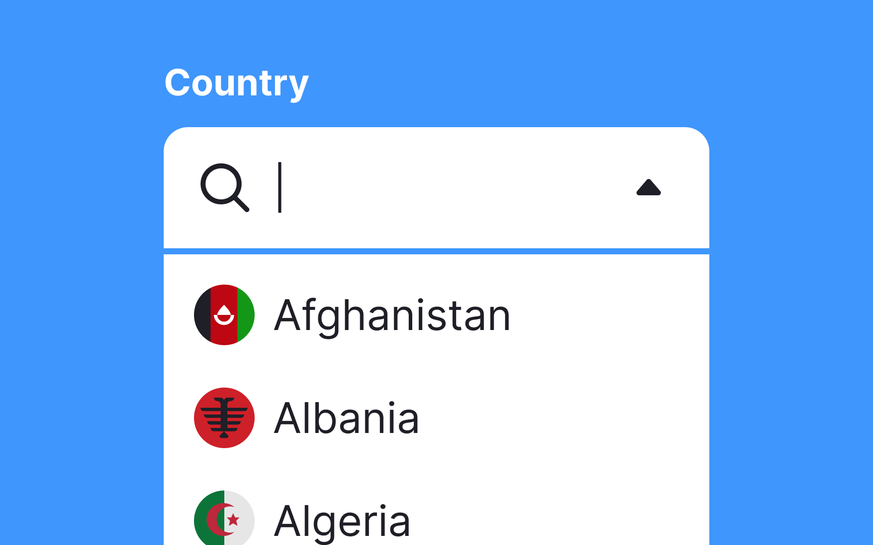
When dealing with extensive lists like countries, languages, or sports teams, it's essential to use the right selection control to improve the user experience. Dropdown menus are a smart choice for these lengthy lists.
They not only conserve valuable screen space but also make the UI cleaner and more organized. By using dropdowns, you simplify the interface, letting users navigate through a myriad of options in a straightforward manner.
Additionally, you can implement search into long dropdown lists so users won't need to scroll as much. This choice minimizes cognitive load and speeds up decision-making, enhancing the overall user interaction.
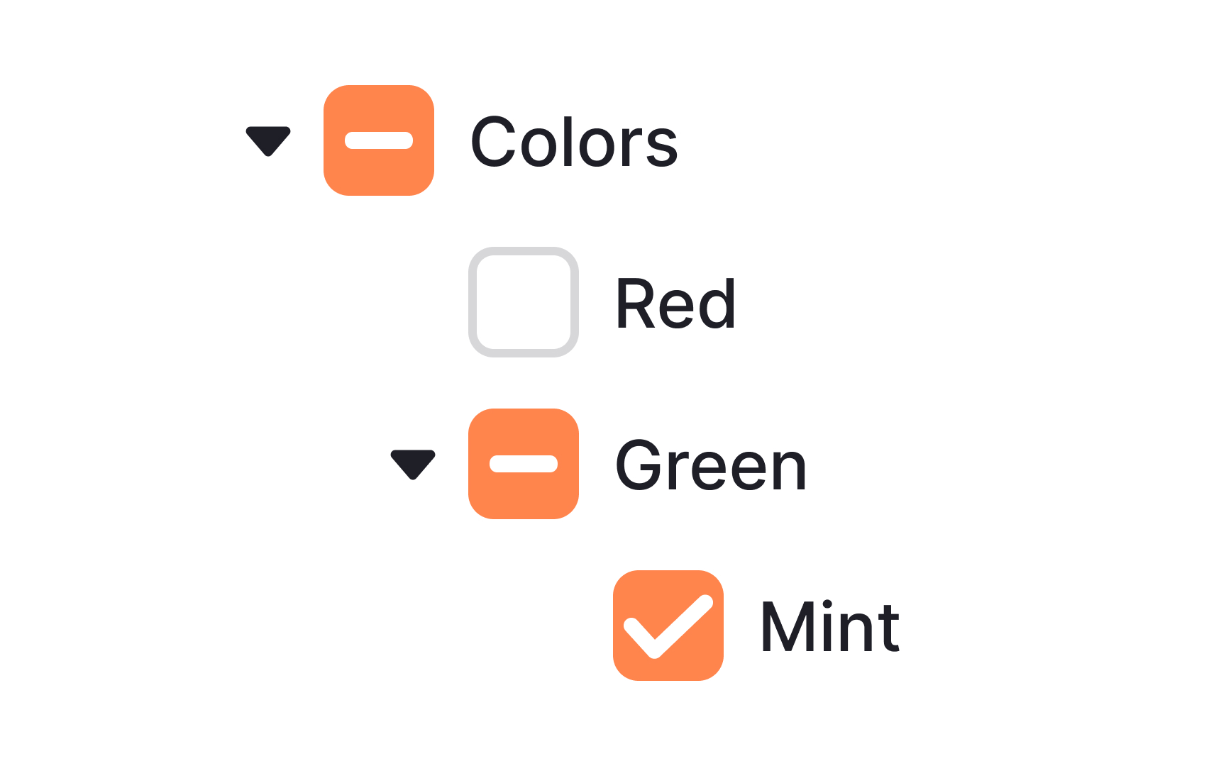
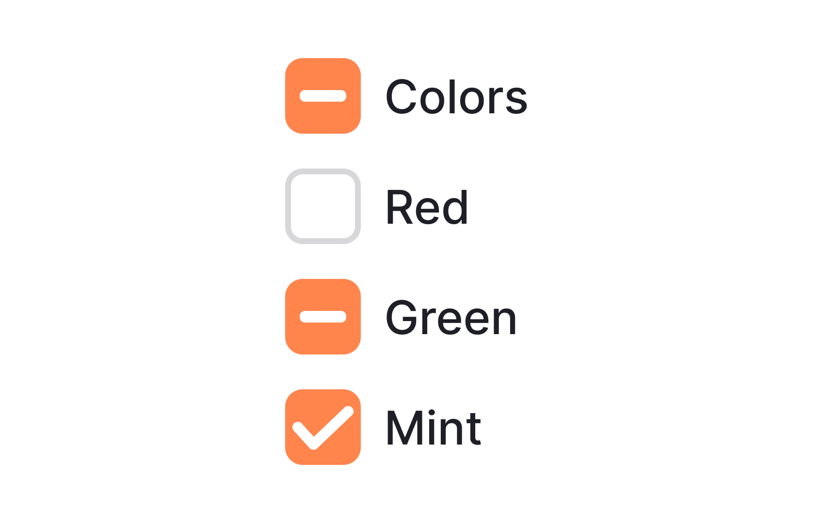
Indicate an indeterminate state
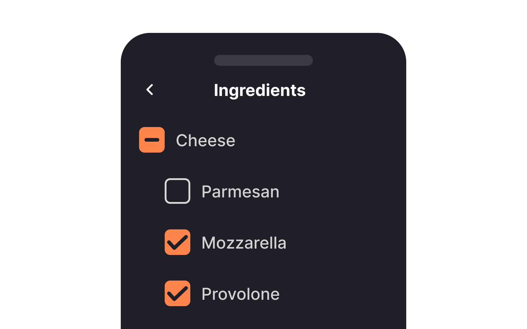

When you're dealing with multi-level lists using checkboxes, you're likely to encounter a variety of selection scenarios. This is where the indeterminate state comes into play. It visually communicates the status of subordinate options. When none are selected, you'll see an empty box.
If some are selected, you'll see a horizontal line, and a checkmark appears when all are selected. This indeterminate state offers clarity and avoids confusion, making it easier for users to understand the selections they've made or need to make.[3]
References
- Selection controls — UI component series | Medium
- Radio Buttons: Always Select One? | Nielsen Norman Group
- Indeterminate Checkboxes | CSS-Tricks | CSS-Tricks


