


One of the most powerful things 3D design does is create the illusion of depth on a flat screen. Achieving this convincingly relies on understanding how humans perceive space and distance. Visual depth cues, including perspective, overlap, shadow, relative size, and atmospheric haze, are what signal to the brain that an image has dimension.
Perspective projection is the most fundamental tool for communicating depth. It simulates the way eyes actually see: objects get smaller as they recede, and parallel lines converge toward vanishing points. The number of vanishing points in a scene, one, two, or three, describes the type of perspective and determines how spatial the composition feels.
Designers also use camera settings to control depth. Focal length changes how dramatic or flat the perspective appears. Depth of field blurs foreground and background elements, directing focus to a specific subject. Understanding these tools gives designers active control over how spatial and immersive their 3D work feels to the viewer.
Camera as a 3D projection point
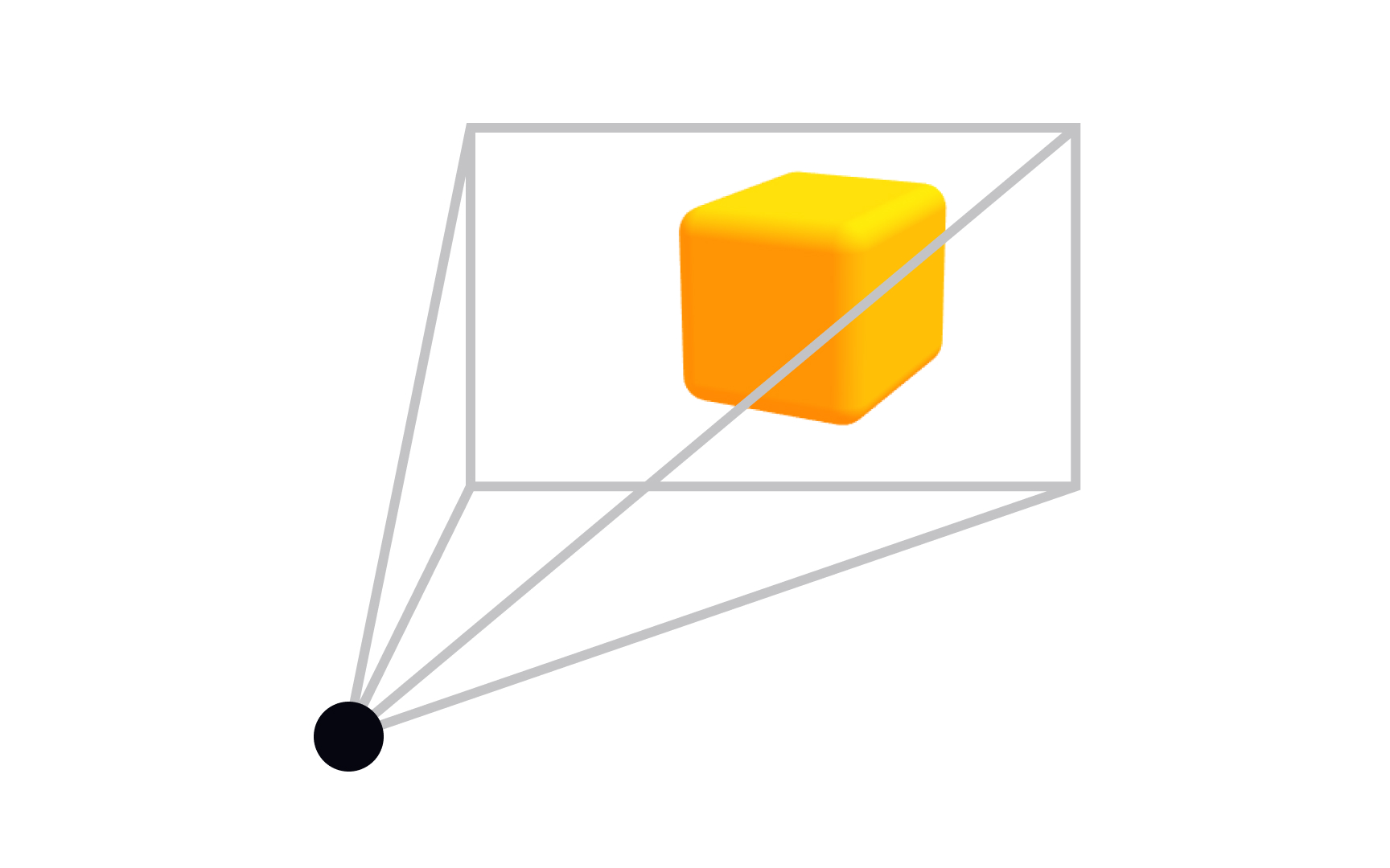
When you set up a scene in a 3D application, the camera does more than just "take a picture." It defines your entire relationship with the scene, defining what's visible, how objects relate to each other spatially, and whether the result feels like a photograph or a technical drawing.
In 3D design, a camera represents a point of view. It maps a three-dimensional scene onto a two-dimensional surface, the same way a real camera collapses the world into a flat image. The type of projection a camera uses determines how that translation happens. Choose parallel projection, and you preserve scale, useful for blueprints and UI work. Choose perspective projection, and you get natural convergence, useful for immersive scenes and product renders.
Most 3D tools (Blender, Cinema 4D, Spline) let you switch projection types directly in the viewport. Getting comfortable with that toggle is one of the first practical skills you build as a 3D designer.[1]
Pro Tip! Switch projection types in your viewport when your work shifts from technical layouts (parallel) to immersive scenes (perspective). Most tools let you toggle instantly.
Parallel projection
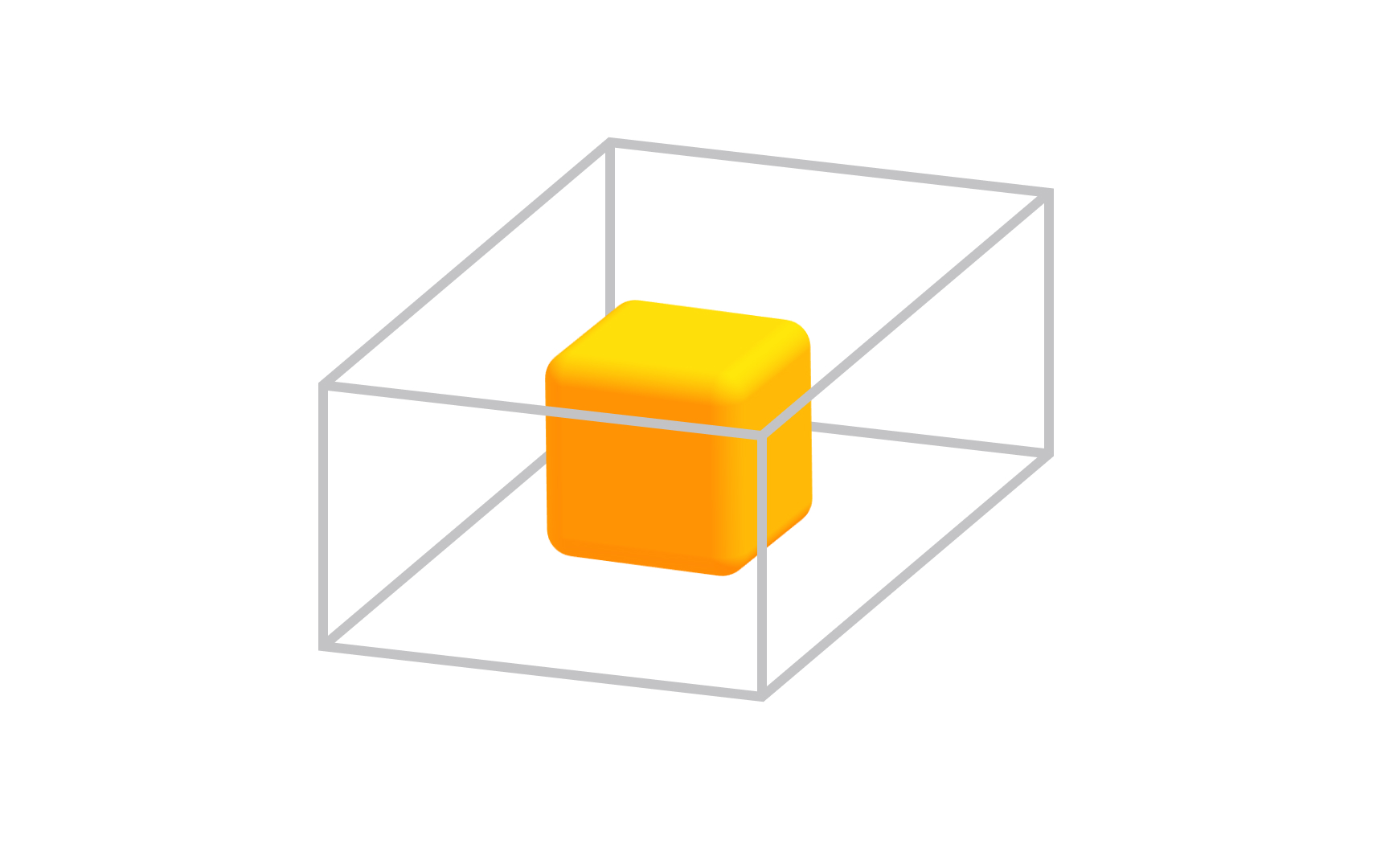
Parallel projection solves a specific problem: how do you represent a 3D object accurately when measurements and proportions need to stay exact? The answer is to extend lines from each point on the object in the same direction, parallel to each other, until they hit the projection plane. Because the lines never converge, scale is preserved across the entire image.
This is why architects, engineers, and UI designers reach for parallel projection. A cube shown in parallel projection has edges that look parallel because they actually are, in the image, not just in space. You can measure from the drawing and trust the result.
Compare this to perspective projection, where those same edges would converge toward a vanishing point. Perspective looks more natural to the eye, but it distorts dimensions. Parallel projection trades that naturalness for precision, which is exactly what technical work demands.[2]
Pro Tip! Parallel projection keeps your dimensions trustworthy for UI and technical work. Perspective mode is for presentation, not measurement.
Orthographic projections
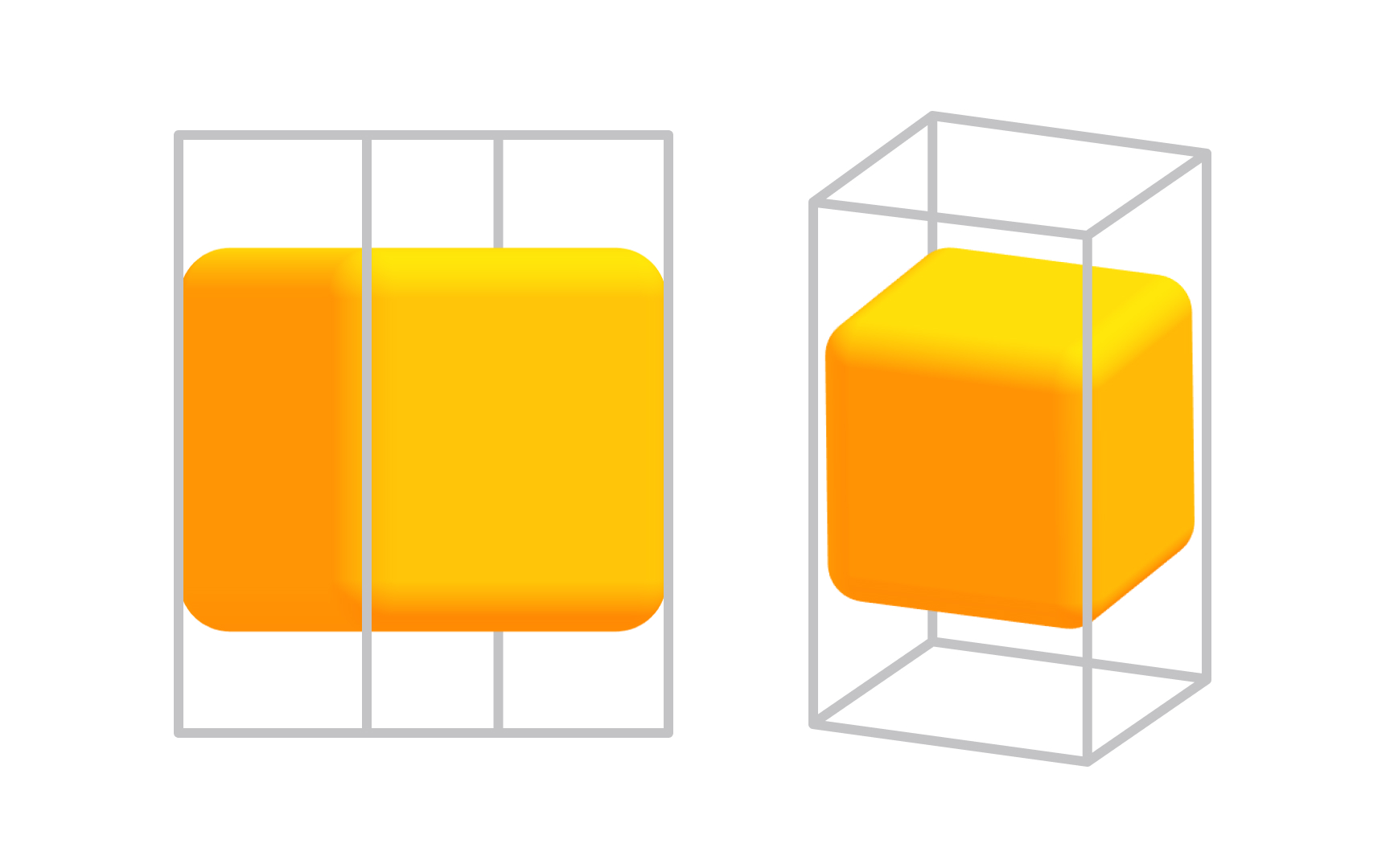
Orthographic projection is the most precise form of parallel projection, and it is the workhorse of technical design. The projection direction is perpendicular to the view plane, with no angles and no foreshortening. You see exactly one face of the object at a time, completely flat and undistorted.
The 3 standard orthographic views are front, top, and side. Together they give you a complete picture of an object's geometry without any single view distorting the others. A product designer working on a physical object, or an architect drawing a floor plan, relies on these 3 views to communicate exact dimensions.
In 3D tools like Blender, you can jump between orthographic views with number pad shortcuts (1 for front, 3 for side, 7 for top). Toggling between orthographic and perspective mode in the viewport is something you will do constantly: perspective for spatial thinking, orthographic for precise placement.[3]
Pro Tip! Front, top, and side views describe any object completely. Orthographic views are the standard format when handing off geometry to engineers or manufacturers.
Isometric projection
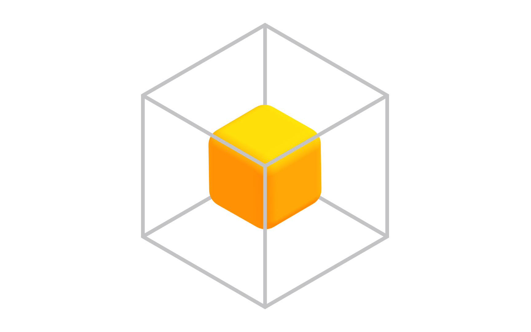
Isometric projection sits in an interesting middle ground: it is technically a parallel projection (no vanishing points, no perspective distortion), but it lets you see 3 faces of an object at once. The projection plane cuts through all 3 coordinate axes at equal angles, which is where the name comes from: "iso" means equal in Greek.
Because all 3 axes are foreshortened equally, the image has a consistent depth feel without any dimensional distortion. This is why isometric views appear constantly in mobile game design, UI illustrations, and technical manuals. The style is both readable and visually rich, and it scales well at small sizes where perspective would become visually noisy.
For product and UI designers, isometric projection is also a gateway into 3D thinking. Tools like Spline let you work directly in isometric mode, making it an accessible starting point before committing to full perspective 3D environments.[4]
Pro Tip! Isometric grids are built into many design tools. In Figma, you can set up an isometric grid. In Spline, isometric camera mode is a single click.
Perspective projection
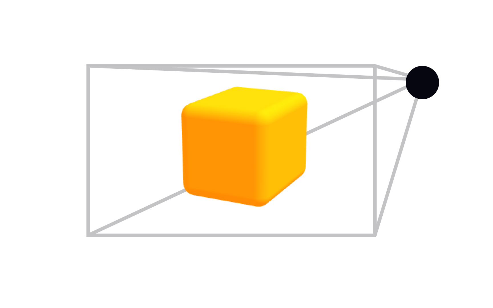
Stand on a straight road and look toward the horizon. The edges of the road, which are actually parallel, appear to converge to a single point in the distance. That is perspective in action, and it is how human vision actually works. Perspective projection replicates this in 3D by having parallel lines converge toward vanishing points, creating the natural depth cues your brain expects from real-world vision.
The number of vanishing points determines how the projection feels. One-point perspective creates a sense of looking directly into a scene (think a hallway or a tunnel). Two-point is the most common for architectural and product visualization, where two sets of lines converge to separate points on the horizon. Three-point adds a third convergence, used for dramatic views from above or below a subject.
Unlike parallel projection, perspective does not preserve scale. An object twice as far away looks less than half the size. This is what makes it feel real, and also what makes it unsuitable for technical documentation. For immersive environments, product visualization, and anything meant to be seen rather than measured, perspective projection is the default choice.
Pro Tip! One-point pulls viewers into a scene. Two-point feels natural for product and architectural views. Three-point is for dramatic up- or down-shots that emphasize scale.
Vanishing Point
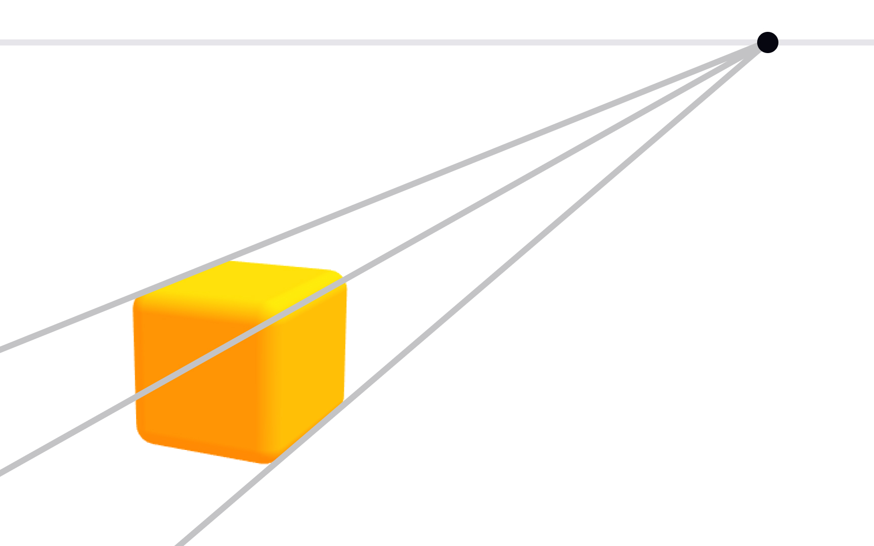
A vanishing point is where parallel lines in 3D space appear to meet on the image plane. You have seen it your whole life without naming it: railroad tracks converging at the horizon, a city street narrowing into the distance, the ceiling of a long corridor seeming to touch the floor far ahead. Every one of those is a vanishing point at work.
In 3D design and visual art, vanishing points give you direct control over perceived depth. Place a vanishing point far away and the scene feels expansive and wide. Bring it closer and the convergence becomes more dramatic, creating tension or exaggerating scale. In video game environments and cinematic 3D scenes, designers use vanishing point placement deliberately to guide where the viewer's eye goes and how much depth they perceive.
Practically, this shows up in 3D tools through camera focal length. A short focal length creates strong convergence (wide-angle feel), a long focal length flattens convergence (telephoto feel). Understanding the relationship between vanishing points and focal length helps you choose camera settings that serve your scene's purpose.[5]
Pro Tip! Focal length and vanishing points are linked. Wide-angle lenses push vanishing points closer and intensify convergence. Telephoto lenses flatten it.
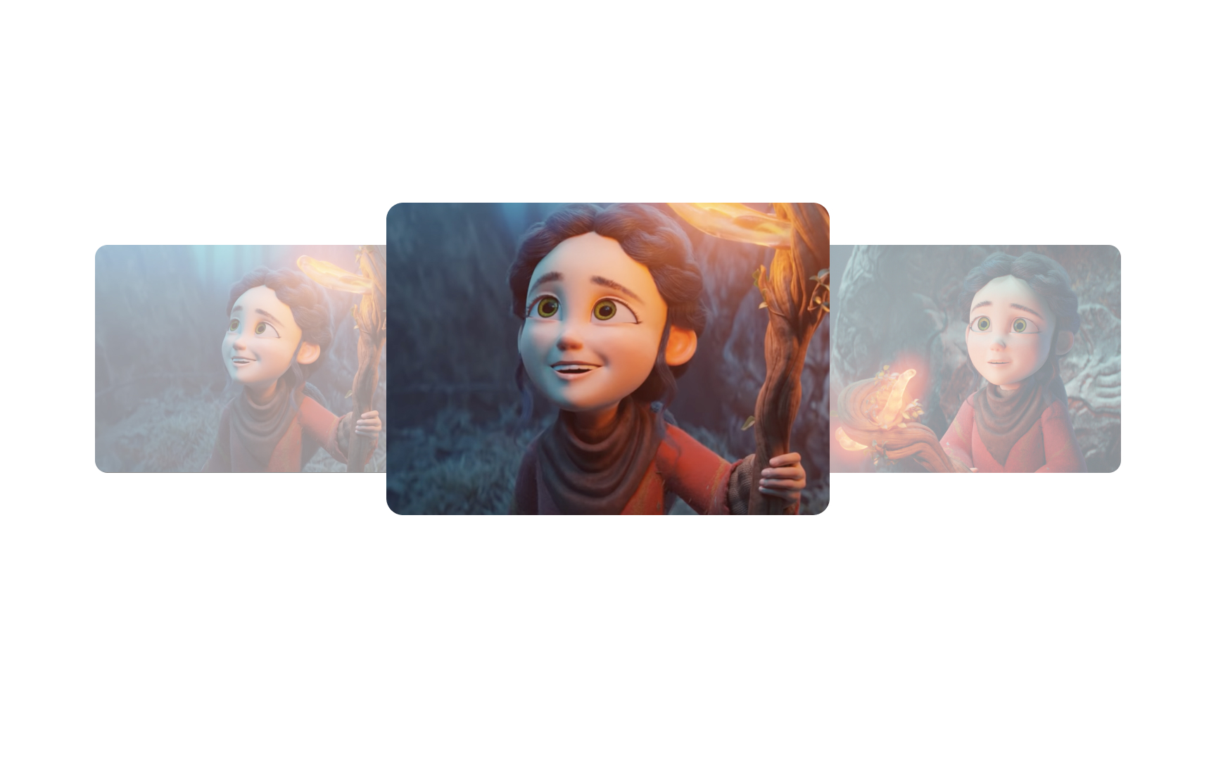
Depth of field
When you focus a real camera on a subject, objects in front of and behind that subject go out of focus. The range of distances that stays sharp is called the depth of field. A shallow depth of field blurs almost everything except a narrow band. A deep depth of field keeps nearly the entire scene sharp.
In 3D rendering, depth of field (DOF) is one of the most powerful tools for making a scene feel photographic and real. It does two things at once: it adds the optical quality of a real lens, and it directs viewers' attention. A product designer rendering a watch, for example, might use shallow DOF to blur the background and make the face of the watch the undeniable focal point, without moving the camera or changing the lighting.
DOF is controlled by 2 camera settings that mirror real photography: aperture (how wide the lens opening is) and focal length. In Blender, Cinema 4D, and Spline, you adjust DOF settings directly on the camera object. Start shallow and push depth wider until the composition feels right, rather than leaving it at the default (which is usually fully sharp and slightly clinical).[6]
Pro Tip! Shallow DOF is great for hero product shots. Deep DOF works better for scenes where the context matters as much as the subject, like an architectural walkthrough.
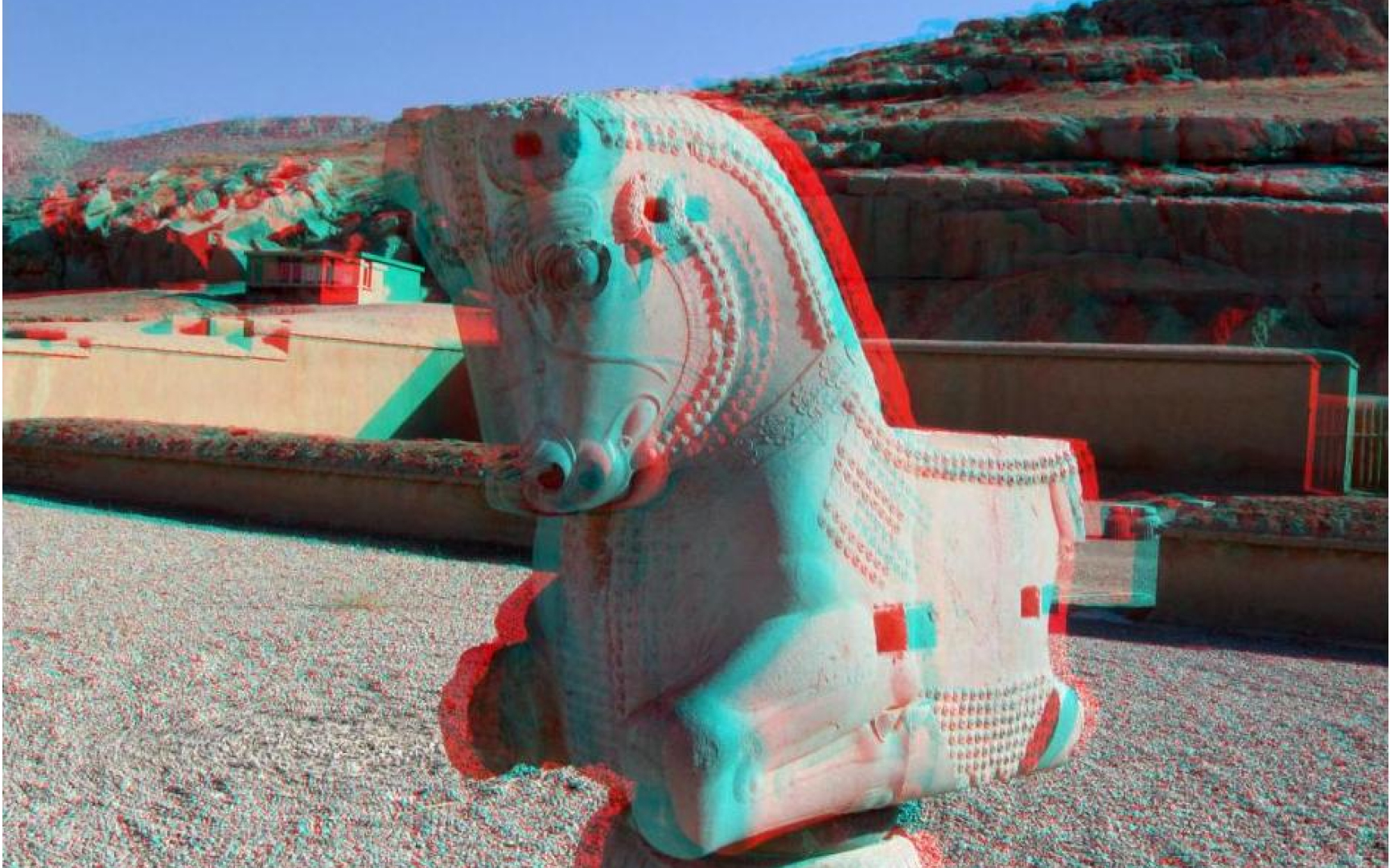
Stereoscopy
Human depth perception depends on a simple trick of biology: your two eyes sit a few centimeters apart, so each one sees a slightly different version of the world. Your brain measures the difference between these two views and constructs a sense of depth from it. This is called binocular disparity, and it is the mechanism stereoscopy exploits.
Stereoscopic 3D presents a slightly different image to each eye simultaneously, but this only works through a device capable of delivering separate views to each eye. VR headsets, 3D cinema glasses, and anaglyph glasses all do this in different ways. The brain fuses the 2 views into a single scene that appears to have genuine depth, not just the simulated depth of standard 3D projection. This is why stereoscopic images can feel startlingly real: they are feeding the actual hardware your brain uses for depth calculation.
The limitation is a mismatch between where your eyes physically focus and where the stereo effect places the depth. This is why some people experience eye strain during extended stereoscopic viewing. VR headsets address this with lens optics designed to bring the 2 into closer alignment.[7]
Pro Tip! VR headsets are stereo displays. Each eye gets its own rendered view, offset by the approximate distance between human eyes, which is around 63-65 mm on average.
Anaglyph
Anaglyph is the oldest and simplest approach to stereoscopy, and if you have ever watched a 3D movie with cardboard red-and-cyan glasses, you have used it. The technique encodes two slightly offset images using different color filters, typically red for one eye and cyan for the other. The matching colored lenses in the glasses block the wrong image from each eye, so each eye only sees its intended view.
The brain receives the two offset views and constructs a sense of depth from the difference, exactly as it does with natural vision. The trade-off is color accuracy: because each eye is seeing through a colored filter, the brain cannot fully reconstruct the original colors of the scene. This is why anaglyph images often look desaturated or have a slight color cast even when you are not wearing the glasses.
For designers, anaglyph is worth knowing as historical context and as a practical shortcut for cheap stereoscopic previews. Blender can output anaglyph renders directly. It does not produce the cleanest stereo result, but it requires no special hardware, which makes it a fast way to test whether a stereo concept works before investing in more sophisticated display setups.
Pro Tip! Blender has a native anaglyph render output mode under camera settings. It's a quick, zero-hardware way to test a stereo composition before committing to a full VR setup.
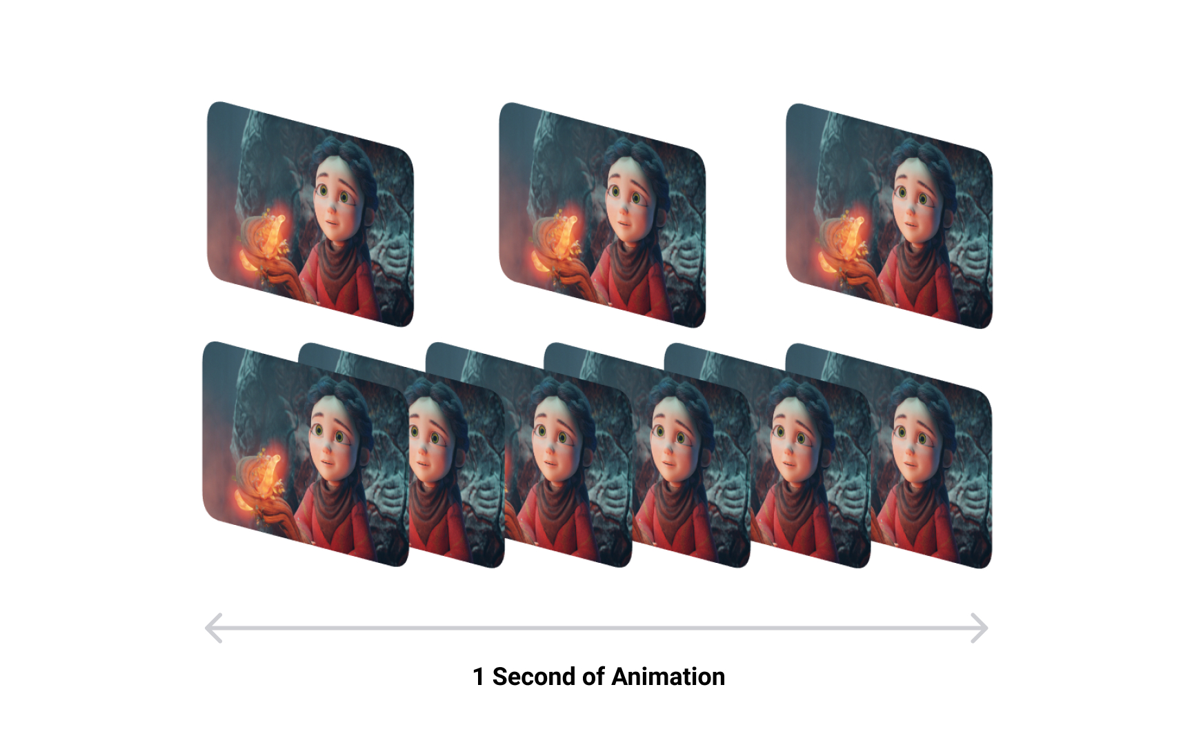
Frames in animation and video
Motion in film and games is not real movement. It is an optical illusion built from a sequence of still images displayed fast enough that your brain stops seeing them as separate pictures and starts perceiving them as continuous motion. Each individual image in that sequence is a frame.
This works because of a phenomenon called persistence of vision, which means your visual system retains an image for a brief moment after it disappears. When a new image appears before that retention fades, the brain interprets the transition as movement rather than replacement. The smoother the transition, the more convincing the illusion.
Understanding frames is foundational for any 3D work that involves time: product animation walkthroughs, motion graphics for UI transitions, cutscenes for games, or AR experiences that respond to user movement. Every animated 3D scene you build is a sequence of rendered frames, and decisions about how many frames to render, and how those frames change, shape how motion feels to the viewer.
Pro Tip! Scrub through your timeline slowly to see individual frames. This reveals timing issues before you commit to a full render.
Frames per second (FPS)
Frames per second (FPS) measures how many still images are displayed every second. This number has a direct relationship to how smooth motion appears, and different contexts use different thresholds based on what looks right and what hardware can support.
The threshold at which the brain stops seeing discrete images and perceives motion is around 16 FPS. Below that, individual frames are visible. Cinema settled on 24 FPS as the standard because it is the minimum that feels genuinely filmic, and 24 frames were cheaper to develop than 30 or more. Television used 30 FPS (or 25 FPS in PAL regions) to align with electrical grid frequency. Games push to 60 FPS or higher because fast-moving objects need more frames to appear sharp during motion, and modern engines and GPUs can support it.
For 3D designers working in animation or interactive contexts, FPS affects two things: perceived quality and render time. Every extra frame is another rendered image. A 10-second animation at 24 FPS is 240 renders, and at 60 FPS it is 600. Understanding the right FPS for your output, whether it is a product animation, a web 3D experience, or a game asset, helps you balance visual quality against production cost from the start of a project.
Pro Tip! Estimate frame count before locking in FPS: multiply duration in seconds by FPS. A 30-second animation at 60 FPS means 1,800 renders.


