


.svg)
All the compositional theory knowledge in the world will only get you so far if you don’t know how to apply it. Being able to identify and implement symmetrical vs asymmetrical designs, dynamic vs static compositions, geometric vs visual centers, etc., will make you a better designer.
While designs in the real world don’t always follow these compositional guidelines, the most effective ones almost always do. It’s smart for designers to understand how these compositional techniques work and when to use them.
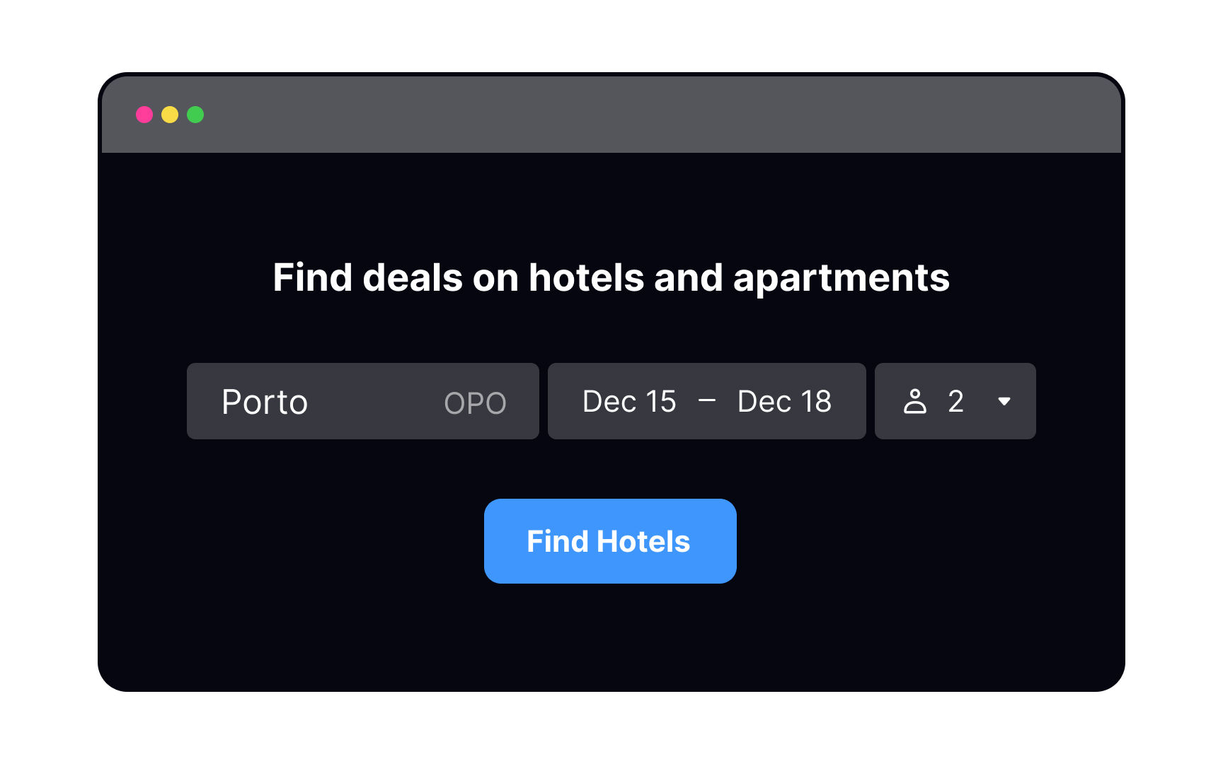
Geometric center


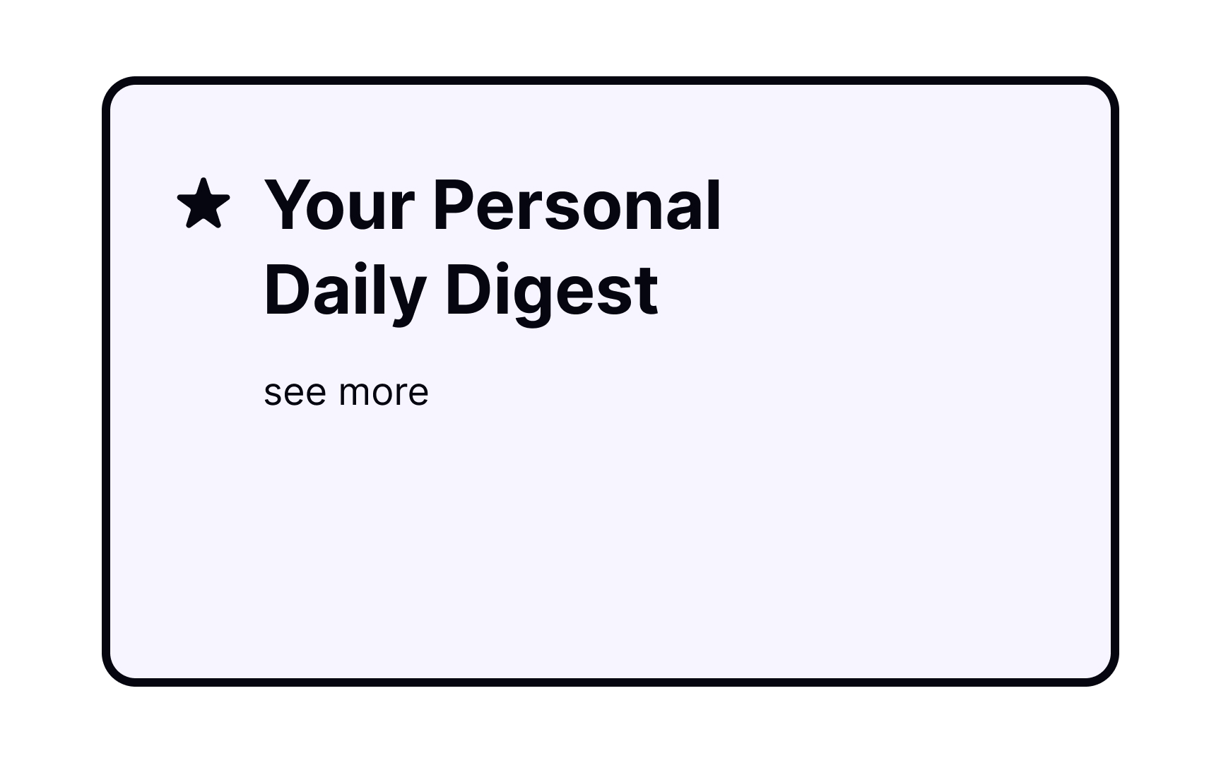

Building your compositions around the screen’s geometric center is a simple, safe way to arrange elements. It gives users a sense of stability, while also capturing their attention effectively. It’s a great option for landing pages or posters but may lack vibrancy and energy. That said, the geometric center isn't always appropriate for some design elements.[1]
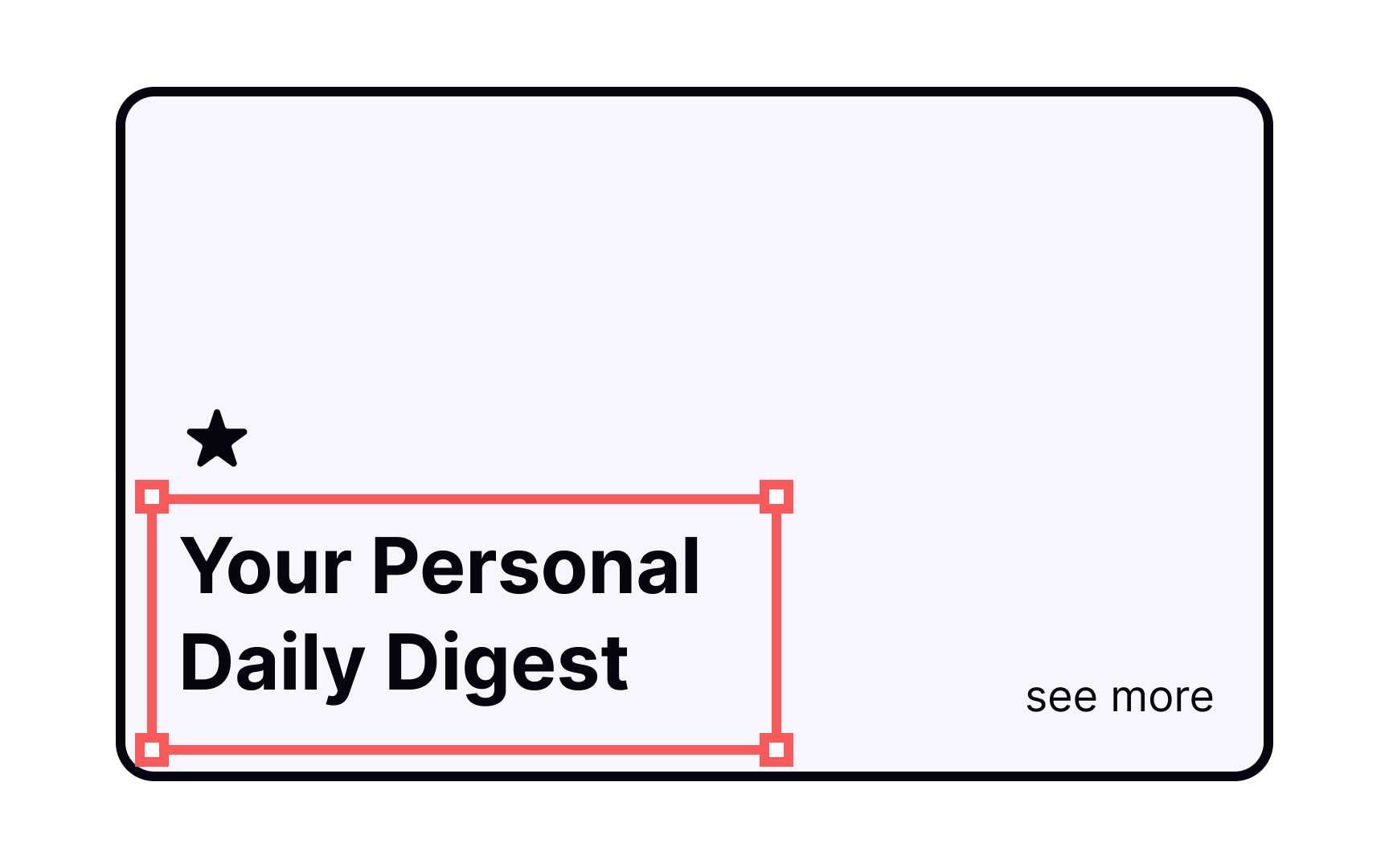
Compositional center
When defining a compositional center, decide where your users' eyes should go first. You can achieve balanced and stable compositions, overlapping compositional and geometric centers, or you can spice things up by moving the center further away. Don't forget to use larger fonts, accent colors, or distinct shapes to make elements stand out.
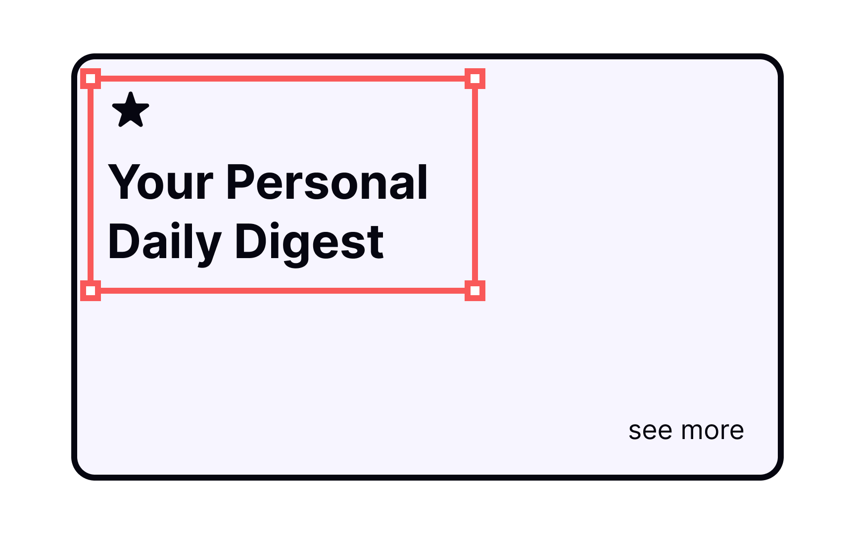
Visual center

A visually centered composition is generally preferable over a geometrical one because it appears more balanced without looking boring.[2] Users’ eyes generally gravitate toward the top of the composition, so positioning the center of your composition just above the geometrical center is more aesthetically pleasing.
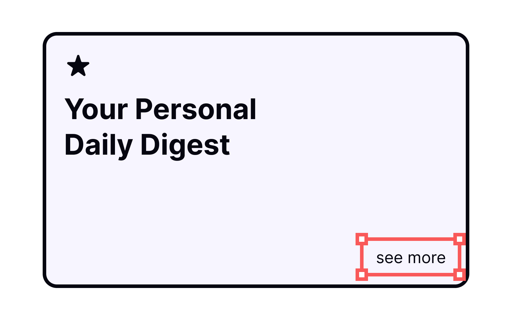
Dominant element
Which element within a composition immediately grabs your attention? The dominant element on a page dictates the alignment and tone for all of the other elements and, of course, stands out the most.
For example, a landing page may include a lot of elements — headline, subhead, image, signup button, etc. — but the headline is the first thing that stands out to users. Set your dominant element apart from the rest of the page via scale, color, and placement.
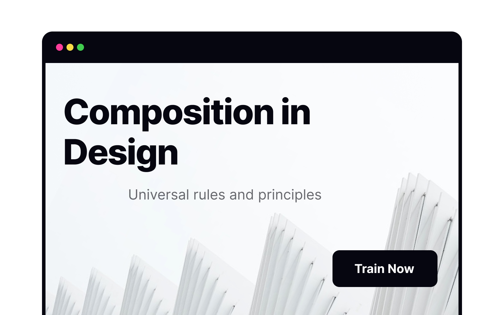
Symmetrical composition
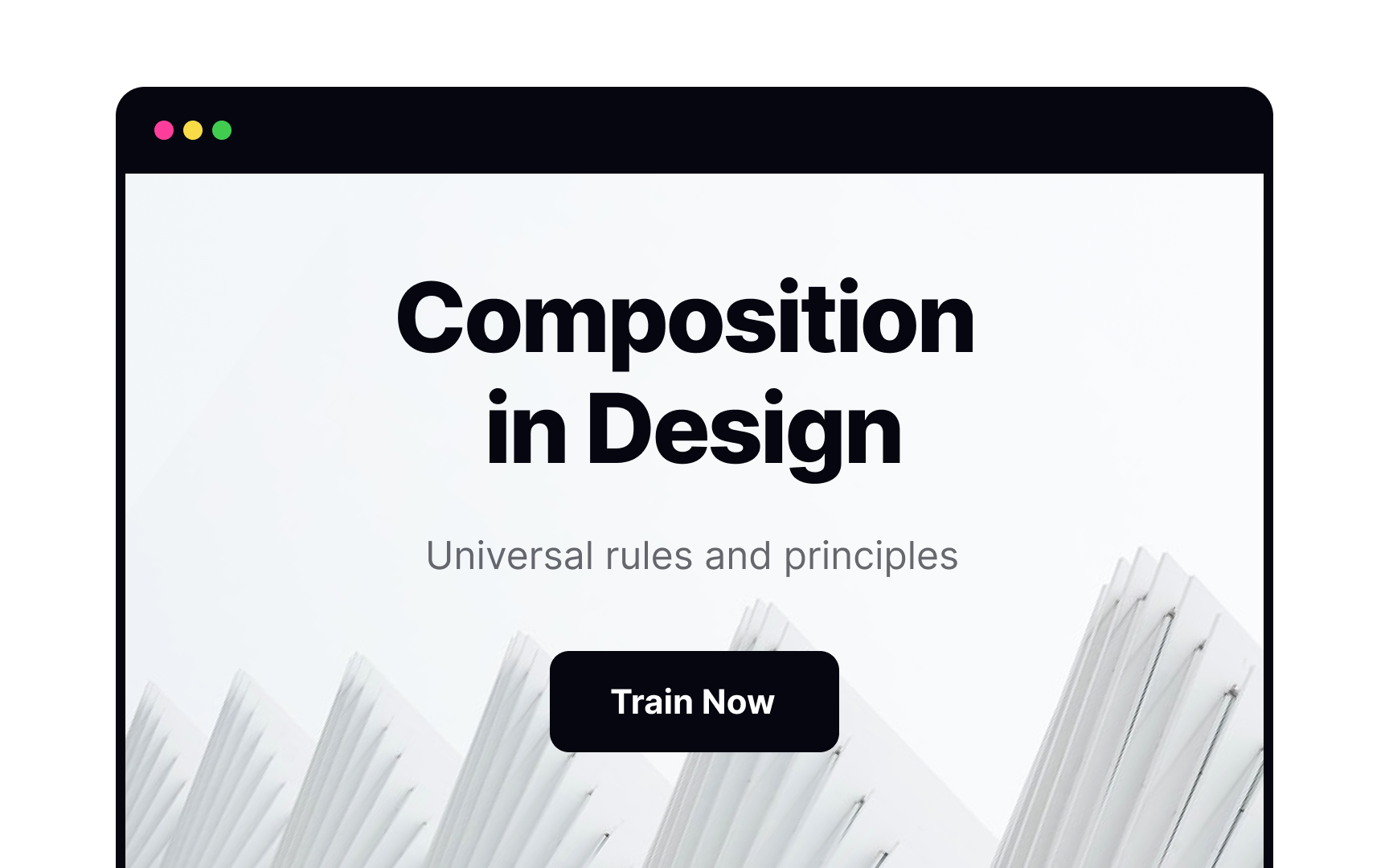
Symmetrical compositions work like mirror images, creating designs with equal visual weight on both sides of the center axis. Symmetrical designs feel natural and graceful, but be careful that they don’t appear too stagnant.
Symmetrical interfaces are well-suited to particular digital projects, such as a website devoted to one product or an artist’s portfolio. They’re an elegant solution and also easier to create than asymmetrical compositions.
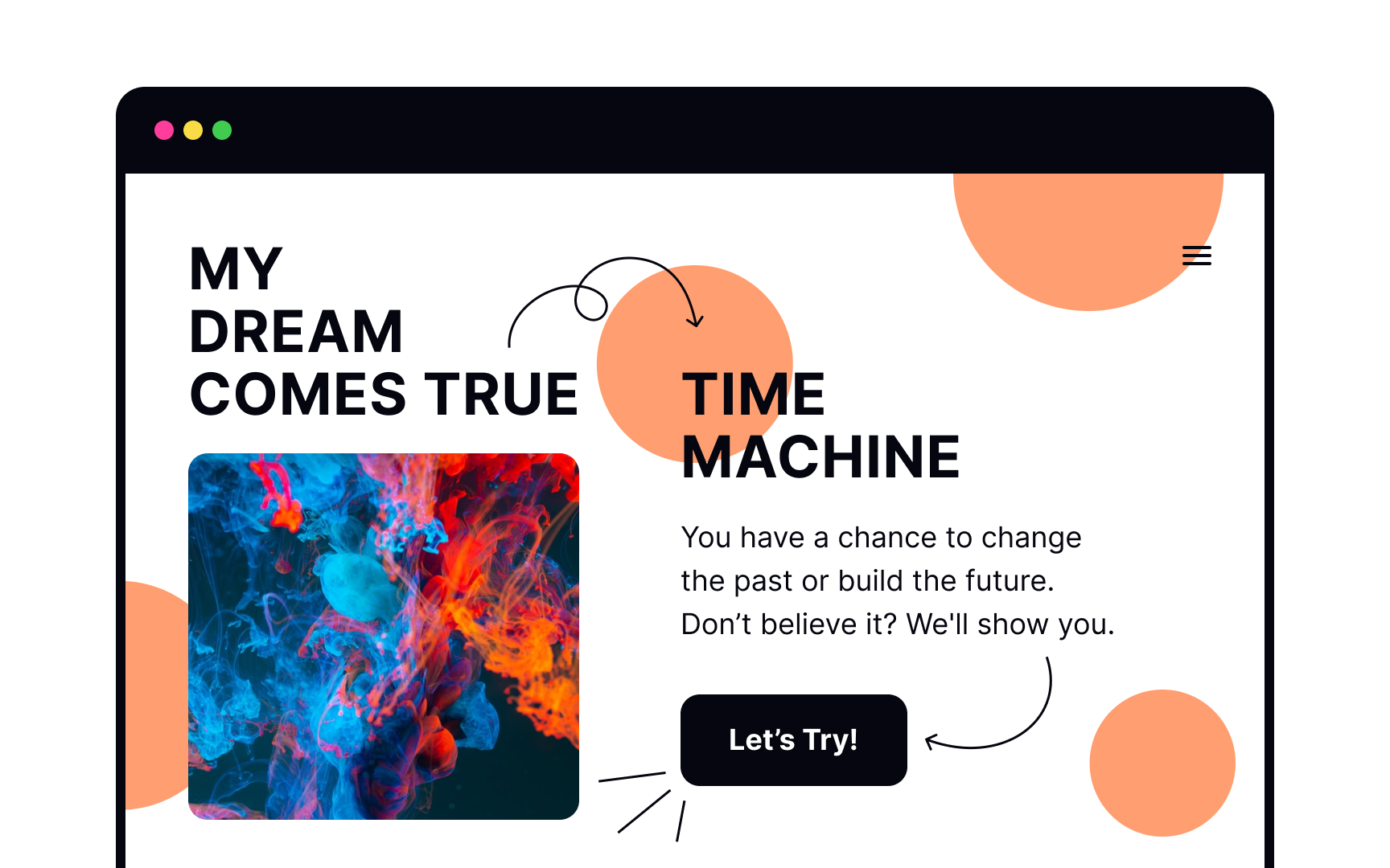
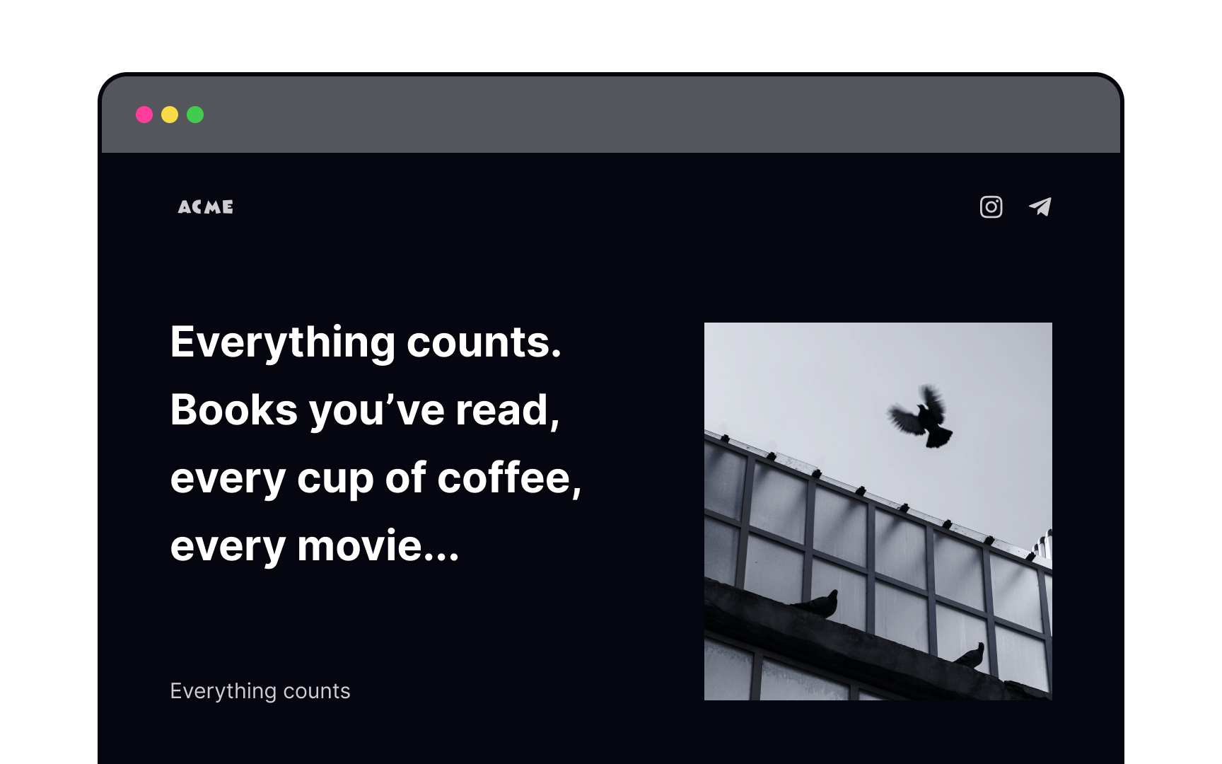
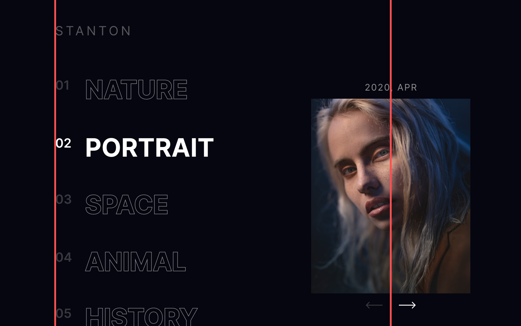
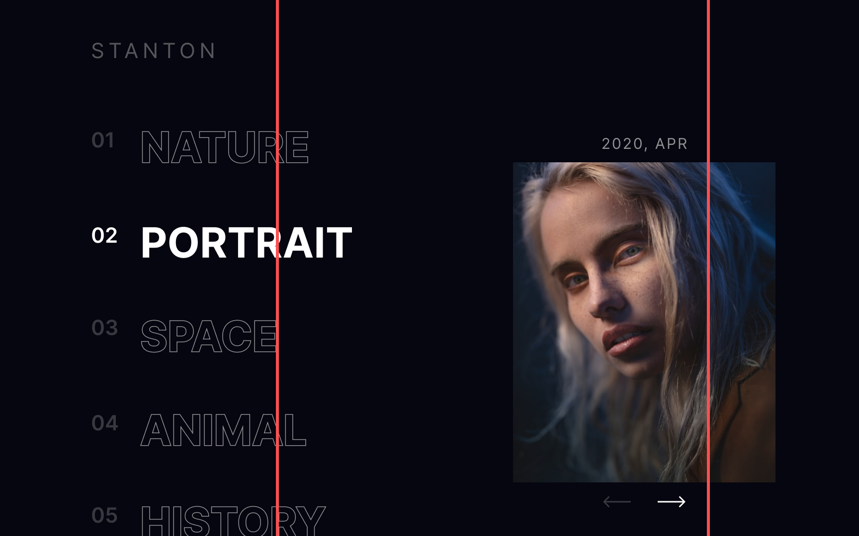
Asymmetrical composition
Asymmetrical compositions are well-suited for more complex and exciting designs with several focal points. They’re also more difficult to do well than symmetrical compositions since there’s no mathematical formula for creating them — they rely on a designer’s eye instead.
In this example, the headline on the left is the main focal point for the design, while less significant focal points — the subhead and CTA button — are on the right. Achieving an asymmetrical composition like this that’s still aesthetically pleasing and balanced requires more practice.
Closed composition
Closed compositions arrange all elements within a (mostly invisible) frame.[3] They provide a sense of completeness. When users look at a closed composition, their eyes focus on the main elements and don’t wander. Such designs feel finished and stable.
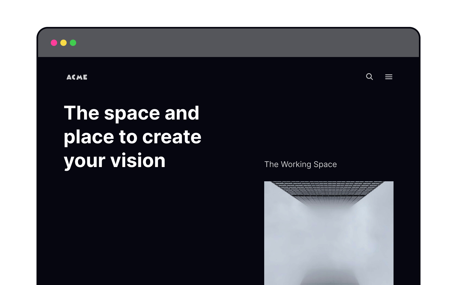
Open composition


Open compositions have no boundaries or defined borders.[4] Elements can be placed without regard to the frame of the screen, providing a feeling of freedom and movement.
Open compositions are like ongoing stories that intrigue users to scroll and explore. They’re perfect for pages with a lot of content. Using leading lines, unfinished shapes and images, and unusual orientations, designers can make their interfaces more dynamic and inviting.
Pro Tip! Use open compositions for websites with long and text-heavy pages.
Static composition

Static compositions appear calm and pleasant to the eye. They’re usually symmetrical in structure, lack movement, and feel safe and predictable.
Use static compositions to organize blocks of information that need to be easy to scan, like forms or infographics. Because of their stable nature, they’re well-suited to activities users might consider high risk (such as making a purchase or reservation).
Dynamic composition
Our eyes instinctively look for balance, and unbalance unsettles us. The irregularities of dynamic compositions take advantage of this to add a sense of depth and movement. They can even create feelings of tension (not always a bad thing).
Dynamic compositions are a powerful tool that can guide users through your design and help them embark on an exciting user journey. Use them when you want your users to feel energized by your products.
Compositional balance


Compositional balance is about an even distribution of visual weight. To achieve it, play with the size, shape, and color of your elements, as well as the negative space between them. Large, heavy elements, like a hero image, can be balanced out with negative space or a few smaller features on the opposite side of the center vertical axis.
Pro Tip! Balance doesn't equal symmetry — it can be achieved with asymmetric composition, resulting in more complex and intriguing designs.
The rule of thirds
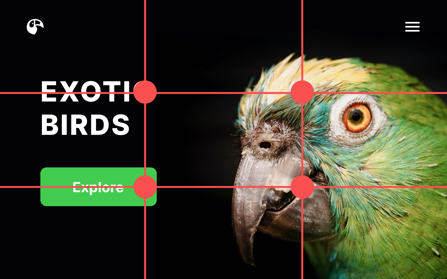
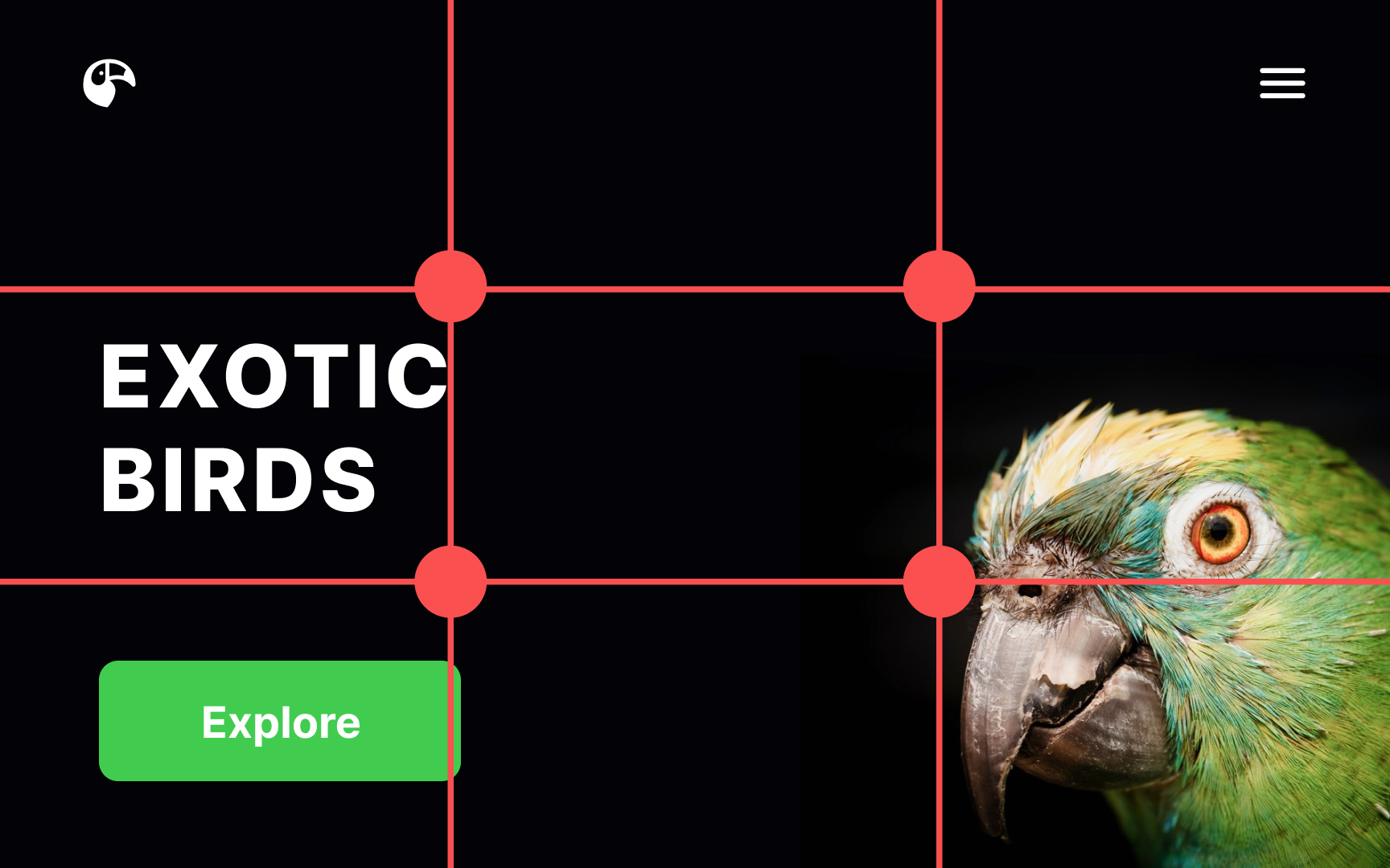
The rule of thirds is a fantastic compositional tool that came to digital design from the world of photography. Imagine the screen divided into equal horizontal and vertical thirds by invisible lines. Our gaze intuitively gravitates toward the intersections of those lines.
According to the rule of thirds, those intersection points are the ideal spots to place key elements, like CTA buttons, headlines, and hero images. They’re most likely to grab users’ attention in these focal points.[5]
Leading lines
Designers use leading lines — similar to grid lines — as a scaffold to build their compositions around. They work because our eyes are naturally drawn to follow the lines within a design, even when the lines themselves are invisible.[6]
Unlike grids, leading lines provide more freedom in creating unconventional, outstanding layouts. It’s up to you to set the rules for arranging and grouping content along these lines, making them a very flexible tool in your design toolbox.
1-Point composition

As the name suggests, a 1-point composition has only one compositional center, where most of a user’s attention goes. It makes for simple, straightforward layouts and allows users’ gaze to float around and explore the design in more detail. Elements aren't fighting for a user’s attention with this type of composition, making it ideal for landing pages or websites focusing on a single product.
Pro Tip! This type of composition is great for concise designs that aren't overloaded with information.
2-Point composition


Designs with two compositional centers have two main areas that draw attention. Instead of one focal point, the viewer’s attention moves between these two areas. When elements on the left and right are visually balanced in size, weight, or spacing, the layout feels stable. Even though the composition is asymmetrical, it still feels ordered and intentional.
3-Point composition


3-point compositions generally create a triangle within your design. Depending on its orientation, that triangle can be either stable or unstable.
Upward triangles create a sense of stability and strength and can provide a sense of unity to your design. Downward triangles, on the other hand, are exciting and create a sense of movement and even urgency.
Pro Tip! 3-point compositions are often used for home pages — with focal points being the headline, the hero image, and the CTA button.
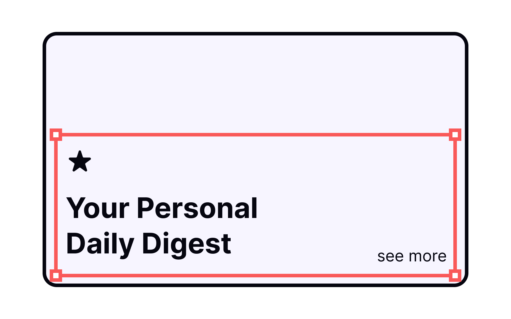
4-Point composition
4-point compositions generally create a frame on the page, resulting in a closed composition. They allow users to concentrate on the elements within the page without their attention wandering out of the frame.
The different focal points can compete for user attention, so use this type of composition with care. They’re great for things like product listings or other pages where content should all carry equal weight.
Pro Tip! Because of their stable, focused structure, 4-point compositions are great for graphs, tables, and forms.
Topics
References
- Geometry in UI Design | Medium
- Designing Using a Visual Center | The Paper Blog | The Paper
- Open vs. Closed Composition
- Notes on Composition: Closed versus Open Composition
- The Rule of Thirds: Know your layout sweet spots | The Interaction Design Foundation
- Leading lines - Line - Higher Art and Design Revision - BBC Bitesize | BBC Bitesize


