


Every product decision carries an ethical dimension, whether or not you name it. The features you ship, the defaults you set, and the metrics you optimize all send a signal about whose interests your product serves. When that signal is wrong, users notice, regulators act, and trust erodes in ways that are hard to rebuild.
Dark patterns are the most visible form of ethical failure in a product. These are design and copy choices that steer users toward actions they didn't intend, like signing up for a subscription buried inside a free trial or opting into data sharing through a pre-checked box in small grey text. But ethical risk goes deeper than UI tricks. Algorithms trained on historical data quietly replicate the biases of the past. Features designed for engagement can create second-order harms that nobody planned for. A product team that only asks "does it work?" is leaving the harder question unanswered: "What does it do to people?"
This lesson gives you a practical framework for spotting and correcting ethical blind spots before they become crises. You will learn to recognize the full taxonomy of dark and grey patterns, understand how algorithmic bias enters products through data and design choices, apply the Newspaper Test to pressure-check decisions against public scrutiny, and practice second-order thinking to trace consequences beyond the immediate release.
Dark patterns and deceptive design


A dark pattern is a user interface deliberately designed to lead users into actions they did not intend to take. The keyword is "deliberately." A confusing checkout is a UX mistake. A checkout that hides the subscription renewal in fine text after the "Buy Now" button is a dark pattern. The intent is to exploit the gap between what users think they are doing and what the product actually records.
The taxonomy is wide:
- Confirmshaming guilt-trips users into opting in ("No thanks, I don't want to save money").
- Fake urgency applies pressure through countdown timers that reset.
- Preselection defaults the most profitable option as already chosen.
- Hard to cancel makes signing up frictionless and exiting a labyrinth.
- Visual interference buries the opt-out checkbox in grey text while highlighting the accept button in bold color.
These patterns generate short-term conversion gains and long-term trust damage. Companies, including Epic Games, Noom, and AT&T, have each paid tens of millions in regulatory settlements tied to deceptive design. For a product manager, the practical test is simple: if a user had to work to undo what your product did by default, ask why the default was set that way.[1]
Grey patterns and the ethics spectrum
Not every ethical problem is a clear-cut dark pattern. Grey patterns sit in the uncomfortable middle: they are not illegal, and they might even be industry-standard, but they nudge users in directions that primarily serve the business rather than the user.
A common grey pattern is the pre-checked "email me offers" box during signup. It is not hidden. The user can uncheck it. But the default serves the company, not the user, and most users will not notice.
Another example is the pricing page that shows annual cost as a daily rate, making a $365 subscription look like "$1 a day." The math is accurate. The framing is designed to minimize perceived cost.
Product managers encounter grey patterns at the boundary between optimization and manipulation. The question is not "is this legal?" but "would a user feel tricked if they understood what we were doing?" A useful internal heuristic: if you would be uncomfortable explaining the design choice to a user in plain language, it is probably a grey pattern. That discomfort is data.[2]
Recognize algorithmic bias in product decisions
Algorithms feel objective because they run on numbers. But algorithms are trained on historical data, and historical data contains the decisions, habits, and exclusions of the past. When you feed a hiring algorithm résumés from the last 10 years, you are also feeding it 10 years of whatever biases shaped those hiring decisions.
Algorithmic bias produces unfair and repeatable errors. A product recommendation system trained on purchase history will under-recommend categories where certain groups were historically underrepresented as buyers. A content moderation model trained on one cultural or linguistic dataset will perform worse for other languages. A credit-scoring model that uses neighborhood as a proxy variable will encode the legacy of discriminatory lending, even if the variable itself seems neutral.
For product managers, the risk is not just reputational. Regulatory pressure on algorithmic fairness is growing in both the EU and the US. The practical responsibility is to ask, at the design stage: What does our training data exclude? Who is underrepresented in our test set? What proxy variables might we be using without realizing it? Those questions will not eliminate bias, but they make it visible and addressable rather than invisible and compounding.[3]
Pro Tip! Prioritize examining training data before model output. Biased data produces a biased model even when the algorithm itself is technically sound.
Apply the Newspaper Test to product decisions

The Newspaper Test is a pressure check for ethical decisions. The question is: if a journalist wrote a story about this feature or decision tomorrow, would you be comfortable with the headline? The test works because it forces you out of your internal optimization frame and into the frame of a reasonable outside observer.
The test has two directions:
- The obvious version is the "Front Page Test": would this decision embarrass the company if it became public?
- The less obvious version is the "Other Front Page Test": is the product being so cautious or restrictive that it is failing users in a different way?
A healthcare app so worried about liability that it surfaces no useful clinical guidance fails users just as surely as one that misleads them.
In practice, apply the Newspaper Test before major feature launches, pricing changes, default-setting decisions, and any data-sharing arrangement with third parties. If you find yourself writing the defense of the decision before you have finished the decision itself, that is a signal to slow down and re-examine the intent.[4]
Pro Tip! Run the test with someone outside your team. Internal groups normalize decisions over time and stop seeing what an outside observer notices immediately.
First- and second-order consequences
Every product decision has at least 2 sets of consequences:
- The first-order consequence is the immediate, intended result: more signups, higher engagement, faster checkout completion.
- The second-order consequence is what happens next because of the first consequence. It is often unintended, and it is often where the ethical problem lives.
An engagement-optimized social feed increases daily active users. That is the first-order win. The second-order effect is that the same mechanism that increases engagement may also increase time-on-platform for the most emotionally volatile content, because that content generates the most reactions. The feature worked as designed. The harm was downstream.
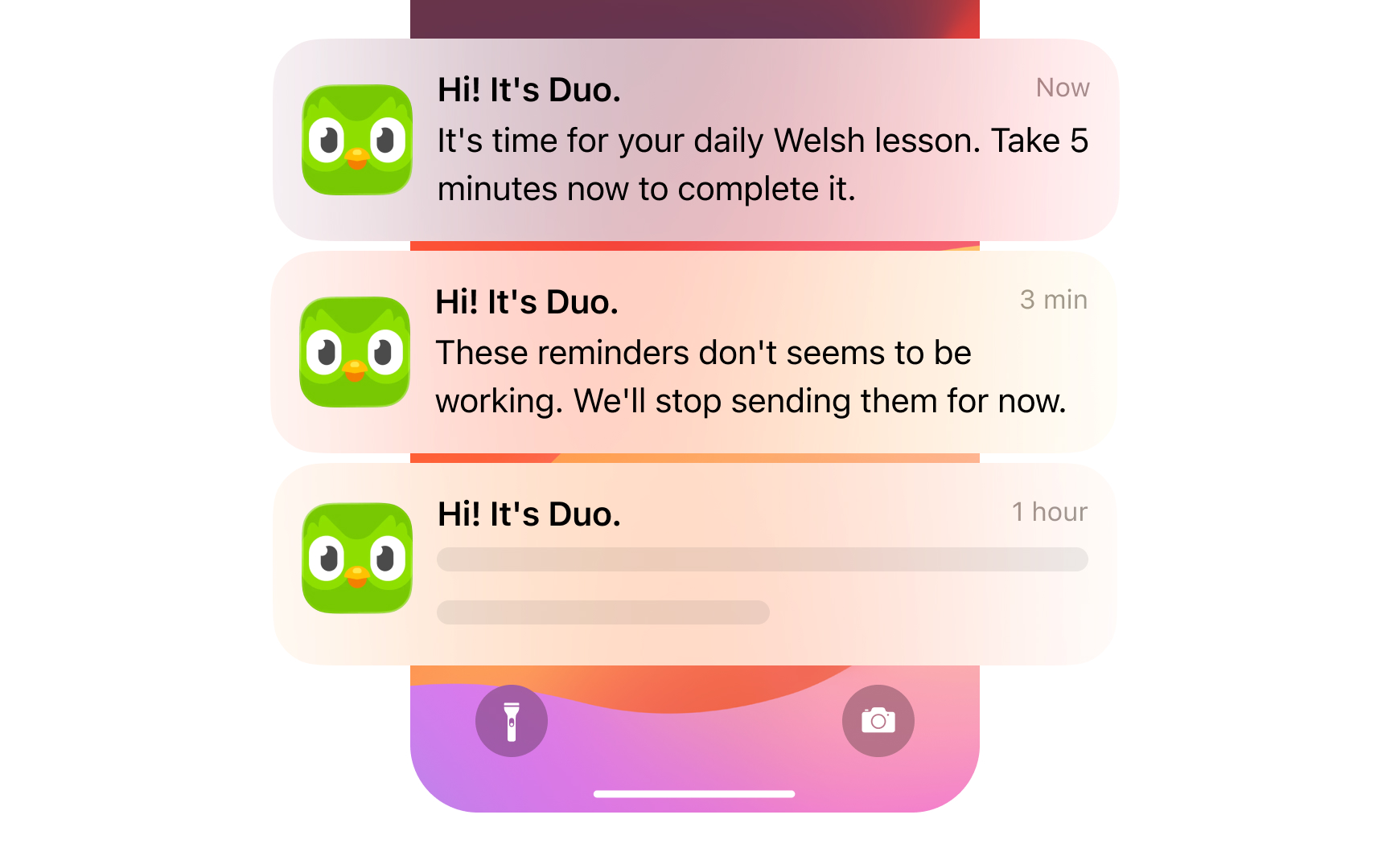
Notifications are another textbook case. Increasing notification frequency lifts short-term open rates. The second-order effect is notification fatigue, which erodes trust and, eventually, churn. In both cases, the metric the team was optimizing looked healthy until the second-order effect surfaced. For product managers, the practical discipline is to ask "and then what?" at least once for every major decision. Map the most likely second-order consequence explicitly before you ship, not after you are asked to explain the damage.
Pro Tip! When modeling second-order consequences, focus on the user behaviors your product makes easier.
Build an ethical decision audit
An ethical audit is not a legal review. It is a structured exercise that the product team runs before shipping a major decision, designed to surface what standard risk assessment misses: unintended harms, biased outcomes, and the gap between user expectations and product intent.
A practical audit covers 4 questions:
- Who benefits from this default, and who is disadvantaged? Defaults should serve users, not just conversion rates.
- What does the training data or behavioral data exclude? Underrepresented groups produce blind spots in both algorithm-based features and manually curated experiences.
- What behavior does this feature make significantly easier, and what is the realistic range of ways users will exercise that ease?
- Would the team be comfortable explaining every design choice to a user in plain language?
The audit does not need to be a multi-week process. A two-hour working session with the PM, designer, and an engineer before launch review is enough to catch the most common ethical failure modes. The goal is to make ethical consideration a pre-launch habit rather than a post-crisis retrospective.[5]
Pro Tip! Rotate who facilitates. The person closest to the feature is the worst choice. A peer from an adjacent team brings the outside perspective that makes the audit useful.
Ethical trade-offs in growth decisions
Some of the most difficult ethical decisions in product management sit at the intersection of business growth and user welfare. The tension is real: engagement features often serve both, but not always equally.
Product-led growth creates a specific version of this tension. Freemium products need users to experience value before they upgrade. But the mechanisms that drive upgrades, scarcity prompts, feature gating, and social proof notifications can cross from honest persuasion into manipulation depending on how they are executed. A usage limit that genuinely reflects product cost is a fair business decision. A usage limit set artificially low to trigger an emotional upgrade response is a grey pattern.
The useful distinction is between friction that informs and friction that coerces. Informing users that they are approaching a plan limit is honest. Designing the warning to feel like an emergency when the actual impact is minor is manipulation. Product managers operating in PLG environments need to hold this line explicitly, because growth teams are incentivized to close the gap between free and paid, and the easiest short-term method is often pressure rather than value.[6]
Protect user trust during data decisions

Data decisions carry more ethical weight than most product managers realize. When users share data with your product, they do it in a specific context, for a specific purpose. Moving that data outside that context, even if it is technically allowed by the terms of service, breaks an unspoken agreement.
Here is a concrete example. When a user shares their location to get directions, they expect that information to help them navigate. If that same location data is then sold to an advertiser or shared with an insurance company, the context has completely changed. The user did not agree to that use, not really. They agreed to navigation. The terms of service may technically cover the broader use, but the user's expectation does not, and that gap is where trust breaks.
For product managers, these decisions most often come up in 3 situations:
- When setting up a new data-sharing deal with a third-party vendor
- When building a feature that collects behavioral data as a side effect of normal use
- When using user data to train or improve a model. Each of these deserves a deliberate conversation.
The test to apply each time is simple: if users could see exactly what we are doing with this data, would any of them feel surprised in a way that feels like a betrayal?[7]
Topics
References
- Deceptive Patterns - Types of Deceptive Pattern
- Deceptive Patterns in UX: How to Recognize and Avoid Them | Nielsen Norman Group
- What is Algorithmic Bias?
- The Buffett Newspaper Test: What It Means and Why It's Important | Protiviti US
- The role of ethics in product development and management | Product-Led Alliance | Product-Led Growth
- What is product-led growth? Complete 2024 PLG guide | Product-Led Alliance | Product-Led Growth
- How to Ensure Contextual Integrity in Product Design


