


Journey maps and experience maps are visualization tools that represent what users go through as they interact with a product or service over time. Both formats capture user actions, thoughts, and emotions across a sequence of stages, making the full arc of an experience visible in a way that isolated research findings cannot. Teams that can see the full journey are better positioned to identify where the experience breaks down and where improvements matter most.
The two map types serve different purposes. A customer journey map focuses on a specific user moving through a defined process, such as onboarding or making a purchase. An experience map takes a broader view of behavior across a category, independent of a specific product. Choosing between them depends on whether the goal is improving a known flow or understanding a wider behavioral context.
Maps also vary by fidelity and intent. A hypothesis-first map built before research serves a different purpose than a research-first map validated with real data. This lesson covers both types, their key components, how to define phases and map emotions accurately, and how to use maps for competitive analysis and team evaluation.
Experience maps in UX research
An experience map visualizes the complete, end-to-end journey a generic person goes through to reach a goal, independent of any specific product or company. Unlike a journey map, which tracks how users interact with a particular product, an experience map captures broader human behavior: what people think, feel, and do as they try to solve a problem in the real world.
Think of it as a bird's-eye view of a person's life before your product enters the picture. A designer researching transportation, for example, might map how people currently get around a city: walking, taking transit, calling a cab, without assuming any app exists. That broader view reveals friction, workarounds, and unmet needs that no competitor has solved yet.
This pre-product perspective is what makes experience maps valuable at the discovery stage. They help teams understand the problem space before committing to a solution, so the product gets designed around actual human behavior rather than assumptions.[1]
Pro Tip! Use an experience map before defining your product to reveal unmet needs no solution has addressed.
Customer journey maps in UX research
A customer journey map visualizes a specific user's process of accomplishing a goal with a particular product, service, or organization. It captures the full picture of what that person does, thinks, and feels at each stage, giving teams a shared view of the experience from the user's perspective.
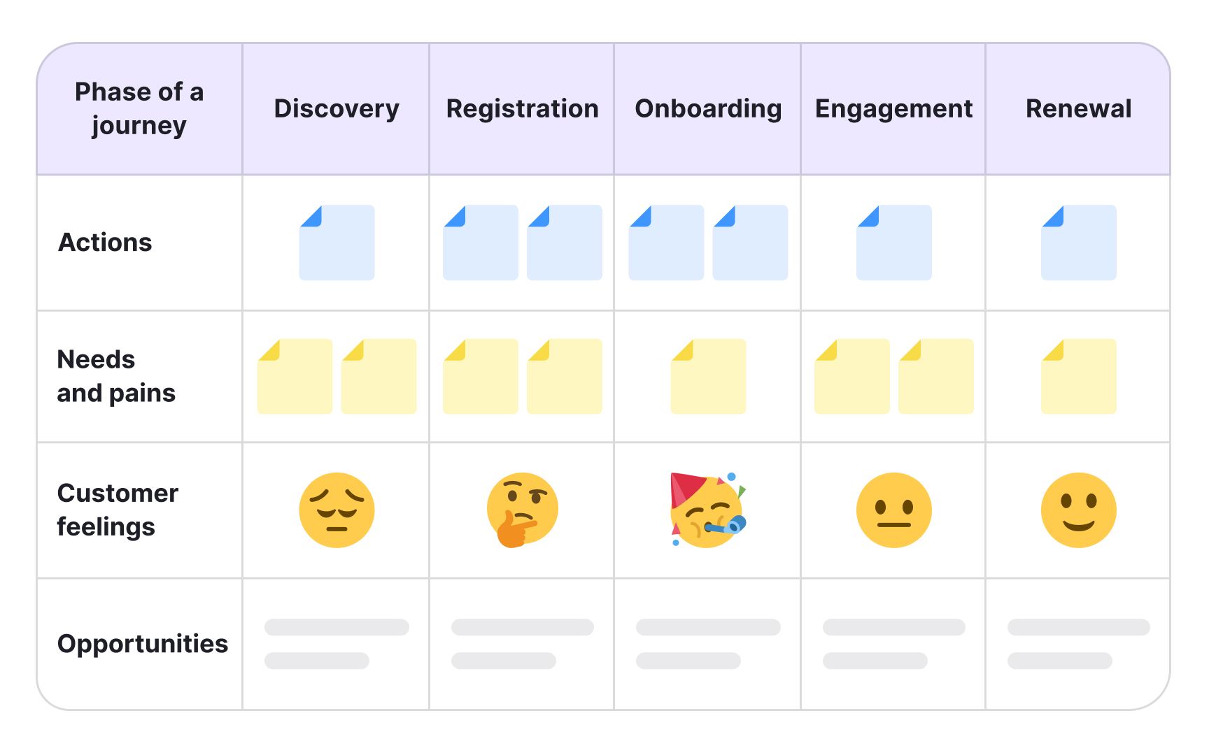
Most journey maps follow a consistent structure: a defined persona and scenario at the top, phases of the journey in the middle (each with user actions, thoughts, and emotions), and insights or opportunities at the bottom. That last layer is the point. The map exists to surface gaps and friction in the experience, so teams can decide what to fix and who owns it.
Journey maps work especially well for omnichannel experiences, where users move across websites, apps, and physical touchpoints. Aligning those channels around a single user journey helps teams spot where the experience breaks down between handoffs. They can be used at any point in the design process: to evaluate a product that already exists or to design a better version of one.[2]
Critical elements of a customer journey map
Customer journey maps are built on 3 critical elements. Understanding them helps you read and create either type of map.
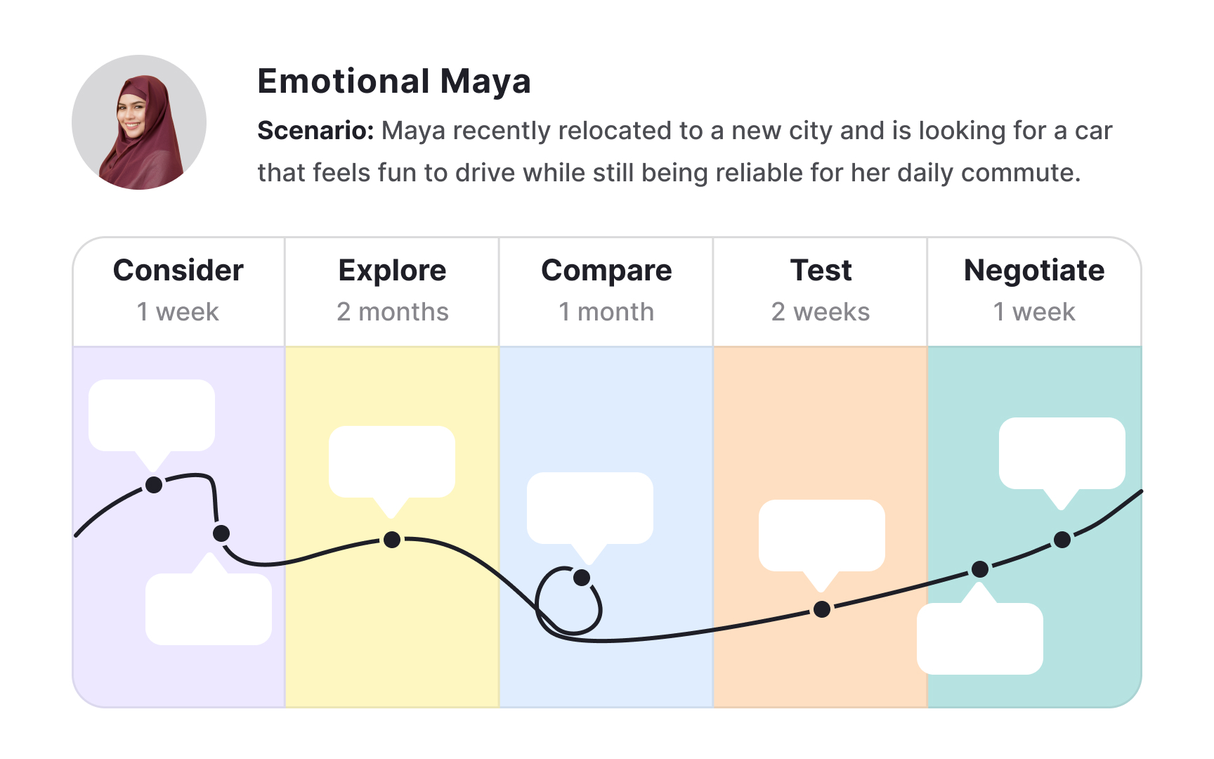
- Actor: The persona whose point of view the map represents. Each map should focus on one actor at a time. If a product serves multiple user types, each needs its own map to keep the narrative clear and findings actionable.
- Scenario and expectations: What the actor is trying to accomplish, what steps they take, and what thoughts and expectations they carry along the way. A scenario can reflect an existing experience or an anticipated one for a product still in design.
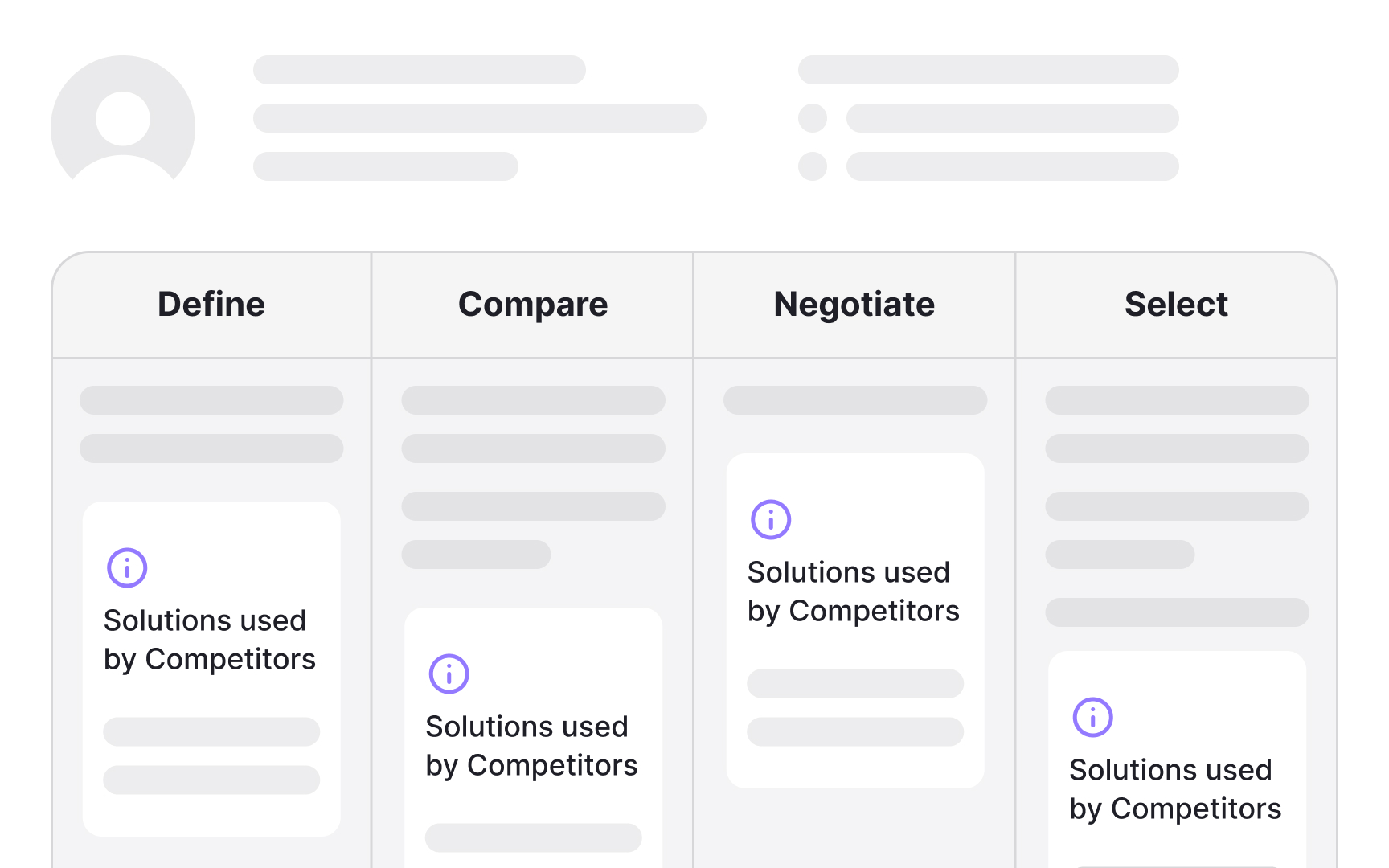
- Journey phases: The high-level stages that divide the scenario. Everything else in the map, including actions, emotions, and opportunities, is organized within those phases. Phases vary by scenario: switching a mobile plan might involve define, compare, negotiate, and select, while ordering takeaway might run from awareness through consideration, conversion, customer service, and loyalty.
Components of an experience map
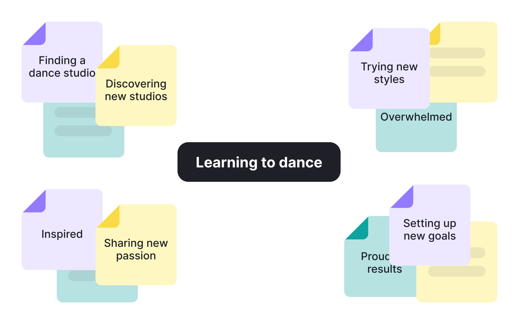
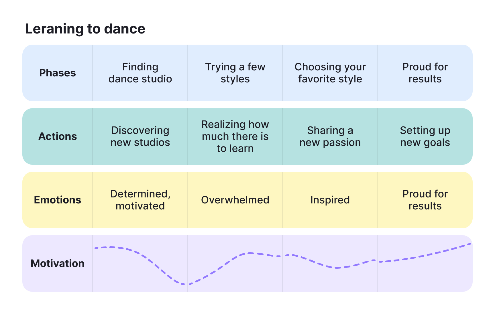
Experience maps are organized into 4 swim lanes that run chronologically across the map, capturing what a generic person goes through when trying to reach a goal:
- Phases: The major stages of the experience, defined by shifting goals or contexts rather than product touchpoints. Each phase groups everything else in that column: the actions, thoughts, and emotions that belong to that moment in the journey.
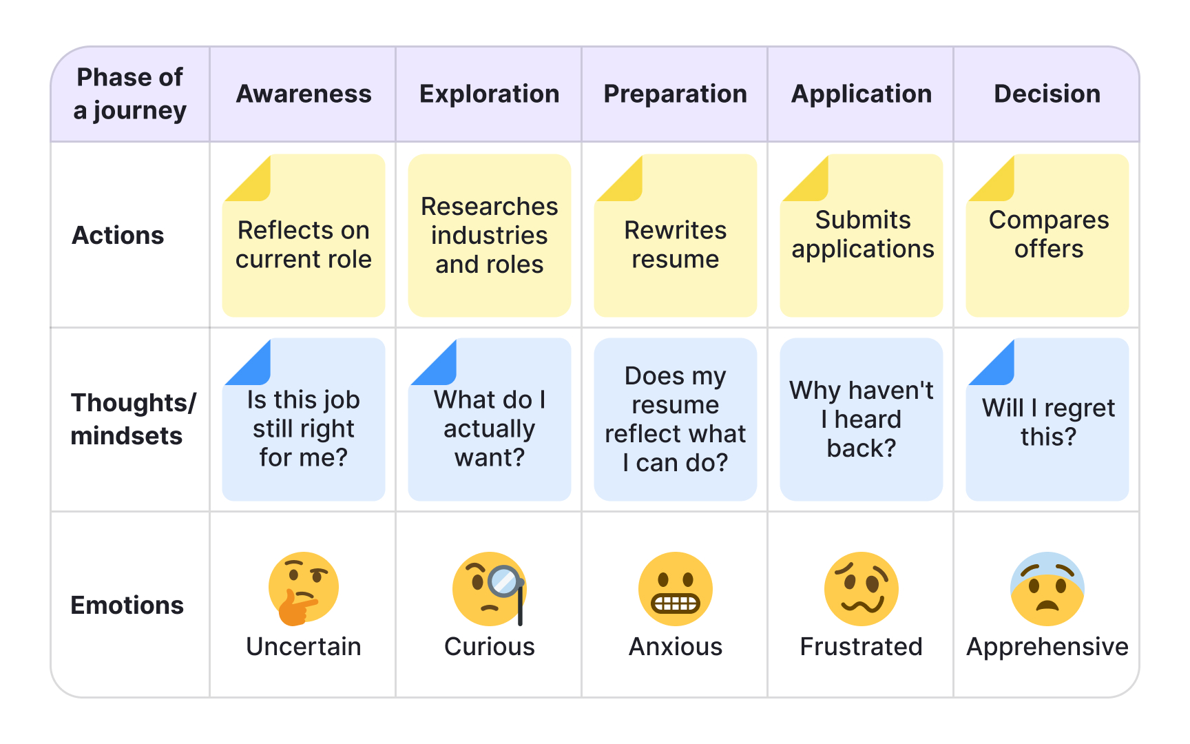
- Actions: The actual behaviors people take within each phase. Not a step-by-step log of every interaction, but a narrative of what people do to move forward. For example, during a job search, a person might research salaries, rewrite their resume, and reach out to contacts.
- Thoughts and mindsets: What occupies people's attention at each phase: their questions, motivations, and information needs. Ideally drawn from real research, these reveal what drives behavior and where uncertainty creeps in.
- Emotions: The emotional highs and lows plotted across the journey. This layer shows where the experience feels effortless and where it creates stress or friction, making it easier to spot which phases need the most attention.[3]
How to define phases in UX maps
Phases are the columns of any map, and defining them is the first step in building both experience and journey maps. The key difference between the two is what drives those phases.
In a journey map, phases reflect a specific scenario tied to a product or service. For an e-commerce scenario like buying wireless headphones, the phases might be: discover, try, buy, use, and seek support. In an experience map, phases reflect shifts in human goals and context, with no product assumed. A map of buying train tickets might include: discover, buy, use, and return.
Phases should cover the full experience from start to finish, so the map reveals where people drop off and what stops them from completing the journey. Keep them high-level. A common mistake is treating individual user actions as phases. Researching prices, reading reviews, and comparing options are all actions within a single Explore phase, not separate phases in their own right.
The number of phases also affects how readable the map is for stakeholders. Too many phases make the map hard to scan, so aim for a number that fits comfortably without requiring horizontal scrolling.
Pro Tip! Most maps should be based on real user data so the first step in mapping is to conduct user research.
How to map actions, thoughts, and emotions in UX maps
With phases in place, fill in the three content swim lanes for each phase: actions, thoughts and mindsets, and emotions. The goal is to build a narrative of how people behave, not a log of every possible interaction.
Prioritize patterns from research over individual observations. A behavior worth mapping is one that repeats across multiple participants: a workaround people keep using, a question that comes up in every interview, a moment where frustration consistently spikes. One-off feedback or feature-specific requests belong in other research artifacts, not here.
For each swim lane, focus on what genuinely moves the story forward:
- Actions: What do people actually do to progress through this phase? Describe the narrative, not every micro-step.
- Thoughts and mindsets: What questions or concerns occupy people at this stage? What motivates them to keep going or makes them hesitate?
- Emotions: Where does the experience feel easy or energizing? Where does it create friction or uncertainty?
Filling in all 3 layers for each phase reveals how behavior, motivation, and emotion interact across the journey, which is where the most actionable insights tend to surface.
Pro Tip! If a swim lane is hard to fill, it is a signal you need more research before mapping that phase.
Evaluate a journey map with your team
Once the swim lanes are filled, the map becomes a tool for analysis. You and your team review each phase, looking for friction points. These are moments where behavior, thoughts, and emotions signal the experience is breaking down. You then surface them as opportunities: specific areas where the design can be improved.
This is why stakeholder involvement matters. Friction rarely falls within a single team's domain. A checkout drop-off might involve form layout, flow decisions, and load times across three different teams. When the right people are in the room, ownership becomes clear and insights are more likely to be acted on.
What you surface depends on the map type. A customer journey map points to friction within your product, where users get confused, hesitate, or abandon a task. Users consistently dropping off before confirming a subscription points to a specific moment worth investigating. An experience map surfaces broader behavioral patterns independent of any product. If research shows people avoid managing finances on mobile, the opportunity is not a UI fix. It's understanding what drives that avoidance and what would need to change to build trust.[4]
Analyze competitors using your journey map
Competitive analysis is particularly useful when designing a future-state journey map for a product that doesn't exist yet. By mapping what competitors do at each phase, you can identify where they fall short, where they succeed, and where there's space to do something better.
Your map's existing phases and user goals give you a natural framework for comparison. Use them to define your criteria before you start, and add more as you go. Three approaches tend to yield the most useful data:
- Use competitors' products yourself, working through the same tasks your persona would. Note where the experience feels smooth and where it creates friction.
- Read user reviews on app stores, marketplaces, and social media. Reviews surface recurring complaints that a polished demo won't reveal.
- Run usability tests with real users on competitors' products. Watching someone navigate a competing product reveals behaviors you can't predict on your own.
Each method captures something different: direct use gives you a researcher's view, reviews give you patterns at scale, and usability tests give you behavioral data. Together, they build a clearer picture of what users need and where the market has room for improvement.[5]
Pro Tip! Start mapping the competition with 3-5 main competitors.
Current-state and future-state user maps
Both map types, experience maps and customer journey maps, can represent either the current state of an experience or a desired future state. Choosing between them shapes what the map is actually for.
Current-state maps capture the experience as it exists today. They're grounded in real research and used to identify existing pain points, gaps, and areas of friction. Because they reflect what's actually happening, they're a reliable foundation for design decisions.
Future-state maps visualize the ideal experience: what you want the journey to look like for a redesigned product or one that doesn't exist yet. They're useful for setting direction, aligning teams around a shared vision, and generating hypotheses to test with users. But they represent a target, not a truth. Using a future-state map to justify finalized design decisions without validating it against real user behavior is a common mistake.
In practice, many teams start with a current-state map to understand existing problems, then create a future-state map to explore solutions. The current-state map keeps the future-state map honest.
Hypothesis-first vs. research-first user mapping
Before building a map, your team faces a practical decision: do you start with what you already know, or do you begin with user research?
- Hypothesis-first approach: you run a workshop where team members pool existing knowledge to build an assumption map. This is useful when you need to move quickly, build stakeholder buy-in, or surface gaps that will shape your research plan. The risk is that teams often stop here, using the hypothesis map to make decisions it was never meant to support. If you go this route, treat the output as a starting point and follow up with research to validate or revise it.
- Research-first approach: you conduct user research before mapping anything. Interviews, field studies, and diary studies give you behavioral data to build on. The map reflects what users actually do, think, and feel, not what your team assumes. This approach takes more upfront time, but the map carries more weight with stakeholders and is less likely to be challenged as anecdotal.
In practice, most teams use a hybrid: start with a hypothesis map to align the team and identify gaps, then run research to update it. Neither approach skips research entirely. The question is when it happens.
Choose the right fidelity for your user map


The fidelity of your map should match where you are in the process. Starting high-fidelity too early wastes time on polish before the content is stable.
- Low-fidelity maps are unpolished and built for speed. Sticky notes on a wall, a whiteboard, or a digital tool like Miro work well here. Because they look unfinished, people feel comfortable moving things around and disagreeing with what's on the map. That's the point: low-fidelity maps are for building the map, not presenting it.
- Mid-fidelity maps, like a collaborative spreadsheet, sit between the two. They're structured enough to organize swim lanes clearly, but still easy to edit. They work well as a bridge when moving from a workshop to a final artifact.
- High-fidelity maps are polished, designed for readability, and built to be shared with stakeholders who weren't part of the mapping process. They carry more weight in presentations, but their finished appearance makes them harder to update.
Start with a low-fidelity version first, even if the goal is a high-fidelity artifact. It keeps the focus on getting the content right before investing in the visual design.
Topics
References
- When & How to Use an Experience Map in UX Design | Adobe XD Ideas | Ideas
- Journey Mapping 101 | Nielsen Norman Group
- UX Mapping Methods Compared: A Cheat Sheet | Nielsen Norman Group
- How To Build an Experience Map | UX Magazine
- How Channels, Devices, and Touchpoints Impact the Customer Journey | Nielsen Norman Group


