


.svg)
Menus seem straightforward until they're not. Too many items overwhelm users. Vague labels slow them down. Inconsistent behavior breaks trust. Good menu design follows patterns people already know. It keeps critical options visible, uses clear and concise labels, and provides enough space for comfortable tapping or clicking. Elevation and shadows help menus stand out without cluttering the interface. Dividers group related actions so users can scan faster. Hover and selection states give feedback that confirms the interface is responding. These patterns exist because they work. Following them means users spend less time figuring out your menu and more time getting things done.
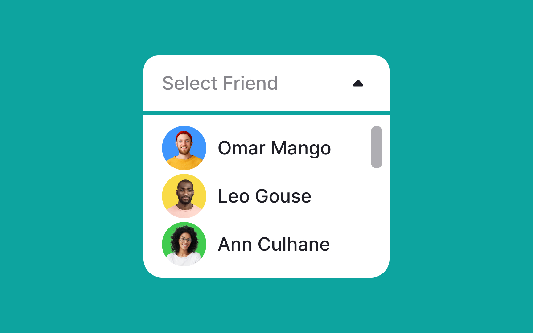
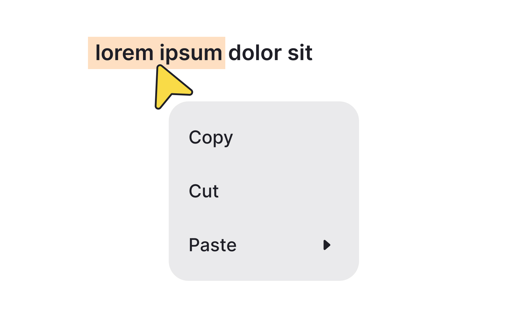
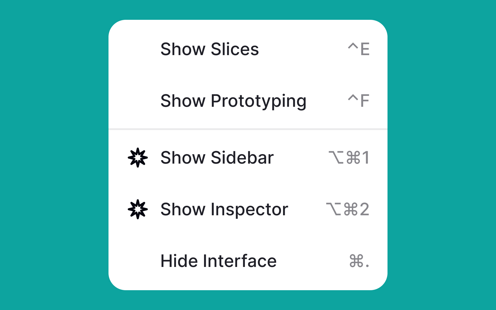
Make sure all critical menu options are fully visible


When you have enough screen space, there's no need to tuck away menu items or add extra levels. Doing so can make interactions more cumbersome, increase cognitive load, and slow down users in finding what they need.
Keep it simple and straightforward: place the most frequently used options at the top of the menu. This way, users can quickly find what they're looking for without having to scroll, making the whole experience more efficient and user-friendly.[1]
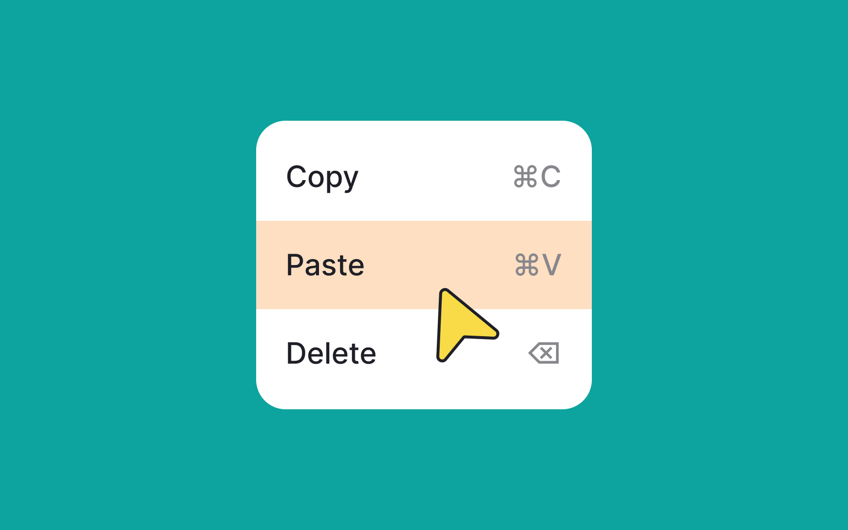
Make it easy to deselect items
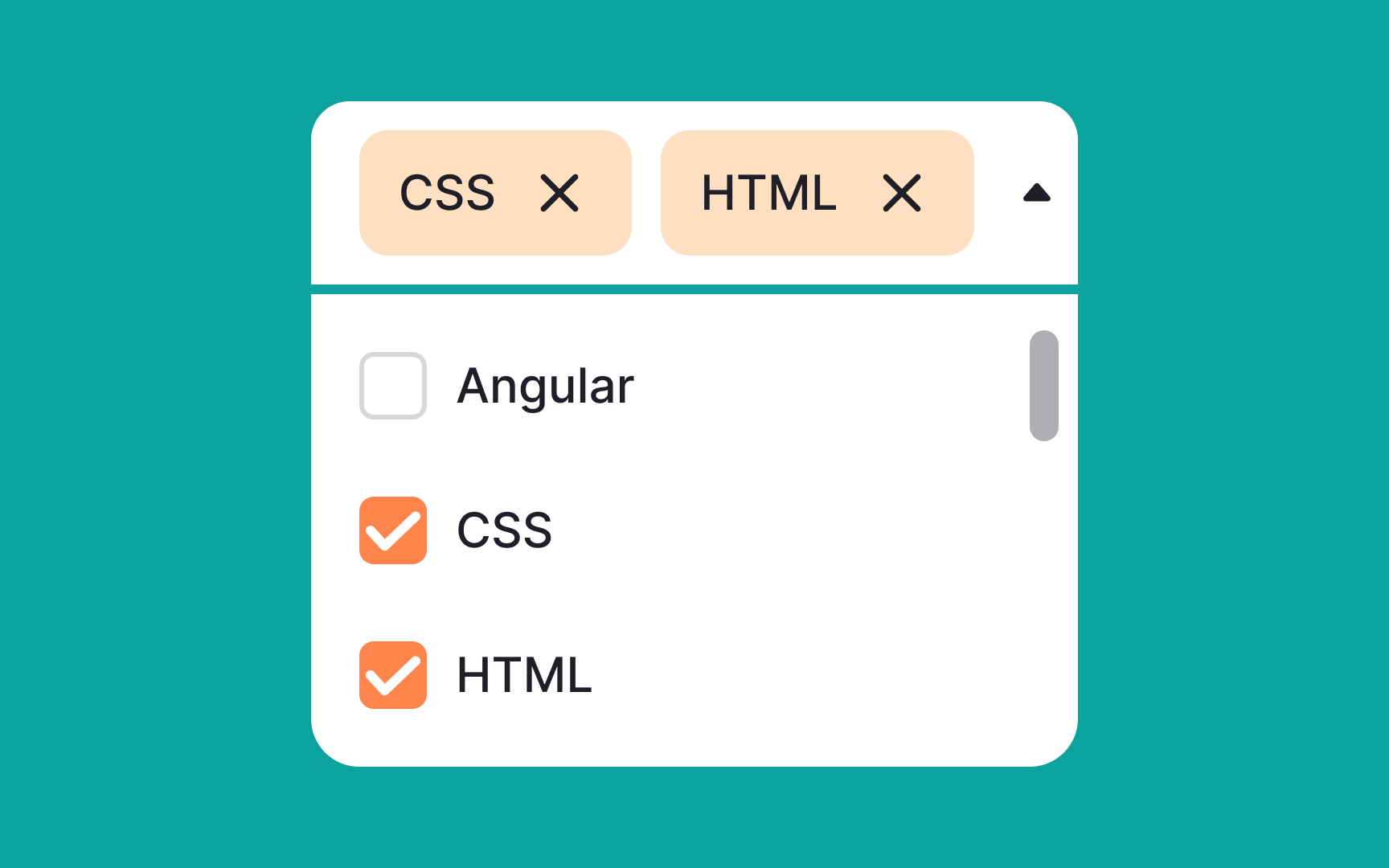
Multiselect menus empower users to select multiple options at once, enhancing flexibility and choice. To improve usability, ensure that users can clearly see all their selected items and have the ability to easily remove any of them directly from the menu input.
Requiring users to backtrack just to deselect an item interrupts the flow and adds unnecessary friction. By simplifying the selection and deselection process, you can offer a smoother, more intuitive user experience.
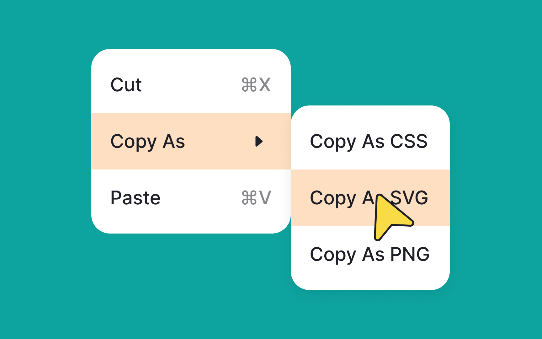
Consider cascading menu position
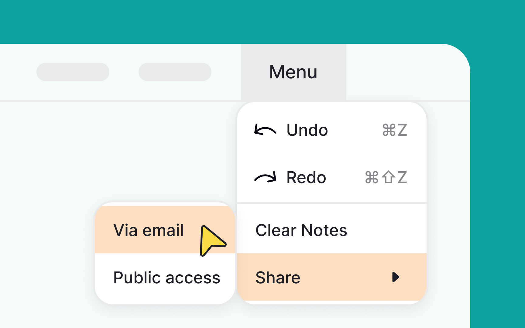
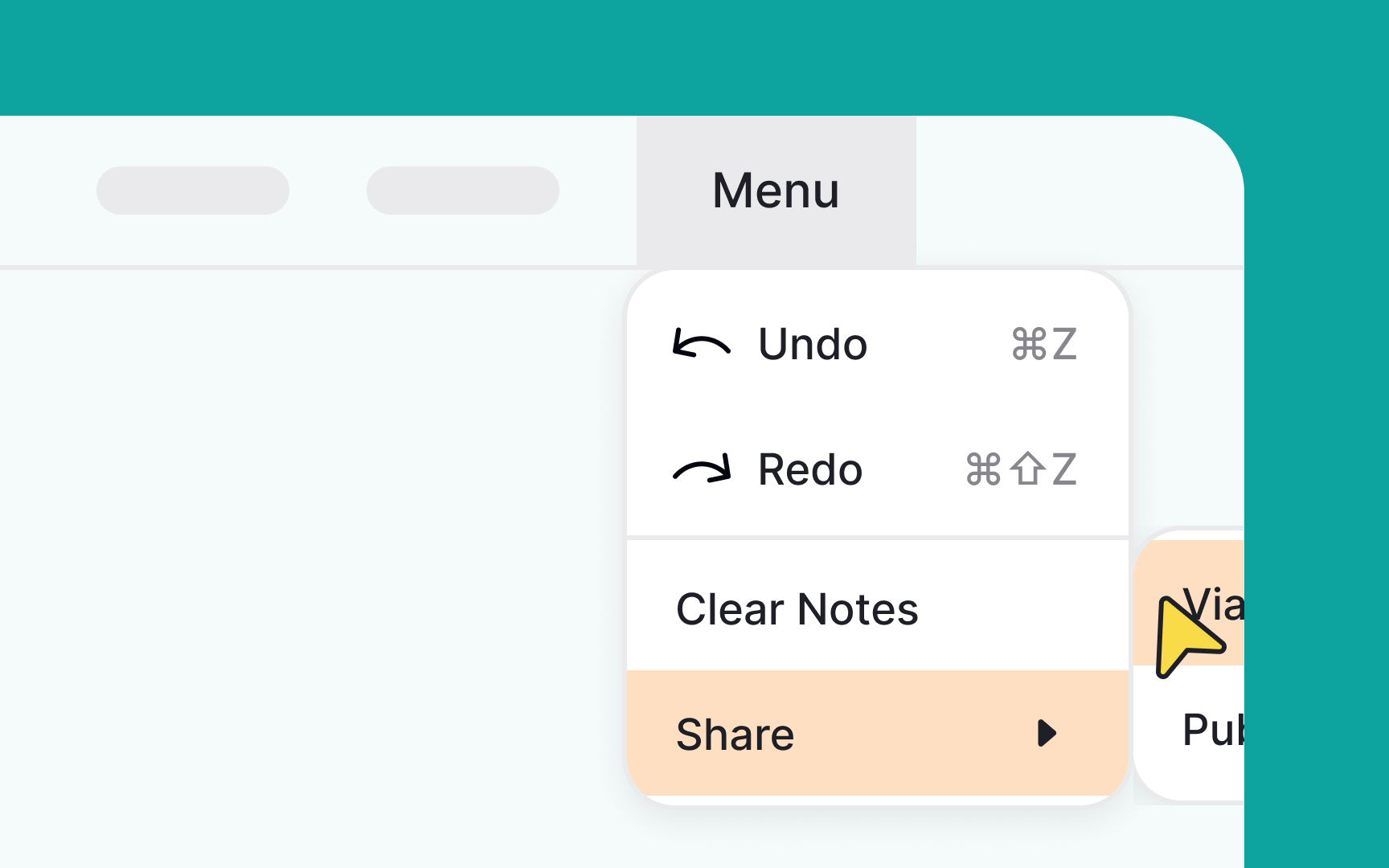
When you're designing cascading menus, it's essential to be mindful of the available screen real estate. Utilize wireframes or mockups to anticipate how the menus will unfold, ensuring there's enough room for each option to be clearly displayed.
You can use design tools that allow for dynamic adjustments, so you can simulate different scenarios. This way, you can adjust the direction or structure of the menus based on the actual space constraints you encounter.
Prioritize menu items

When choosing menu items, ensure you don't increase the users' cognitive load. Most people can store between 5-9 pieces of information at any time, and 2-4 of those can be processed simultaneously.[2]
This means that you need to consider the most important actions — like copy, paste, or save — and leave them in the primary list. Less critical items can go on the second, less visible, hierarchy level. A menu list like this will help users spot a needed action much faster.
Add enough space within a menu
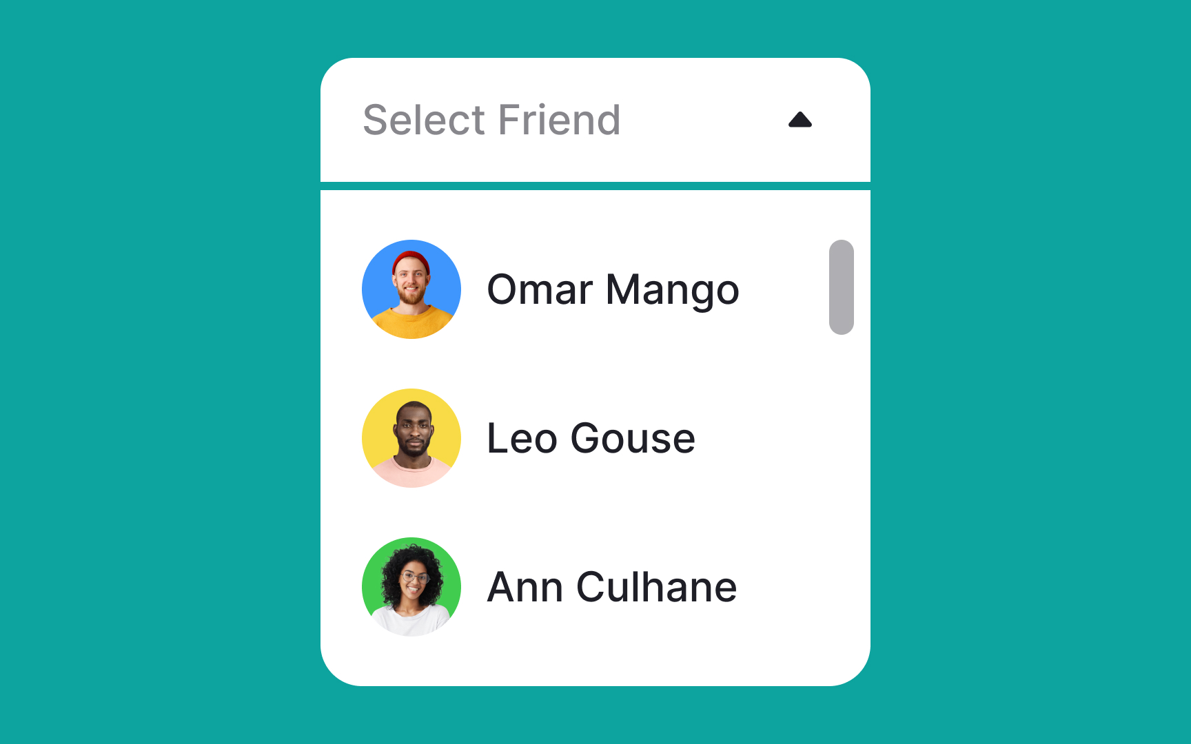
Great design requires balance. Make sure the menu items are well-spaced, providing users with ample room to make a selection. Proper padding and height will increase legibility and be more accessible for users with fine motor control impairments. According to Google’s Material Design guidelines, clickable elements should be at least 48x48 pixels in size.[3]
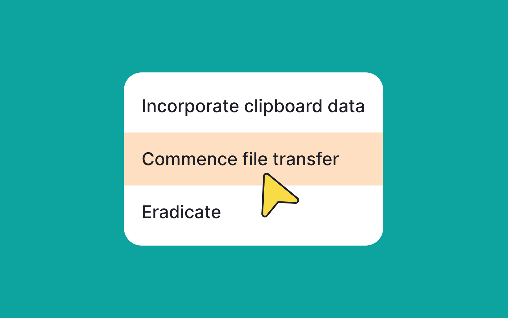
Truncate longer labels
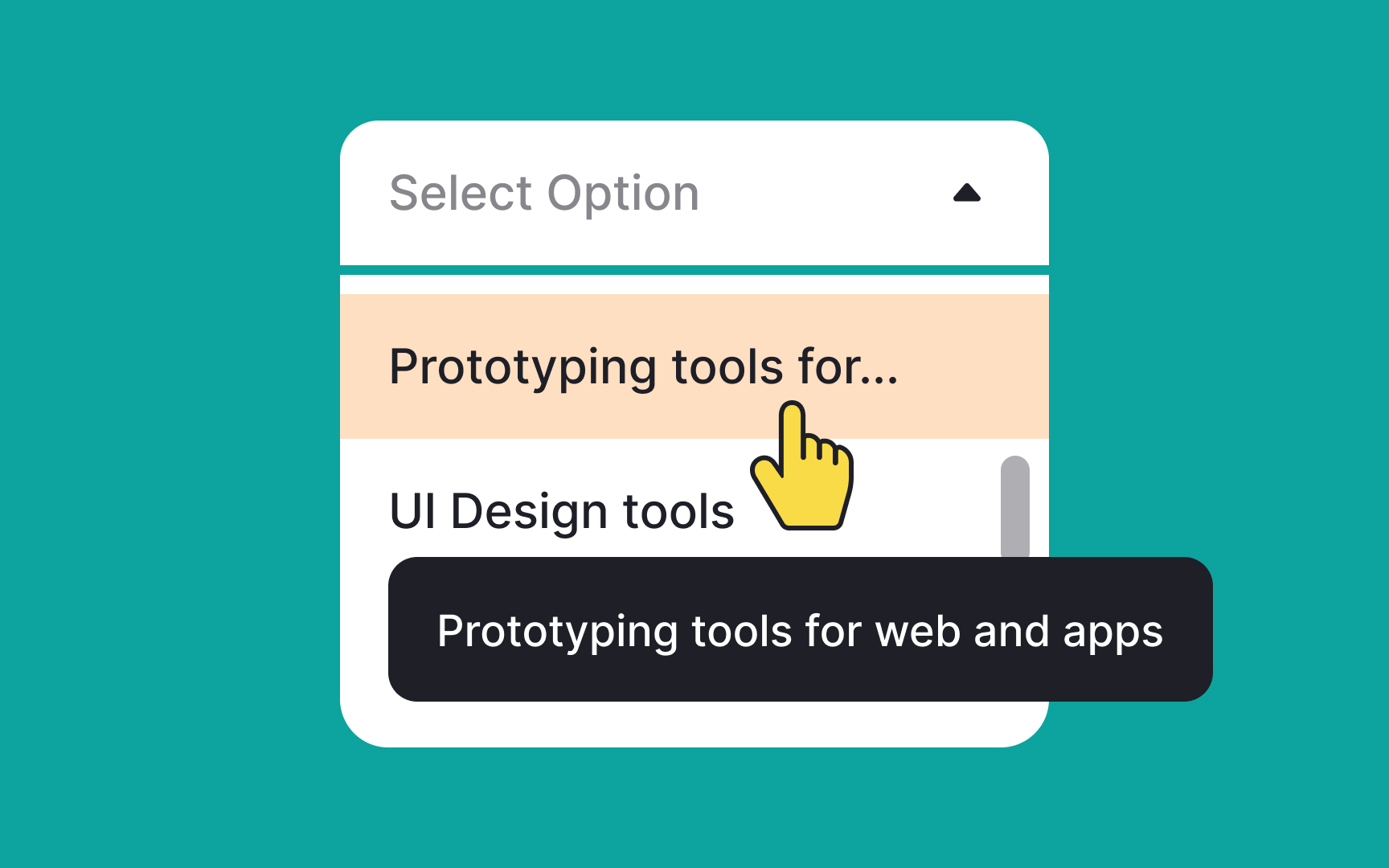
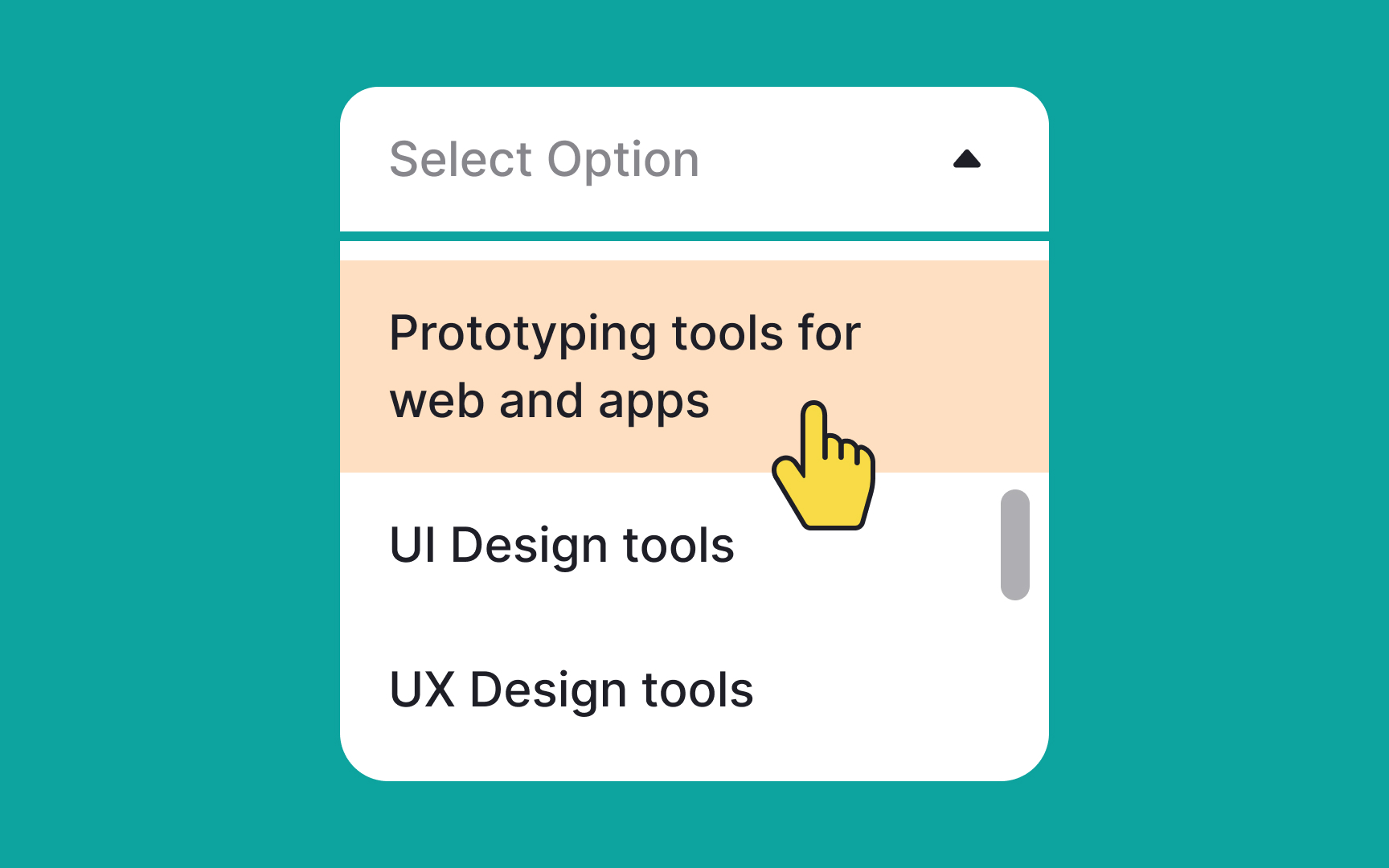
In the first place, keep menu labels simple and to the point; this isn't the venue for clever wordplay or lengthy descriptions. Straightforward and descriptive labels help users quickly find what they need.
If you absolutely can't avoid long labels, consider truncating them and using tooltips to reveal the full text. This keeps the menu layout clean and consistent. On mobile devices, where space is at a premium, ensure that labels are as concise as possible without losing clarity. If a label overflows to the next line, it's a sign that it needs further refinement.
Add elevation to guide users' attention to a menu
In Google's Material Design, elevation serves to establish visual hierarchy by placing elements at different heights along the z-axis. Menus, in particular, benefit from higher elevation settings, typically around 8dp, to naturally capture users' focus.[4]
Elevating menus helps specify them as actionable or information-rich elements, effectively drawing attention away from the rest of the interface. The use of shadows and color contrast further accentuates this visual layering, making it easier for users to navigate and interact with the menu. In essence, higher elevation not only adds aesthetic depth but also intuitively guides users' attention to the most crucial elements on the screen.
Ensure menus behave predictably
Menus should show up when users tap them and go away when users tap somewhere else on the screen. This is the usual way menus behave, and it's what most people are familiar with and what they expect when interacting with this control.
By meeting user expectations for how menus should behave, you remove friction and make your interface more user-friendly.
Keep menu labels short and helpful
Menu labels should tell what happens when users click or tap the item. They must be clear and concise. Long or confusing labels — for example, using jargon — will cause unnecessary cognitive load, which will slow users down.
To create user-friendly menu labels, use conventional labels such as Paste instead of Insert. The labels should be relevant to the menu and simple so that even non-native speakers can understand them.
And most importantly, test your labels. What seems clear to you might confuse your users. Research methods such as card sorting can help you get feedback on your labels.[5]
Pro Tip! Verbs and verbal nouns are perfect for labels as they imply action.
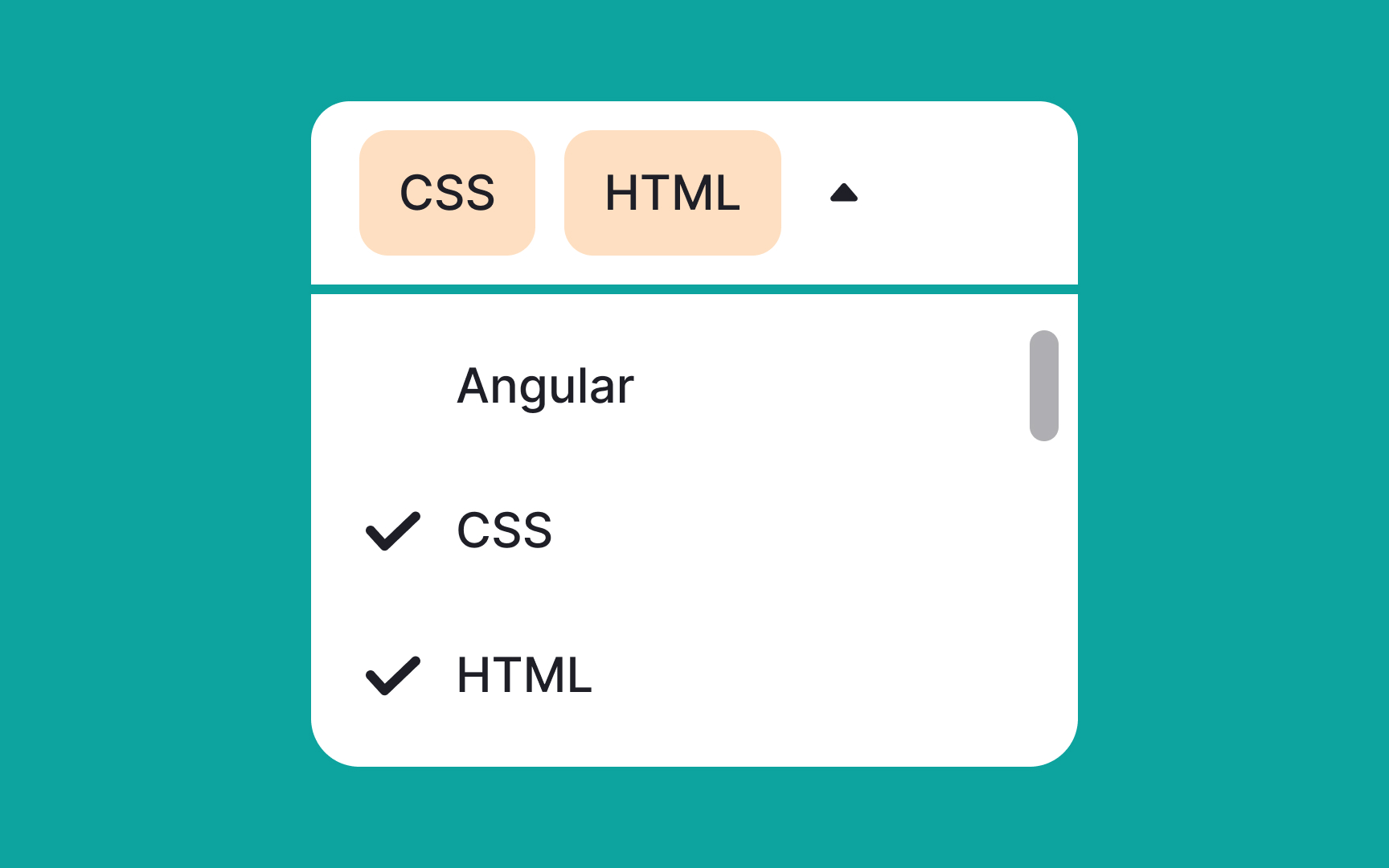
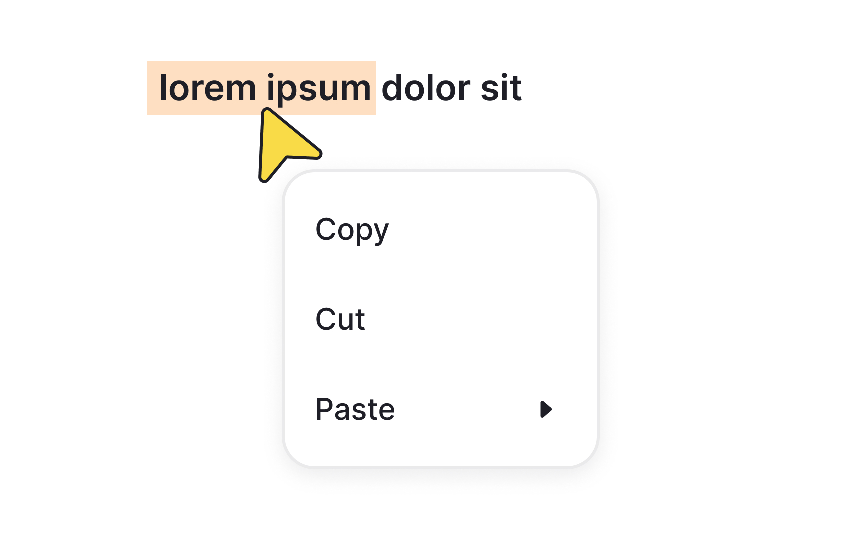
Use familiar icons to indicate menu selections
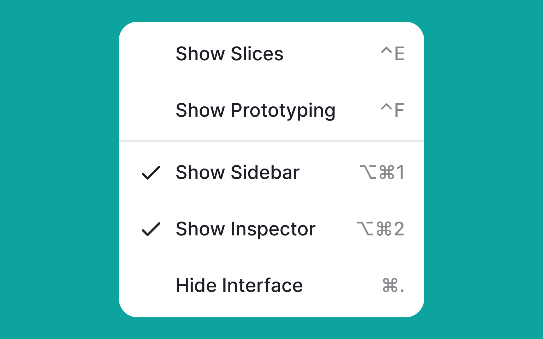
The selection state icon is the mark that indicates what item or items users have chosen in a single-select or multiselect menu.
Most commonly it's either a checkmark or an "X." These symbols feel intuitive to users as that's what we use when we fill out paper forms. Avoid using unconventional marks for selection state icons to not confuse users.
Pro Tip! The selected option can also be indicated with color overlay.
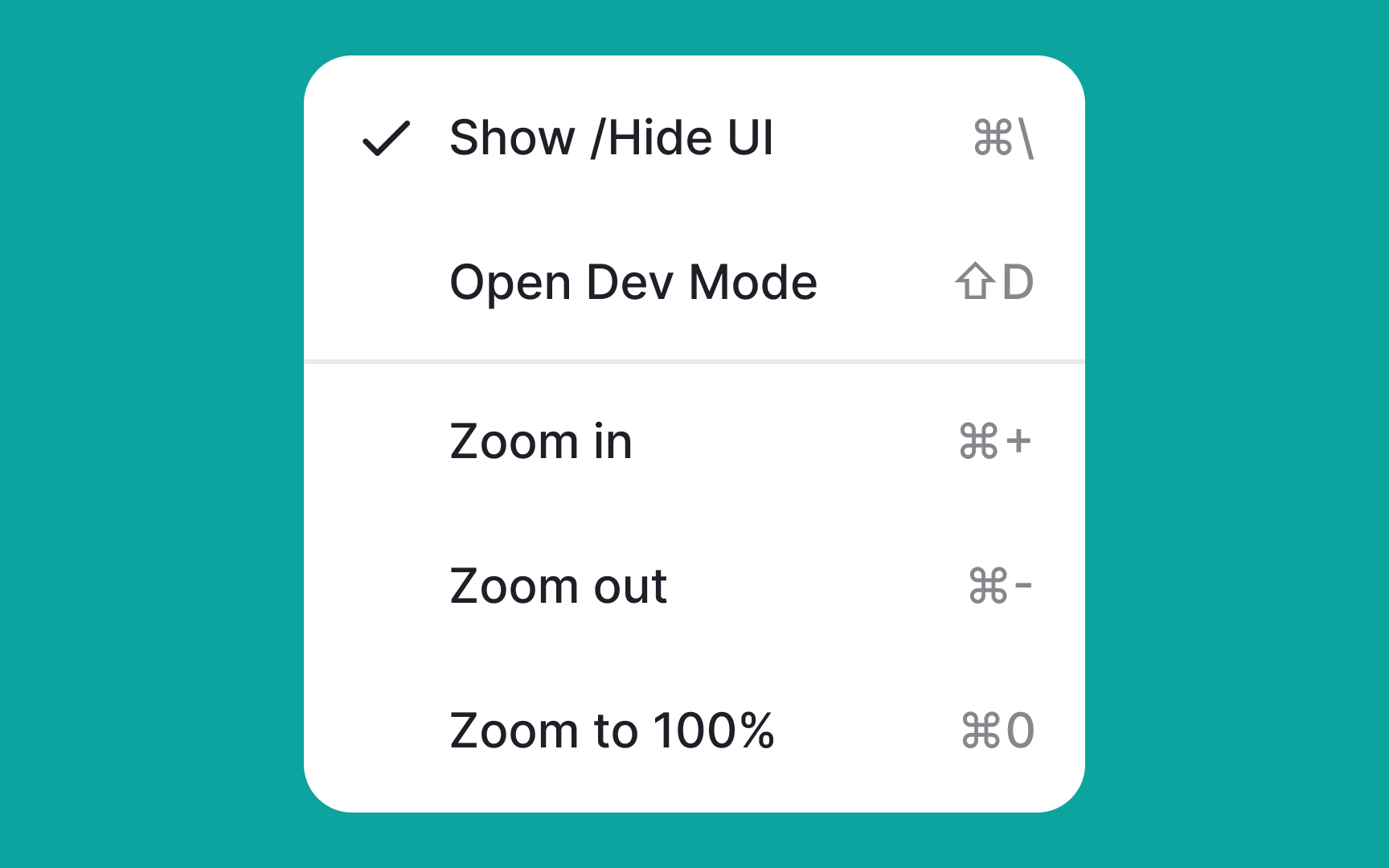
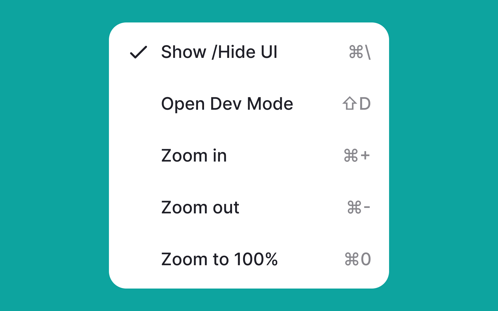
Indicate menu states

In interactive design, giving immediate visual feedback when users hover over menu options is crucial for usability. This dynamic response keeps users informed, assuring them that their action—like hovering—is acknowledged by the UI.
Commonly, designers opt for color overlays with low opacity to signify a change in state. You can also experiment with other subtle effects like a slight elevation, shadow, or even a thin border to show that a particular menu option is interactive. These visual cues make the interface feel more engaging and intuitive, contributing to a smoother user experience.
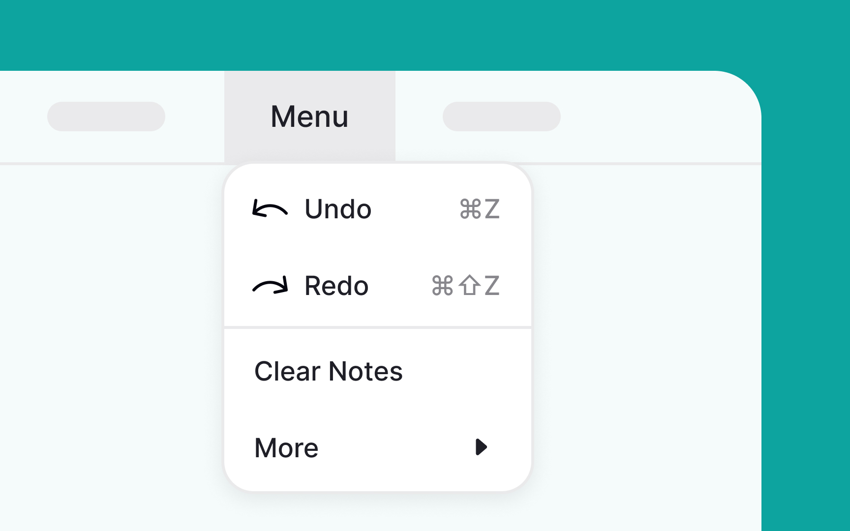
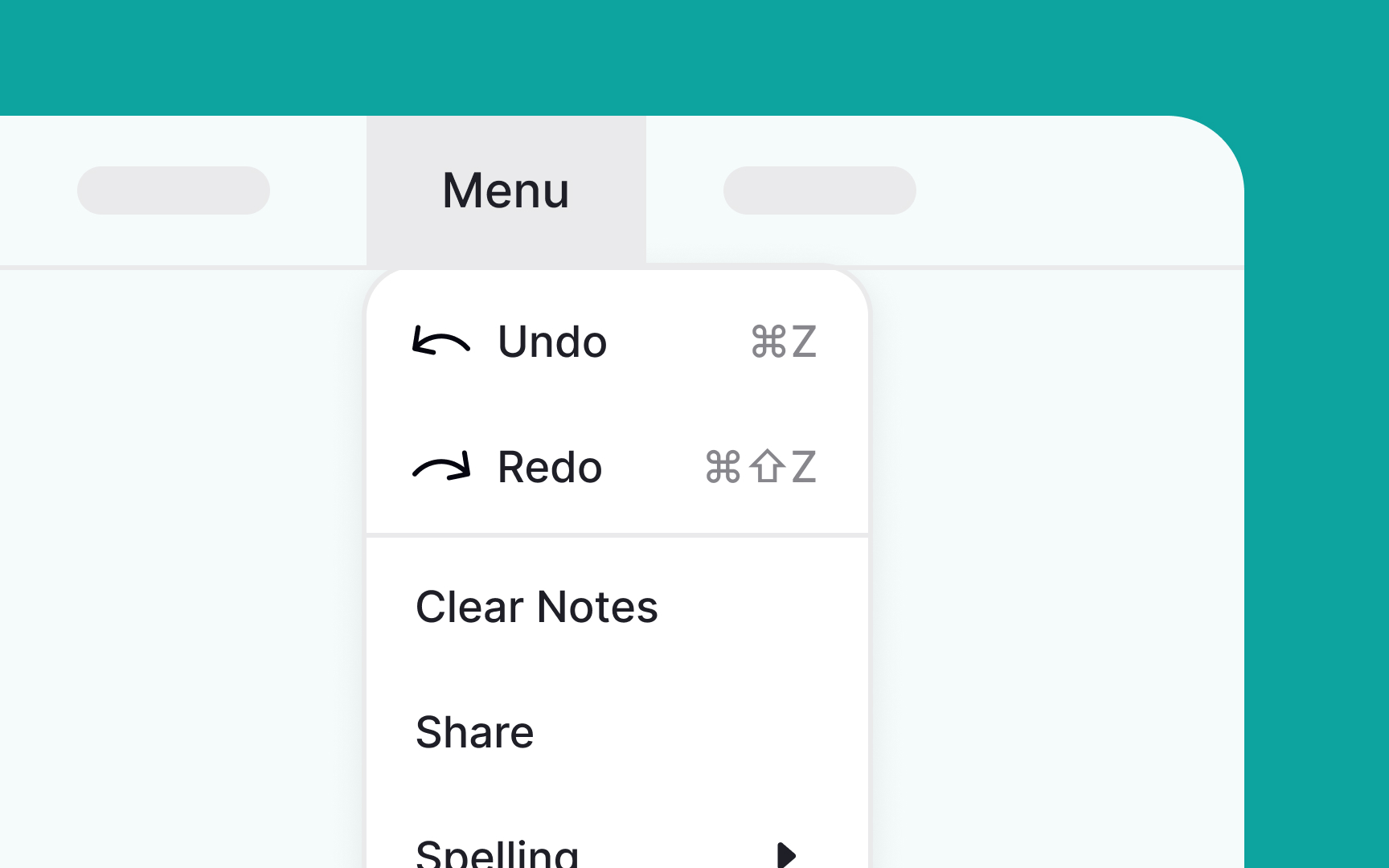
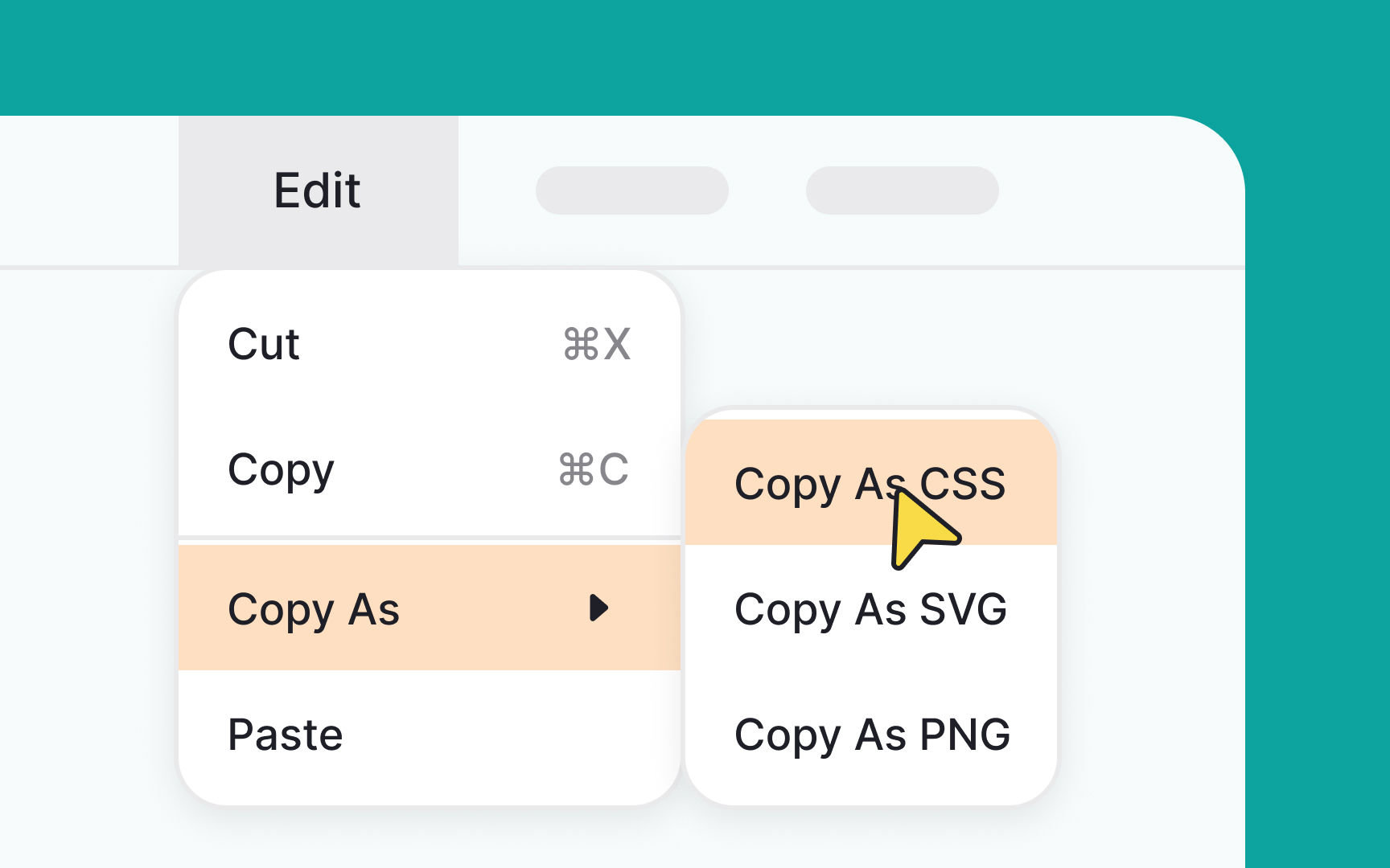
Use dividers to group similar actions
In menu design, visual cues like dividers serve an essential purpose. Dividers are pale horizontal lines that help to cluster related items together within a single menu. By doing so, they make navigation easier and the menu more readable. This way, users can quickly identify groupings of similar actions, enhancing their understanding of the interface.
Importantly, dividers achieve this without cluttering the UI or requiring separate menus for different item categories. Using dividers strategically can lead to a more organized and intuitive user experience.
Pro Tip! Color overlays and negative space can also play the divider's role.
References
- Menu Design: 15 UX Guidelines to Help Users | Nielsen Norman Group
- Understanding cognitive load to better engage your students
- Material Design | Material Design
- Material Design | Material Design
- Avoid Category Names That Suck | Nielsen Norman Group


