


.svg)
Users don't always enter a website through the front door. Search engines, shared links, and bookmarks drop people deep into site structures with no context about where they've landed. Breadcrumbs provide that context, showing the path from the homepage to the current page and making every step along the way clickable.
The value of breadcrumbs is orientation. Users can instantly see how the current page fits within the larger site architecture. They can jump back to parent categories without hunting for navigation menus or hitting the back button repeatedly. For complex sites with deep hierarchies, this kind of wayfinding prevents users from feeling lost.
Text breadcrumbs
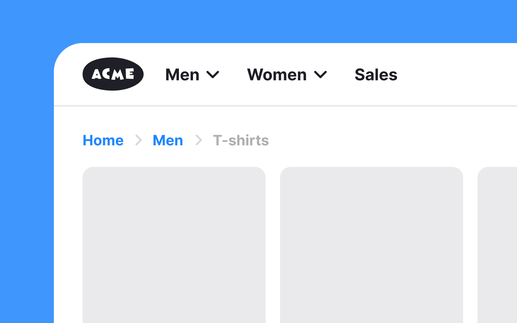
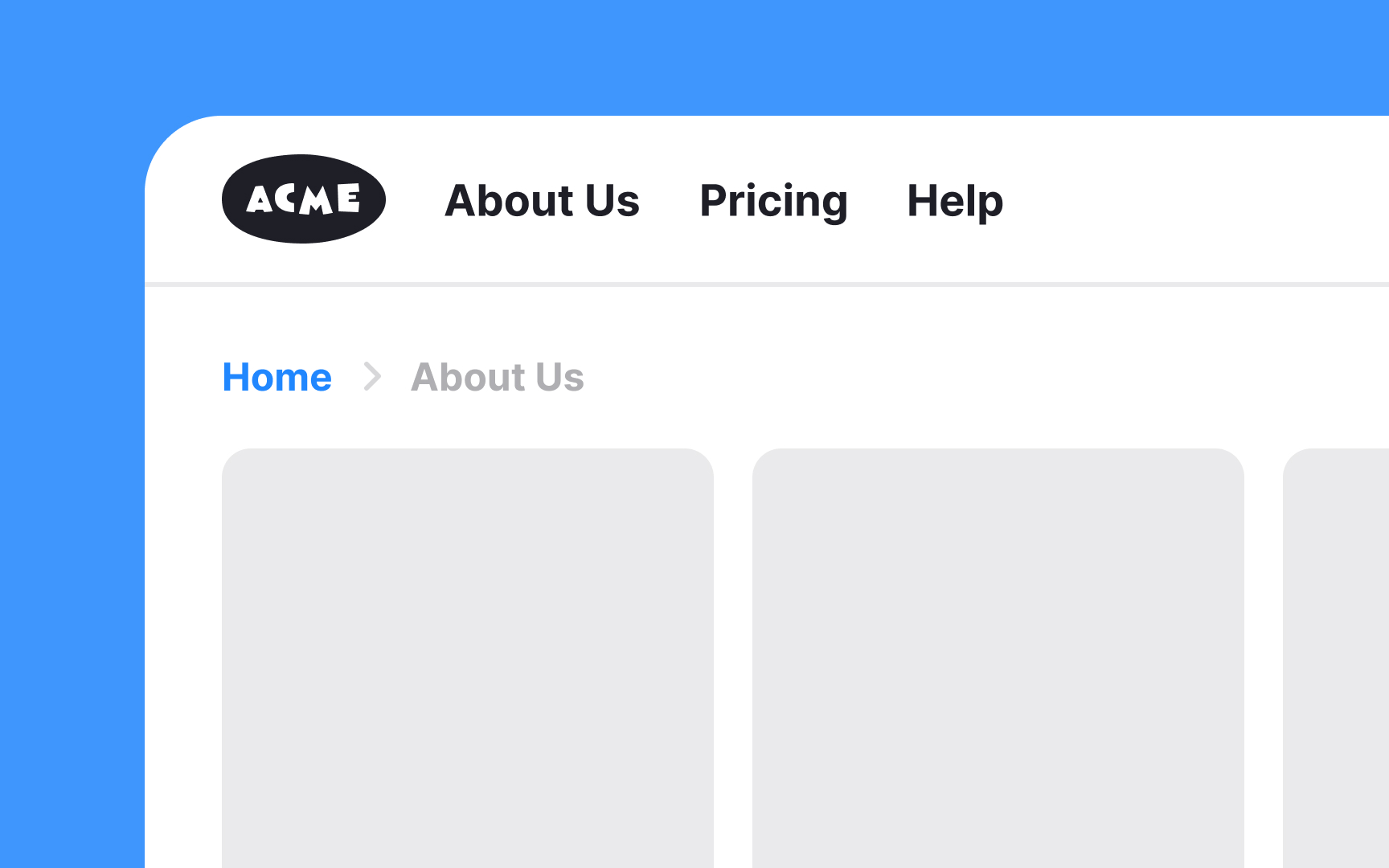
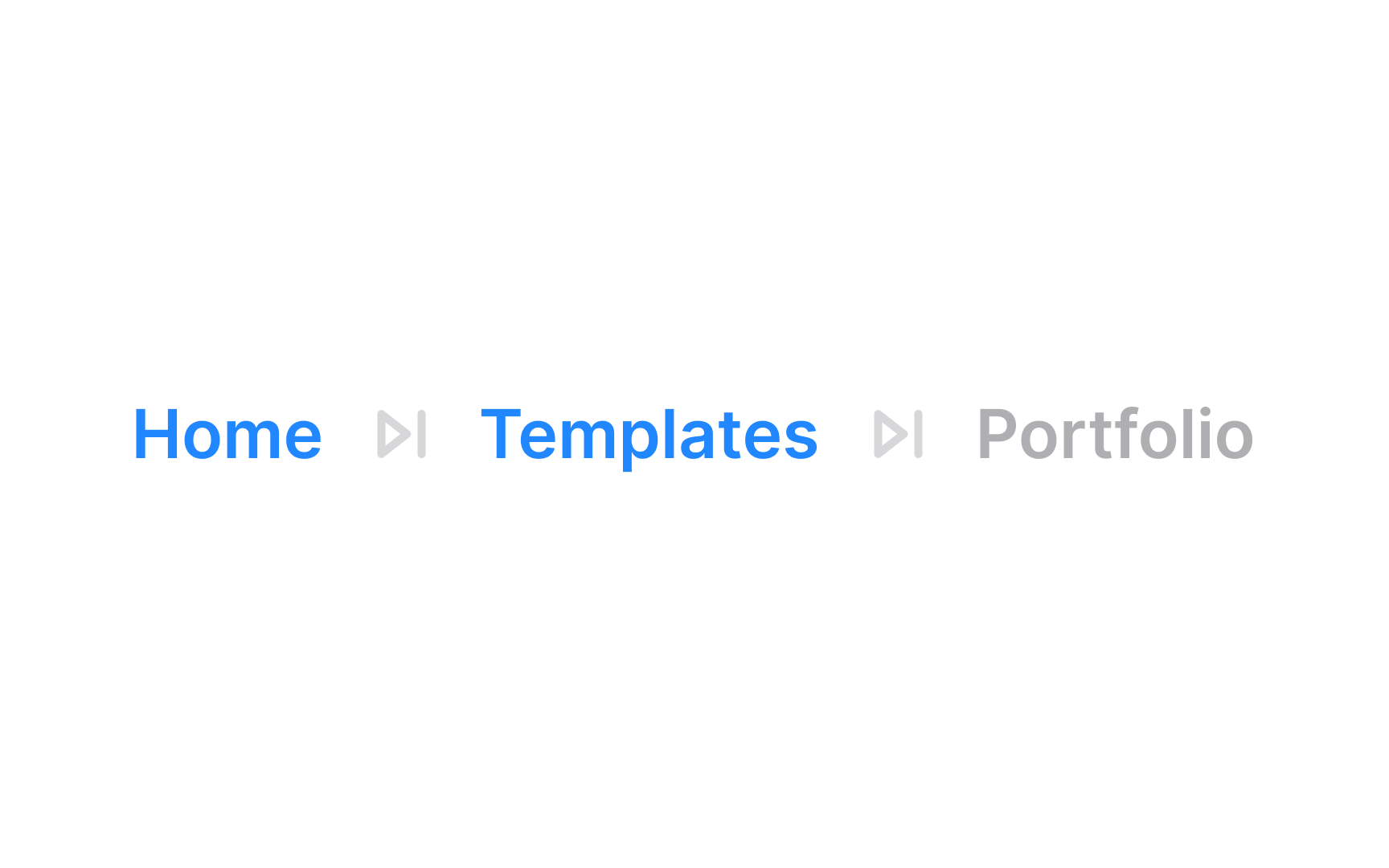
Text breadcrumbs show you where you are within the site by listing the pages you've clicked through, like a trail. Each part of the trail is a clickable link, letting you go back to any previous page. The links are usually separated by a symbol like (>) or (/) to show the path. Text breadcrumbs are great for minimalist designs and save space, making it easy for users to understand their location on the site.
Button breadcrumbs
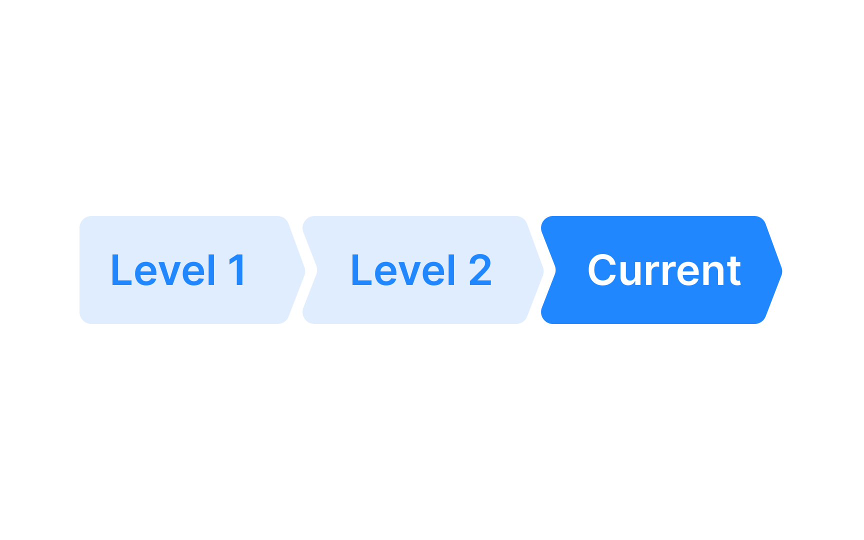
With button breadcrumb trails, each "button" is a clickable link that shows the path you’ve taken through the site, making it easy to go back to any page you visited before. They stand out more than text breadcrumbs and are easy to use because they have a larger touch target area and enhance visibility. They can be styled in various shapes, such as arrows, to indicate the direction of your navigation path.
Pro Tip! Breadcrumbs should be visible, but don't go overboard — they shouldn't be the first thing the user notices.
When to use breadcrumbs


Breadcrumbs are best utilized in websites with complex structures and multiple levels of content hierarchy. For example, in large e-commerce sites, educational platforms, or extensive blogs, breadcrumbs allow users to trace their path back to higher-level pages easily.
However, for websites with a simple, linear structure and only one or two levels of depth, breadcrumbs are less useful.[1] In such cases, there's no significant hierarchy or complex relationships between pages to display. Instead of breadcrumbs, it's better to use clear navigation in the header menu or within the menu categories.
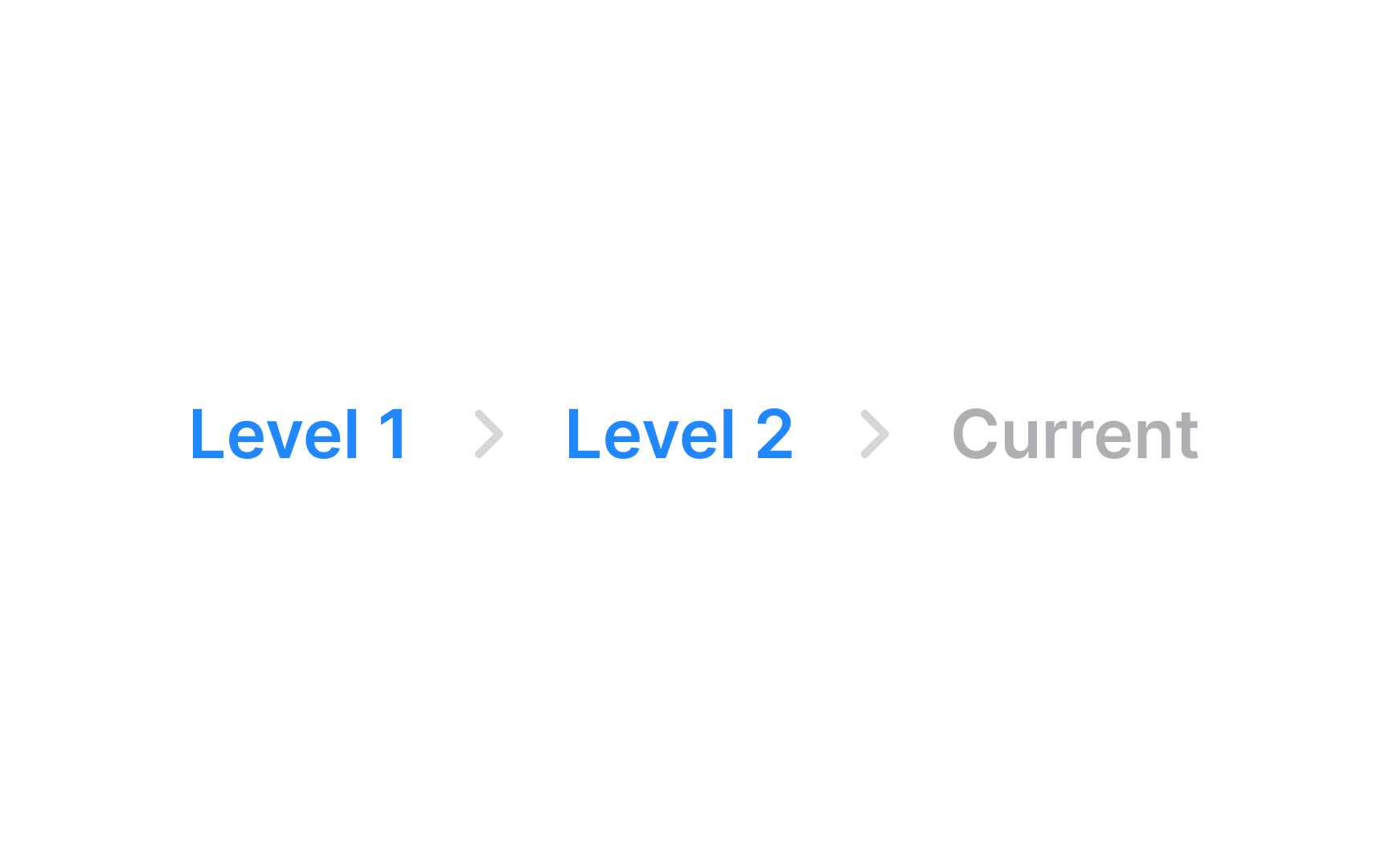
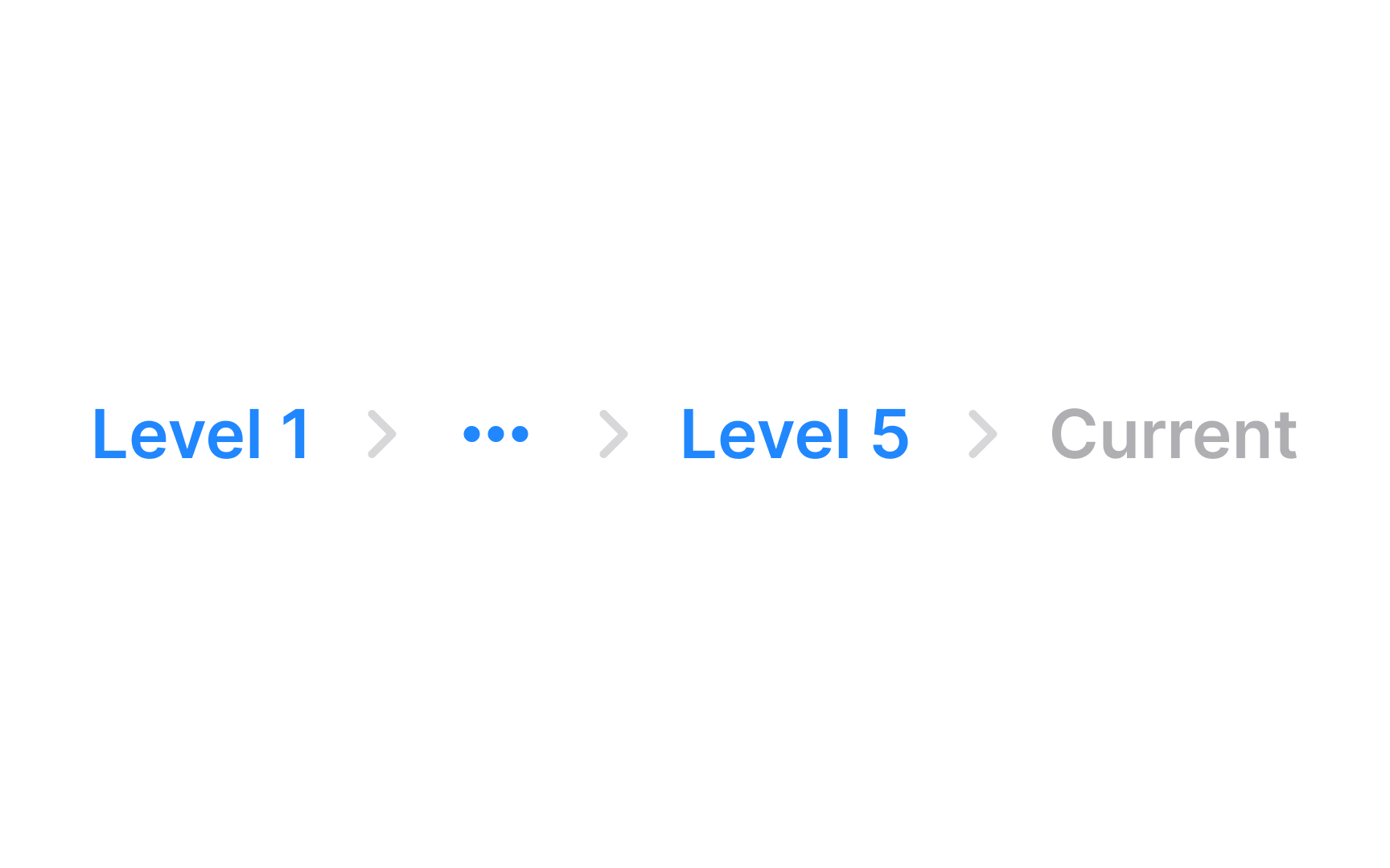
Current page
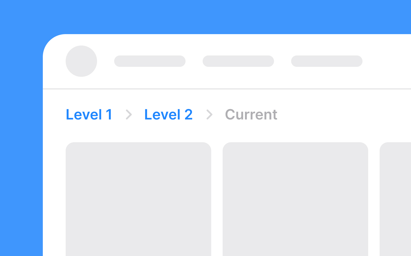
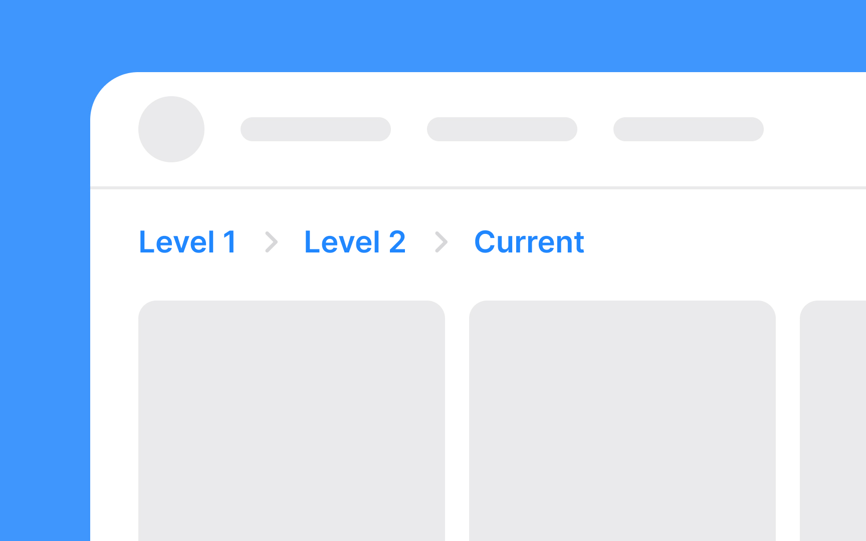
The current page is typically the last item in the breadcrumb trail and is crucial for orienting users. It's essential to style this element distinctively to differentiate it from the clickable links leading to previous pages. The current page in breadcrumbs is usually not clickable, as it represents the page users are currently viewing.[2]
You may use a different font style or weight (e.g., bold) for the current page to make it stand out. Consider employing a color that contrasts with the other breadcrumb links but still fits the overall website color scheme.
Since it's not a link, avoid underlining the current page to prevent confusion.
Previous pages
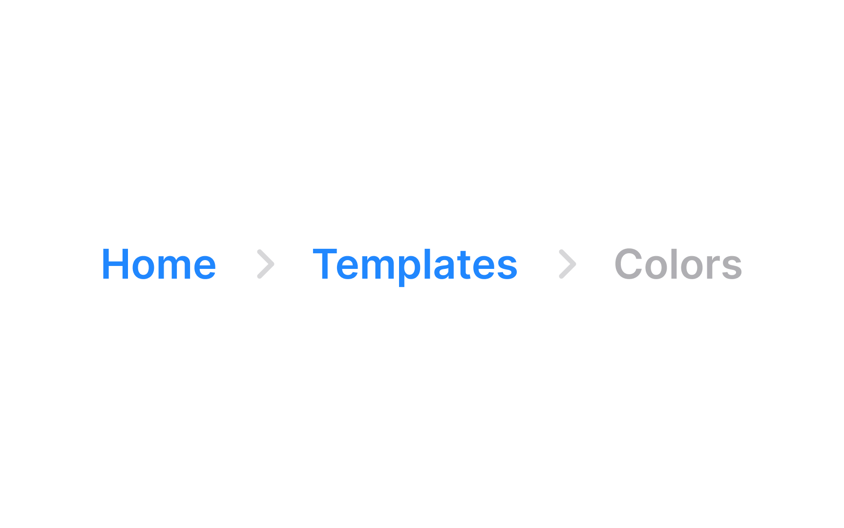
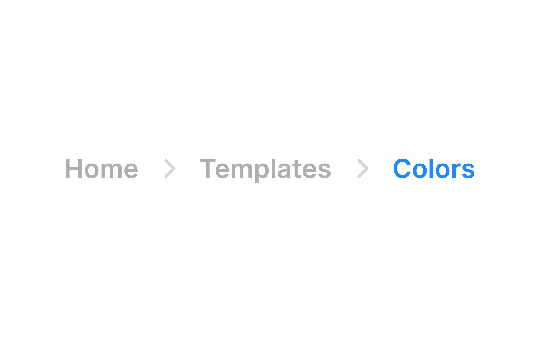
For the previous pages in a breadcrumb trail, the styling should encourage user interaction while clearly indicating their role as navigational links. These elements, unlike the current page, are clickable and lead back to higher-level pages in the site hierarchy.
Use a color that is easily distinguishable yet harmonizes with the site's color palette. This ensures that the links stand out without clashing with the overall design. Adding a hover effect, like a color change or underline, can further indicate interactivity and guide users to navigate back through the site structure.
Breadcrumbs positioning


Ideally, breadcrumbs are placed at the top of the page, below the main navigation bar or header, but above the page content. This positioning makes them easily noticeable without dominating the page layout. They must be consistently placed in the same location on every page to maintain a coherent user experience.
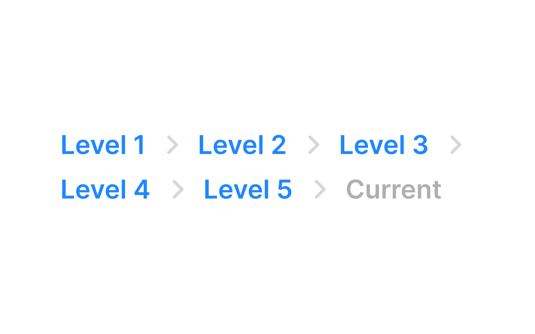
The alignment of breadcrumbs is typically horizontal, following a left-to-right reading direction, which aligns with the natural flow of most languages. This placement also mirrors the website's hierarchical structure, guiding users from left (higher-level pages) to right (current page).
Divider styling

In breadcrumb navigation, the choice of dividers between links is key to maintaining clarity and user-friendliness. Commonly used dividers like chevrons (>), arrows (→), and slashes (/) are preferred because they are familiar and intuitively suggest a hierarchy or sequence. Unconventional dividers that use unique symbols can be confusing as they might not clearly indicate the navigational path and could be mistaken for a different type of navigation panel.
Once a specific style of divider is chosen, it should be uniformly applied throughout the site. This uniformity helps in reducing cognitive load for users as they don't have to repeatedly adjust to different navigation styles on different pages.
Use overflow menus
When a breadcrumb trail becomes too long, you’ll need to manage this overflow for a cleaner, more user-friendly design. Overflow menus are an effective solution for shortening lengthy breadcrumb trails. They keep the navigation tidy and easy to read by truncating the middle links while always keeping the first and last items visible. The first link typically leads back to the homepage, and the last shows the current page, providing a clear context for navigation.
For the truncated links, implementing a menu control allows users to access these hidden intermediate pages. This ensures that even though some links are not immediately visible, they remain accessible, maintaining the full functionality of the breadcrumb trail.
Allow users to access pages in overflow
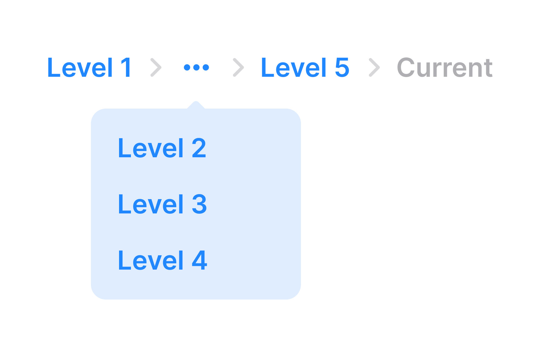
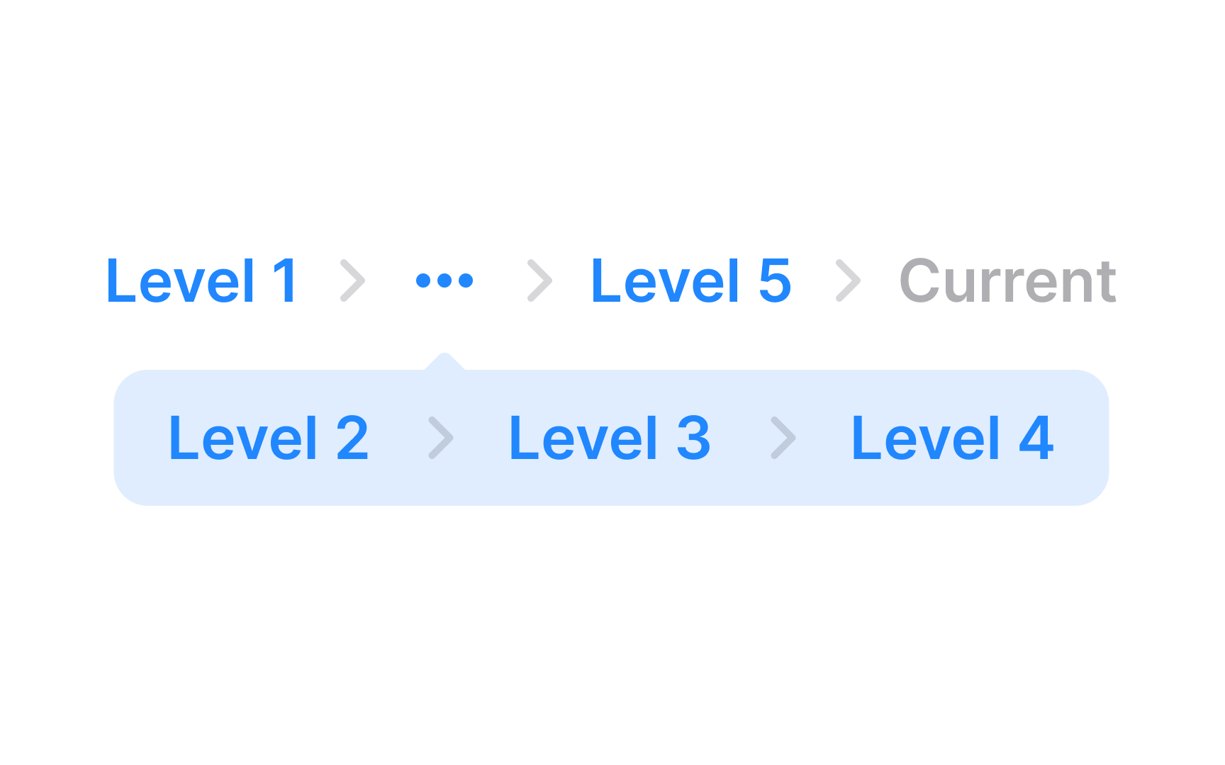
Ensure users have access to hidden pages in breadcrumb overflows by placing additional pages in a menu control. This approach keeps all links accessible, maintaining the full functionality of the breadcrumb trail, even if some links are not immediately visible. By using a menu control, you can avoid cluttering the interface while still providing a way for users to navigate through the entire breadcrumb path.
Truncate long labels
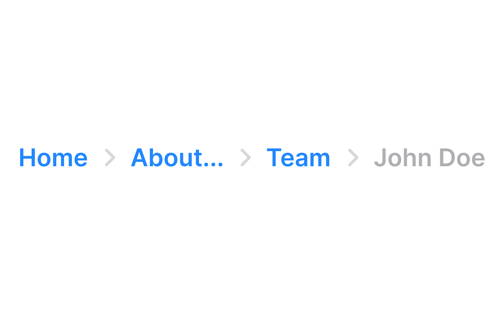

Dealing with long text labels in design, especially in breadcrumbs, can be challenging as they disrupt the layout's smoothness. Truncation is a practical solution here. It involves shortening the text labels to a manageable length, ensuring they fit neatly within the design.
However, ensure that users can still access the full text. This is where tooltips become useful. When users hover their mouse over a truncated label, a tooltip should appear, displaying the label's full text. This allows users to understand the complete label without overcrowding the design.
Additionally, setting a maximum width for each breadcrumb label is a good practice. It standardizes the size of the labels, contributing to a more uniform and tidy appearance.


