


Every page ends somewhere. Footers mark that boundary while offering users options for what comes next. Rather than letting pages trail off into empty space, footers provide a destination for users who've consumed the content above or scrolled past it looking for something specific.
The footer's position at the bottom creates specific design considerations. Users arriving there have already committed to scrolling, which signals engagement or frustration depending on what brought them down. Either way, they're primed to take action if the footer presents relevant options. Footer types range from minimal strips with copyright notices to expansive sections rivaling the header in complexity. Site goals, content volume, and user needs determine which approach makes sense.
Simple footer
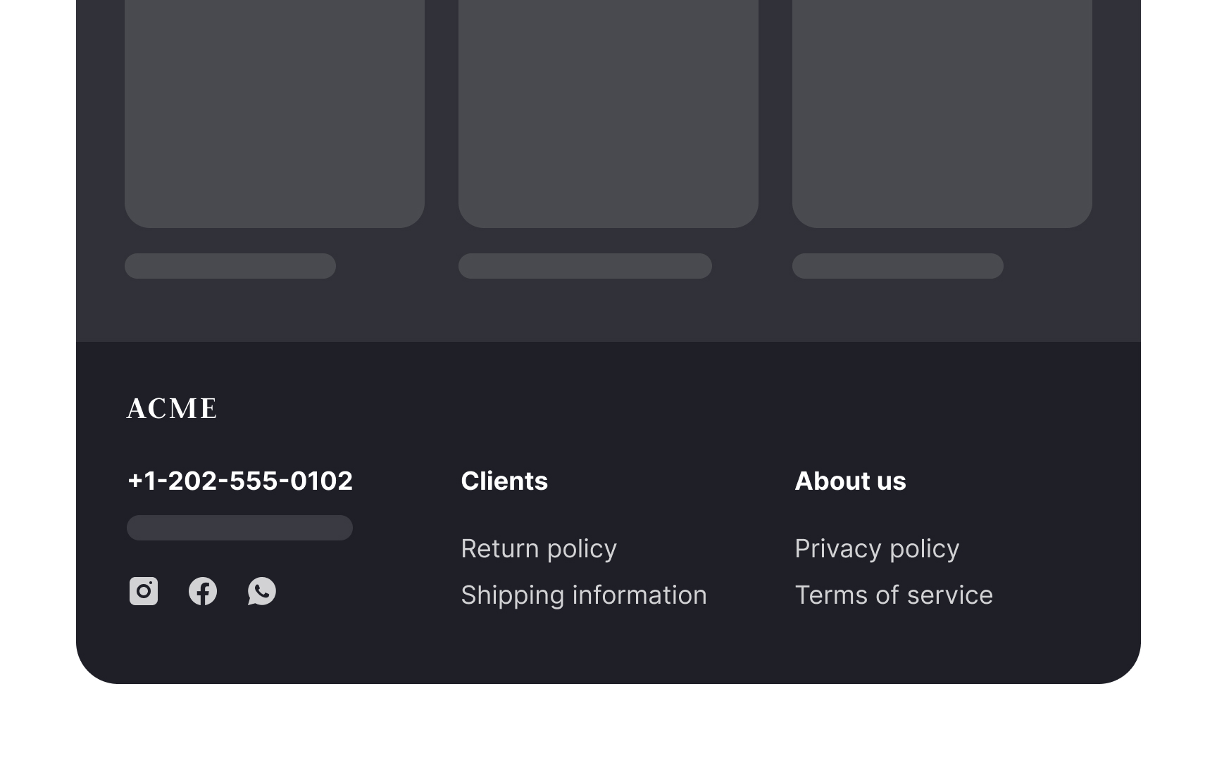
A simple footer provides the most basic information such as:
- Contact information (the company's address, phone number, and link to live chat)
- Customer support information
- Privacy policy
- Terms of use
It might also include a logo or copyright information. Simple footers don't overwhelm the rest of the site's design, so they are great for minimalistic websites. Another use case is single-purpose websites like landing pages.
Rich footer
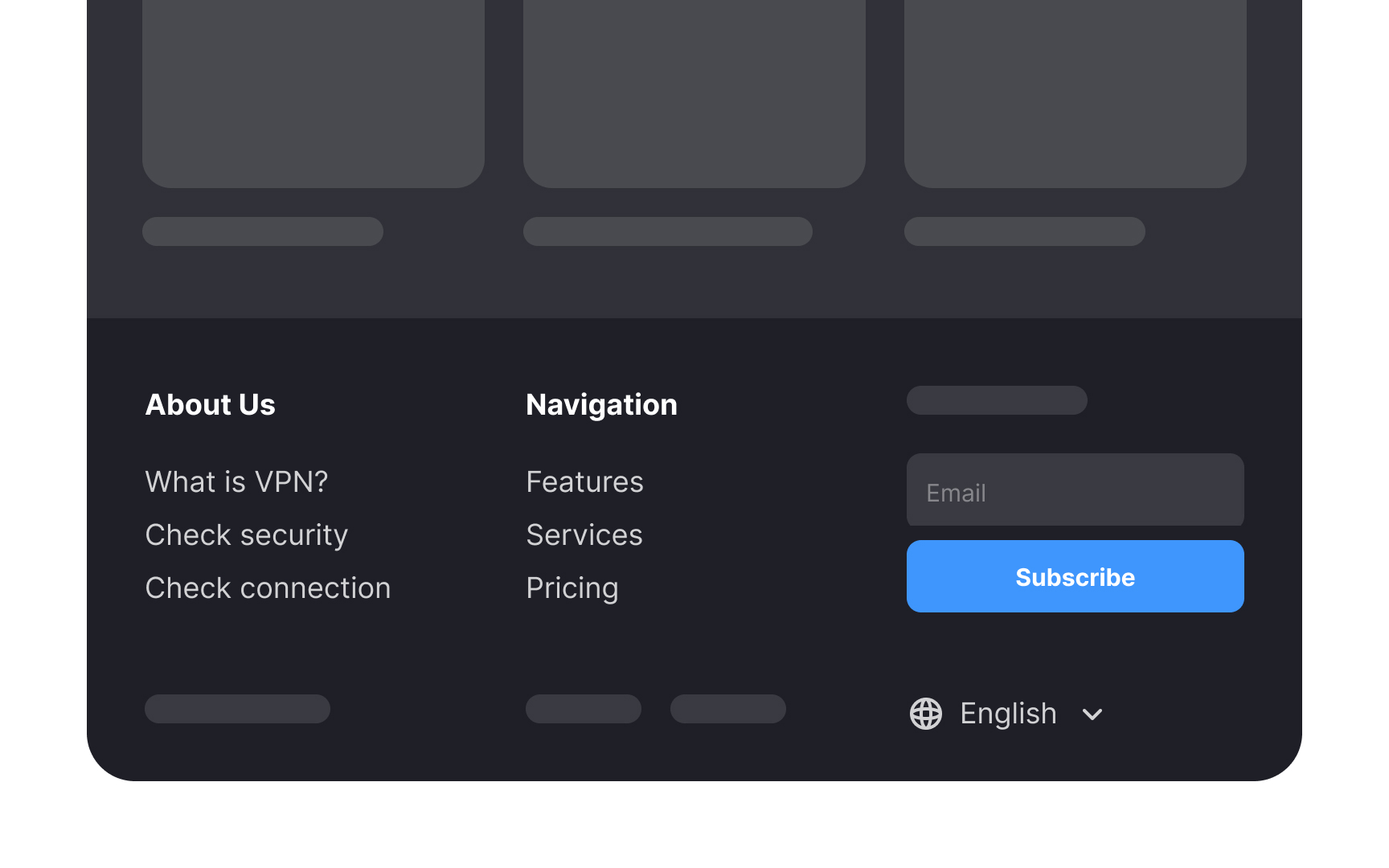
Rich footers include more information or functionality than simple footers. Besides social media and utility links, footers can contain other components that will depend on the website's type and purpose.
This could include:
- Global navigation on long pages so that users don't have to scroll back to the main navigation
- Secondary tasks like applying for a job, finding company affiliates, etc., on sites with multiple user groups with different user journeys
- A site map on large sites with multiple levels of information or subdomains
- Testimonials or awards for startups or companies with less brand awareness
- Brands associated with large, multinational organizations with many subsidiaries or partnered brands
Mini footer
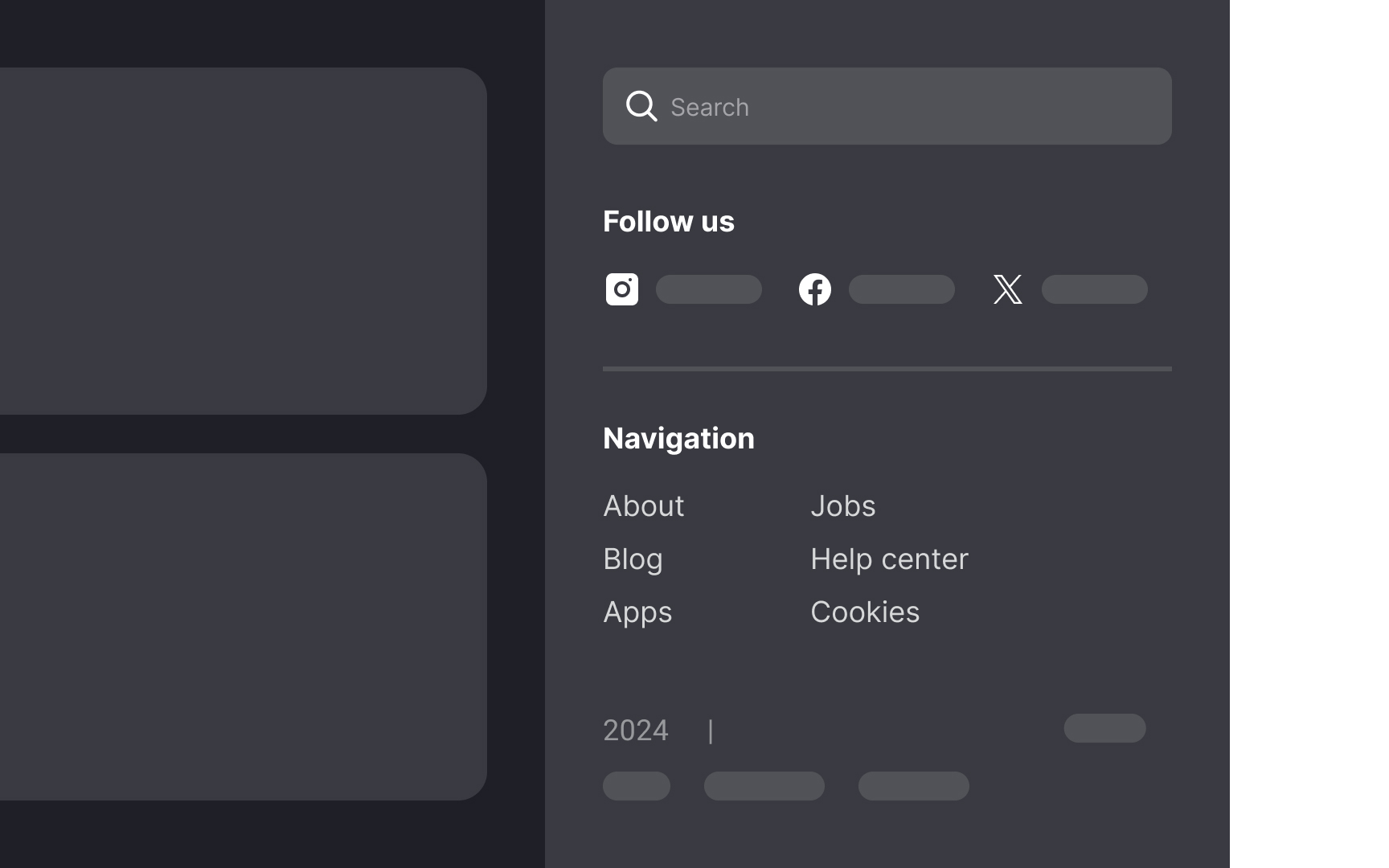
Mini footers are an alternative to traditional footers on websites with infinite scroll. In these designs, information typically found in footers is instead integrated into a sidebar or within an expanded global navigation menu.
It's important to differentiate footer designs for static-length pages (with a definite end) and dynamic-length pages (like those with infinite scroll). Using the same footer style for both can lead to user frustration. On dynamic-length pages, users might struggle to click on footer links, as new content loading pushes the footer out of view, creating a "whack-a-mole" effect.
Site map
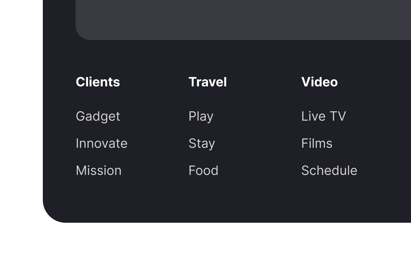
A site map footer can include a combination of global navigation and important resources. It allows users to explore other sections or navigate directly to relevant information without returning to the top of the page.[1]
Site maps footers are helpful for:
- Exposing underlying topics that are not evident at the global navigation level
- Increasing awareness of the site's primary content
- Reminding users of the company's offerings
Site maps are commonly used on large multiple-level resources like news websites and e-commerce platforms.
Social media links
Another common feature of footers is social media links. These are often included as icons that link to the brand's Facebook, Instagram, LinkedIn, or other social media accounts.
Why place social links in the footer and not the header? When users click one of those icons, they'll land on a site that does everything possible to keep these users. They can easily get distracted and forget about your product. For this reason, it's crucial to include social media icons in the footer.
Only include links to social accounts that are regularly updated. Old, outdated posts don't add to the credibility of a company.
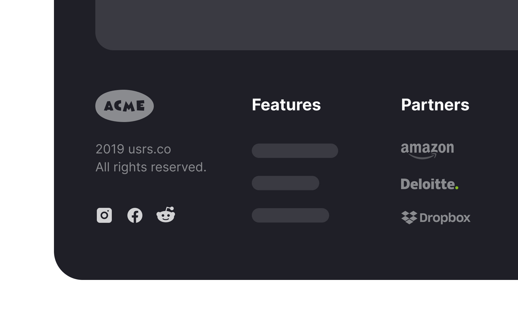
Partners & awards
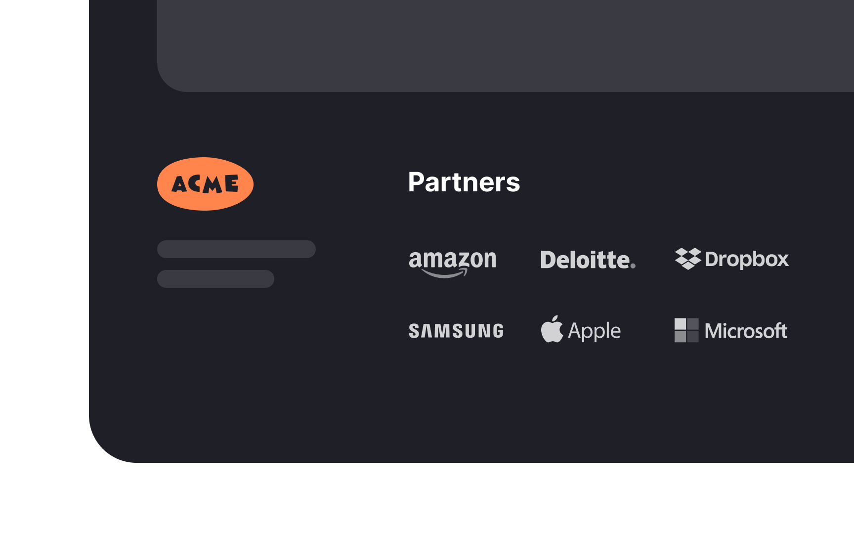
For companies with less brand awareness, footers are an excellent place to build authority and credibility. You can do so by including awards, certifications, testimonials, or more well-known partner companies.
You can measure the effectiveness of these additions through usability tests and A/B testing. These tests can help determine whether such content in the footer positively impacts user experience and engagement. Additionally, they can assist in finding the optimal number of testimonials or awards to display, ensuring the footer remains informative without being overwhelming.
Showcase sub-brands
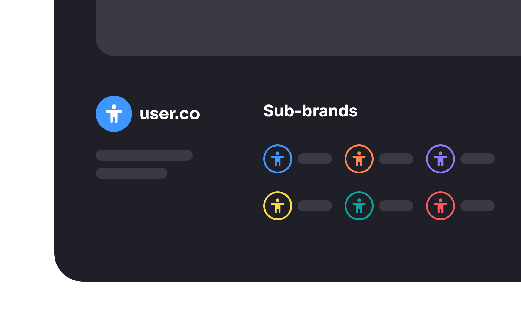
Large multinational organizations often use their website footers to link to their sub-brands. This serves two main purposes:
First, it showcases the breadth and diversity of the parent organization's portfolio. By displaying links to various sub-brands, visitors can see the range of services or products offered, reinforcing the brand's presence in multiple sectors.
Second, it aids user navigation. For visitors seeking specific solutions or products, these footer links provide a convenient way to explore relevant sub-brands. This enhances user experience by simplifying navigation and directing traffic more efficiently across the organization's platforms, ensuring visitors find what they need.
Layout and alignment
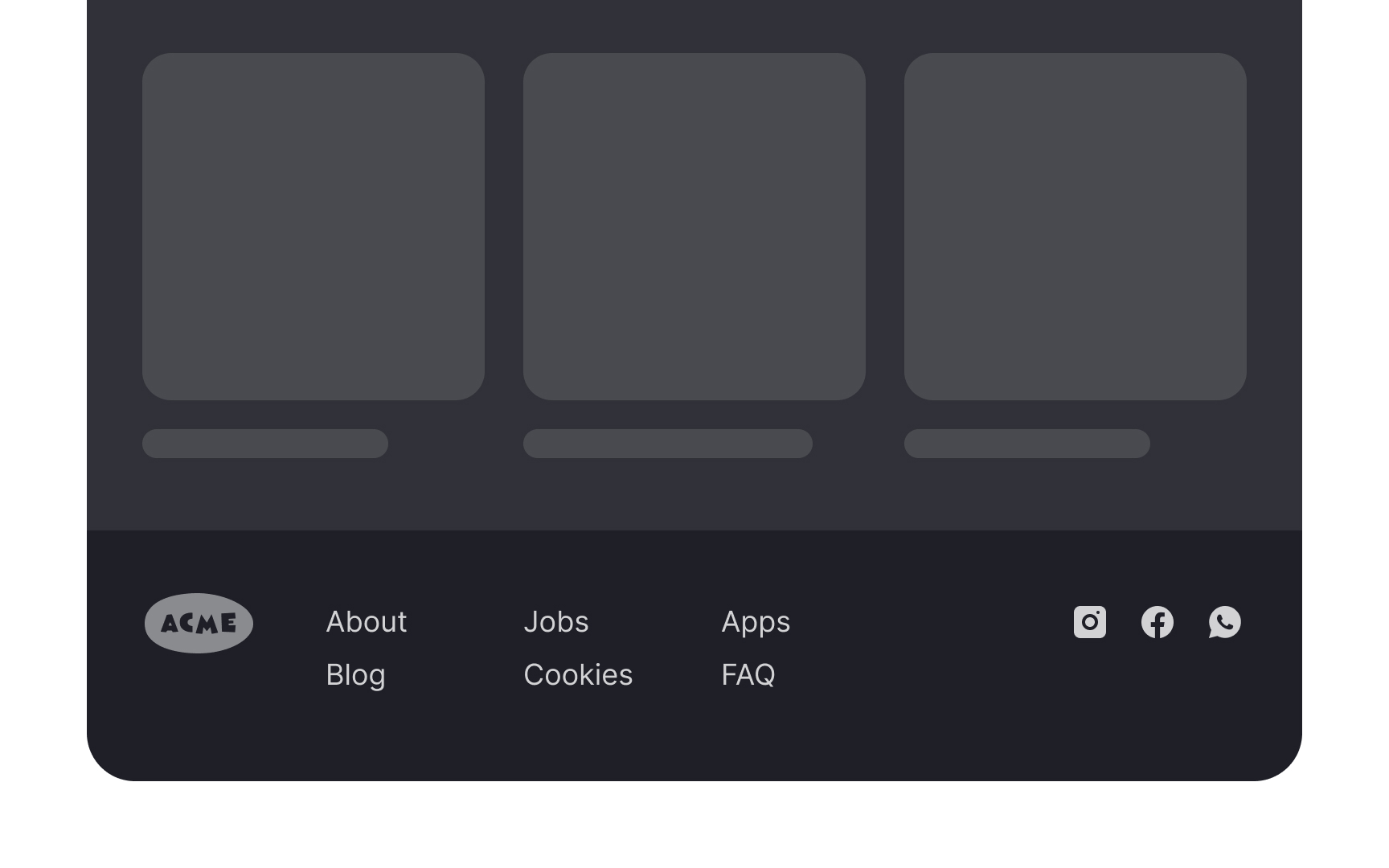


Align the footer with the header to create a cohesive and balanced layout. For example, if a website's header has left-aligned elements and a central logo, the footer should mirror this arrangement. This alignment ensures visual harmony across the page, framing the content in a structured manner. The consistency provides a seamless user experience and reinforces the brand's identity and professionalism.


