


.svg)
Breadcrumbs borrow their name from Hansel and Gretel's trail through the forest. In interfaces, they serve a similar purpose: helping users retrace their steps through a site's hierarchy. But like the fairytale's breadcrumbs, poorly implemented ones can fail when users need them most.
The key is balance. Breadcrumbs should be visible enough to find when needed but subtle enough not to compete with primary navigation or page content. Hierarchy is the organizing principle. Each link should represent a meaningful level in the site structure, starting from the homepage and ending at the current page. Breadcrumbs that include arbitrary pages or skip logical levels confuse rather than clarify.
Practical considerations affect the usability of breadcrumbs. Links need enough spacing to tap accurately. Left alignment follows natural reading patterns. Mobile screens demand simplified approaches since full breadcrumb trails rarely fit. And breadcrumbs should always complement global navigation, never attempt to replace it.
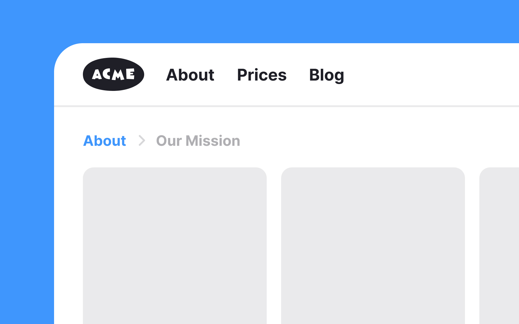
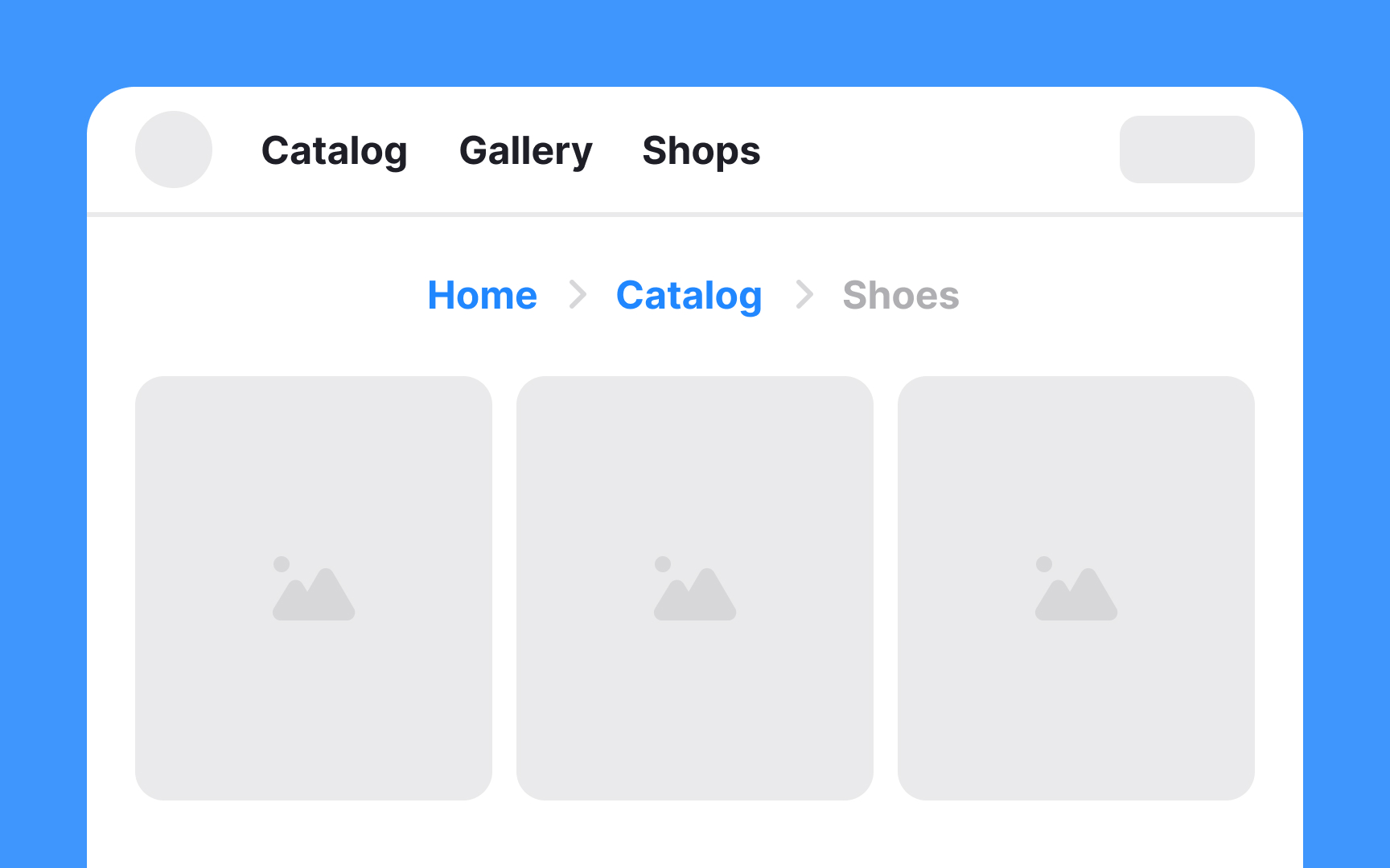
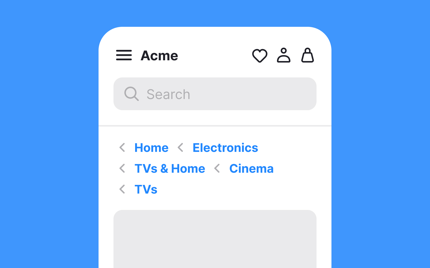
Use the breadcrumb trail to display hierarchy


Breadcrumbs in web design should reflect the website's structure, not users' browsing history.[1] Their purpose is to show the levels of the website hierarchy that users have navigated through, like a map showing the main routes, not every single step taken. Including every page users have visited in the breadcrumb trail can make it overly complex and visually messy.
Also, limit breadcrumbs to key levels of the site, such as main sections or categories, known as ancestor pages. If a particular subcategory or item doesn’t have its own dedicated page, it shouldn’t be part of the breadcrumb trail. This keeps the breadcrumbs focused and useful, helping users understand where they are in the site’s structure without unnecessary details.
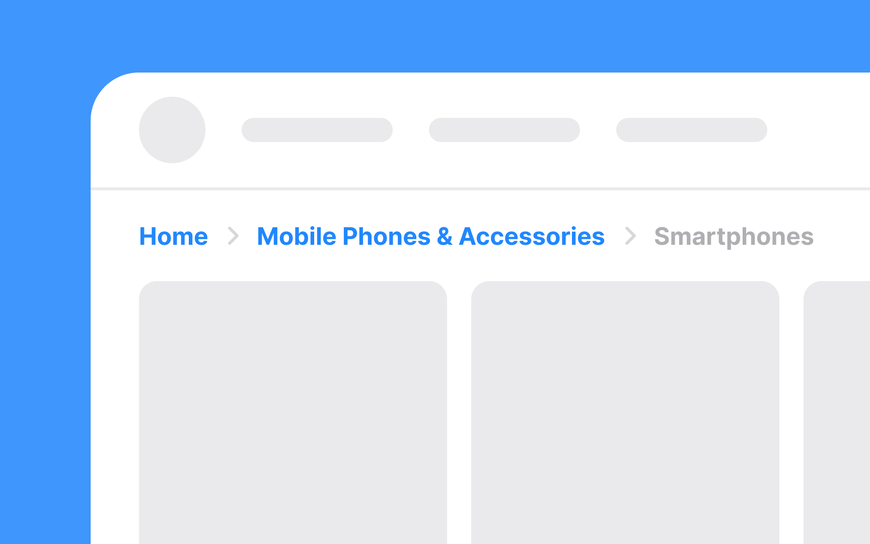
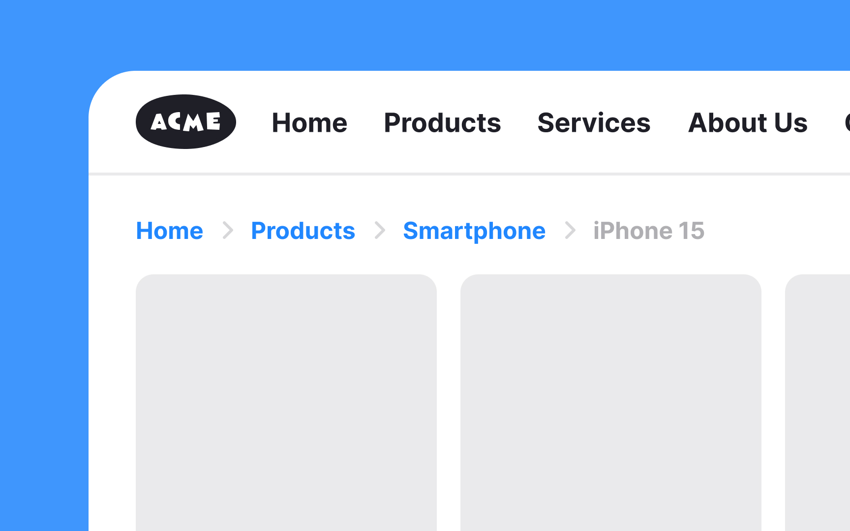
Provide enough space between links


A crammed breadcrumb trail can hinder usability, making it difficult for users to quickly scan and understand the labels, or to accurately select the desired link. This is especially crucial in mobile design, where screen space is limited and touch accuracy is a key concern.
To ensure ease of use, provide sufficient spacing around each breadcrumb link. This breathing space enhances readability and navigability. Additionally, on mobile devices, each link's touch target area should be at least 44 x 44px. This size is generally considered comfortable for fingertip navigation, reducing the risk of users tapping the wrong link.[2]
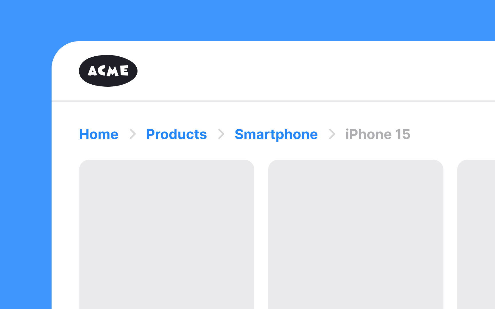
Indicate the home page with the first breadcrumb

In breadcrumb navigation, the homepage usually acts as the starting point, representing the foundation of the website's hierarchy. By including the homepage link – such as the Home link or the company's name, like eBay – in breadcrumbs, users can conveniently return to the main page. This is especially helpful if they need to reset their navigation path or if they feel disoriented within the site's structure.
Don't go overboard with the styling
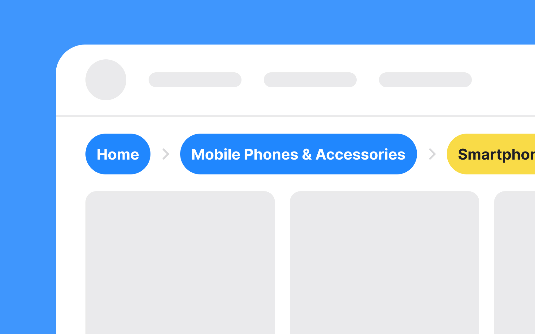
Breadcrumbs are a secondary navigation tool and should be designed to blend subtly into a webpage. They are not meant to be the most prominent element on the page. So, avoid using flashy or high-contrast colors for breadcrumbs. Such colors can draw undue attention, distracting users from the primary navigation elements and the main content of the page.
Additionally, consider accessibility standards, specifically the Web Content Accessibility Guidelines (WCAG). These guidelines include requirements for color contrast to ensure that content is accessible to all users, including those with visual impairments.[3]
Left-align breadcrumbs to simplify scanning
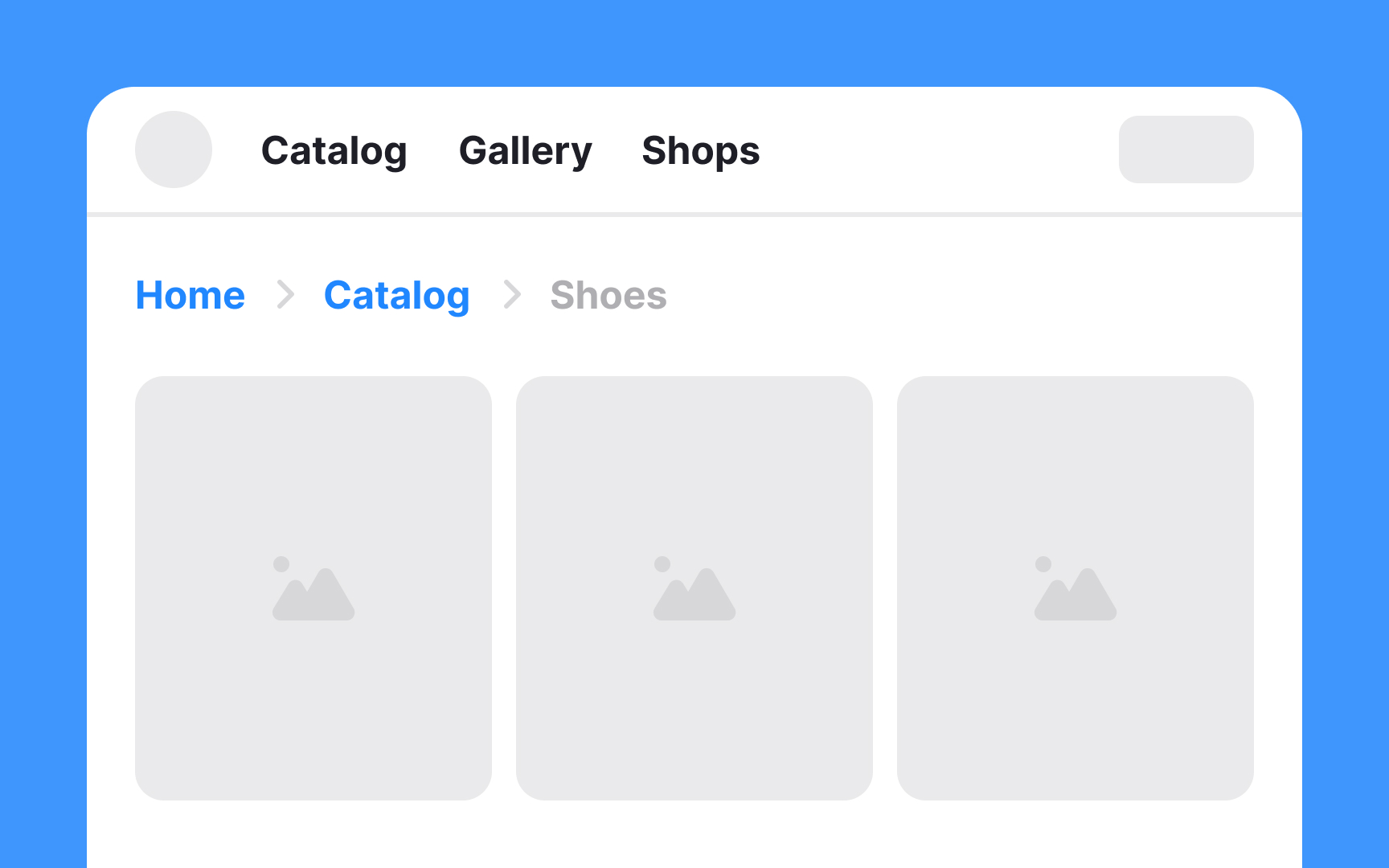
For websites catering to audiences who read from left to right, breadcrumbs should ideally be left-aligned. This alignment aligns with the natural reading flow, making it intuitive and easy to follow for users.
Conversely, for websites designed for right-to-left reading audiences, like those in Arabic or Hebrew, right-aligning the breadcrumbs is the most logical approach.
Center-aligned breadcrumbs can appear out of place and may disrupt the legibility and overall flow of the page. Consistency in alignment is key — if the general layout of a website aligns elements to the left, then breadcrumbs should follow this pattern to maintain a cohesive design.
Don't replace the global navigation with breadcrumbs
Breadcrumbs should not be used as a substitute for global navigation. They are a supplementary navigation tool, designed to aid users in understanding their location within a website and to easily navigate back through previously viewed pages.
Global navigation, on the other hand, is the primary way of navigating a website. It usually includes main menu items that link to the major sections of the site and is essential for providing direct access to these sections from anywhere on the site.
While breadcrumbs enhance navigability by showing the path taken, global navigation offers a comprehensive view of what the website has to offer. Therefore, both breadcrumbs and global navigation should coexist in a website's design, each serving its distinct purpose to ensure a smooth and intuitive user experience.
Breadcrumbs should only include site pages
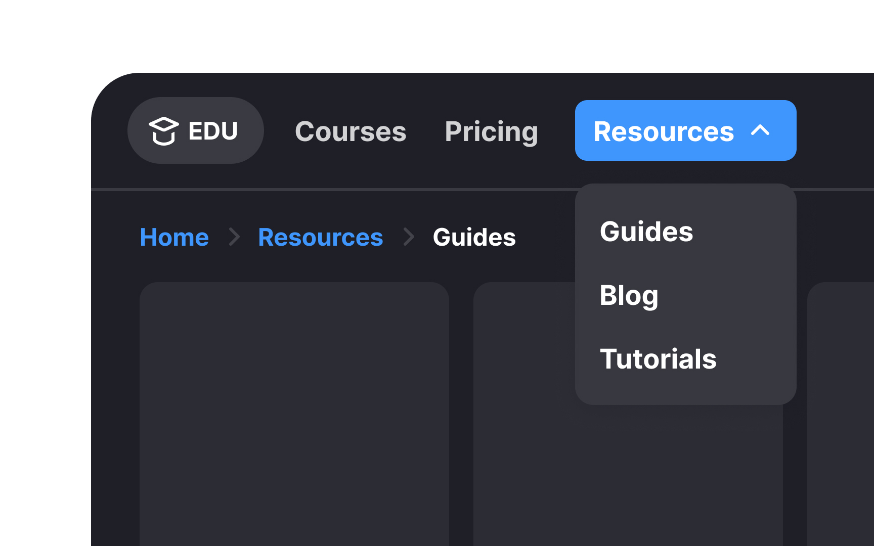
Breadcrumb trails should exclusively feature clickable links to pages that users can actually visit. This navigation tool is designed to reflect the actual structure of the site, guiding users through the different levels they have navigated.
Including any non-navigable categories in breadcrumbs can lead to confusion, as users might expect every element in the breadcrumb trail to be a link to a page they can visit. When these elements turn out to be non-clickable, it creates dead ends in the navigation process, disrupting the user experience.
Keep a single breadcrumb on mobile

On mobile devices, it's important to use screen space wisely while keeping navigation clear. A good practice for breadcrumbs on mobile is to include just a single breadcrumb pointing up one level. This can help users achieve their main goals without cluttering the screen. For example, on an e-commerce site, if a user lands on a specific dress’s page through a search engine, they might want to see other dresses in the same category. A breadcrumb link to the parent category makes this easy, allowing for comparison shopping without a long breadcrumb trail.
This approach prevents clutter and saves mobile screen space, making the interface clean and easy to navigate. However, this method should only be used on mobile devices. On desktops, where there's more space, showing the full breadcrumb trail is better for comprehensive navigation.


