


A mental model is the internal representation a user holds about how a system works. It is built from prior experience, analogies to familiar products, and whatever they can observe about the interface itself. When a product's actual logic matches that internal model, users navigate it without friction. When it does not, they make errors, feel confused, and often blame themselves before eventually blaming the product.
The mismatch between user mental models and system design is one of the most common sources of usability problems, and one of the easiest to overlook. Designers who are close to a product understand its logic intuitively and stop noticing where that logic diverges from what a new user would expect. Research methods that surface mental models directly, including contextual inquiry, think-aloud sessions, and card sorting, give teams the external perspective needed to close that gap.
This lesson covers how mental models form, how to identify and resolve mismatches, how to introduce new interaction patterns without overwhelming users, and how contextual education can help users update their models when a product genuinely requires a new way of thinking.
Mental models in UX design
Mental models are the internal beliefs users bring to your product, not facts about how it actually works, but assumptions built from past experience. A user interacting with a new app doesn't start from scratch. They draw on what they've learned from similar products and apply those expectations to what's in front of them.
This matters because users act on their mental model, not on your intentions as a designer. If someone expects the back button to undo their last action, they'll press it without a second thought. When the product behaves differently, frustration follows. The gap between what users expect and what the system does is one of the most common sources of usability problems.
Your job as a designer isn't just to build something that works. It's to build something that works the way users think it will. That means understanding their mental models through research, and designing interactions that either match those expectations or guide users clearly when you need to introduce something new.[1]
Work with users' existing mental models
Mental models are flexible. They shift as users encounter new products, pick up habits from other interfaces, and talk to people around them. That's what makes them designable, not fixed traits you have to work around, but something you can actively support.
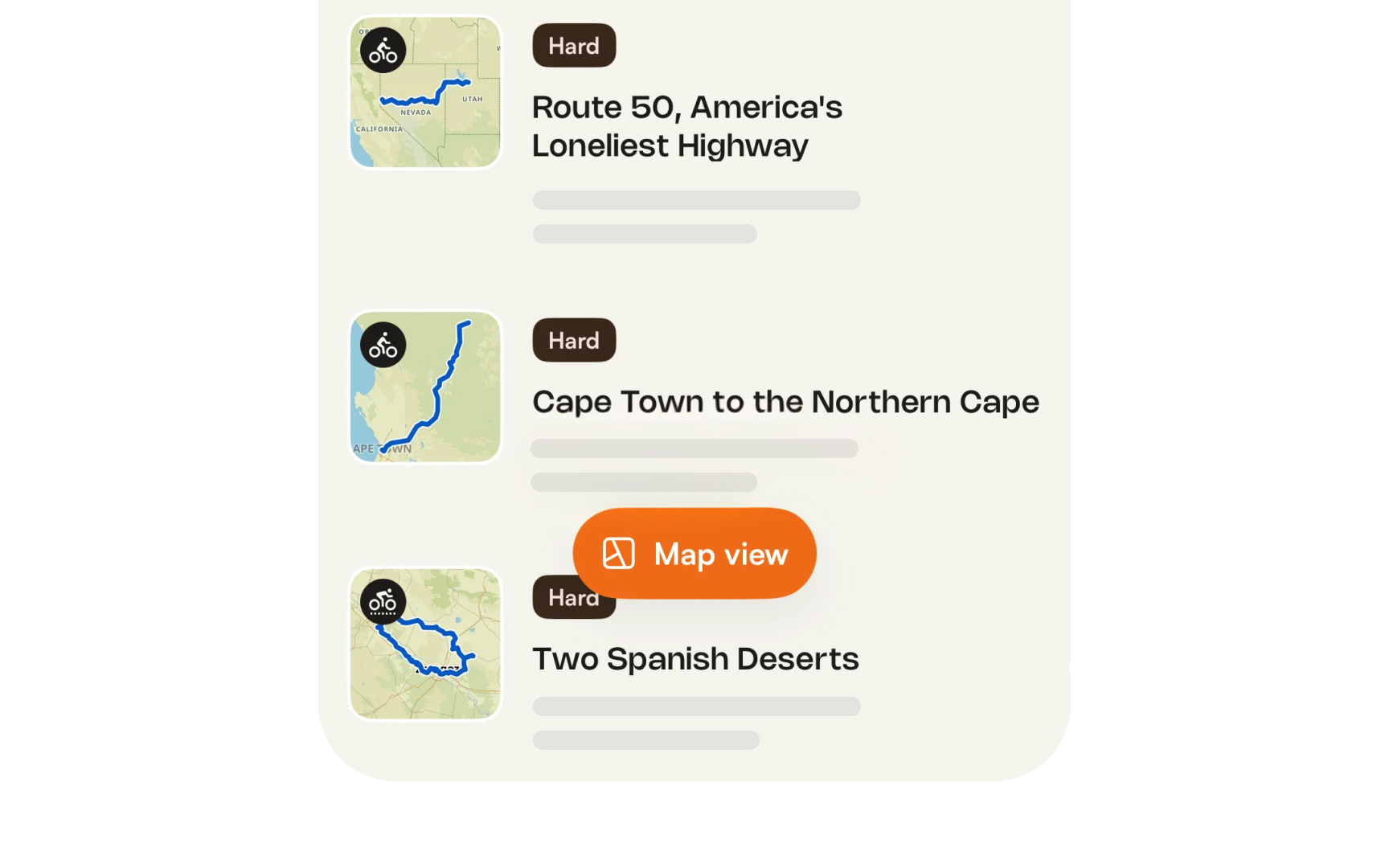
The most reliable strategy is to design with existing mental models, not against them. When your interface follows patterns users already know, familiar navigation placement, predictable button behavior, standard checkout flows, they can transfer their existing knowledge directly to your product. Less to learn means less room for frustration.
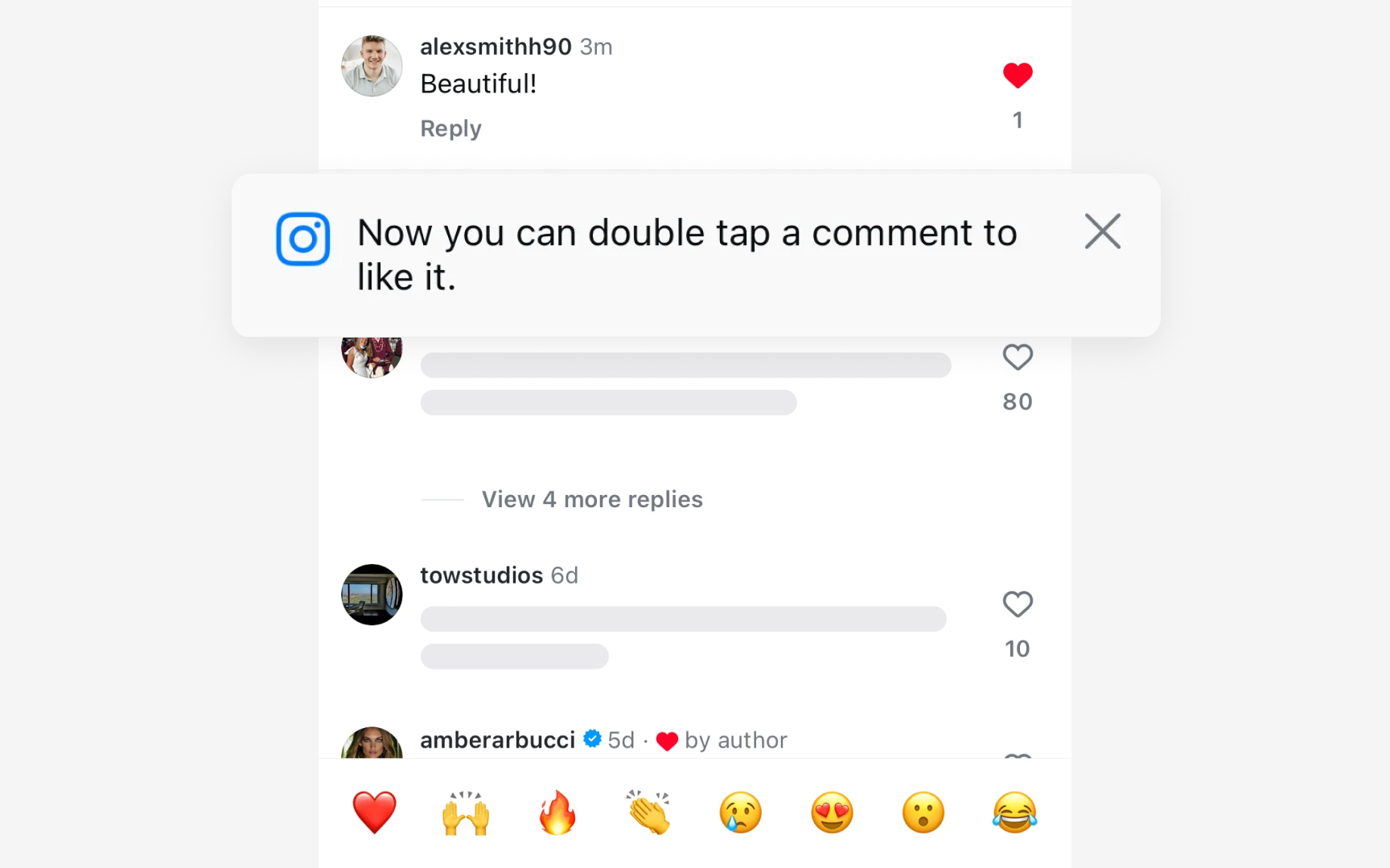
When you do need to introduce something unfamiliar, clear labels, microcopy, and contextual cues help users update their model without feeling lost. A tooltip explaining what a feature does, or a confirmation message that shows what just happened, gives users the feedback they need to calibrate their understanding. The goal isn't to teach users how your system works. It's to make the system behave in a way that feels like they already knew.
Pro Tip! Alignment beats education. Match what users already expect, and they won't need to learn your product.
Identify and resolve mental model mismatches
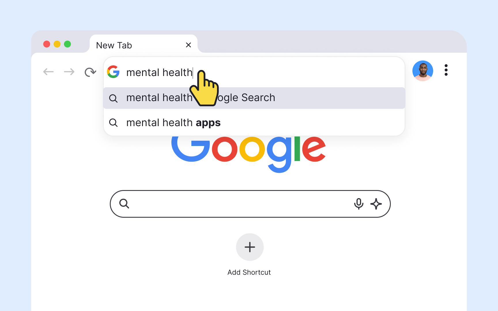
Because mental models are built on belief rather than fact, they are not always accurate. A user might type a website name into a search bar instead of the browser's address field, because their mental model of "finding a website" doesn't distinguish between the two input types. From the user's perspective, both boxes accept text and return results. The mismatch is invisible to them.
These gaps between what users expect and how a system actually works are a primary driver of usability problems. When a UI element doesn't behave the way users assume it will, they don't blame their mental model. They blame the product.
When you spot a mismatch, you have two options:
- Change the design to match how users think it should work. If users consistently look for account settings in the wrong place, move them.
- Help users form a more accurate model through the interface itself, using clearer labels, contextual help, or onboarding that explains how the system works.
The first approach is usually preferable. Changing a design is more reliable than trying to change a mental model.
Pro Tip! When users blame themselves for errors, it's often a mental model mismatch in disguise.
Introduce new interactions by overcoming mental model inertia
Mental models have inertia. What users already know tends to stick, even when those models aren't helpful in the current situation. Introducing a new interaction pattern means asking users to set aside something familiar, which takes effort and motivation.
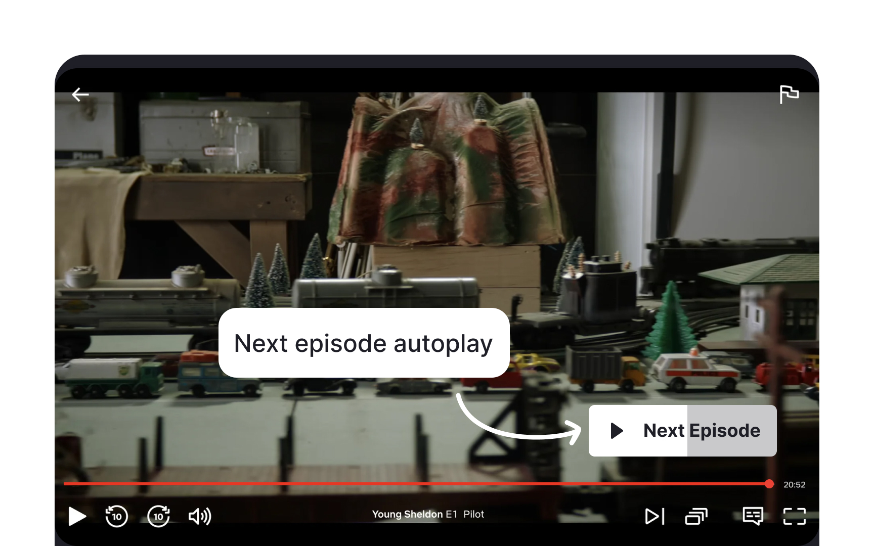
Take Netflix's autoplay feature. Before it existed, users' mental model of watching TV was built around active choice: you finish one episode, you decide whether to start the next. Netflix introduced a default that plays the next episode automatically after a short countdown. That directly contradicted what users expected. But because the new behavior removed friction rather than adding it, most users adapted. The value was clear enough to justify updating their model.
This is the bar new interactions have to clear. When you ask users to change how they think something works, the new way has to be meaningfully better than the old one. If the benefit isn't obvious, users won't make the effort. They'll assume the product is broken, or just stop using it.
Use contextual education to bridge mental model gaps
When your product introduces something genuinely new, user education becomes part of the design work. Users will arrive with existing mental models and apply them immediately. If your product works differently, they need a way to understand that difference without having to figure it out through trial and error.
Onboarding flows, tooltips, and contextual help are all tools for this. Used well, they can point users to where your product diverges from what they expect and explain why the new approach is worth learning. The key word is "contextual." Help that appears at the moment users need it is far more effective than upfront instructions they have to read before they've touched anything.
That said, education has limits. Onboarding tutorials often don't improve task performance, because users can't retain instructions they haven't yet had a reason to apply. Whenever possible, design the interface to be self-explanatory first and rely on documentation as a fallback, not a fix.
Enrich personas with mental model data

Personas already capture who your users are. Mental model data adds a layer that standard personas often miss: what those users expect your product to do before they've touched it. Users with similar backgrounds can still hold very different assumptions about how a system should work.
Enriching a persona means documenting the expectations a user brings to the product, based on four key factors:
- Prior product experience: what similar tools or interfaces have they used?
- Domain knowledge: how well do they understand the subject matter your product addresses?
- Tech literacy: are they comfortable with novel UI patterns, or do they rely on familiar conventions?
- Cultural context: do regional norms shape how they interpret certain interactions?
This gives designers something a standard persona doesn't: a basis for predicting where users will move through the product with confidence and where they'll hit friction. A persona with deep domain knowledge and experience with comparable tools is likely to adapt quickly. One who is new to the space will need more support at exactly the points where your product deviates from what they know.[2]


