


Email design operates under constraints that web design doesn't face. Rendering varies wildly across clients. Images get blocked by default. Users scan rather than read, often on mobile screens while doing something else. Your email competes with dozens of others for attention that's already stretched thin. These limitations shape what works.
Simple layouts survive better than complex ones. Clear hierarchy guides scanning eyes toward what matters. Text carries the message because images might never load. The call-to-action needs to be obvious at a glance because a second glance might not happen. Email design isn't about what looks impressive in your preview. It's about what survives the inbox, earns a few seconds of attention, and makes the next step obvious enough that someone actually takes it.
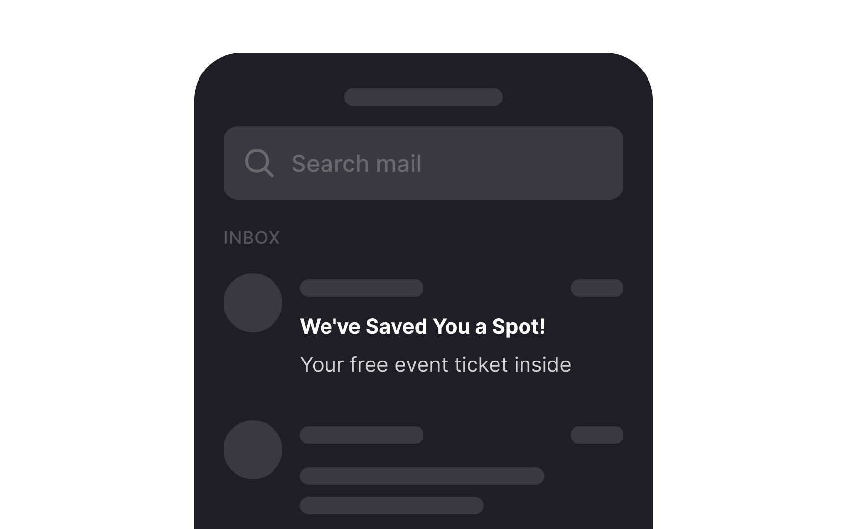
Informational emails


Informational emails serve as powerful tools for engaging, informing, and building trust with your audience. They include:
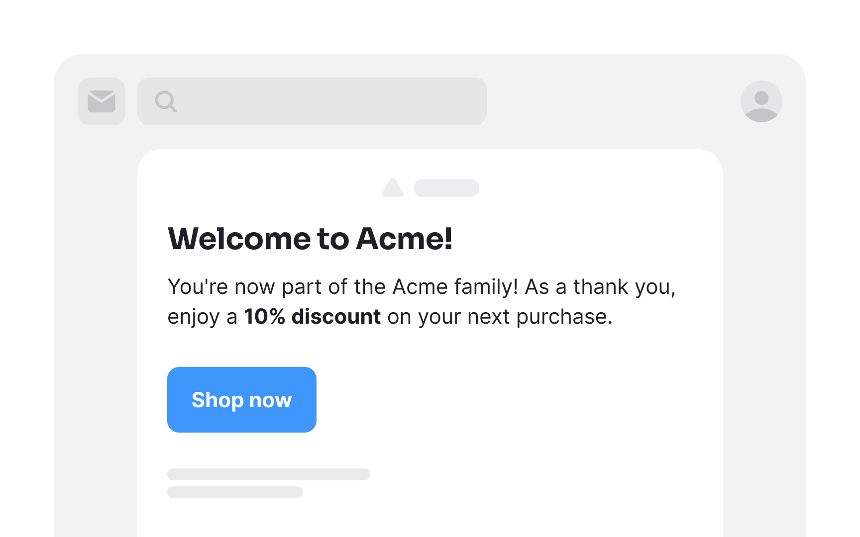
- Welcome emails: Initial messages to new subscribers, aiming to make them feel valued and leave a positive impression. These express gratitude, introduce products or services, and encourage further exploration.
- Newsletter emails: Content-rich messages featuring updates, news, and crucial information about your products or services. The goal is to spark curiosity and prompt readers to delve deeper into your offerings.
- Announcement emails: Used to inform subscribers about upcoming changes, events, or offers, these are crafted to generate excitement and anticipation.
- Order receipt emails: These provide essential transaction details, confirming a purchase and instilling confidence in the customer. While this is a good place to display offers to encourage more purchases, be mindful not to overdo it.
In all cases, find the right balance between providing valuable information and engaging your audience effectively.
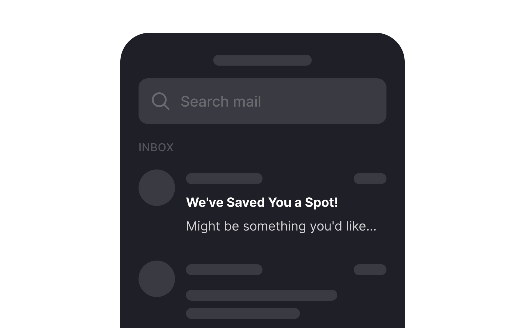
Re-engagement emails
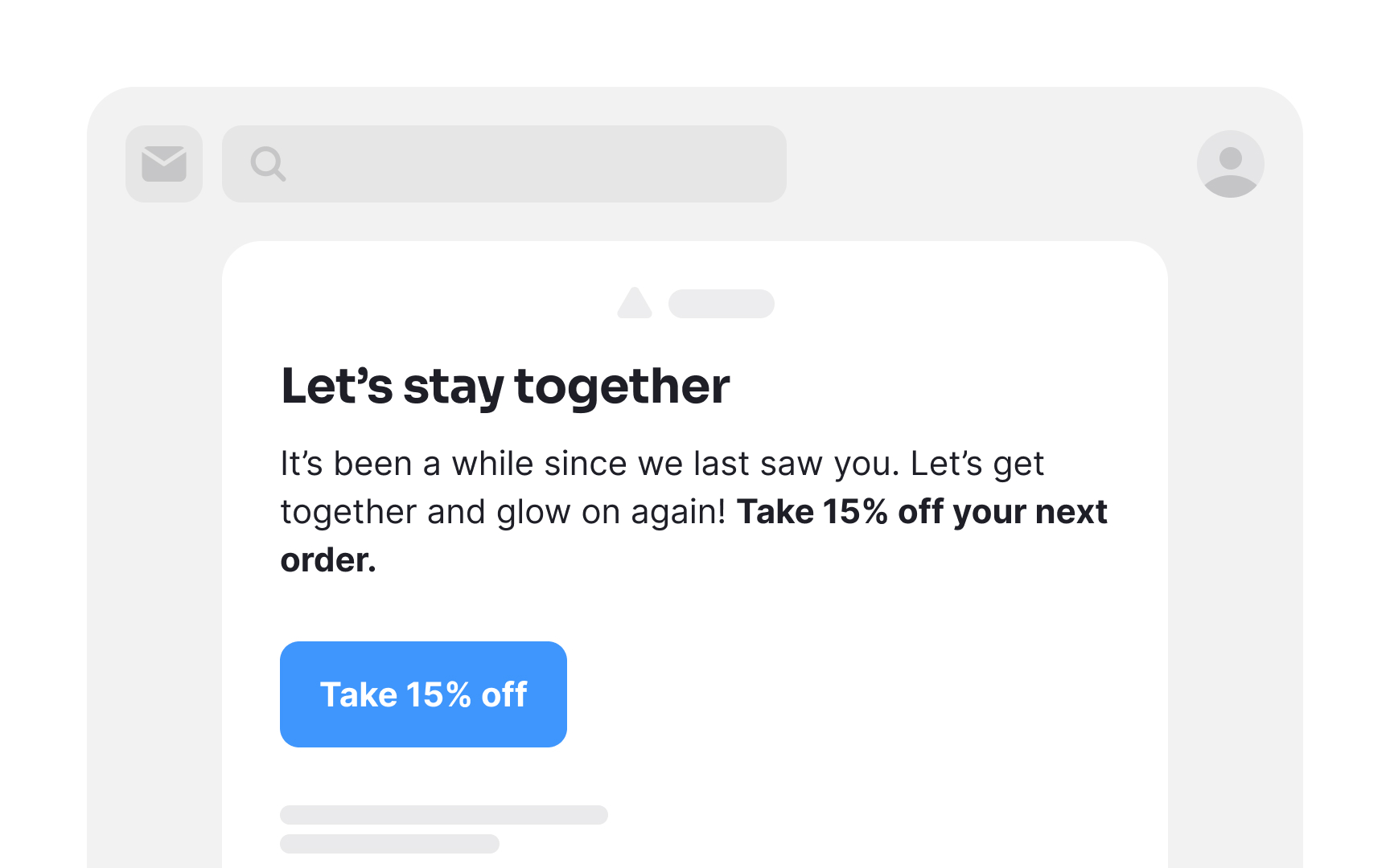
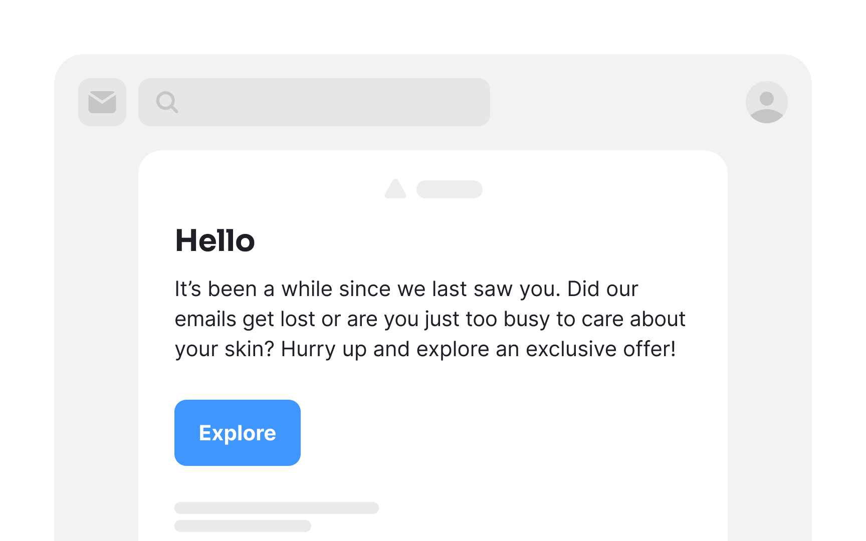
As time goes on, subscribers might gradually lose their initial enthusiasm for opening your emails. Additionally, life's demands can sometimes lead users to overlook their inbox altogether. Utilizing engagement metrics like click rates and, if available, open rates, allows you to identify subscribers who may have become less engaged.
Reengagement emails serve as a compelling nudge, providing them with an enticing reason to reconnect with your product.[1] This incentive could take the form of rewards, updates on products or services, or exclusive opportunities they may have missed out on.
Pro Tip! Avoid being passive-aggressive or appearing desperate in re-engagement emails. A polite and respectful approach is more likely to resonate with your audience.
Cart abandonment emails
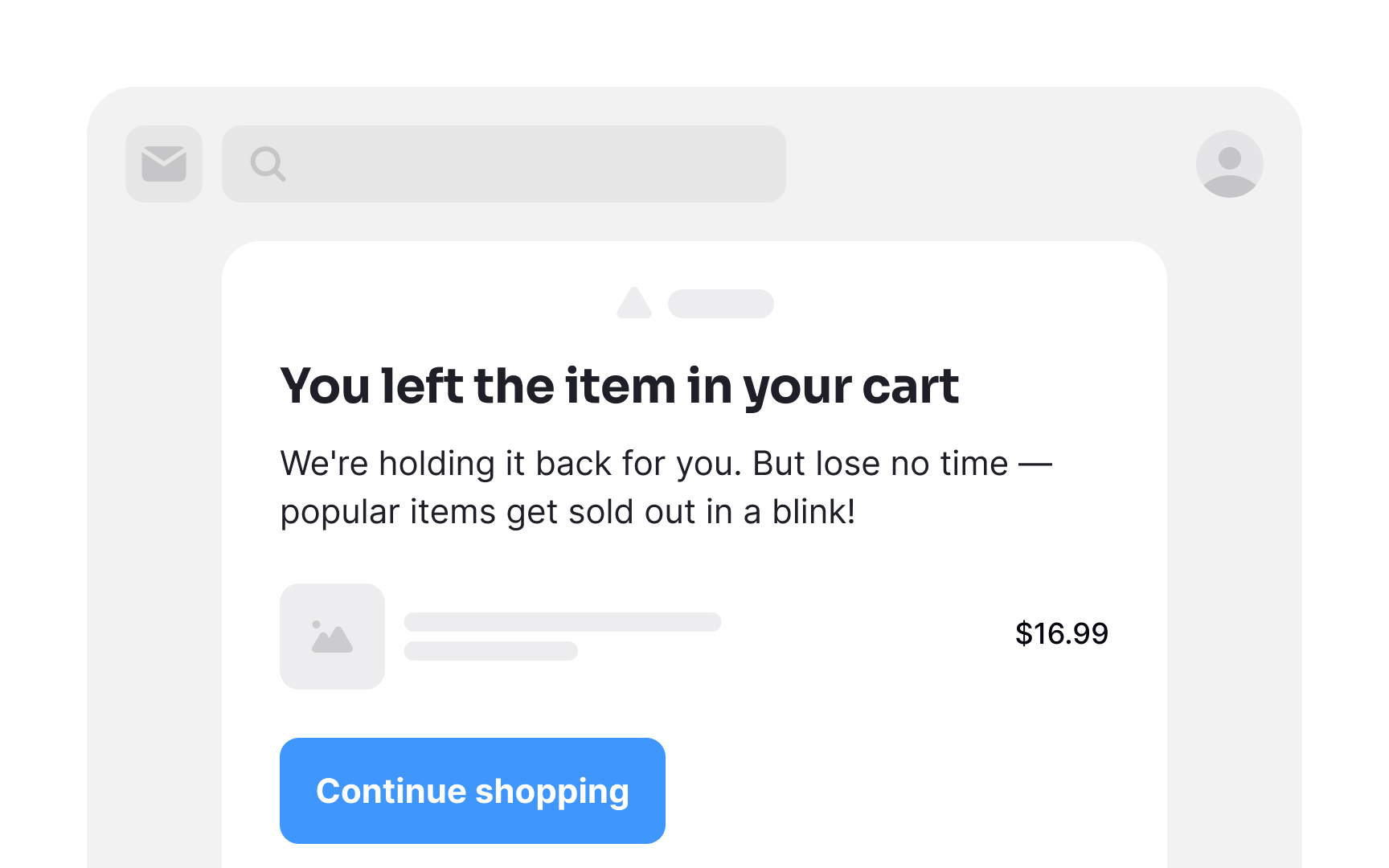
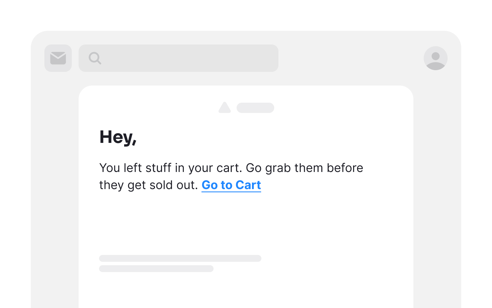
Abandoned cart emails mean to re-engage shoppers who left items in their carts without completing checkout. Research shows that almost a third of clicks on abandoned cart emails (29.9%) lead to a recovered sale.[2]
Give your users a nudge and remind them about their unfinished purchases. Time is of the essence — cart abandonment emails sent within the first hour of abandonment perform best. Regardless of why shoppers abandon their shopping carts, you have a minimal window to win them back.
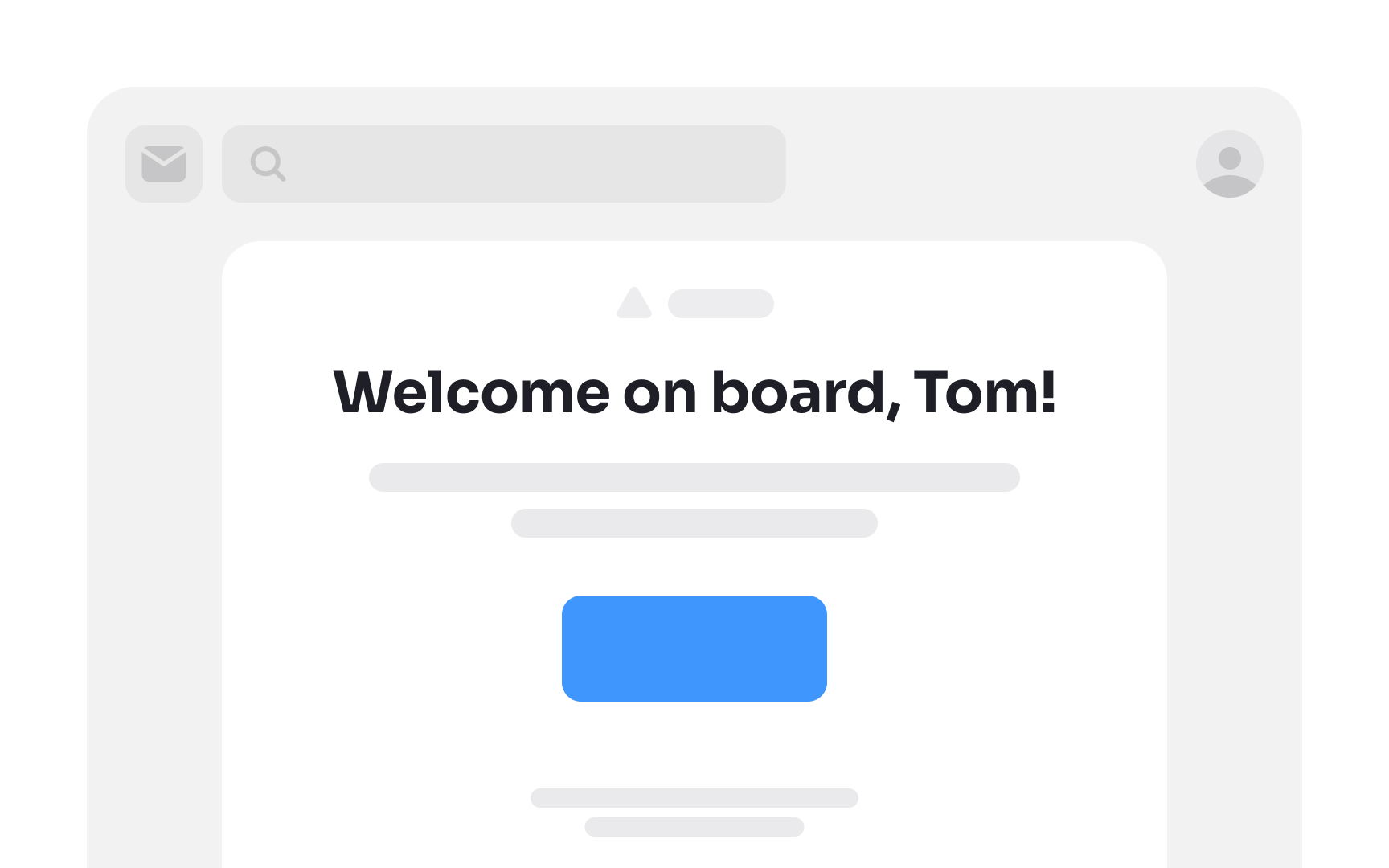
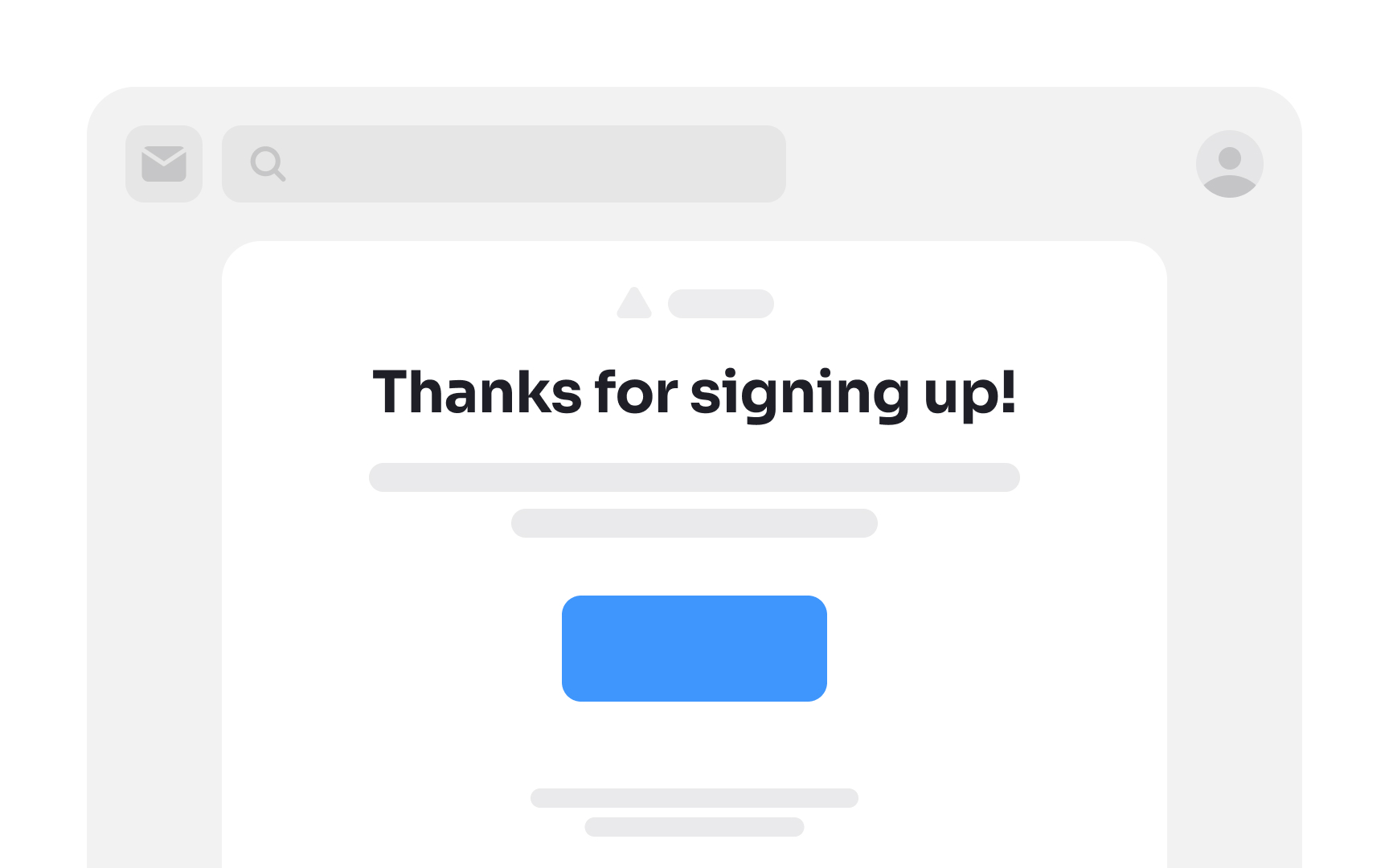
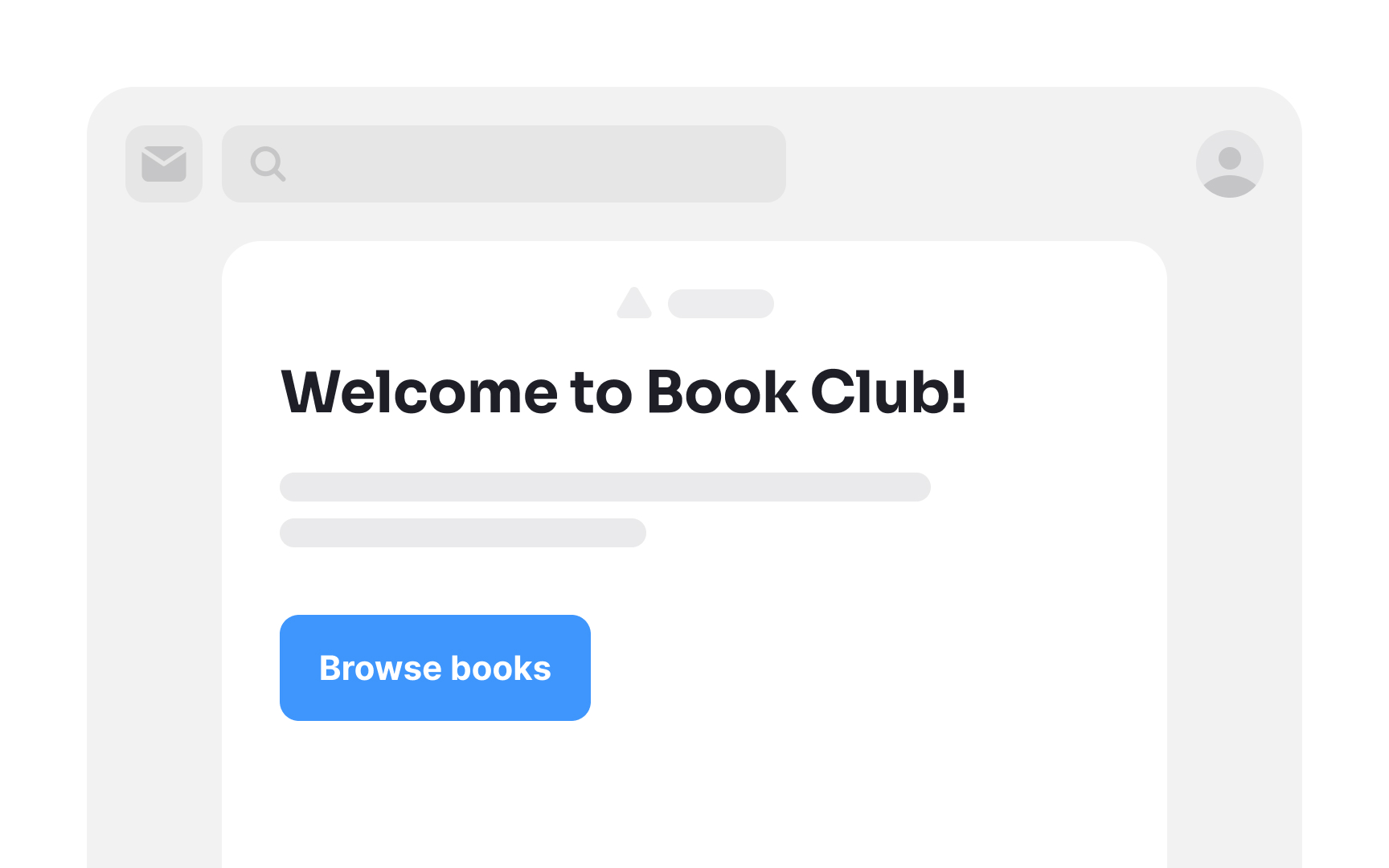
Inverted pyramid layout
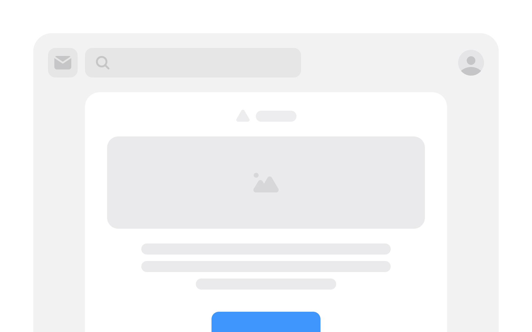
The inverted pyramid layout is a design technique meant to grab users' attention, excite them, and then guide them to take action. It is made up of 3 essential layers:
- Headline: This attention-grabbing statement presents your value proposition or a compelling promise. Its purpose is to pique readers' curiosity, encouraging them to delve deeper.
- Engaging details: The following segment adds depth and substance, furnishing supporting information for the value proposition or promise. Here, you have the opportunity to enthuse readers about what you have to offer and how you intend to deliver it.
- CTA: The concluding layer represents the CTA, where you seal the deal. With the preceding layers executed well, readers should be primed and eager to click and convert by the time they reach the CTA.[3]
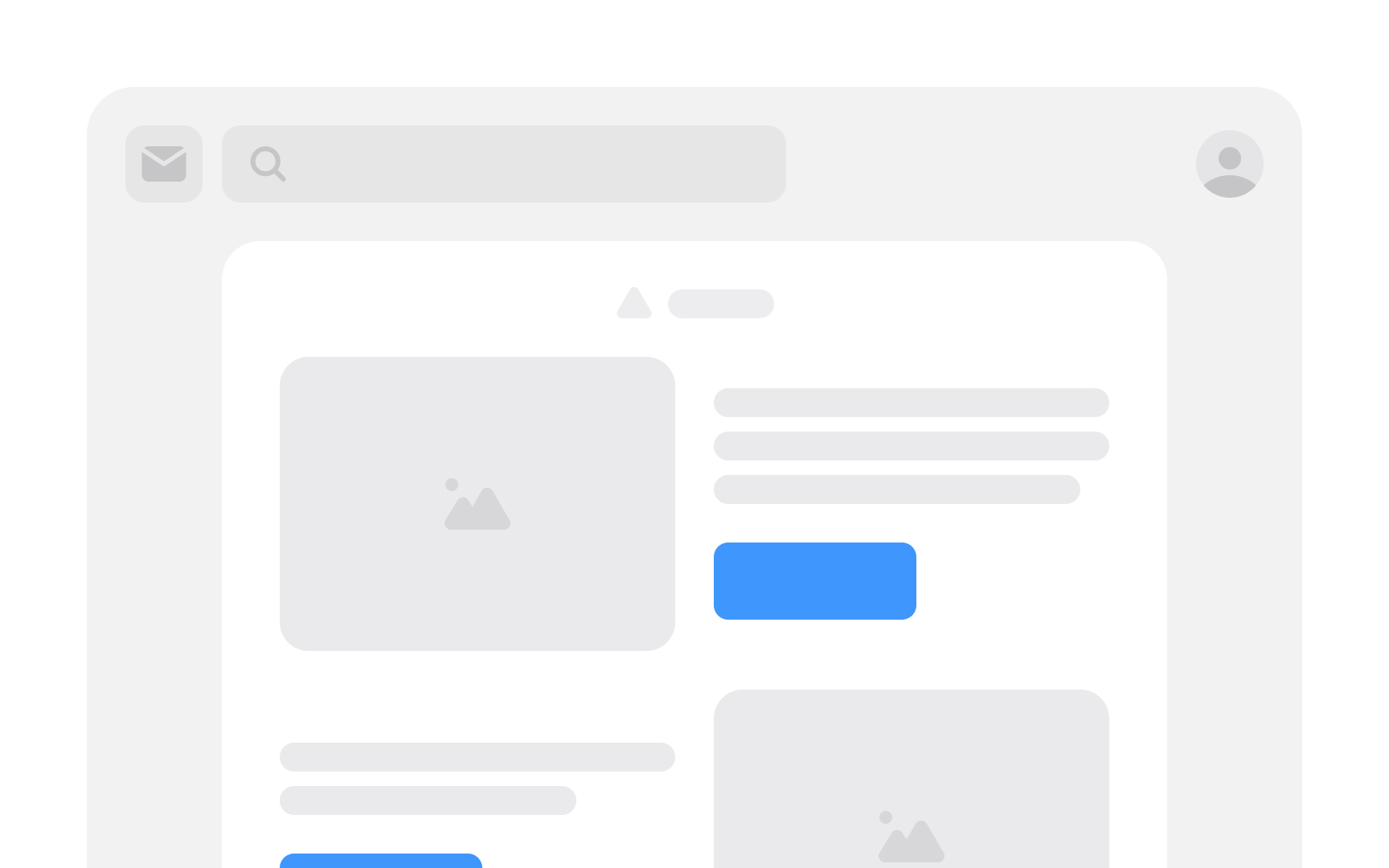
Zigzag layout
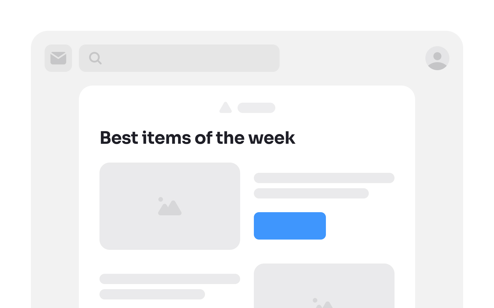
The zigzag email layout, aptly named for its resemblance to the letter "Z," aligns with the natural flow of a user's eye movement. By strategically incorporating attention-grabbing images and compelling titles, you establish visual checkpoints that seamlessly lead users through the email.
While the zigzag design excels on desktop platforms, ensure it gracefully collapses for consistent viewing on mobile devices. This layout is particularly effective for content-heavy messages, where you aim to capture attention swiftly and guide readers through key information with engaging visuals and succinct titles.
Single-column layout
Single-column emails, the traditional layout, excel across all devices, and facilitate efficient skim-reading. But the format particularly caters to mobile users. This is highly relevant because research shows that 4 out of 10 emails are opened on mobile apps.[4]
These emails are designed to be long and narrow, ideal for swift scrolling. This layout is effective because users are accustomed to vertical navigation on mobile screens, placing information precisely where they anticipate it. It's best employed for ensuring seamless accessibility and user-friendly engagement on mobile devices.
Use branded elements
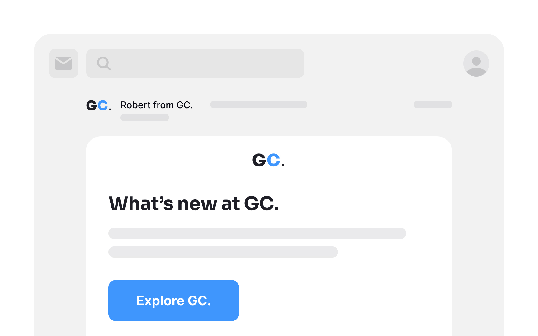
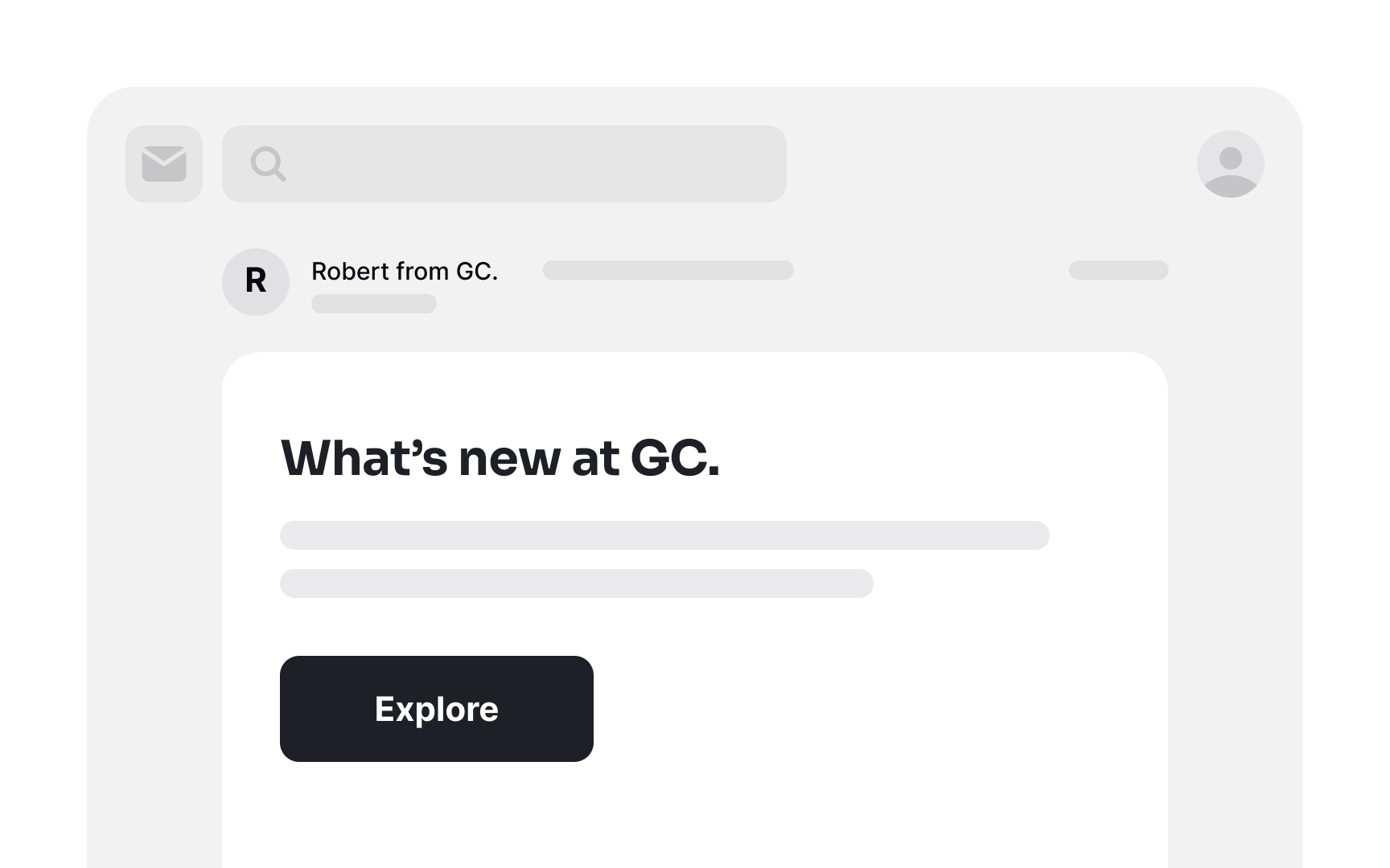
Integrate brand elements in your emails to establish recognition and trust. These elements could include your logo, brand colors, fonts, and other distinctive visual components. When users instantly identify your brand, it greatly reduces the likelihood of your email being relegated to the spam folder. Moreover, seeing familiar logos and brand colors instills a sense of comfort and sparks curiosity, compelling users to engage with your content.
Avoid aggressive subject line formatting
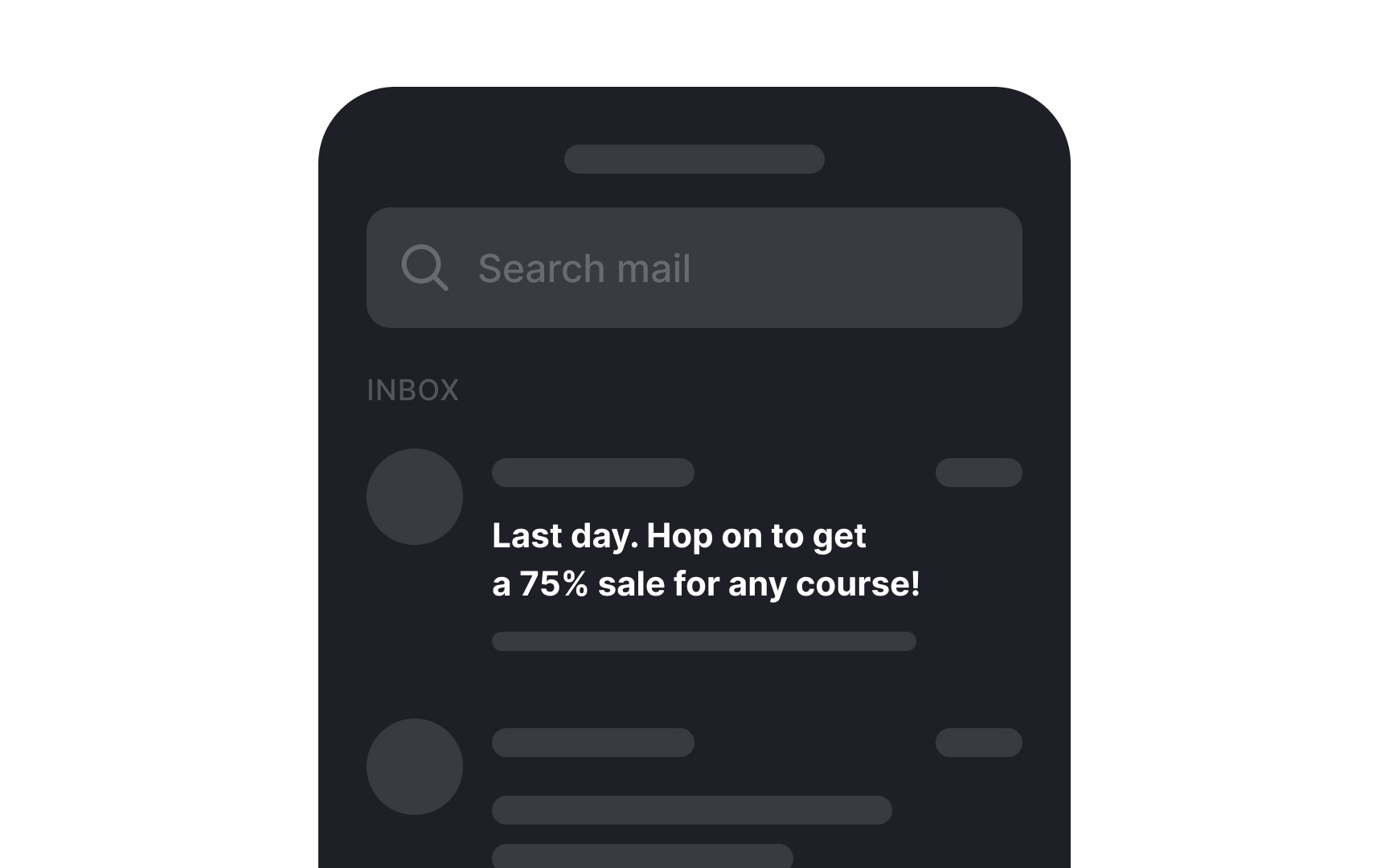
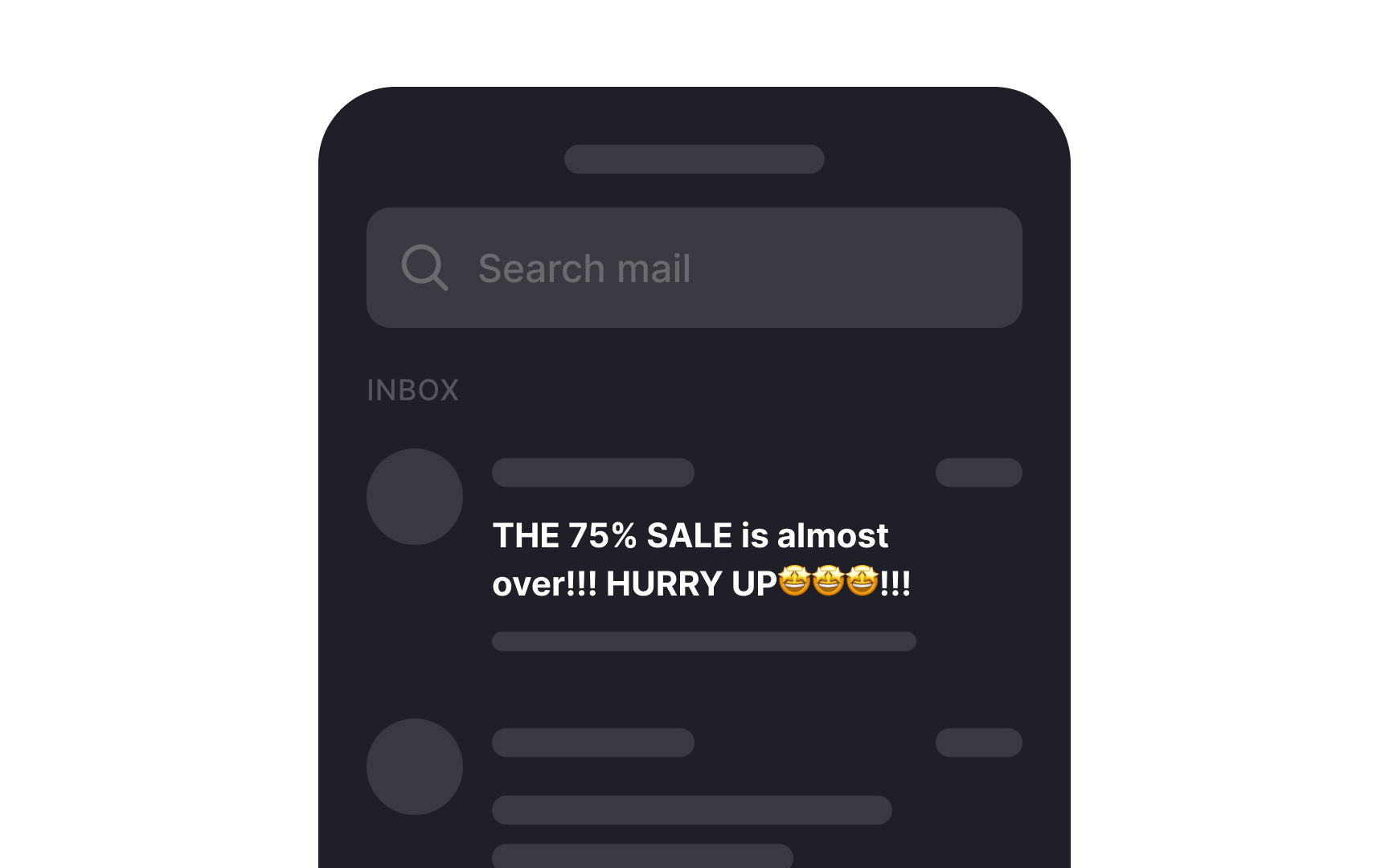
Steer clear of employing overly aggressive subject line formatting, which encompasses:
- Excessive use of capital letters
- Over-reliance on exclamation and question marks
- Generic marketing phrases
- An abundance of emojis
These tactics do not lead to higher open rates; rather, they make your emails appear overly promotional and distant.[5] Such formatting can also give off an impression of being of lower quality and may erode user trust.
Moreover, research from the Nielsen Norman Group indicates that incorporating emojis into subject lines can lead to a 26% increase in negative perceptions. Users frequently describe such emails as "boring," "dull," and "frustrating" when compared to emails that refrain from excessive emoji use.[6]
Engage users with a preheader
The preheader, often referred to as the "Johnson Box," is a valuable companion to the subject line. Positioned just below it, its purpose is to succinctly outline the email's content. A well-crafted preheader can further entice recipients to engage with your message.
Craft a concise preheader that complements the subject line, offering value or a compelling call-to-action for maximum impact.
Address users by their names
Dale Carnegie's renowned quote, "A person's name is to him or her the sweetest and most important sound in any language," rings true for email communication as well. HubSpot's studies affirm that emails featuring the recipient's first name in the subject line are more likely to be opened. [7]
This personalized touch fosters a culture of respect, recognition, and consideration. Embrace this approach by incorporating the subscriber's first name in both the subject line and the body of your email for more engaging and effective communication.
Keep mobile users in mind
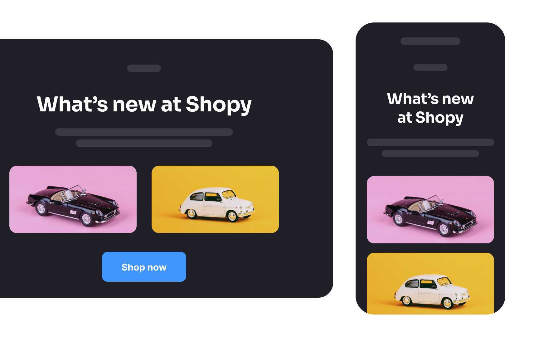
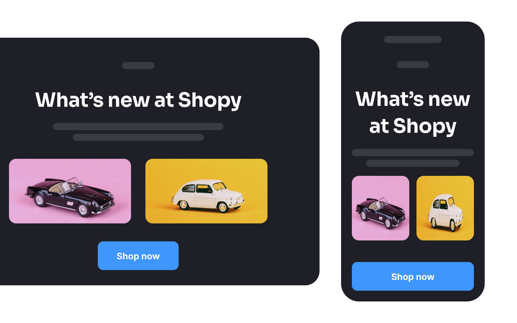
When creating email designs, consider their responsiveness on smaller screens. With the widespread use of smartphones, any layout discrepancies or distortions can lead to user disengagement.
Employ responsive design techniques to ensure your content displays seamlessly on various devices, providing an optimal user experience. This includes using mobile-friendly fonts, optimizing images, and utilizing flexible layouts that adapt to different screen sizes.
Pro Tip! Take a width of 600px for desktop and 320px for mobile as a starting point for email design.
Use enough white space
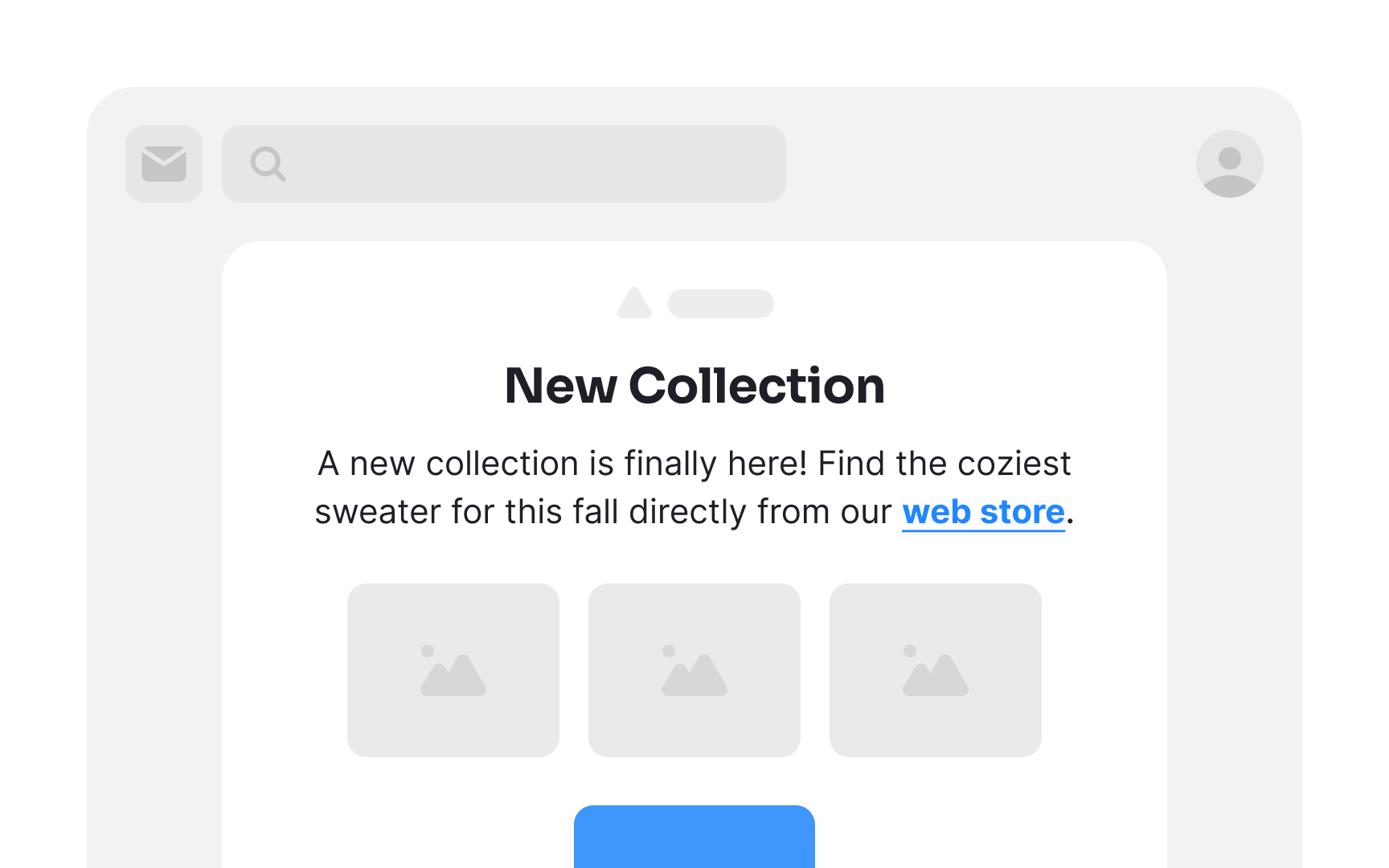
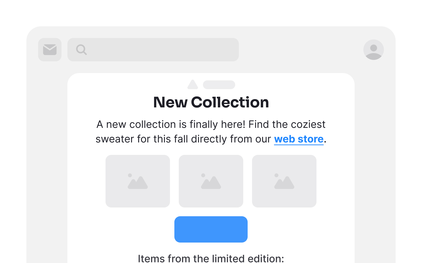
Generous use of white space in your email can work wonders. It's not merely empty space — rather, it provides vital breathing room for elements. This prevents clutter and promotes a clean, organized appearance, making your email content more digestible at a glance. Additionally, ample white space enhances readability, directs attention to key elements, and ultimately contributes to a more pleasant and effective user experience.
Emphasize the CTA
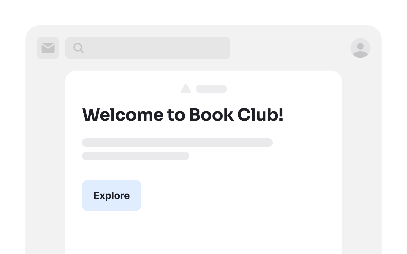
Ensuring a prominent CTA button is essential in email marketing. If the CTA isn't immediately noticeable, recipients may not make the effort to seek it out.
To enhance the visibility of the CTA button, consider factors like color, font, and shape. Choose a hue that contrasts well with the background and aligns with your brand's visual identity. Opt for a font style that is clear and easy to read.
When crafting the CTA label, use action-oriented verbs such as "buy," "get," "try out," or "grab." These words instill a sense of urgency and nudge users to take the desired action promptly.
Pro Tip! Adding enough white space around the CTA enhances its legibility.
Make links recognizable
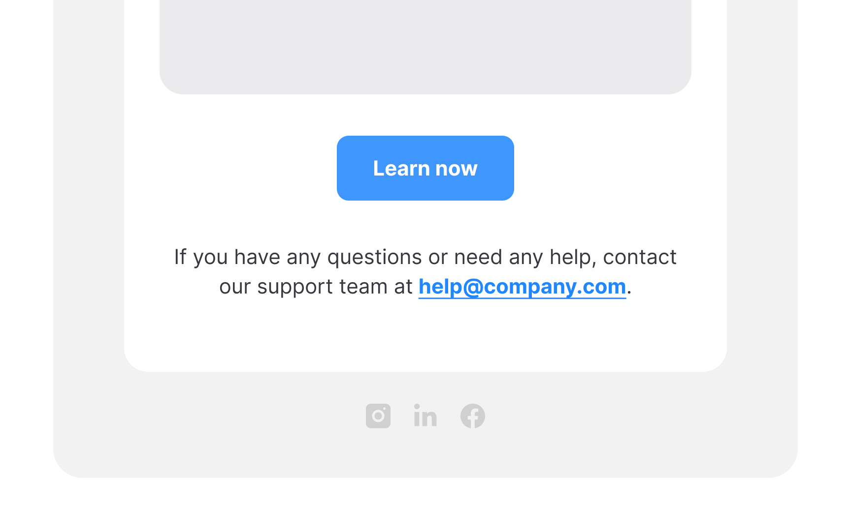
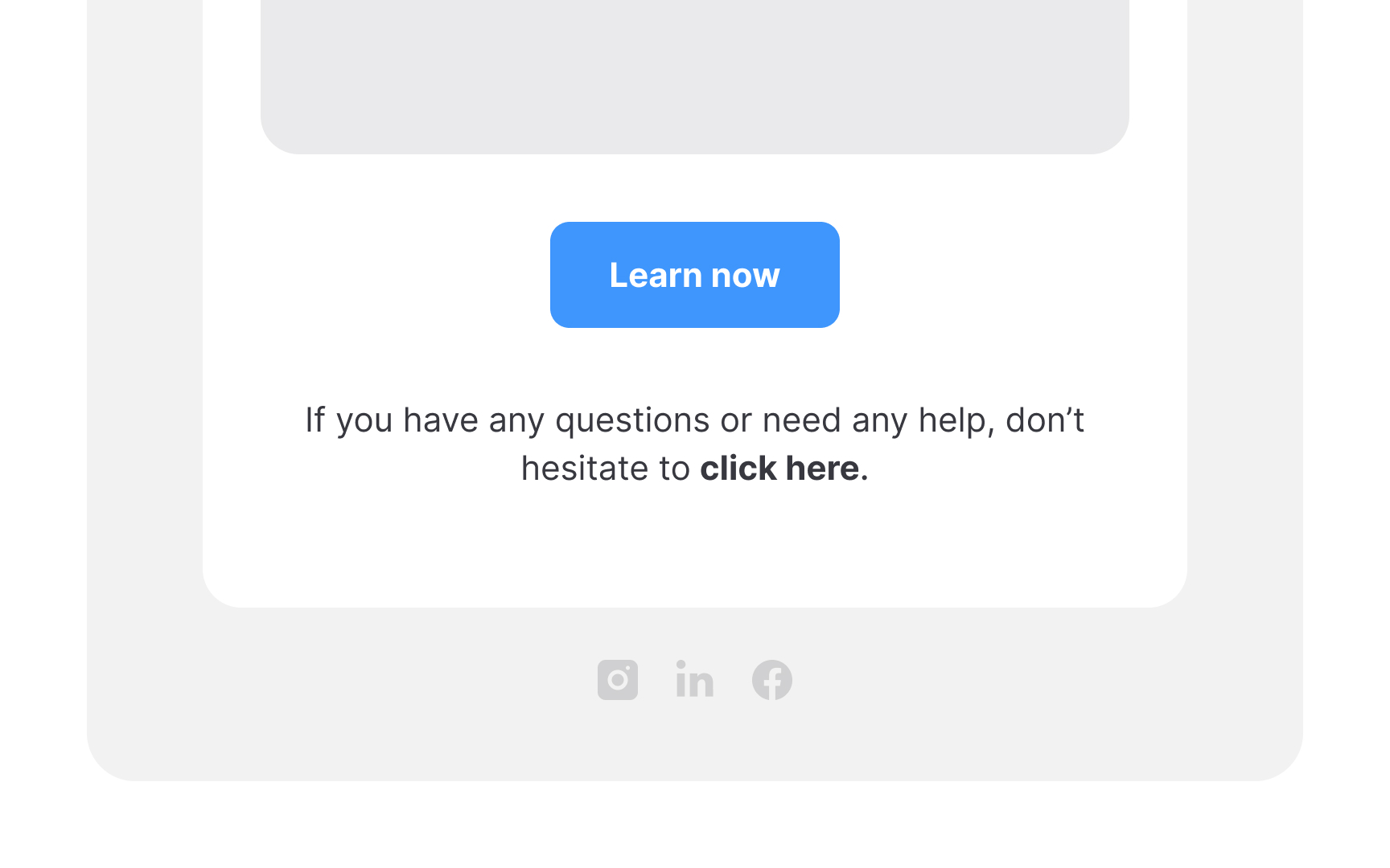
Link styling has remained consistent with underlined, typically blue text for years. Attempting to substitute it with italic or bold formatting can lead to user confusion.
Also, ensure that link text is self-explanatory; avoid vague phrases like "click here." This clarity benefits all users, particularly those relying on screen readers who greatly benefit from knowing where a link will take them.
Include useful information in footers
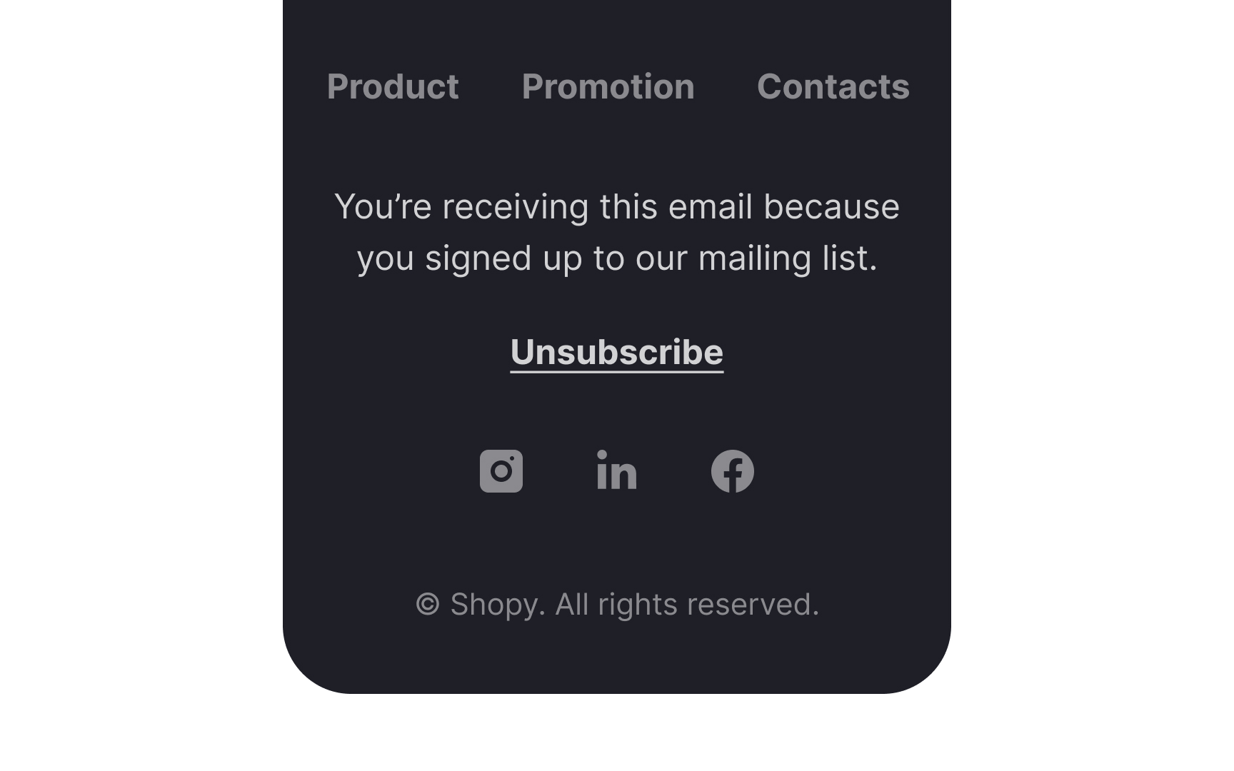
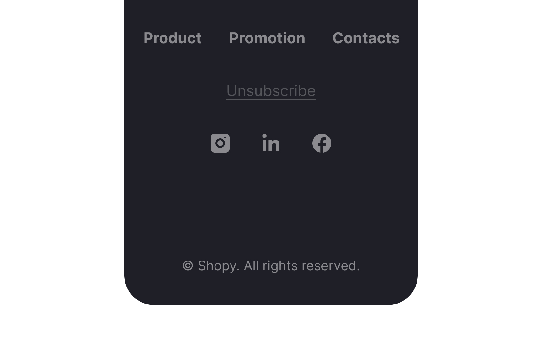
The footer of your email serves as a final touch to reinforce the positive impression created by the valuable content and appealing visuals in your email. It typically encompasses links to your website, contact information, copyright notice, privacy policy, and social media buttons.
Equally crucial is the presence of an Unsubscribe link. Concealing this option could lead to frustration among users seeking to opt out, potentially damaging your brand's reputation. Along with the Unsubscribe link, include a brief statement explaining why users receive your emails. Did they sign up on your website? Do they have an active subscription with you? This assures them of the legitimacy of your communication and helps build trust.
References
- Re-Engagement Emails: Examples and Best Practices to Win Back Subscribers - MailPoet | MailPoet
- The art and science of killer abandoned cart emails | Dynamic Yield
- How to Use the Inverted Pyramid Design to Boost Email Conversions | Stencil | Stencil
- Mobile Email Statistics - TrueList 2022 | TrueList
- Emojis in Email Subject Lines: Advantage or Impediment? | Nielsen Norman Group
- Email Subject Lines: 5 Tips to Attract Readers | Nielsen Norman Group
- 22 Eye-Opening Statistics About Sales Email Subject Lines That Affect Open Rates [Updated for 2022]


