


Collecting data is only half the work of UX research. Analysis is where raw observations, transcripts, and metrics become findings that a team can act on. Without it, even well-run studies produce little more than a pile of notes that no one has the time or framework to interpret.
Analysis looks different depending on the data type. Qualitative data from interviews, field notes, and usability sessions require coding and thematic analysis to identify patterns across participants. Quantitative data from surveys, analytics, and benchmarking requires statistical interpretation to determine what the numbers mean for the product. Both approaches require anchoring the work to the original research objectives, because it is easy to find patterns that are interesting but irrelevant to the decisions that need to be made.
This lesson covers the full arc of UX research analysis: planning the approach before data collection begins, working with attitudinal and behavioral data, avoiding common mistakes in qualitative interpretation, synthesizing findings, handling contradictory results honestly, and sharing conclusions in a form that is useful to the people who need to act on them.
Why analyzing UX research data matters
Conducting UX research without a clear plan for what to do with the findings is a common trap. The real goal isn't just to gather data. It's to sort through it, analyze it, and generate insights that can meaningfully inform product decisions.
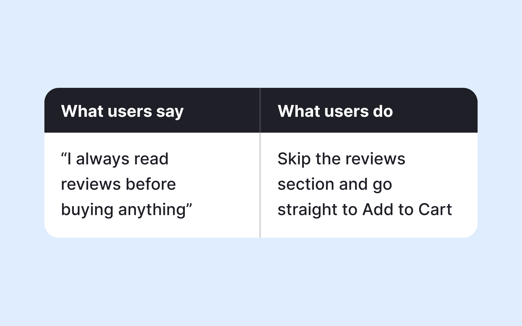
One of the biggest mistakes UX practitioners make is jumping to conclusions based on raw numbers or surface-level patterns without asking why. Proper data analysis helps teams see the bigger picture, make more rational decisions, and ultimately save time and money. Instead of fixating on isolated statistics or quotes, researchers should dig into the reasoning behind user behavior.[1]
For example, if 80% of users ignore your Subscribe button, the instinct might be to redesign it. But a thorough analysis might reveal the real issue is placement, or that the subscription benefits aren't compelling enough. Without that deeper look, you risk solving the wrong problem.
Analyzing data well means moving from observation to understanding, so that every design decision is grounded in what users actually need.
Pro Tip! Raw data tells you what happened. Analysis tells you why. Always ask "why" before jumping to solutions.
How to analyze attitudinal data in UX research
Attitudinal data captures what users say, think, and feel. It includes quotes and observations collected through interviews, focus groups, and diary studies. But having this data is only the starting point. The real work is analyzing it to find patterns that reveal genuine user needs.
The most common method for analyzing attitudinal data is thematic analysis. It works by assigning short labels, called codes, to meaningful quotes or observations. For example, if multiple users say they find the checkout process confusing, you might code those responses as "navigation friction." Once you've coded your data, you look for patterns across codes and group related ones into broader themes. A theme isn't just a topic. It represents a recurring experience or need that surfaces across participants.
Here's where a critical limitation of attitudinal data comes in: users don't always do what they say they will. Someone might tell you they'd use a feature daily, but behavioral data could show they rarely open it. This gap between what users say and what they do is actually valuable. It points to areas worth investigating further, and it's a good reason to pair attitudinal analysis with behavioral data whenever possible.[2]
When you combine both, you move from "users said they find this confusing" to "users said it's confusing, and 70% dropped off at that same point." That's a finding you can act on.
Pro Tip! Treat contradictions between attitudinal and behavioral data as signals, not noise. The gap often reveals the most actionable insights.
How to analyze behavioral data in UX research

Behavioral data captures what users actually do. It comes from observations during contextual inquiries, usability tests, session recordings, heatmaps, and analytics, and it's considered highly reliable precisely because it's not filtered through memory or self-reporting.
The core approach to analyzing behavioral data is pattern recognition. You look across sessions or observations and ask: where do users slow down, drop off, or take unexpected paths? For example, if session recordings show that most users click a non-clickable element on a page, that's a pattern worth flagging. It suggests a mismatch between what users expect to be interactive and what actually is.
When you have observational data from contextual inquiries or usability tests, coding works similarly to attitudinal analysis. You tag recurring behaviors, such as "skipped onboarding step" or "used search instead of navigation," then group those codes into themes. The difference is that your raw material is actions, not words.
The biggest challenge with behavioral data is that it tells you what happened, but not why. If 60% of users abandon a form halfway through, the data confirms the problem but doesn't explain it. That's the moment to bring in attitudinal data by following up with an interview or a short survey targeted at users who dropped off.
Pro Tip! Start your analysis by identifying the biggest behavioral anomalies: the unexpected clicks, the ignored features, the rage clicks. These outliers often point to the most actionable design problems.
Plan your analysis before UX research begins
One of the most common mistakes in UX research is treating analysis as something you figure out after the data is collected. In practice, the best analyses start taking shape before a single session is run.
Your research goals and hypotheses act as a filter. They help you stay focused during analysis and avoid the trap of chasing every interesting detail in the data. If your research goal is to understand why users abandon a shopping cart, you already have assumptions going in. Maybe you suspect the checkout process is too long, or that users hit an unexpected cost at the final step. Those assumptions shape what you look for and how you interpret what you find.
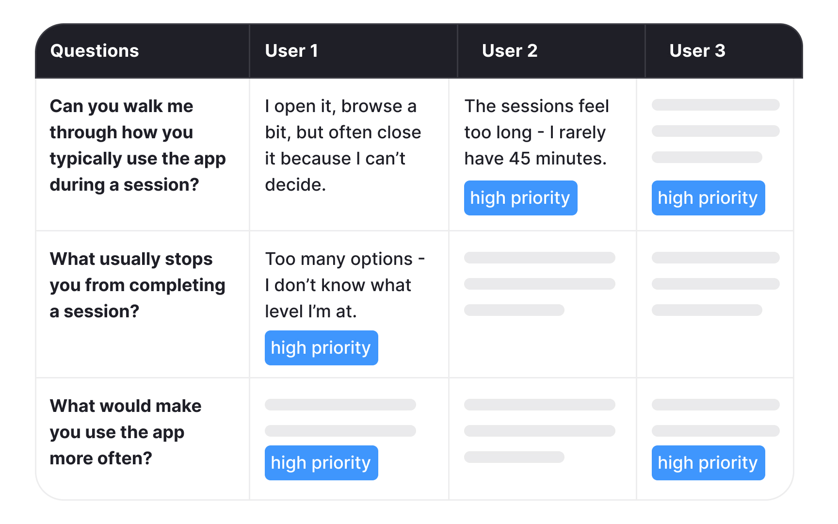
One practical way to prepare is to define your codes before fieldwork begins. Codes are short labels you assign to observations or quotes that match your research goals. For example, if you're testing the usability of a landing page, you might set up codes like "navigation," "aesthetics," "critical errors," and "recommendations" in advance. When a participant struggles to find the sign-up button, you tag it immediately rather than sorting through raw notes later.
This approach doesn't mean you should ignore unexpected findings. Surprising patterns that fall outside your initial codes are often the most valuable. But having a structure in place makes it much easier to spot them.
Prioritize findings against your research goals
When you're sitting in front of a large dataset, it's easy to feel overwhelmed. Research goals defined at the start of your project are what keep you from going in circles. They act as a filter, helping you separate findings that demand immediate action from those that are interesting but not urgent.
Take a yoga app as an example. If your research goal was to understand why users stop engaging with the app after the first week, that goal becomes your reference point during analysis. Every finding gets evaluated against it. Users reporting that workout sessions feel too long and rigid? That maps directly to your goal and becomes a must-have fix. Users expressing interest in adding meditation content? That's a valuable insight, but it belongs in the nice-to-have category for now.
This distinction matters because not all findings carry the same weight. Without a clear goal to anchor your analysis, it's easy to over-prioritize interesting but peripheral findings while overlooking the ones that actually answer your research question.
Going back to your original goals also helps you communicate findings to stakeholders. When you can show that a finding directly addresses what the team set out to learn, it's much easier to make the case for acting on it.[3]
Pro Tip! Map each key finding to a specific research goal before your readout. If a finding doesn't connect to any goal, ask yourself whether it warrants a separate follow-up study.
Quantitative data analysis in UX research
Once you've collected numerical data through surveys, polls, or web analytics, you'll typically have a large dataset on your hands. Tools like SPSS, JMP, Stata, and R are built for this kind of analysis, though a well-structured spreadsheet can handle simpler datasets just as effectively.
Several methods can help you extract meaningful insights from quantitative data, and choosing the right one depends on what question you're trying to answer:
- Cross-tabulation lets you examine the relationship between two or more variables and spot patterns across different user groups. For example, you might use it to compare feature usage across age groups or devices.
- Max-diff analysis, also known as best-worst scaling, helps you measure the relative importance of different features or attributes. By asking users to identify what matters most and least to them, you get a clear prioritization rather than a flat list where everything seems equally important.
- Conjoint analysis takes this further by identifying the optimal combination of features users value most. It breaks a product down into attributes (such as price, speed, or design) and their levels (low, medium, high), then determines which combination resonates most with your audience.
- Gap analysis measures the distance between where users expect your product to be and where it actually is. For example, you might use it to compare expected and actual satisfaction scores after a redesign.
- Trend analysis tracks how a metric changes over time and what factors might be influencing that change. It's particularly useful for identifying whether a design change had a lasting impact on user behavior.
- Sentiment analysis uses natural language processing (NLP) tools to process open-ended text responses at scale, categorizing feedback as positive, negative, or neutral to surface patterns that would be difficult to spot manually.[4]
Pro Tip! Combine two or more approaches to get the full picture. You can use gap analysis to identify a problem and trend analysis to understand how it developed over time.
Qualitative data analysis in UX research

Qualitative data from interviews, field notes, or open-ended surveys requires a more interpretive approach than numbers do. The best method depends on your research goals, the volume of data, and what kind of insight you're after:
- Thematic analysis is the most widely used method in UX research. It works by coding observations and quotes, then grouping those codes into themes that represent recurring user needs, behaviors, or frustrations.
- Content analysis takes a more structured approach by counting how often certain words or topics appear. It's useful when you want to understand not just what users say, but how frequently a concern comes up across your dataset.
- Narrative analysis examines individual accounts in depth to understand how users construct meaning around their experiences. It's particularly useful in diary studies where personal context matters.
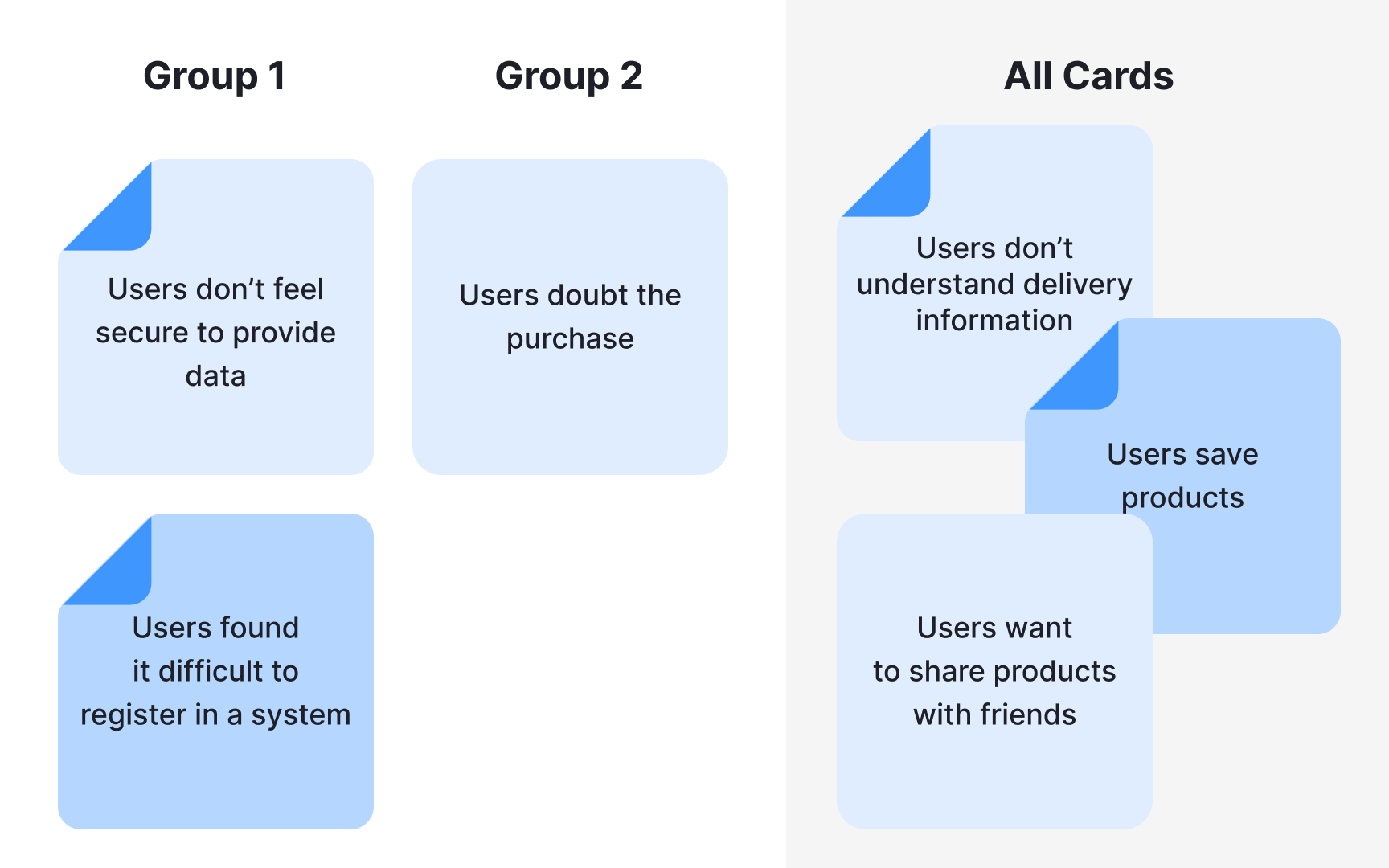
- Affinity diagramming is a visual, collaborative approach where observations are grouped by similarity. It helps teams surface patterns quickly across large volumes of raw data.
The method you choose shapes what you find. The same dataset can reveal a recurring usability theme through thematic analysis, or uncover user anxiety through narrative analysis, pointing to a very different design response.[5]
Common mistakes in qualitative data analysis
Even experienced UX researchers make mistakes when analyzing qualitative data. Knowing what to watch for can save you from drawing the wrong conclusions.
- Drowning in uncategorized data. When everything feels important, nothing is. Work with your team to prioritize user feedback, agree on what can be omitted, and keep only what directly serves your research goals.
- Researcher bias. It's easy to unconsciously favor data that confirms what you already believe and dismiss findings that don't fit. Write down your assumptions before fieldwork begins and revisit them during analysis. Having a second researcher review your interpretations independently adds another layer of protection.
- Over-reduction. This happens when rich qualitative data gets flattened into binary categories, such as responses coded simply as positive or negative. This strips away the nuance that makes qualitative research valuable in the first place. If your analysis starts to look like a spreadsheet of yes and no answers, that's a sign you've lost the depth you were looking for. Open-ended questions during research sessions are the first line of defense against this.[6]
Pro Tip! If your entire team agrees on every finding without debate, that's often a sign that bias is at play rather than genuine consensus.
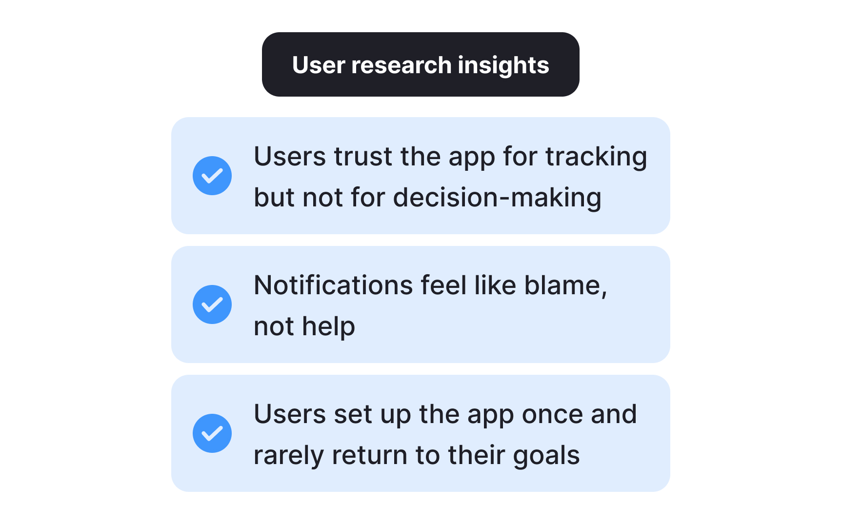
How to synthesize research findings
Synthesis is what turns a collection of findings into something your team can act on. While analysis breaks data down, synthesis builds it back up into a coherent picture of user needs, behaviors, and pain points.
Here's how to approach it:
- Prioritize. Filter your findings against your research goals and focus on what most directly answers your research question. Not everything that surfaced during analysis deserves equal attention.
- Organize. Use sticky notes, whiteboards, or collaborative tools like Miro to arrange findings visually. Seeing everything in one place makes relationships between findings easier to spot and helps your team build shared understanding.
- Look for connections. Synthesis isn't just about grouping similar findings. It's about asking what patterns mean together. Two separate findings about user confusion and drop-off rates might point to the same underlying problem.
- Validate. Before treating a pattern as an insight, check it against your raw data. A good insight should be supported by multiple data points across different participants or sessions.
- Document and share. List your key insights in a shared document and present them to your team. Brainstorming together often surfaces implications that aren't obvious to the researcher who was closest to the data.[7]
Pro Tip! Aim for 3 to 8 insights per study. Fewer may suggest your research scope was too narrow. More often means you haven't been critical enough about what genuinely matters.
How to handle contradictory research results
Contradictory results are more common in UX research than most people expect, and they don't always signal a problem. Sometimes they reveal something genuinely important about your users.
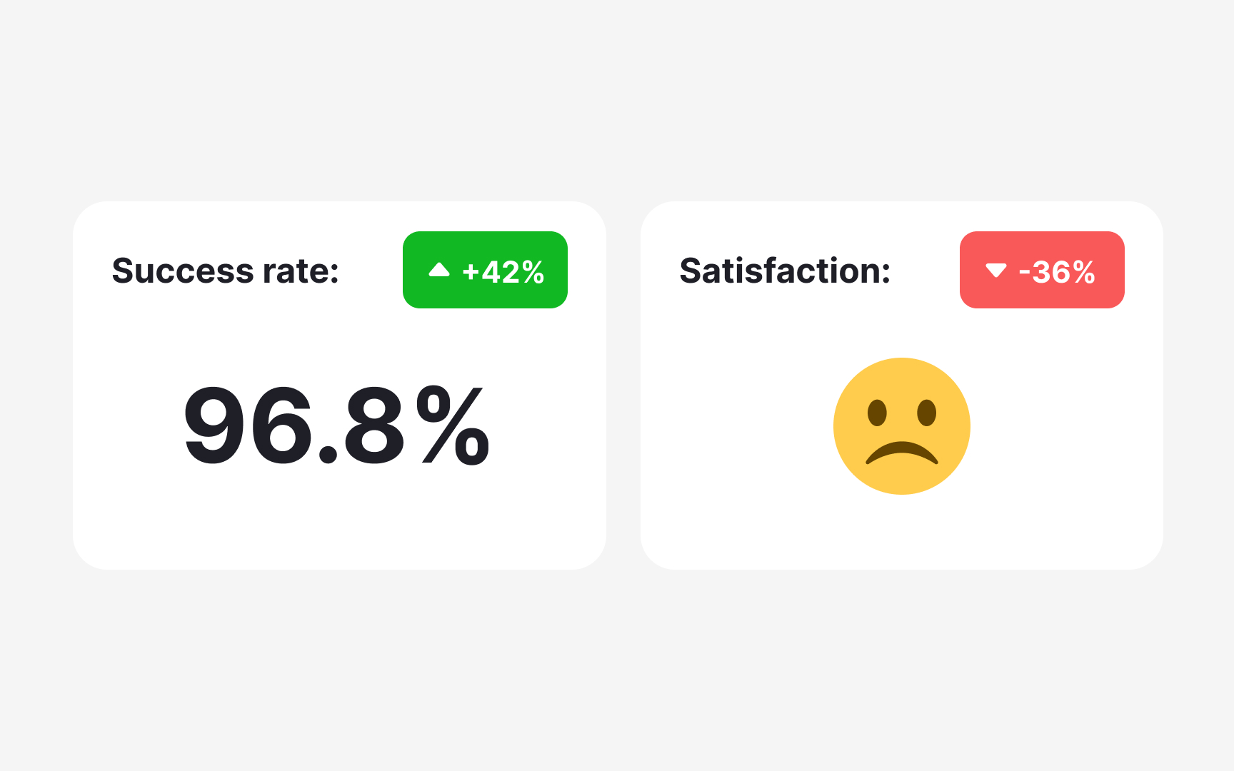
A classic example: a usability test shows 100% task success rate, but follow-up interviews reveal that users are frustrated and would switch to a competitor if they found one. Both findings are true. They're just measuring different things. Task completion tells you whether users can do something. Satisfaction tells you how they feel about doing it.
When you do encounter contradictions, start by examining your methodology:
- Respondents. Did the same participants take part in both studies? Different people bring different experiences and expectations, which can produce genuinely different results.
- Tasks. Were conditions consistent across participants? Differences in time allowances or task framing can produce results that appear contradictory but are actually measuring different things.
- Environment. Were there external factors, such as noise, device type, or setting, that could have influenced responses in one study but not the other?
- Data analysis. Is the statistical significance strong enough to draw conclusions? Is there a chance the data was overcorrected or misinterpreted during analysis?
If your methodology checks out, contradictory findings may simply reflect the complexity of your users' experience. In that case, conducting an additional study using a different method can help triangulate the results and bring you closer to a reliable answer.[8]
Share insights and recommendations with your team
The final step of analysis is also where research becomes most valuable: turning insights into recommendations that motivate your team to act.
You can approach this in two ways:
- Include formal recommendations directly in your research report. Pairing each key insight with a supporting data point and a suggested direction gives stakeholders something concrete to move on.
- Run an open team discussion. Share a document with your insights, then bring the team together, in person or remotely, to brainstorm together. Instead of presenting ready-made solutions, frame your insights as "how might we" questions. This opens the door to collaborative problem-solving and brings in perspectives you might not have considered.
For example, if the insight is "users abandon their shopping carts because they don't see the total amount until they click the Pay button," the design opportunity becomes: "How might we help users review the total price, including delivery costs and fees, before they reach checkout?"
Both approaches work. The right choice depends on your team's working style and how much alignment you need before moving forward.[9]
Use AI for transcription and summarization in UX research
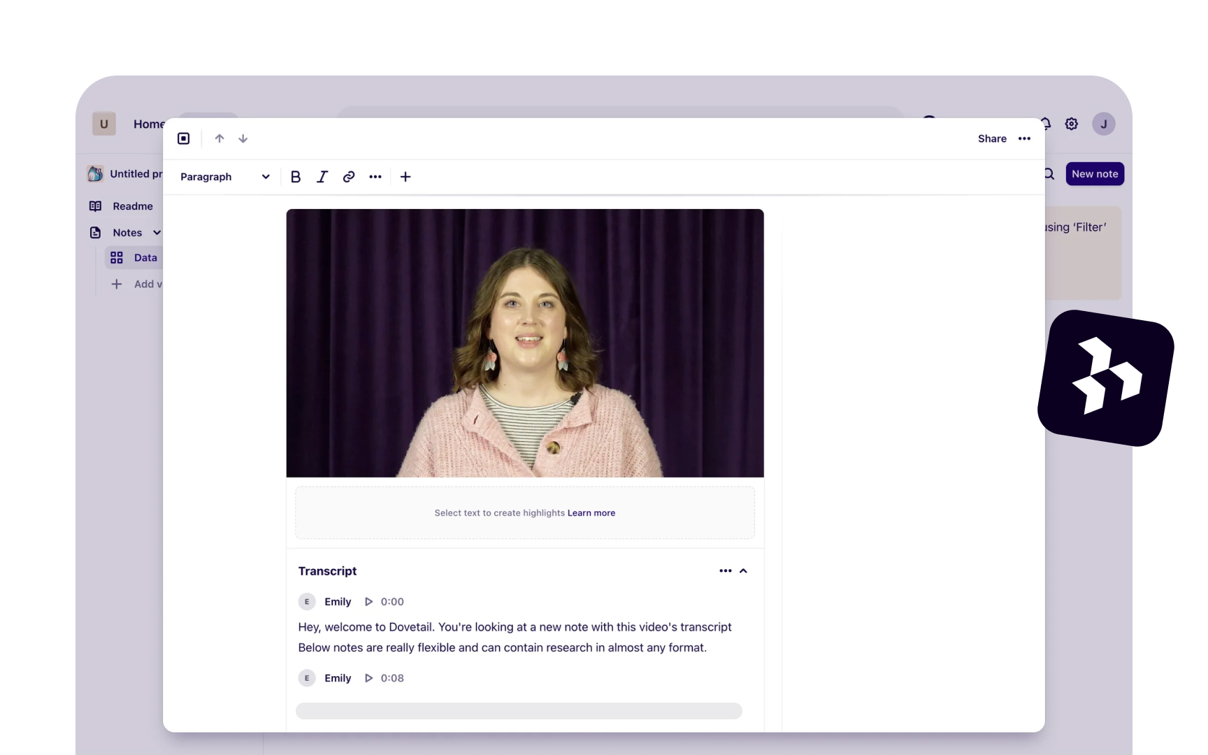
AI transcription tools like Otter.ai, Looppanel, and Dovetail can convert a one-hour interview into text within minutes. That speed is genuinely useful, but it comes with a catch: AI makes mistakes, and those mistakes don't announce themselves.
AI commonly struggles with:
- Product names and domain-specific terminology
- Quiet or mumbled speech
- Crosstalk when two people speak at once
The resulting errors are easy to miss because the surrounding text reads naturally. A sentence like "users found the checkout confusing" can quietly become "users found the checkout amusing."
This is why reviewing every transcript before analysis is not optional. Go through each one with your discussion guide nearby, paying close attention to key terms and moments where the audio was unclear. Anything that slips through here will carry into your codes and themes.
AI summarization works similarly. Tools like Looppanel and Dovetail can generate a short overview of each session, which helps you navigate across interviews and locate moments worth examining more closely. But summaries omit nuance. An offhand comment or a participant contradicting themselves rarely makes it in, yet these moments often carry the most important signal. Use summaries to orient yourself, then return to the full transcript for anything that matters.[1][2]
Pro Tip! Before uploading transcripts to any AI tool, anonymize participant names and sensitive details. General-purpose AI tools do not store data securely.
How to use AI for coding and thematic clustering in UX research
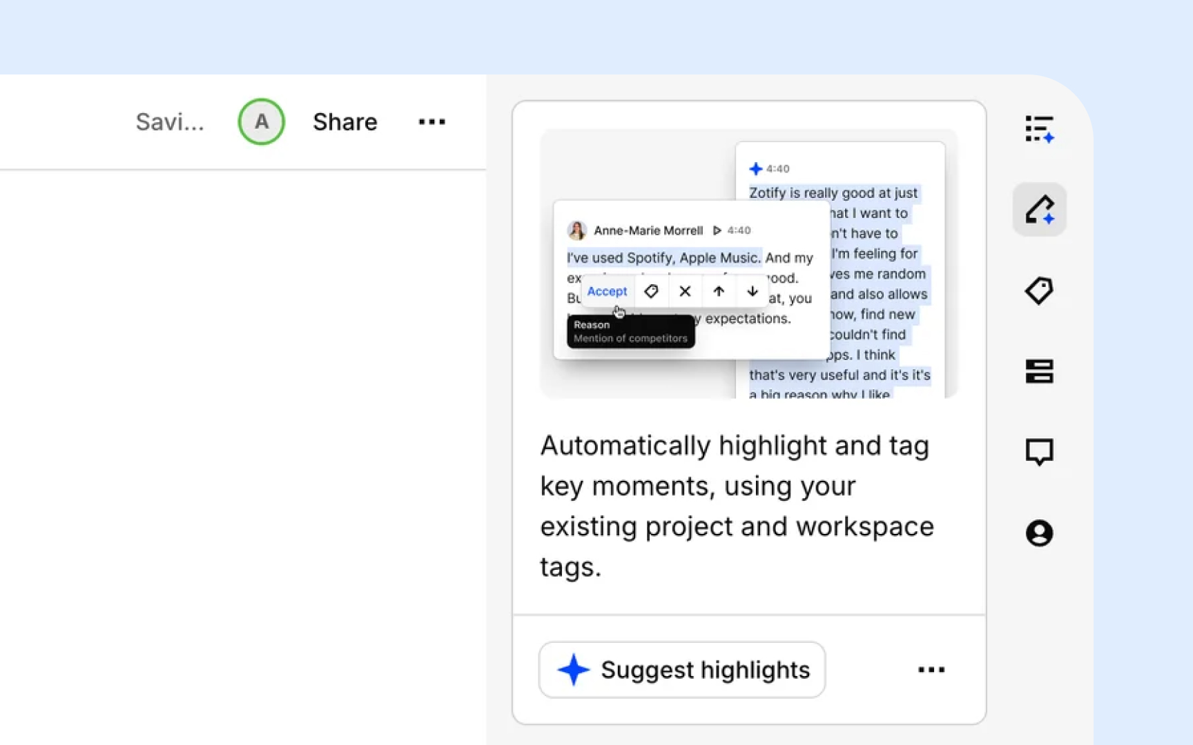
AI can handle the mechanical work of coding and clustering, but without clear direction, the output is usually too vague to be useful. Dropping raw transcripts into a tool and asking it to "find themes" produces broad, overlapping codes that take longer to clean up than manual coding would have.
Follow these steps to get reliable results:
- Organize your data first. Group transcripts by discussion guide question or topic before passing them to AI. Tools like Looppanel do this automatically. Structured input produces tighter, more relevant codes.
- Write a specific prompt. Include your research goal and study context. Vague prompts produce vague codes.
- Review the output critically. AI defaults to surface-level, descriptive codes. It will flag "navigation issues" as a theme but won't tell you that users feel disoriented because the layout contradicts how they think about the task. Merge overlapping codes, discard anything unrelated to your research goals, and add your own interpretive notes.
- Validate clusters against raw data. AI groups observations by surface similarity. A cluster labeled "trust issues" might mix concerns about data privacy, unclear pricing, and an unfamiliar brand name, which are three different problems that need different solutions.[10]
Pro Tip! Test your prompt on 2 or 3 transcripts before running it across the full dataset. If the codes feel off, adjust and retry. Iteration on a small sample saves hours.
Topics
References
- UX Research Data Analysis: A Step-By-Step
- How to Analyze Qualitative Data from UX Research: Thematic Analysis | Nielsen Norman Group
- UX Research Data Analysis: A Step-By-Step
- Getting Started with Quantitative Data Analysis | UX Booth
- 5 Qualitative Data Analysis Methods to Reveal User Insights
- Extracting Research Insights: How to Analyze Qualitative Data with Timothy Moore of The Design Gym
- UX Research Synthesis Methods for Actionable Insights | Looppanel
- Interpreting Contradictory UX Research Findings | Nielsen Norman Group
- UX insights | Lyssna
- AI Analysis & Synthesis for UX Research: A 6-Step Pipeline


