


.svg)
Footers have a reputation problem. Designers often treat them as dumping grounds for links that don't fit anywhere else. Legal requirements, secondary navigation, social icons, and partner logos get tossed together without much thought about how users actually interact with them.
But users who reach footers aren't scrolling aimlessly. They're often looking for something specific: contact details, support links, company information, or content they couldn't locate through primary navigation. Arriving at the footer represents intent, not abandonment. Link labels carry more weight in footers than elsewhere. Users scanning a dense collection of options rely on clear, descriptive names to find what they need. Clever or abbreviated labels that might work in a sparse header fail when surrounded by dozens of competing links.
Visual consistency with the rest of the site reinforces trust. Footers that feel disconnected, whether through jarring color shifts, different typography, or unfamiliar layouts, create subtle friction. Users shouldn't feel like they've landed somewhere else just because they've scrolled to the bottom of the page.
Prioritize information


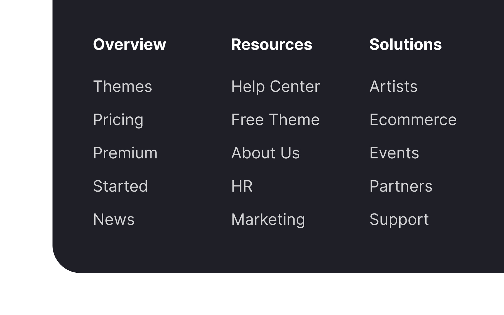

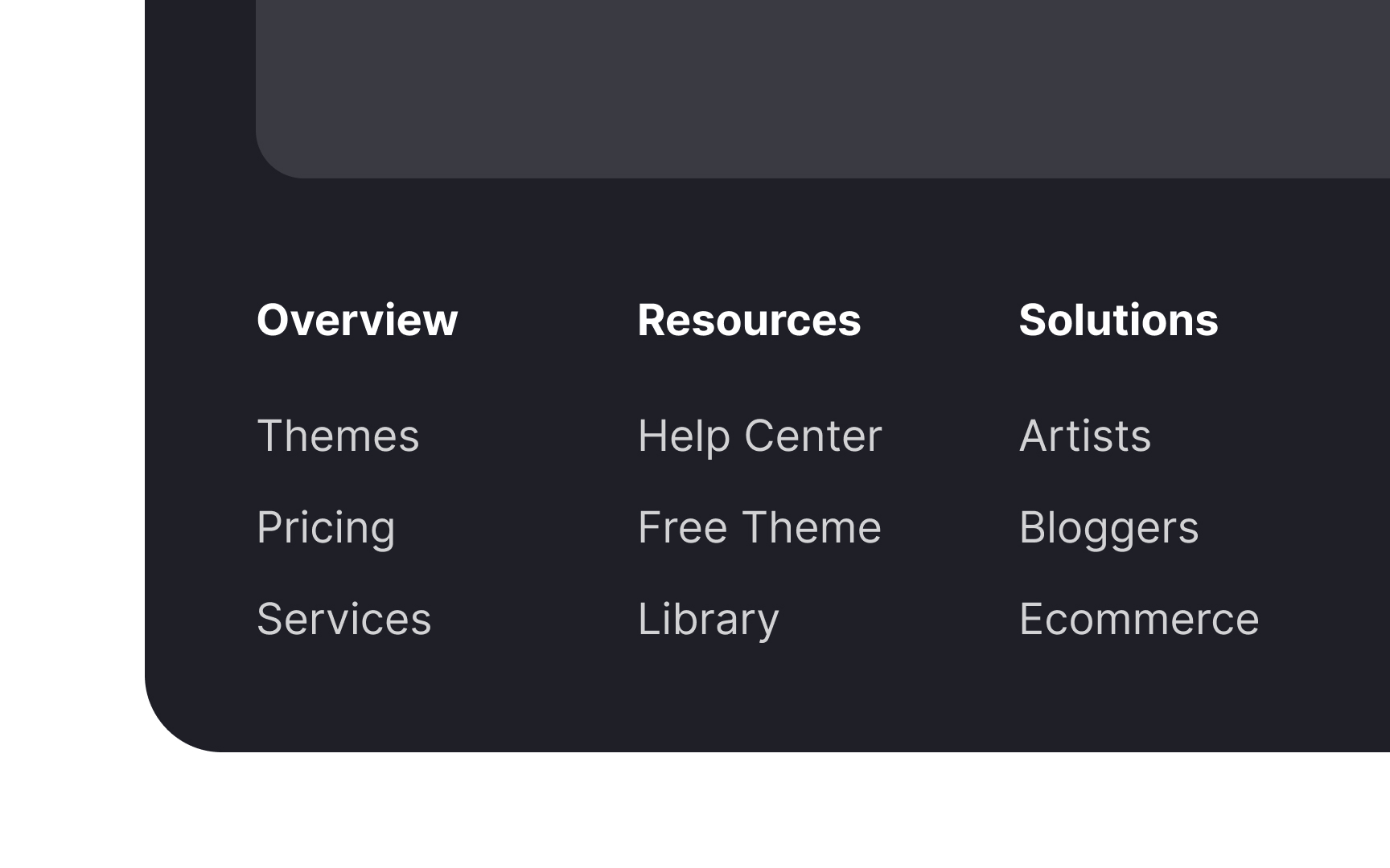
Everything in a footer must serve a purpose and have a clear visual hierarchy. Prioritize what to include — the most crucial elements are global navigation, contact details, a privacy policy, and social media links.
If you include a site map, don't add more than first- and second-level links. This will run the risk of making the footer unwieldy and challenging to use. Instead, you can provide a full-featured site map on a separate page and link it in the footer, where users expect to find it.
Use consistent terms throughout the website

Consistency and attention to detail communicate professionalism and instill confidence in users. One way you can ensure this is by using the same terms to refer to the same sections of the product.
For example, if you decide to name a section "Contacts," use this name everywhere and avoid replacing it with synonyms like "Contact details" or "Contact info." This approach will decrease the cognitive load for users.[1]
Don't neglect information hierarchy
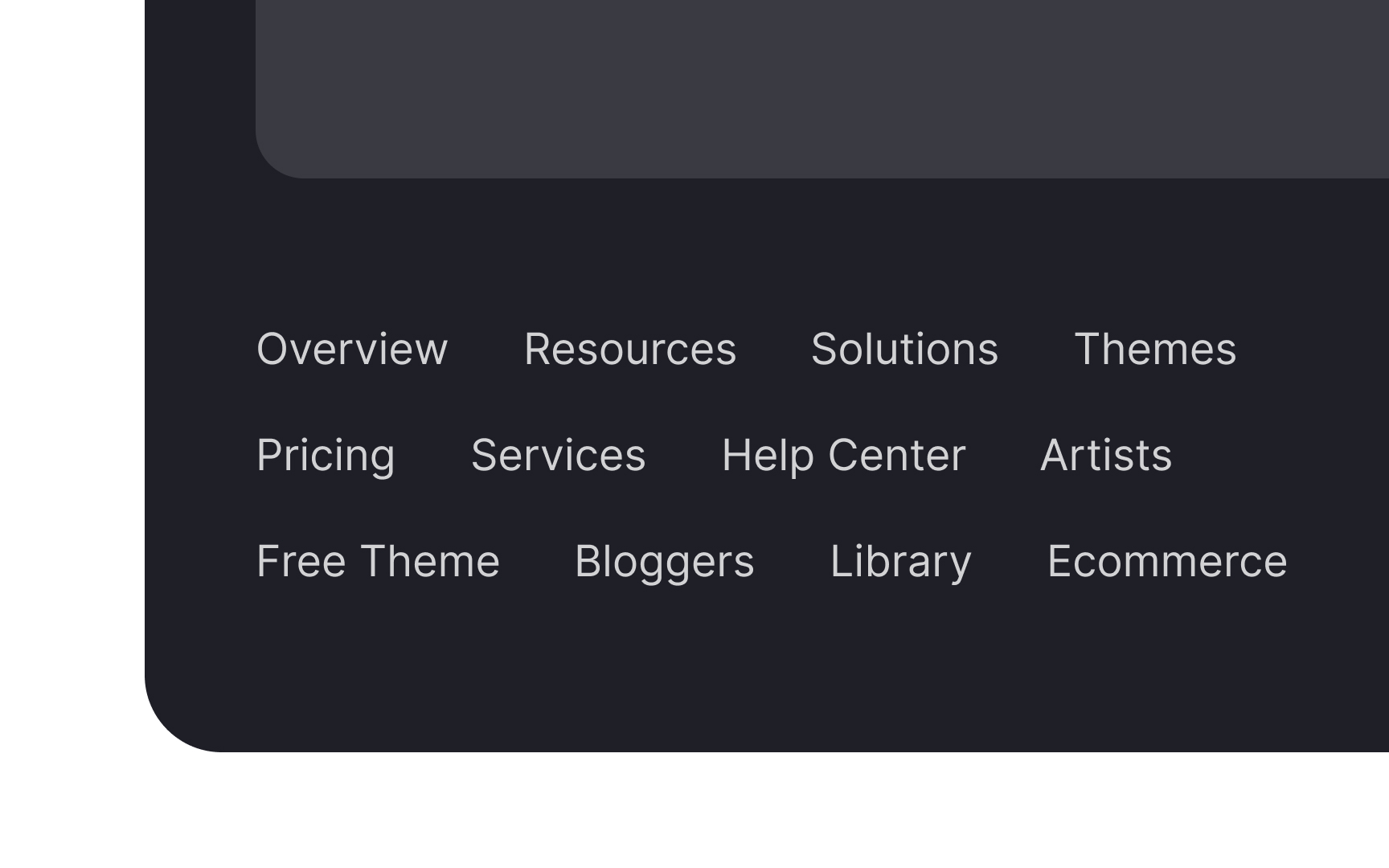
A disorganized footer can overwhelm users, leading them to either painstakingly examine every link or, more likely, to largely ignore the footer.[2]
To make the footer effective and user-friendly, it's essential to establish a clear information hierarchy. This can be achieved by grouping similar items together and using design elements such as headings, different font sizes, or even varying colors to enhance this structure.
Make the footer visible and legible
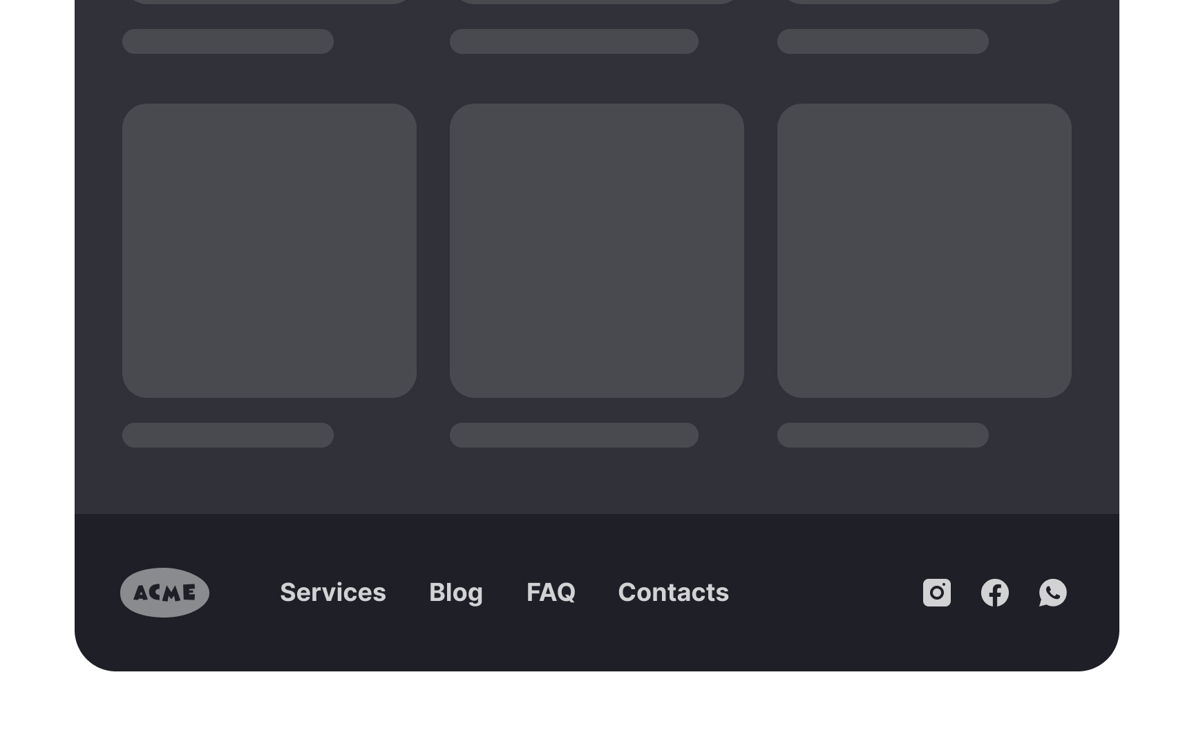
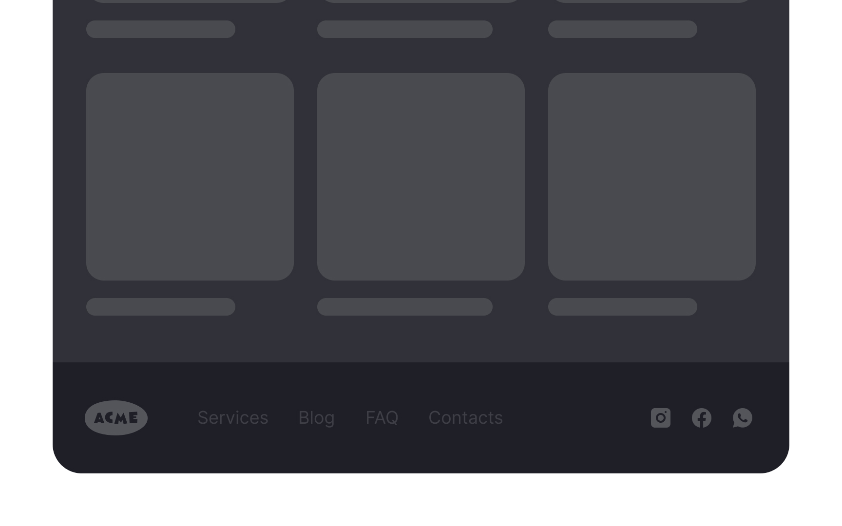
Make sure your footer is visible and highly legible. While footers aren't a part of primary navigation, many users rely on them as the last resort when looking for information. That's also where they expect to find certain types of information, such as social media links and contact details.
The footer should be visible without being too prominent. Use a legible font size and color and avoid using decorative fonts. Most importantly, do not hide or collapse the footer, as people expect it to be there at the bottom of each page.
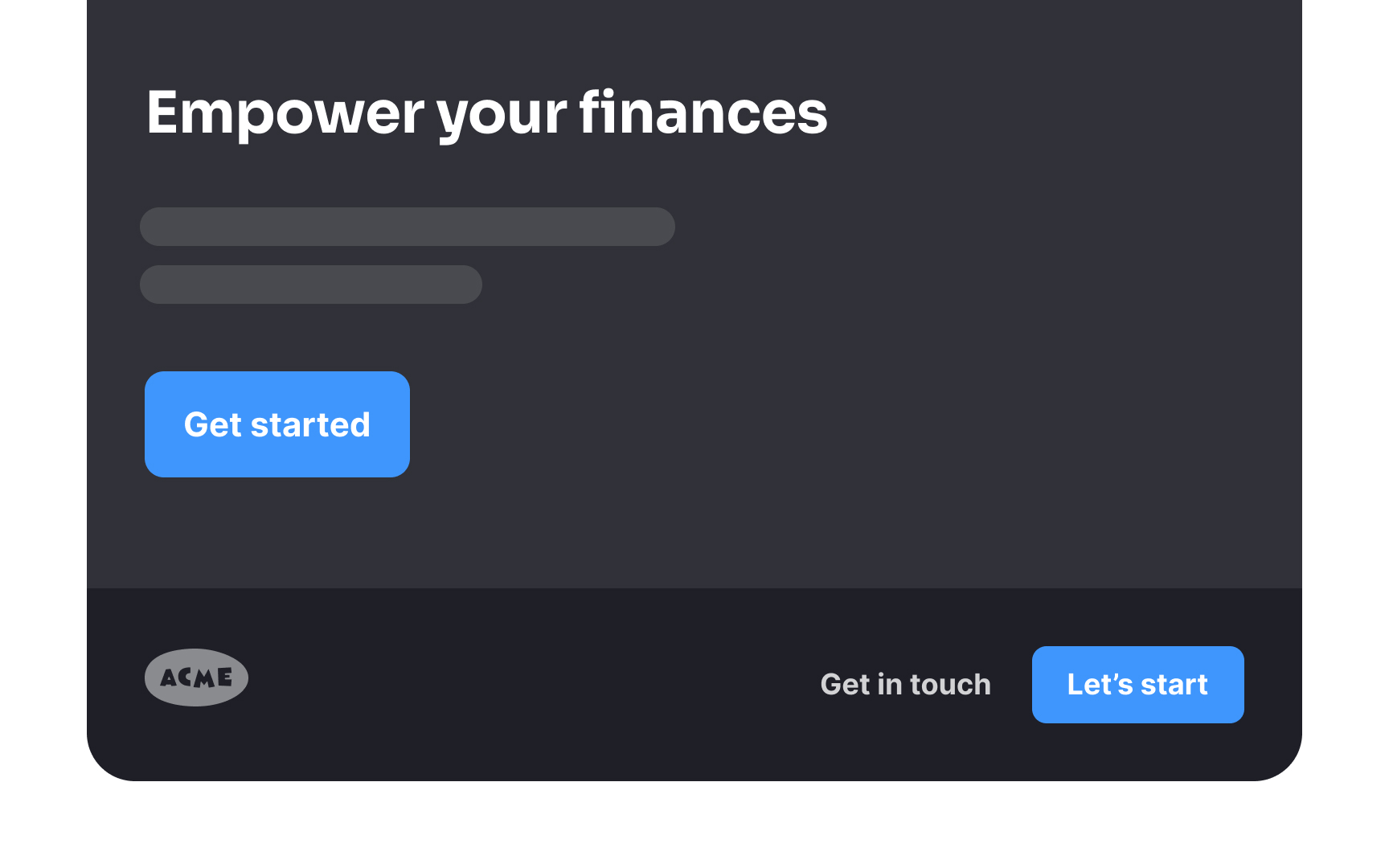
Add an email signup
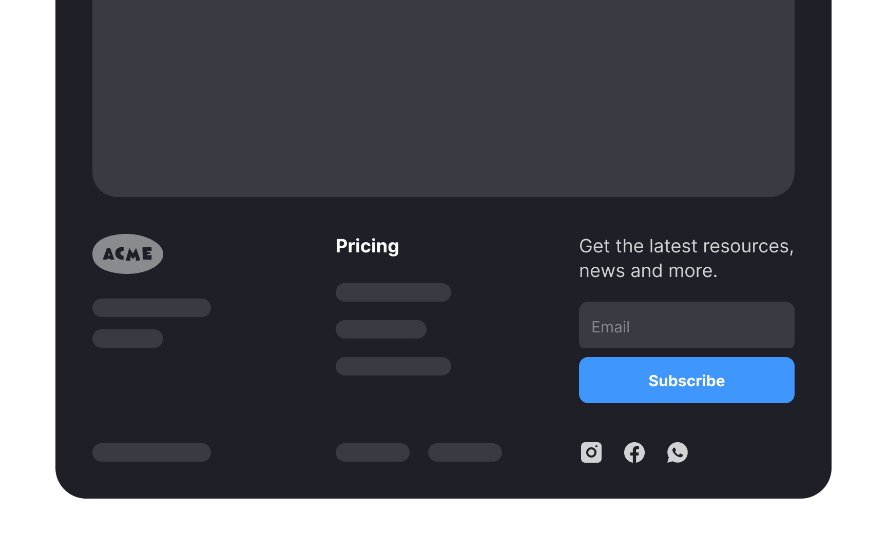
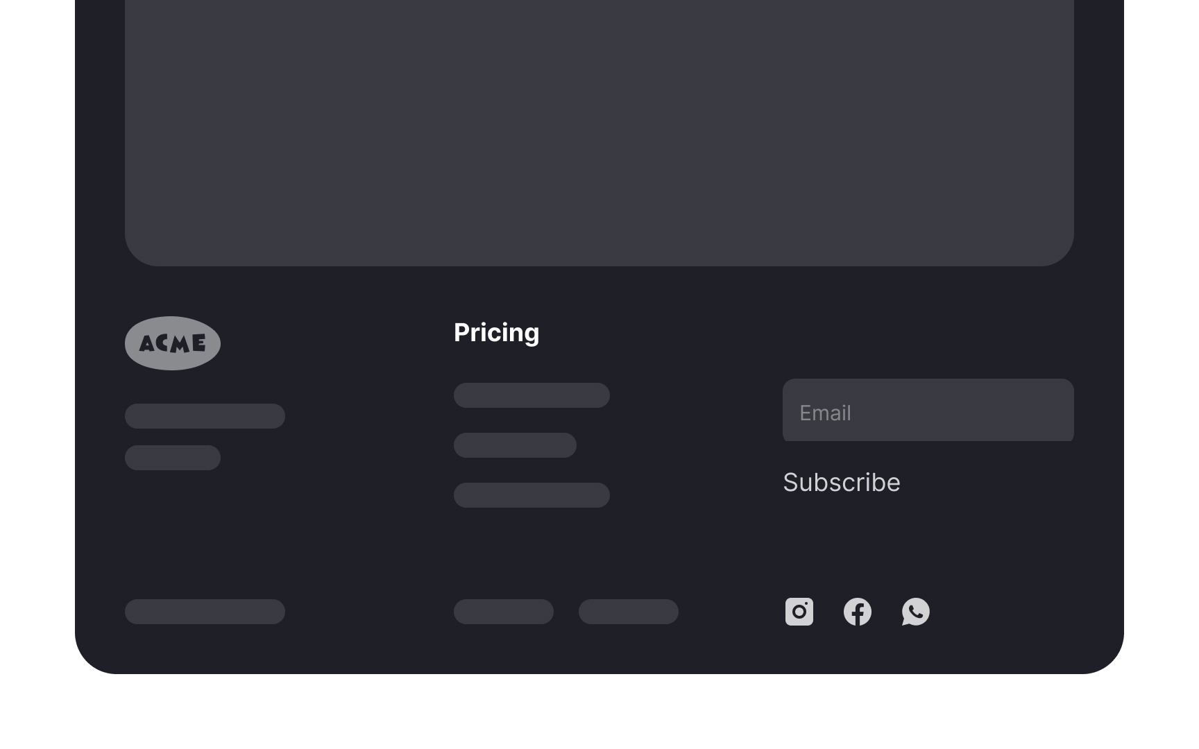
Footers are an ideal location for mailing list signup prompts because they appear on every page, providing consistent exposure to the signup option, regardless of where users navigate on the site. This ensures that visitors who have engaged with the content and might be interested in more are reminded to subscribe, no matter their location on the website.
Also, placing the signup prompt in the footer keeps it unobtrusive yet accessible — it doesn't interrupt users' browsing experience but is readily available for those seeking to stay connected. Not to forget, users often scroll to the footer seeking contact information or additional resources, making them more likely to notice and consider the mailing list option at this point.[3]
Match the design theme
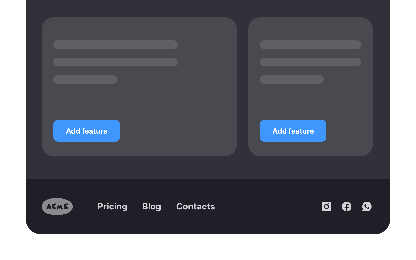
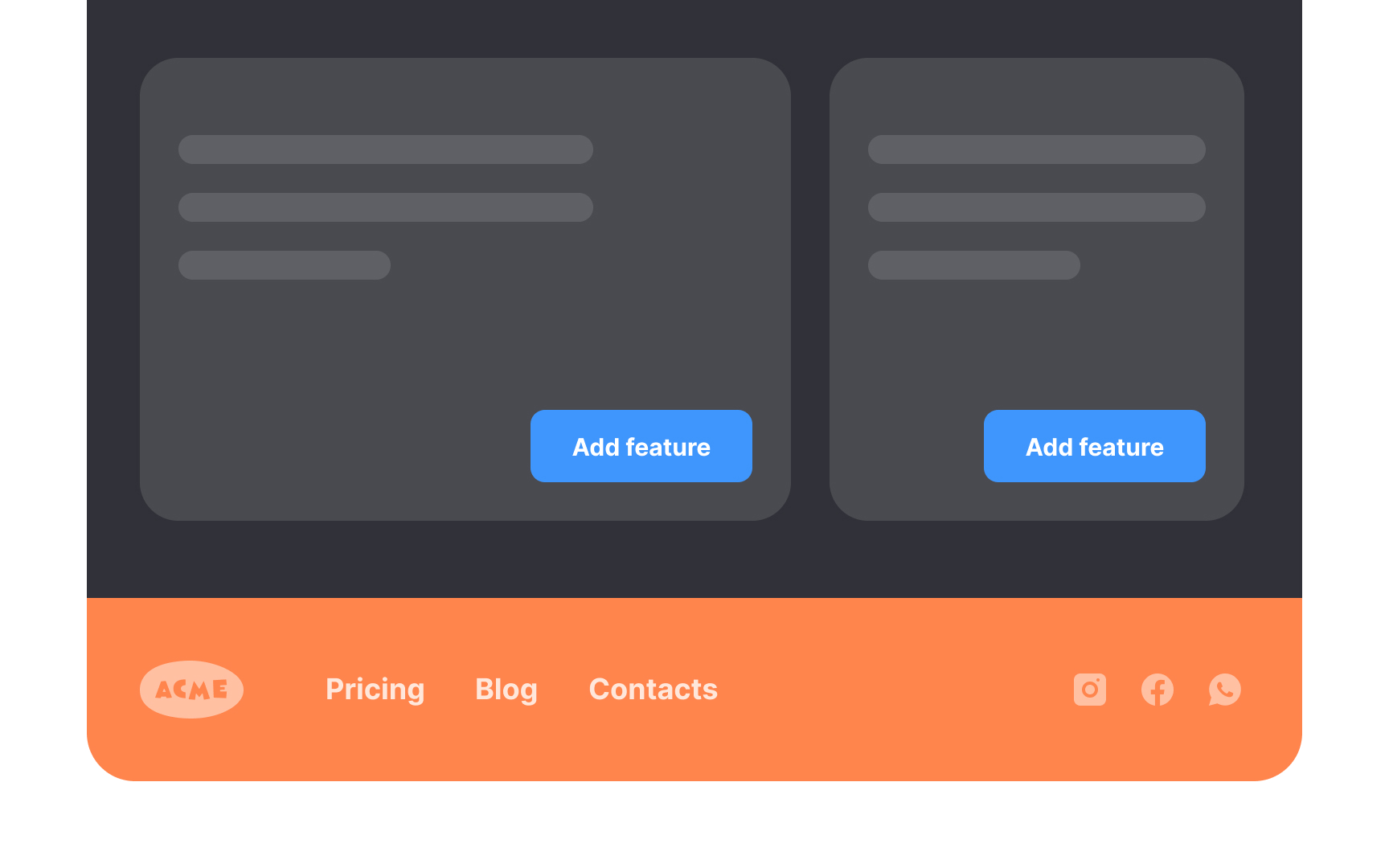
As an integral part of the website navigation, the footer should match the overall design theme for the site. Footer color and style should mirror the overall tone. Avoid making the common mistake of adding a box footer that does not match.
Opt for colors with high contrast, such as a light background with black text or a dark background with white text. Avoid using varying colors or ornate typefaces.
The footer must be there when users need it but shouldn't attract too much attention. Make it visible but modest to maintain the visual hierarchy.
Use clear link names
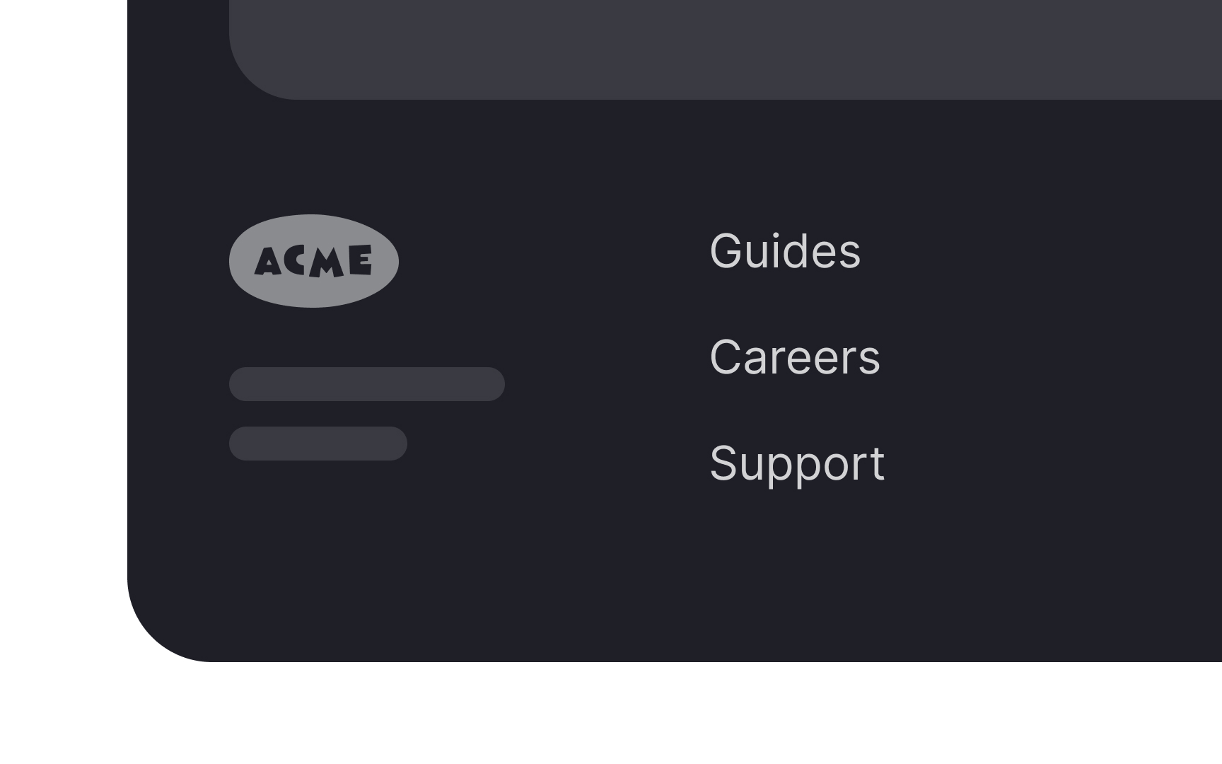
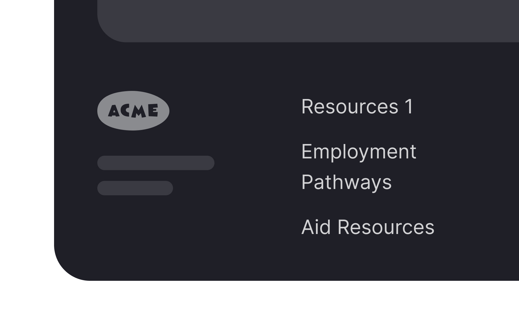
Generic link names can confuse users because it's unclear what content it encompasses. A more effective approach is to use clear, specific terms that accurately describe the content or categories they lead to.
For example, instead of a generic "Resources" link, a website could use distinct labels like "Guides," "Case Studies," or "Support." These terms immediately convey what type of information the user can expect to find, enhancing usability and navigation efficiency.
If there's uncertainty about the best terms to use, methods like card sorting or usability testing can be invaluable.
Topics
References
- UX writing explained in 5 F words | Inside Design Blog
- Exhaustive Review or "I Can't Believe It's Not There" Phenomenon | Nielsen Norman Group
- Web Page Footers 101: Design Patterns and When to Use Each | Nielsen Norman Group


