


.svg)
Components are the building blocks of an interface. They include buttons, checkboxes, labels, inputs, cards, and many others. Each of them has unique anatomy and implements a specific role to help users achieve their goals.
What is the difference between radio buttons and checkboxes? Cards and containers? Links and hyperlinks? Understanding how each component works and where it should be applied is powerful knowledge. Not only will you feel more relaxed communicating with designers, but you'll also be more confident in your professional skills.
Buttons
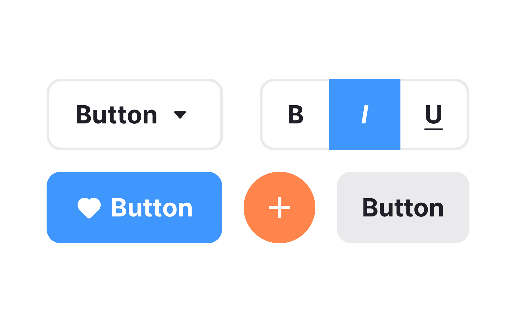
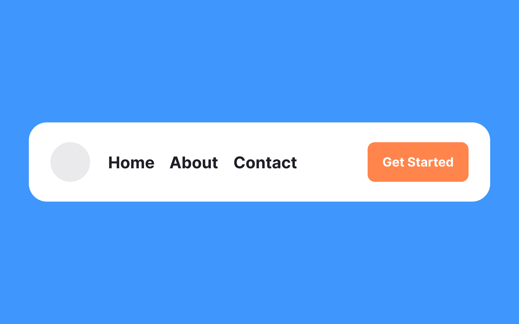
In digital products, buttons communicate actions that users can take. They usually consist of a rectangular, square, or circular shape with a label or an icon. Buttons allow users to perform actions with a single click or tap.
A button can also be represented solely by an icon or label. Text buttons and links may look similar but they do different things. Clicking buttons changes the state of a system (either front or back end), while clicking links redirects you somewhere else and doesn't change the system's state. Plus, links often appear in the text and thus, can be longer. Buttons can also be used to toggle states, open dropdowns, or trigger overlays like modals and tooltips.
Navigation components
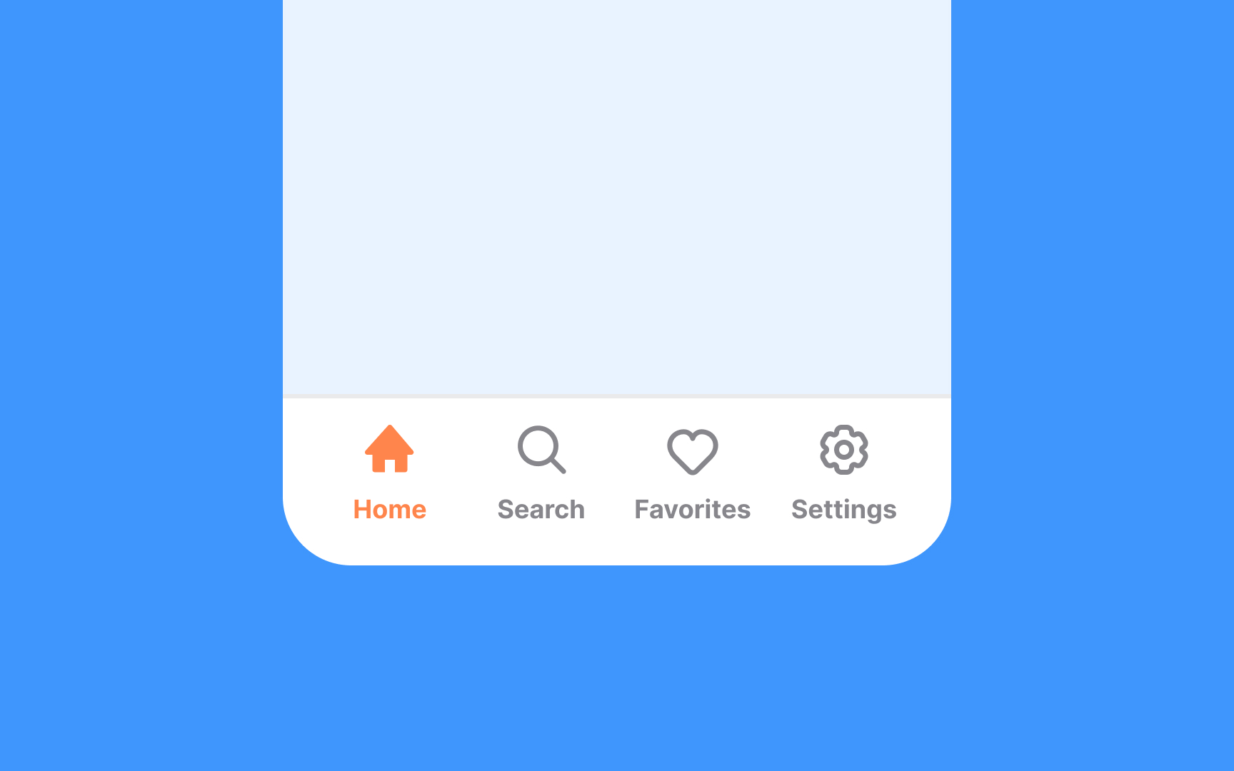
Navigation is the system of how users can move through an app or a website. A product's navigation should be consistent across all pages.
Navigation may include various navigational components, for example:
- Navigation bars
- Sidebars
- Breadcrumb trails
- Menus
- Other features that help users find what they need
Hamburger menus
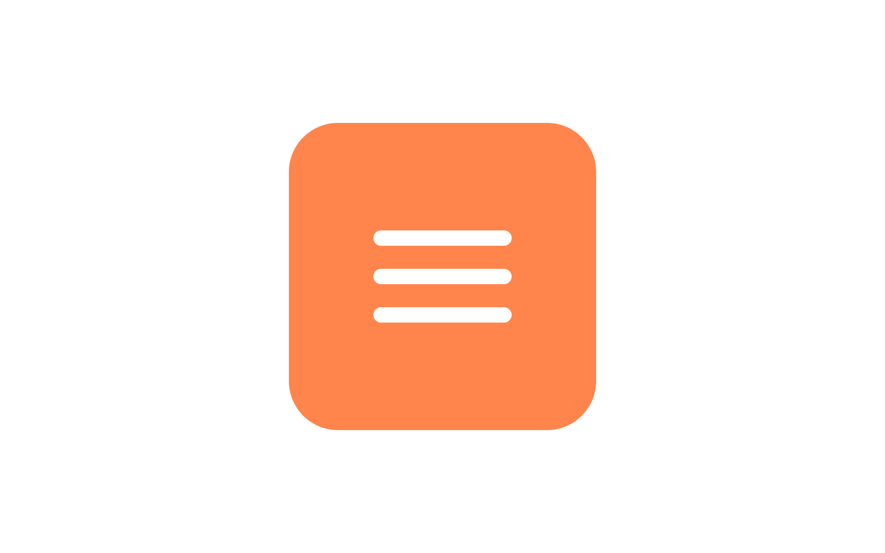
The hamburger menu is a button commonly found in websites and apps that, when clicked or tapped, reveals a side menu or navigation drawer. Traditionally, it's represented by three parallel horizontal lines stacked on top of each other. These lines may sometimes be accompanied by the word "Menu" or even an icon suggesting interaction, like an arrow. The layout is intended to resemble a simplified drawing of a hamburger to those with culinary inclinations — hence the name.
The icon serves as a compact way to hide navigation links while offering an intuitive way for users to access various sections of a site or app. This design choice is particularly useful for mobile interfaces where screen real estate is limited.
Breadcrumbs
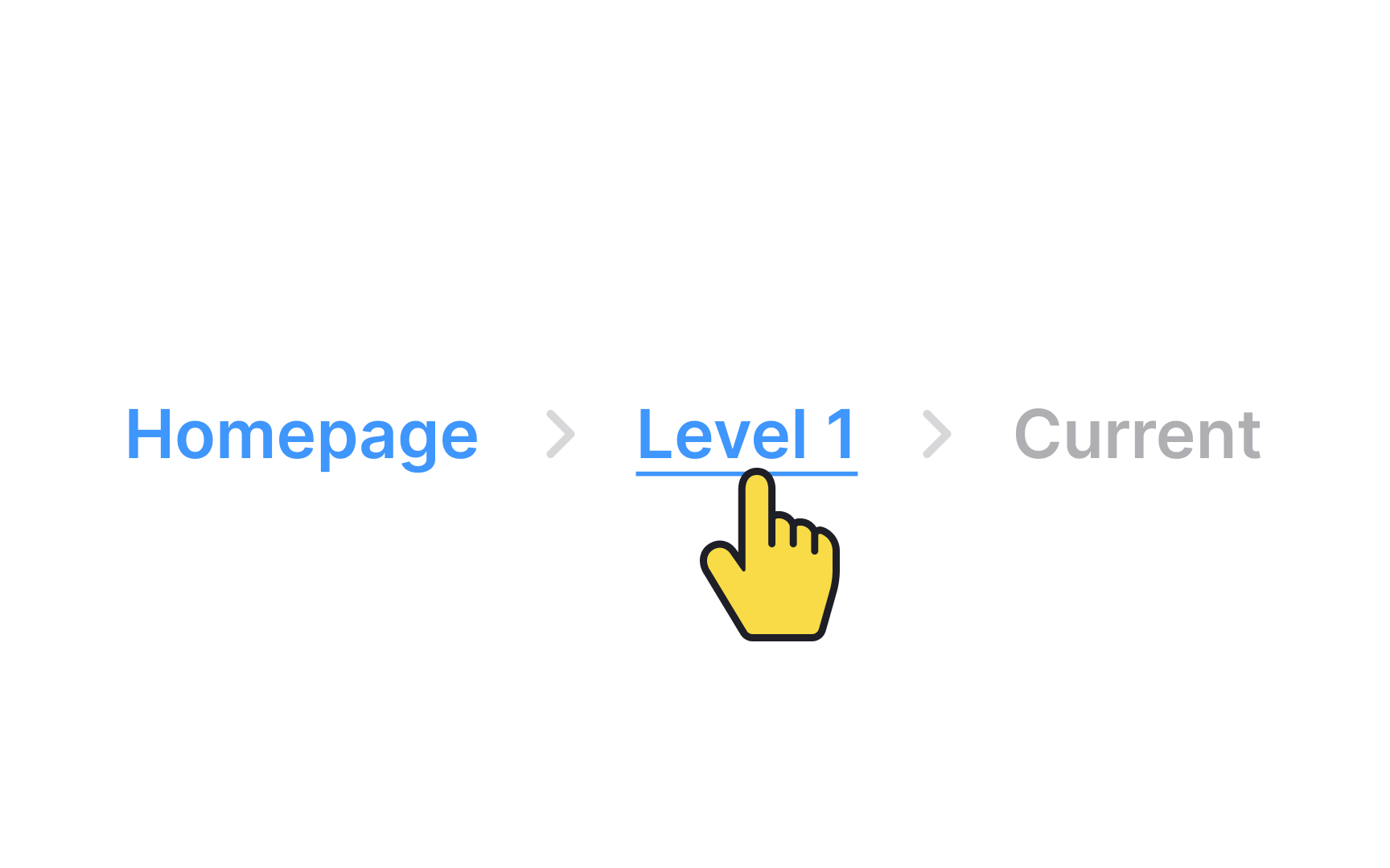
Breadcrumbs are a secondary navigation element that look like a row of links separated by dividers, often chevron icons (>). Like in the tale of Hansel and Gretel, breadcrumbs leave a trail to guide users. They display users' current location and assist them in navigating the product.
The last item in the breadcrumb should stand out from the rest because it marks the user’s current page. It should not be a link, since the user is already on that page and does not need to click it.
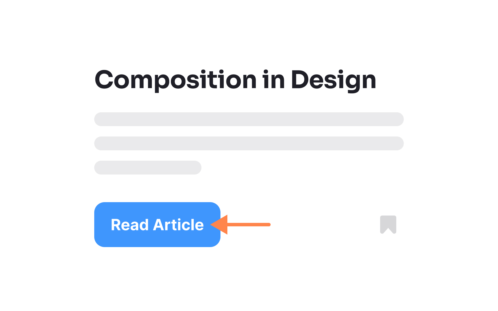
Cards
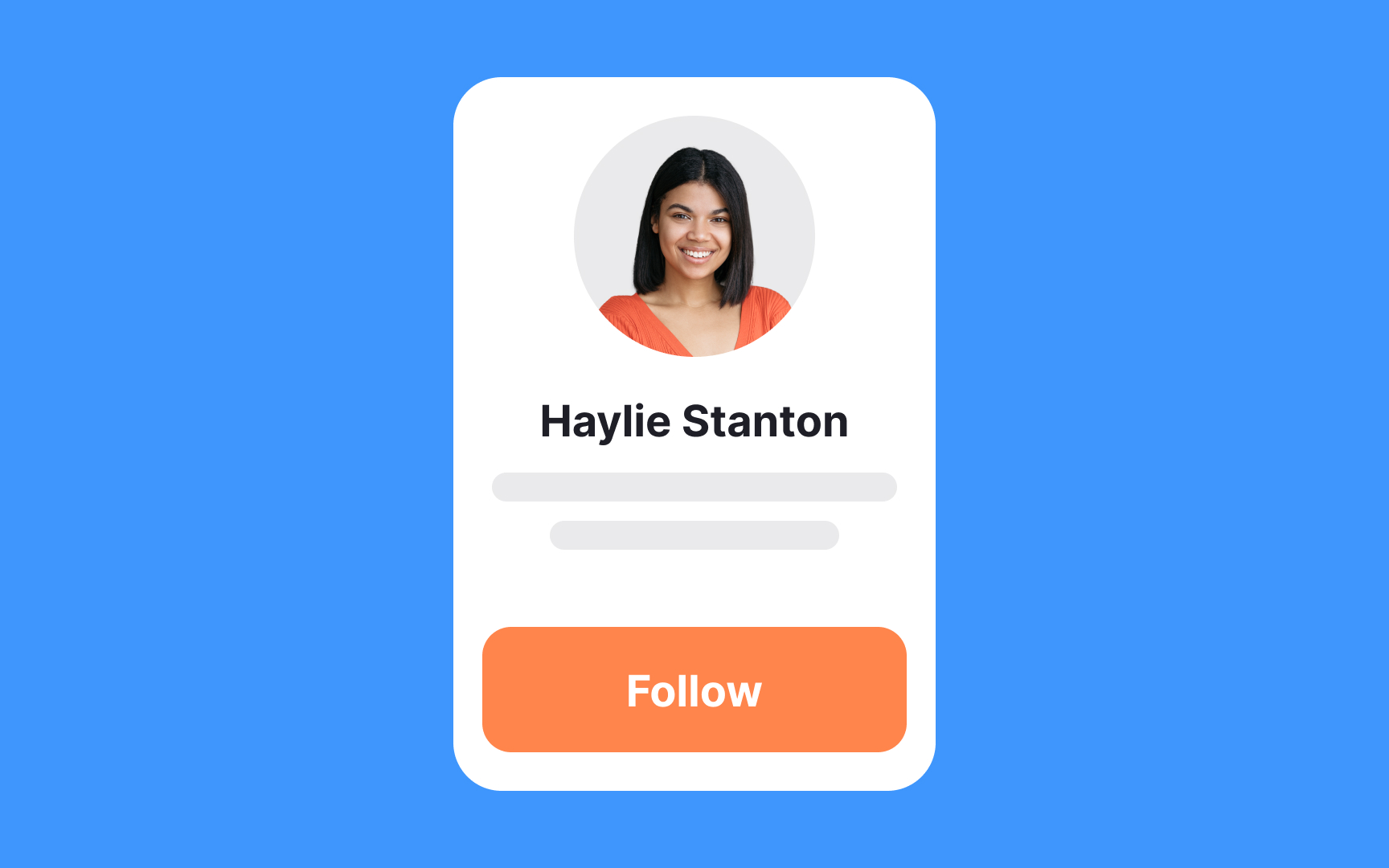
A card is a UI component that contains content and actions about a single subject. Cards in UI resemble trading cards in real life — they're rectangular and often include an image and some text. They may also contain interactive elements such as Learn More or Read More buttons.
Pinterest is an excellent example of a website leveraging cards to the fullest extent.
Checkboxes
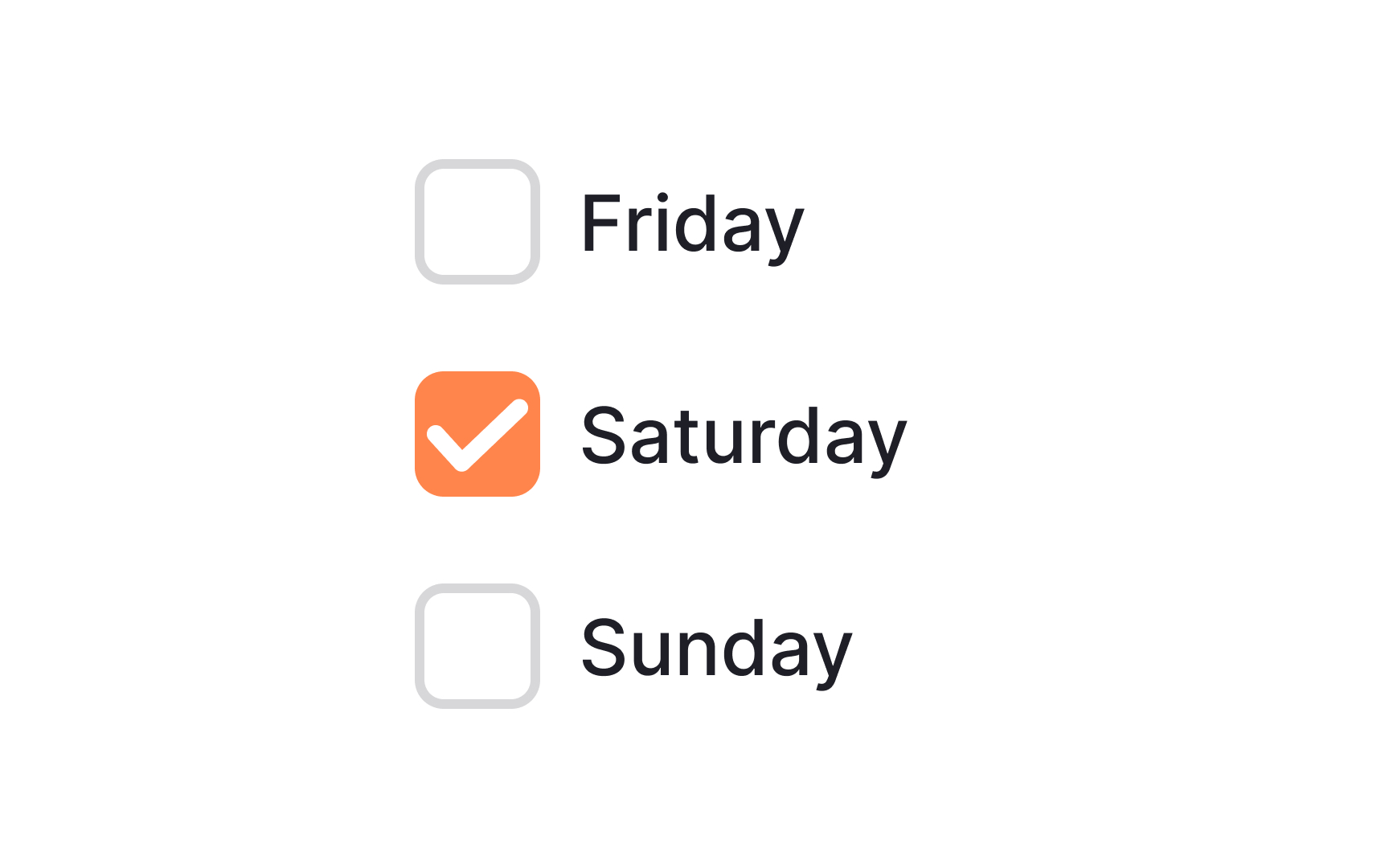
Checkboxes are UI selection controls commonly found in forms. Single checkboxes are often encountered when asking for users' consent to the Terms and Conditions and Privacy Policy. When checked, they display a small box with a check mark inside. When unchecked, they appear as an empty box.
In contrast to radio buttons, checkboxes allow users to select several options at the same time and enable or disable each one of them.
Containers
A container divides content into meaningful sections. Just like storage containers help organize a pantry, UI containers help structure and group content.
Containers can hold text, images, or action items. Rigid containers restrict the size or cropping of the elements inside them. Flexible containers grow to fit the size of the content they hold.[1] That’s how responsive design works: all elements are placed inside containers that adapt to screen size and orientation, ensuring consistency across layouts.
Menus
A menu serves as a practical element in a UI, offering a list of various actions that users can take. It usually pops up when users engage with specific controls like buttons or tabs. Most navigation menus feature command labels paired with icons, and occasionally, some helper text for added context.
The beauty of menus lies in their efficiency: they pack a multitude of options into a compact space, keeping the interface clean and easy to navigate. This makes them invaluable for both desktop and mobile designs where real estate is at a premium.
Toggles
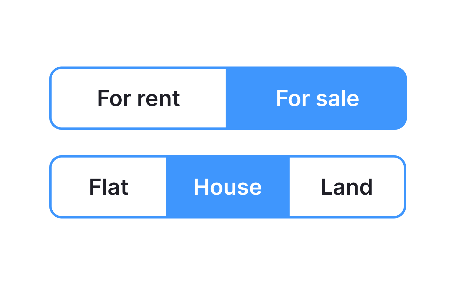
Toggle buttons group 2 functions (sometimes 3) into a single container. In Apple's Human Interface Guidelines, you can encounter a similar component called segmented buttons.[2]
All buttons are usually equal in width, and only one button can be selected at a time in each group. The chosen option is usually highlighted with colors or overlays. In contrast, segmented buttons allow multiple choices.
Inputs
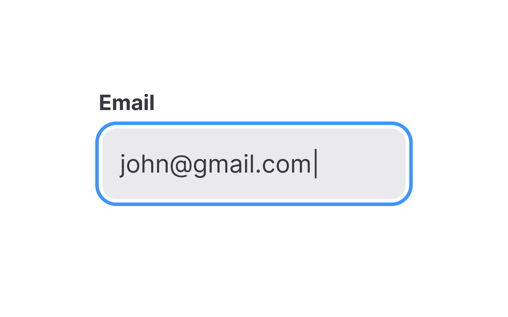
Input fields, commonly referred to as "inputs," are essential UI elements that enable users to input various types of data—be it a name, password, email, or even date and time. You'll typically find these fields within forms and dialogs.
Their purpose is straightforward: to collect information in a way that's efficient and user-friendly. Inputs come in many flavors, catering to different data types and user needs. They can include text boxes for general information, password fields that obscure entered text, or specialized fields for dates and numbers.
The key to effective use of inputs is clarity and context; labels, placeholder text, and design cues like icons can guide users, making their interaction with your interface smooth and intuitive.
Labels
A label is a static piece of text that people can read and copy but not edit. Labels display text throughout the interface — in buttons, menu items, and views. They aim to help people understand the current context and what they can do next. For example, within a button, a label generally conveys what the button does, such as Edit, Cancel, or Send.[3]
Radio buttons
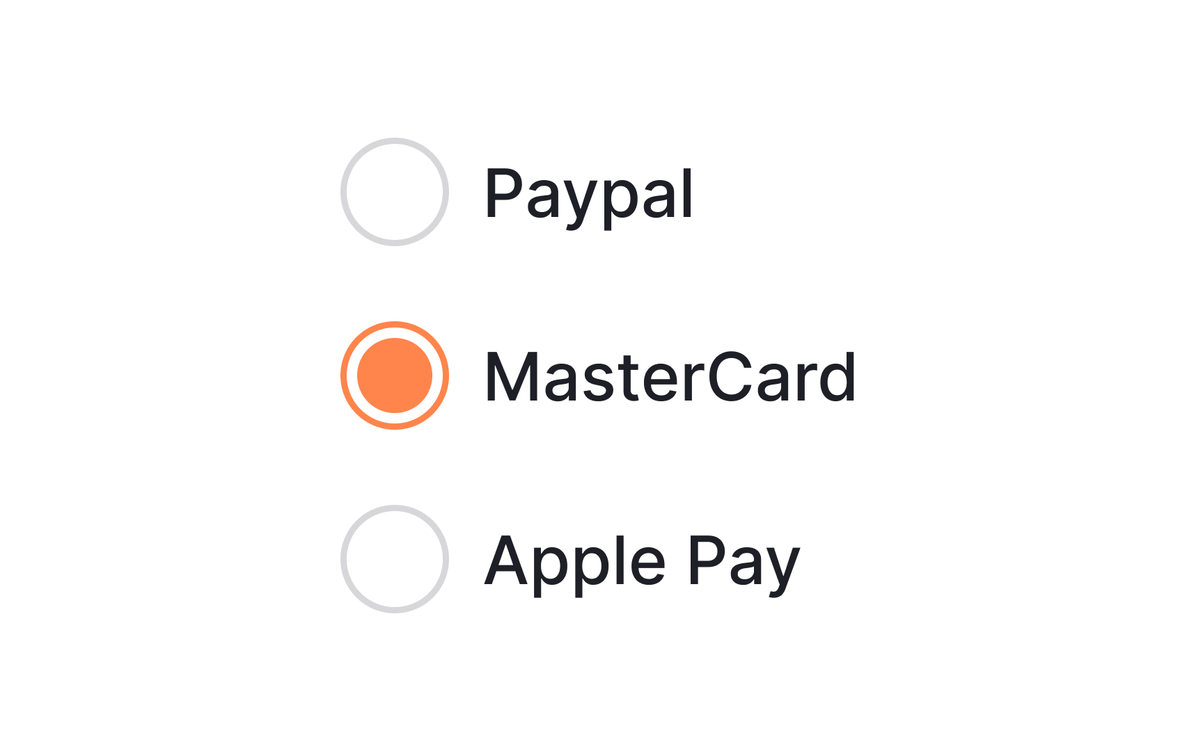
Radio buttons are controls that appear as outlined circles. A filled dot inside the circle shows the selected option.
Unlike checkboxes, radio buttons let users choose only one option. Once selected, an option can't be unselected; it can only be replaced. To avoid locking users into a choice, include a "None of the above" or similar option.
Hyperlinks
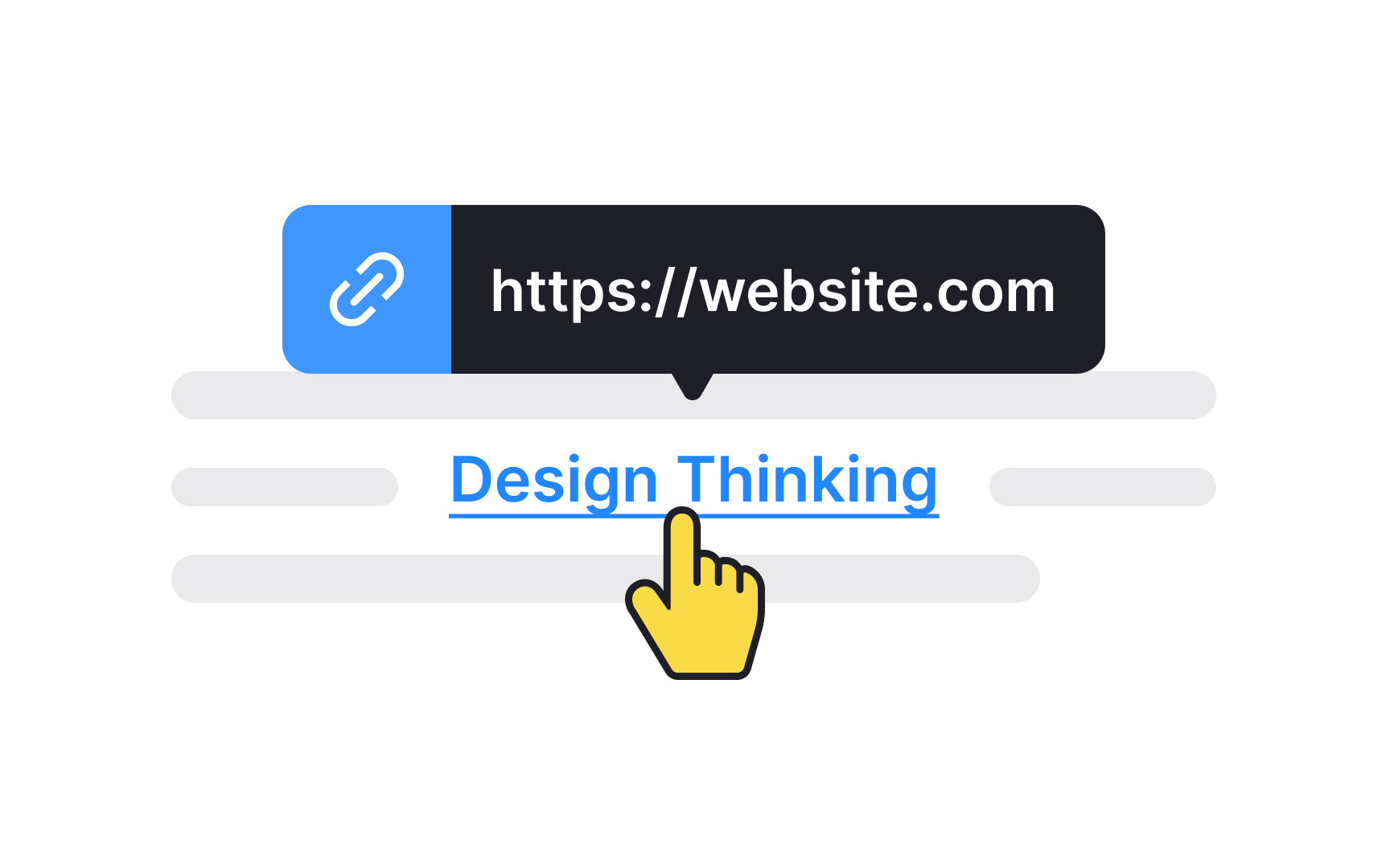
A hyperlink is a word, phrase, or image you can click on to jump to a new page or section within the current page. The text that makes up the link is known as link text, and it's usually immediately recognizable by its bright color and/or underline.


